 As the novel coronavirus pandemic is in full swing, COVID-19 is now by far the most topical issue on the global agenda. So it’s no surprise that the vast majority of the data visualization projects we’ve come across this week are about the outbreak. That’s why the new DataViz Weekly article is entirely devoted to the same subject — the coronavirus.
We are quite sure many of you have already seen some if not all of the best dashboards, charts, and trackers of the global COVID-19 outbreak from Johns Hopkins University, The New York Times, Financial Times, Business Insider, The Guardian, Bloomberg, and others. Awesome animated simulations from The Washington Post’s Harry Stevens, showing why epidemics like this spread exponentially and how social distancing could help to flatten the curve of COVID-19 cases, have almost certainly came to your attention and does not need to be presented additionally.
Headquartered in the United States, we decided to find out more about what has been going on about COVID-19 in America. Join us on a review of four interesting (though sometimes a bit frightening) data graphics features created by top media outlets, which provide insight into where the U.S. stands — from the perspective of cases and tests (Politico), scenarios (TIME), and hospital bed capacity (The Upshot by NYT), as well as compared to the rest of the world (BuzzFeed News). Check out the special “COVID-19 in US” edition of DataViz Weekly on the AnyChart blog.
Data Visualization Weekly: March 13, 2020 — March 20, 2020
COVID-19 Cases and Tests
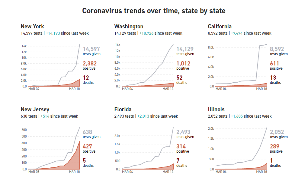
Politico allows you to keep track of the overall situation with COVID-19 in the United States through the prism of data about coronavirus tests. Maintained by Politico‘s graphics reporter Beatrice Jin and updated as new numbers arrive, this project uses data from the volunteer-driven COVID Tracking Project to monitor how many Americans have been tested so far across the country and with what result, state by state and overall.
What makes Politico‘s live tracker of COVID cases especially interesting is the opportunity to understand coronavirus trends. While a bubble map and stacked bar charts show the latest data about total tests and positive tests in America, dedicated line-and-area combination charts visualize COVID-19 outbreak trends over time for each state and the District of Columbia as well as nationwide, since March 4.
See where the U.S. and all its states currently stand struggling to fight the novel coronavirus pandemic on the American territory.
Coronavirus Scenarios
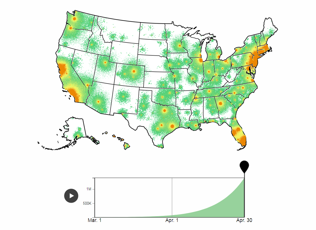
TIME presents a visual simulator showing five scenarios of how fast the novel coronavirus disease can spread across the United States. Picked from a hundred of potential COVID-19 outbreak scenarios for the U.S. exclusively provided to the magazine by Northeastern University’s Laboratory for the Modeling of Biological and Socio-technical Systems, as allegedly most probable, they are based on different percentages of coronavirus cases being detected.
The models displayed in this TIME‘s interactive vary between detection rates of about 25% of the Americans who catch the coronavirus to 40%. That’s right, the number of confirmed cases will hardly happen to be too close to the real number of all infected people. The reason is that “not all infected individuals will exhibit symptoms or be tested, even though they remain contagious,” explains Chris Wilson, Director of Data Journalism at TIME.
Find out how fast the COVID-19 coronavirus is forecast to infect hundreds of thousands to more than one million of Americans if one degree of surveillance and intervention or another takes place in the United States. TIME promises to update the scenario simulator as more data comes to light.
Hospital Bed Capacity Against Projected COVID-19 Hospitalizations
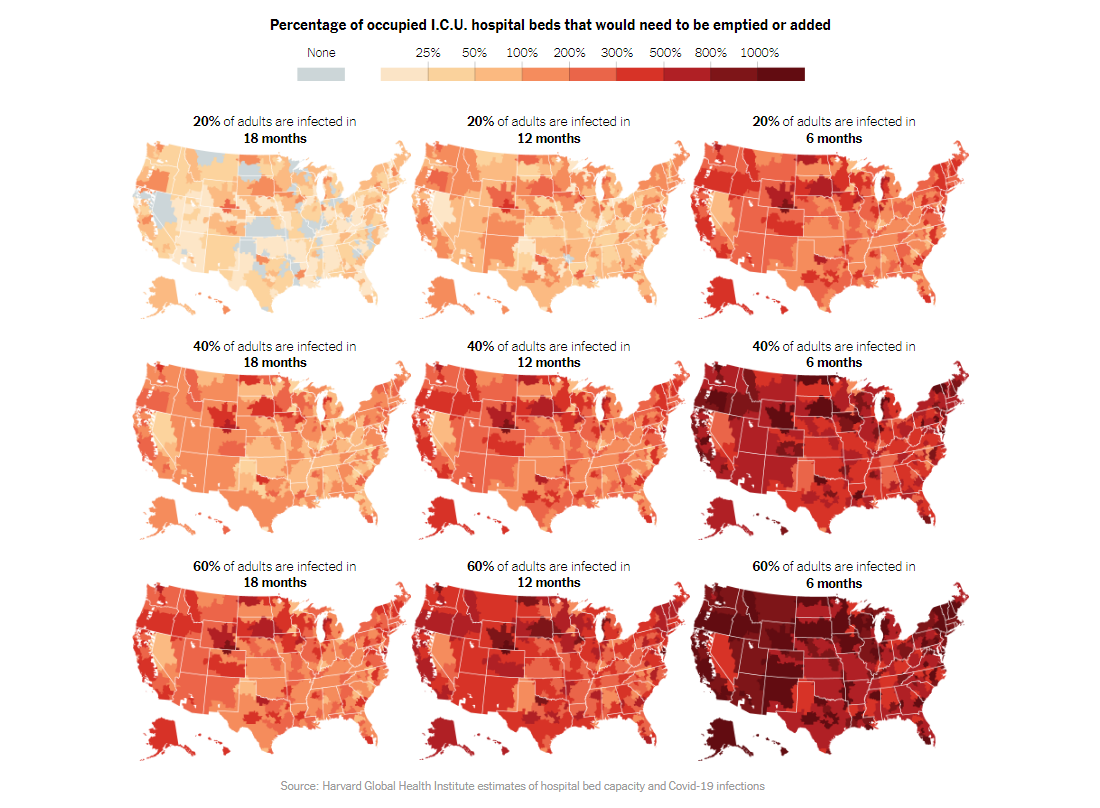
For The Upshot project, The New York Times‘ Sarah Kliff, Margot Sanger-Katz and Alicia Parlapiano looked into the findings of a new analysis from Harvard researchers. Directed by Dr. Ashish Jha, the Harvard Global Health Institute team generated estimates of hospital bed capacity under nine different scenarios of how fast the coronavirus could spread across the United States.
According to the results of the research, many parts of the U.S. are likely to run out of hospital beds if COVID-19 continues to quickly expand (and if no action is taken to increase capacity). The maps visualize data about 305 of the 306 hospital referral regions in the U.S.; only the area of Panama City, FL, could not be included due to insufficient data.
Check out the maps to explore the percentage of occupied hospital and intensive care unit (I.C.U.) beds that would need to be emptied or added in each scenario. Don’t miss out on two charts plotting bed capacity against the potential number of coronavirus hospitalizations.
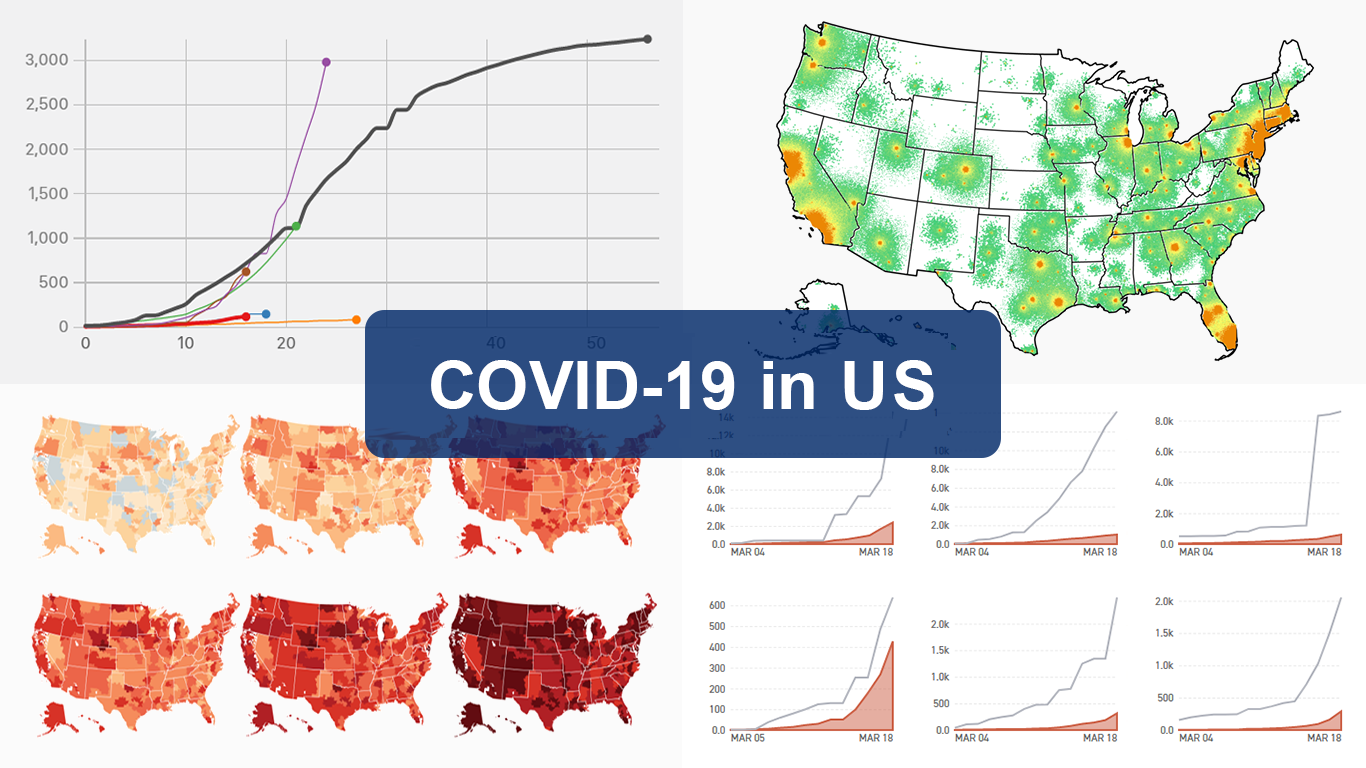
Comparing US Coronavirus Outbreak to Those in Other Countries
So, we’ve seen important COVID-19 data in some figures and curves that reveal how the Wuhan coronavirus disease has been spreading in the United States these days and where it could take us. But how does the U.S. outbreak compare to the rest of the world? Here are four other COVID-19 charts that can bring clarity.
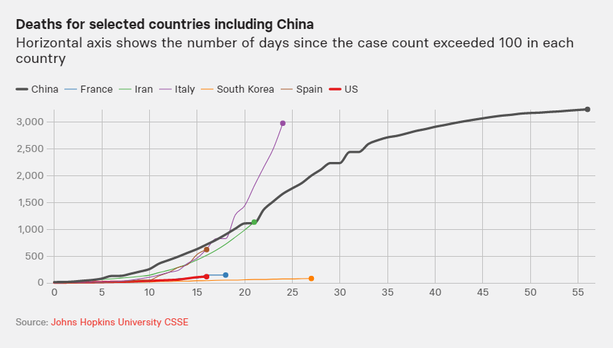
BuzzFeed‘s science reporter Peter Aldhous and data editor Jeremy Singer-Vine visualized timelines of the coronavirus outbreaks in what they called “the worst-affected” countries using data from the Center for Systems Science and Engineering (CSSE) at Johns Hopkins University. The line charts display the confirmed cases and deaths over time since the day when the COVID-19 case count exceeded 100 in each country.
Take a look at where the U.S. coronavirus outbreak stands in comparison with those in France, Iran, Italy, South Korea, and Spain, with and without China data represented. However, “it’s important to realize that all these case numbers are inevitably undercounted, because no country is able to test everyone who might have the virus,” the authors say. These charts get updates on a daily basis.
***
We hope you are safe and in good health.
Stay tuned for Data Visualization Weekly where, each Friday, we highlight new great charts, maps and infographics from around the web demonstrating the power of data viz.
- Categories: Data Visualization Weekly
- 2 Comments »