 Myriads of enterprise-level software developers rely on our award-winning JavaScript data visualization library to build comprehensive reporting and analytics applications. However, AnyChart is also widely chosen to operate basic charts. One example of such a use case is a visualization of student success metrics at Mills College, a famous American higher education institution attended at different times by filmmaker Sofia Coppola, musician Dave Brubeck, and Congresswoman Barbara Lee among other great people.
We interviewed Angelique Felgentreff from Mills College to get you first-hand information about their experience using charts powered by AnyChart. (Stack: OmniUpdate OU Campus/PHP.)
AnyChart: Hi Angelique. To start with, could you please briefly tell our community about yourself? What do you and your team do?
Angelique Felgentreff: I work as the web administrator and developer for the marketing team at Mills College, an independent liberal arts college in Oakland, California. Our team is focused on supporting the College’s recruitment and retention efforts.
A: What role does data visualization play in your work at Mills College? Why do you need it and how does it help?
AF: Educational outcomes and successes are key data points that higher education institutions can offer to help prospective students and parents make sound choices during the college selection process. Visual presentation of this data makes it easier to see overall data trends at a glance. Charts brought that to our web pages, added a visual punch and bit of interactivity, yet still retained the ability for visitors to see underlying data if desired.
A: Please describe the project in which you are making use of AnyChart in a bit more detail: What’s its purpose? What technologies is it built on? How did it look before?
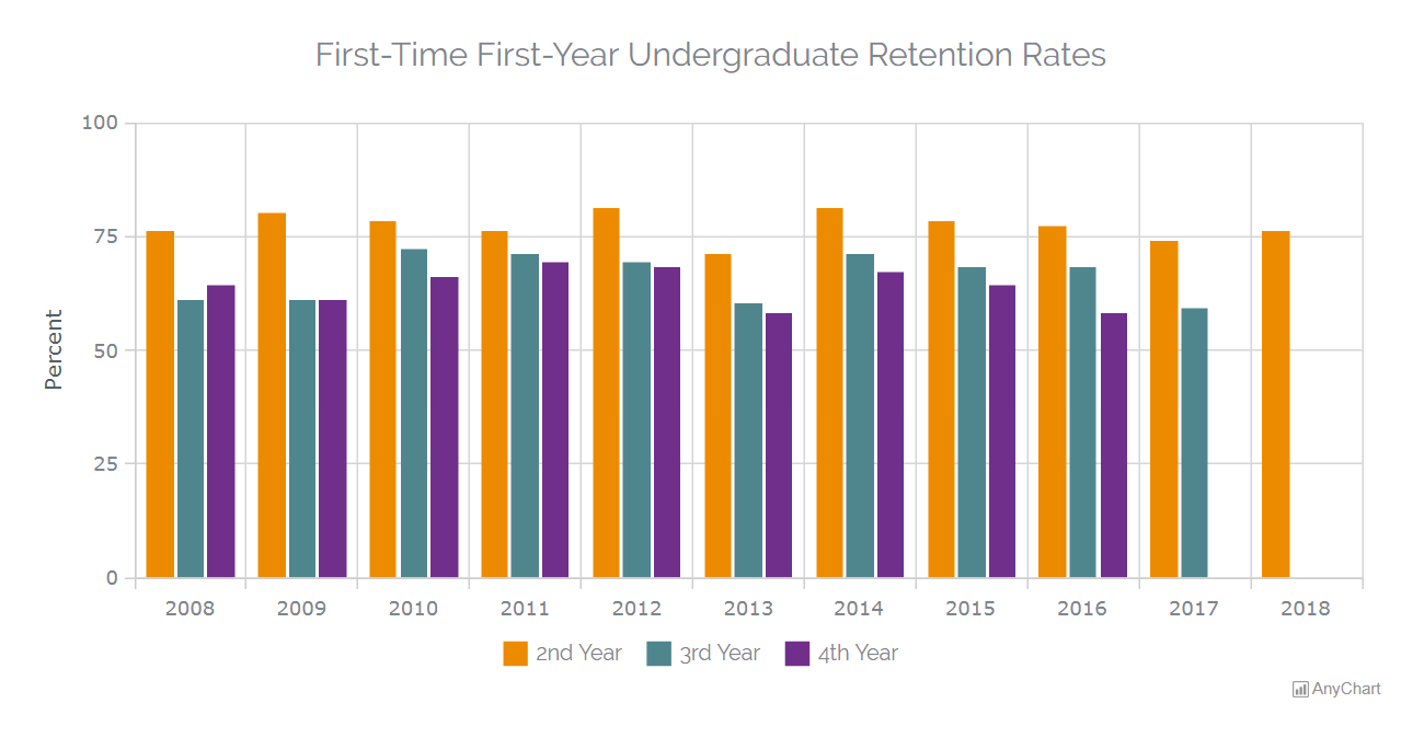
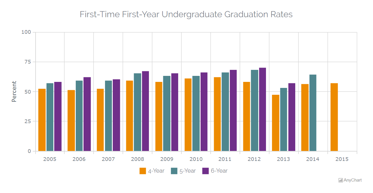
AF: Our project was to post retention and graduation rates for the last ten years. The desire was to have a presentation that was: easy to understand, visually interesting, displayed well on both mobile and desktop devices; and did not present accessibility hurdles.
Our site construct is quite basic and uses PHP and JavaScript relying on OmniUpdate’s OU Campus for our CMS.
Prior to using AnyChart, the team would have either posted a JPG image and/or used an HTML table to solve a request like this.
A: How do you use AnyChart for your college student retention and graduation rates data visualization? What chart types and features are most helpful?
AF: For this project, I took the source data and created several versions of the data in charts with AnyChart. I presented some data in sample visualizations as both line charts and bar charts. I had also created a couple of pie chart samples for a few data sets, but then it was decided that showing some of the data graphically was highlighting weaknesses in them — so those didn’t make it to prime time.
Ultimately two column charts were selected for publication on the Retention & Graduation Rates page. Those are super basic but show exactly what and how we wanted.
A: Why did you choose AnyChart? What do you like most about our JS library?
AF: Before choosing AnyChart I looked at a couple of other options. Among those I considered were a free open source option like Chart.js and some WYSIWYG tool. I’m not a terribly strong developer so I was looking for something without too steep of a learning curve. I also had a very aggressive deadline for the project, so I didn’t have the luxury of tinkering with something too long to get a proof of concept working.
Ultimately I chose AnyChart because I had the ability to get right in and use it — giving me the ability to see if I was going to sink or swim before having to make a commitment to the tool or to my manager. Moreover, the AnyChart documentation and examples were tremendously robust. With other options, I found myself tumbling down a rabbit hole of vaguely related discussion threads on coding support sites just trying to figure out how to initialize my variables.
With AnyChart I was able to quickly build what I needed. It was straight-forward to work through the example library to create a prototype and then build upon it and tailor it to meet my team’s needs.
A: Please tell us how we can further improve AnyChart: What do you think it lacks and what would you like to see in the future versions?
AF: I ran into a few display issues with the pie charts. The charts looked super slick, but our legends were verbose and our marketing manager wanted down to the pixel control over their display — even on mobile — which is why those were ultimately rejected. I think your next version was going to introduce elements which would have solved one or more of the display issues (I can’t remember if it was a font control issue or a positioning issue I ran into at this point which ended up being the roadblock — it’s been a while).
There tend to be a lot of typography, layout, and positioning things that my marketing team seems to view as trivial that are quite difficult in HTML/CSS — especially considering getting things to work in an equally well (if not a perfect pixel-to-pixel, matchy way) that make working on web projects with my team particularly difficult. The deal-breakers for this team are the kinds of layout things that take a whole page of code just to adjust in something like Chart.js (frankly things outside of my own current skill set). AnyChart had most of them nailed by default.
A: When asked by a friend which JS charting library to use for data visualization, would you recommend AnyChart?
AF: I’d absolutely recommend AnyChart to my peers as a first choice. Within a single evening, I was able to create a solid set of responsive chart options — bars, lines, and pies. I had professional-looking charts ready for review in the morning. I felt like a total boss. All that was left was for my manager to choose the best format for each data set and swap the sample data out.
Check out the Mills College case study we’ve just published as well and see other selected case studies.
Read more cool customer stories in our blog.
If you want to share your own AnyChart story, please let us know and we’ll be more than happy to publish it.
- Categories: AnyChart Charting Component, HTML5, JavaScript, Success Stories
- No Comments »