Nick Mar Uses AnyChart JS Charts to Visualize User Performance and Stock Market Data
April 24th, 2023 by AnyChart Team As the world’s top provider of cutting-edge data visualization solutions, we are constantly thrilled to witness how our products are utilized by both businesses and individuals to create interactive charts and dashboards. We recently had the opportunity to chat with software developer Nick Mar, who shared some of his personal projects with us, highlighting the use of AnyChart and his experience with our JavaScript charting library. Check out our interview with him! (Stack: HTML/CSS/JavaScript.)
- Categories: AnyChart Charting Component, HTML5, JavaScript, Success Stories
- No Comments »
Vasari Diagram Visualizes Wikipedia Networks of Painters with AnyChart JS
September 29th, 2022 by AnyChart Team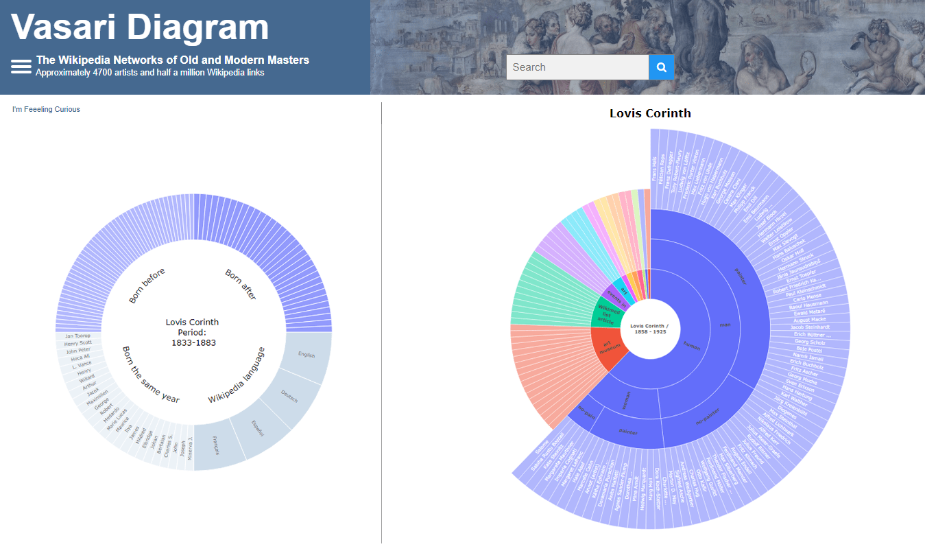 There are numerous cases where our customers first picked a different JavaScript charting library to operate data visualization in their projects but then could not get absolutely what they wanted, and in the end, switched to AnyChart and are happy with their new and final choice. Here is one of such examples.
Francis Lapique and Temenuzhka Dimova ended up using our Sunburst Chart solution in their Vasari Diagram, a fascinating asset for art history researchers and enthusiasts. This project lets anyone explore which people and topics various painters are connected with.
Read our interview where Francis describes the Vasari Diagram project and how AnyChart is used, and check it out!
- Categories: AnyChart Charting Component, Big Data, Charts and Art, HTML5, JavaScript, Success Stories
- No Comments »
SunnyByte Chooses AnyChart for Native American Cancer Data Visualization
February 16th, 2022 by AnyChart Team Out-of-the-box error bars and the ability to create a cool error chart without hassle have always been a major attraction of AnyChart, among other great features prompting developers to choose our JavaScript charting library. If you want to look at some real-world examples of such visualizations in action, Shen DeShayne, a partner at SunnyByte has recently brought a new interesting use case for them to our attention. The American Indian & Alaska Native Cancer Data website, his web development agency built for the University of New Mexico, represents information in interactive error charts powered by AnyChart. Learn more about the project and how our JS library is used, from a quick interview. (Stack: Craft CMS/Vue.js.)
- Categories: AnyChart Charting Component, Big Data, HTML5, JavaScript, Success Stories
- No Comments »
COVID-19 Risk Assessment App Pandemonium Uses AnyChart for Data Visualization
January 26th, 2022 by AnyChart Team We continue to support initiatives addressing the pandemic crisis by providing them with a full-featured free license for any of our data visualization tools. Today we are honored to be among the first to talk about a new project that joined this program, an innovative COVID-19 risk assessment app and framework called Pandemonium where all charts and maps are powered by AnyChart.
Built by Quantum Risk Analytics, Inc., a charitable nonprofit founded by MIT alumni, Pandemonium uses sophisticated machine learning algorithms to more accurately model the disease spread and provide a highly personalized evaluation of infection risks. It’s not yet publicly launched as the developers want to add a few more major features and data sources before the official release. But the app is already in the testing phase that the team encourages anyone to join.
We asked Richard Hamlin, CEO at Quantum Risk Analytics, Inc., to tell us more about Pandemonium, how it works, and how our data visualization solutions are used. Read on to know all the details.
- Categories: AnyChart Charting Component, AnyMap, Big Data, Dashboards, HTML5, JavaScript, Success Stories
- No Comments »
Maigret.de Picks AnyChart JS Charts to Visualize Data on Georges Simenon’s Work
December 29th, 2021 by AnyChart Team When data is all around, it’s no wonder to see charts here or there as they greatly help make sense of it. With thousands of happy customers worldwide, both for our JS charting library and Qlik charting extensions, we have seen countless applications for data visualization across all fields and industries. Some use cases, however, might be less expected than others. What about a website dedicated to literature?
Maigret.de — a remarkable resource about Georges Simenon, a famous Belgian writer best known for creating police detective Jules Maigret — has recently started to publish interactive data graphics revealing interesting patterns and facts in his immense work. All the charts on the website are built with AnyChart.
We have chatted with Maigret.de’s creator Oliver Hahn about his project, data visualizations, and experience using our solutions. Read the quick interview and go check out the website. (Stack: HTML/MySQL.)
- Categories: AnyChart Charting Component, Books, HTML5, JavaScript, Success Stories
- No Comments »
AnyChart Used for Data Visualization in Open-Source Redis Inventory Tool
September 29th, 2021 by AnyChart Team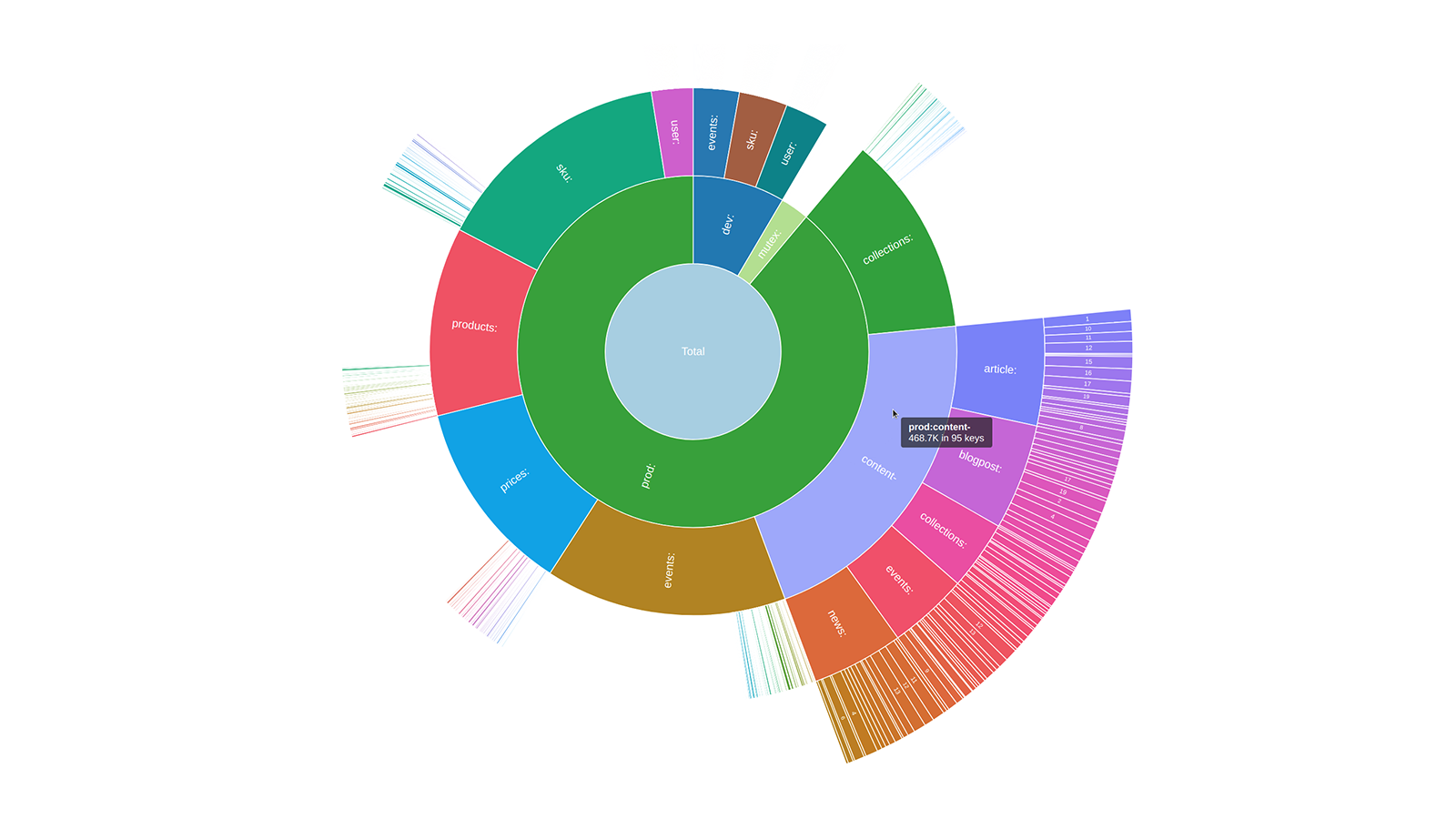 Sunburst charts are known to be greatly useful for visualizing hierarchical data structures. So it is no surprise that this chart type became a big hit among our users immediately after we added it to the AnyChart JavaScript library. Because the core of our global customer base is enterprise clients, most of the real-world use cases for our JS sunburst chart are hidden in internal corporate apps. But AnyChart is often picked for data visualization in open projects as well, and we invite you to see a super cool example we have recently found out about — Redis Inventory. It is an open-source tool that makes it easy to view Redis memory usage by key patterns in a hierarchical way, with an interactive sunburst chart in action.
Learn more about Redis Inventory and how AnyChart is used there from our quick interview with its creator Aleksandr Obukhov. (Stack: Go/Cobra/Redis.)
- Categories: AnyChart Charting Component, Big Data, HTML5, JavaScript, Success Stories
- No Comments »
AnyChart Used to Power Charts in Data Science Teaching Project Made at Edinburgh Napier University
September 16th, 2021 by AnyChart Team At AnyChart, we are eager to support education projects by letting their creators work gratis with the same data visualization solutions used by the world’s leading companies to build interactive charts.
Recently, a group of students at Edinburgh Napier University — including Martin McVey, Tibor Toth, Daniel Glen, Flynn Kearney, David Stewart, and John Frampton — reached out to us as they were building a website to assist with the learning of data science. And we were more than happy to provide them with a free license for the use of our JavaScript charting library.
The website is now available to the public, presenting a wide range of chart types with real-world examples along with questions and answers. Acknowledged as one of the top projects in the university year and awarded with a prize from Computershare, it is to be used for teaching about data visualization and analytics in Scottish schools.
We thought you could be interested to not only check out the website but also learn some more about the project and its developers’ experience with AnyChart. So we had a quick talk on that with Martin McVey from the team. Read below.
- Categories: AnyChart Charting Component, AnyMap, HTML5, JavaScript, Success Stories
- No Comments »
Cesefor Uses AnyChart to Visualize Forestry Data in Nemus System
August 31st, 2021 by AnyChart Team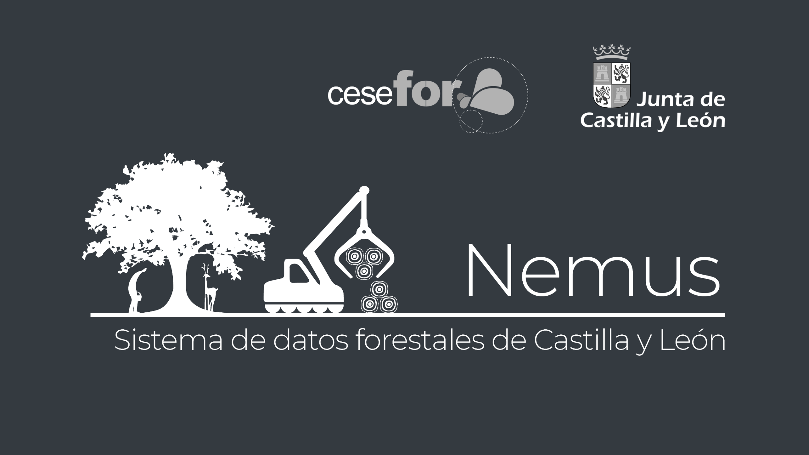 Many thousands of developers worldwide use our solutions for interactive data visualization. So it is hardly surprising to come across a graphic powered by AnyChart here or there. Some projects, however, deserve a showcase. Such a new interesting one demonstrating great use of AnyChart has recently come to our notice and we are happy to let you know about it.
A Spanish nonprofit, Cesefor used our JavaScript charting library to visualize forestry data for the Spanish region of Castile and León in a whole lot of different charts and maps, aiming to make relevant insights easily accessible and actionable for sustainability.
The project is called Nemus. Shh, it is still in beta, not yet officially launched. But Rodrigo Gómez Conejo, Head of ICT and Knowledge Management Area at Cesefor, allowed us to let you in and even gave us a brief interview disclosing some peculiar details about the system and how AnyChart is employed — check it out below. (Stack: jQuery/CodeIgniter/PostgreSQL.)
- Categories: AnyChart Charting Component, AnyMap, Big Data, Dashboards, HTML5, JavaScript, Success Stories
- No Comments »
Yarra Hills Secondary College Uses AnyChart to Visualize Student Progress on Digital Data Wall
August 10th, 2021 by AnyChart Team Leading the enterprise data visualization market, AnyChart is also widely used by not-for-profit organizations in sectors such as education. Stephen Blackwell from Yarra Hills Secondary College (Australia) has recently shown us another great example of such an application.
Data walls have become a widespread practice in schools across the globe, letting teachers track and benchmark student progress to create effective learning environment. In many cases, they are just physical. For Yarra Hills, Stephen created a digital one that supercharges the overview with the help of well-thought-out visualizations powered by our JavaScript charting library.
Stephen kindly agreed to tell us about his Digital Data Wall project and how AnyChart is implemented. Read our fresh interview below. As you can imagine the original web app is for internal use only, but if you want to take a glance here is a copy with de-identified student data (password anychArt) and this is an example of an individual student profile. (Stack: PHP/MySQL.)
- Categories: AnyChart Charting Component, Big Data, HTML5, JavaScript, Success Stories
- No Comments »
AnyChart JS Charts Used to Visualize Data on Ancient French Riddles
June 30th, 2021 by AnyChart Team As global leaders in data visualization solutions, we feel it is part of our mission to support educational and research projects by granting their authors a free license to use our products. Les Énigmes de Mercure (The Riddles of Mercury) by Timothée Léchot from the University of Neuchâtel (UniNE) is one such initiative we are proud to back on non-commercial terms.
Recently, we had a quick talk with Timothée and asked him a few questions to learn more about his project and experience visualizing data with the AnyChart JS charting library. Read our quick interview below. (Stack: PHP/MySQL.)
- Categories: AnyChart Charting Component, Big Data, Charts and Art, HTML5, JavaScript, Success Stories
- No Comments »