 Need a cool interactive error chart visualization for your web page or app? Let me be your guide! Follow this tutorial and you’ll learn how to easily create elegant interactive error charts using JavaScript.
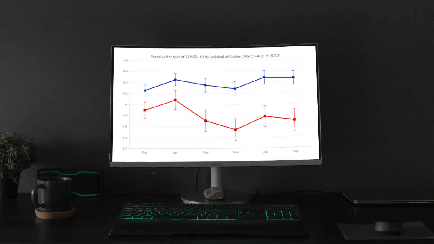
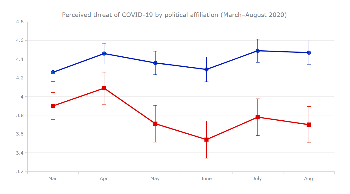
Here, I will be visualizing data on COVID-19 threat perceptions in the United States during the first six months of the pandemic, by political affiliation. So you will also be able to explore the divergence in those attitudes between Democrats and Republicans. The data originates from the article “COVID-19 and vaccine hesitancy: A longitudinal study” published in the Plos One journal.
What Is Error Chart
Before I begin, I’d like to make sure we are on the same page in understanding what an error chart actually is and how it works.
An error chart is a type of data visualization commonly used to show uncertainty or variability of data with the help of so-called error bars. The latter can be added on top of the main graph to represent value ranges in addition to average (mean) values plotted in the form of lines, columns, bars, areas, markers, or other types of series.
Error Chart Preview
Now, let me show you how the final error chart will look to get you all even more excited about learning how to create one yourself!
So, I am going to represent the perceived threat of COVID-19 among the American population by political affiliation over time, from March to August 2020. Precisely, I will show the results of the longitudinal survey conducted by Ariel Fridman, Rachel Gershon, and Ayelet Gneezy in the following way. Mean responses of self-identified Democrats and Republicans will be visualized in two line charts, and the error bars will represent the 95% confidence intervals. In the survey, the scale for the responses was from 1 to 7, where 1 is the minimum perceived threat and 7 is the maximum.
Basic JS Error Chart in 4 Simple Steps
An error chart is pretty simple to create with a good JavaScript charting library. Here, I am going to use AnyChart, which is a flexible and easy-to-use one. It has great documentation, a lot of useful examples, and a playground to experiment with the data visualization code on your own.
Basic knowledge of web technologies is always good to have. But when it comes to creating interactive JavaScript-based graphs like this, everything is quite straightforward even without much of such background.
The process of building a JS error chart can be split into the following four basic steps:
- Create an HTML page.
- Include JavaScript files.
- Add data.
- Write some JS charting code.
1. Create an HTML page
The first thing I am going to do is create a basic HTML page to hold my error chart. There, I define a block element with an id attribute (let it be “container”). Next, I add the style attributes in the <head> section, where I set the width and height of the <div> as 100% so that my chart renders over the whole page.
<html>
  <head>
    <title>JavaScript Error Chart</title>
    <style type="text/css">
      html, body, #container {
        width: 100%; height: 100%; margin: 0; padding: 0;
      }
    </style>
  </head>
  <body>
    <div id="container"></div>
  </body>
</html>
2. Include JavaScript files
Then, I need to include all necessary scripts. I am going to use them from the CDN, but you can also download the files if you want.
For an error chart, all I need is the base module. I reference it in the <head> section of the web page.
<html>
  <head>
    <title>JavaScript Error Chart</title>
    <script src="https://cdn.anychart.com/releases/8.11.0/js/anychart-base.min.js"></script>
    <style type="text/css">
        html, body, #container {
          width: 100%; height: 100%; margin: 0; padding: 0;
        }
    </style>
  </head>
  <body>
    <div id="container"></div>
    <script>
      // All the JS error chart code will be here.
    </script>
  </body>
</html>
3. Set the data
There are multiple ways to load data. In this case, the amount of data I want to visualize is pretty small. So I can just go ahead and put it right there in the code.
I am going to plot two series, for Democrats and Republicans. So I add the data like this:
var data1 = anychart.data
  .set([
    ['Mar', 4.26, 0.1, 0.1],
    ['Apr', 4.46, 0.11, 0.11],
    ['May', 4.36, 0.126, 0.126],
    ['June', 4.29, 0.132, 0.132],
    ['July', 4.49, 0.124, 0.124],
    ['Aug', 4.47, 0.124, 0.124]
  ])

var data2 = anychart.data
  .set([
    ['Mar', 3.9, 0.144, 0.144],
    ['Apr', 4.09, 0.172, 0.172],
    ['May', 3.71, 0.196, 0.196],
    ['June', 3.54, 0.198, 0.198],
    ['July', 3.78, 0.196, 0.196],
    ['Aug', 3.7, 0.194, 0.195]
  ])
Now that all the background work has been sorted out, let’s get to the main part of creating a JavaScript error chart. Well, it takes only a few more lines of code.
4. Write some JS charting code
To begin with, I add a function that encloses all the JavaScript charting code to ensure that the page is ready before executing anything. Inside this function, I create a line chart and provide it with a title.
// create a line chart
var chart = anychart.line();

// add a chart title
chart.title('Perceived threat of COVID-19 by political affiliation (March–August 2020)');
Next, I set the data for both series in the form of an array as described in the previous step. And I use the mapAs function to map what each element of my array corresponds to.
// create a dataset (democrats)
var data1 = anychart.data
  .set([
    ['Mar', 4.26, 0.1, 0.1],
    ['Apr', 4.46, 0.11, 0.11],
    ['May', 4.36, 0.126, 0.126],
    ['June', 4.29, 0.132, 0.132],
    ['July', 4.49, 0.124, 0.124],
    ['Aug', 4.47, 0.124, 0.124]
  ])
  // map the data
  .mapAs({
    x: 0,
    value: 1,
    valueLowerError: 2,
    valueUpperError: 3
  });

// create a dataset (republicans)
var data2 = anychart.data
  .set([
    ['Mar', 3.9, 0.144, 0.144],
    ['Apr', 4.09, 0.172, 0.172],
    ['May', 3.71, 0.196, 0.196],
    ['June', 3.54, 0.198, 0.198],
    ['July', 3.78, 0.196, 0.196],
    ['Aug', 3.7, 0.194, 0.195]
  ])
  // map the data
  .mapAs({
    x: 0,
    value: 1,
    valueLowerError: 2,
    valueUpperError: 3
  });
Since all the data values lie within a range, I configure the Y-axis accordingly using the yScale function.
var yScale = chart.yScale();
yScale.minimum(3.2);
yScale.maximum(4.8);
Finally, I create a line series for each dataset, set the container reference, and draw the resulting error graphics.
// create a line series for the first dataset
var series1 = chart.line(data1);

// create a line series for the second dataset
var series2 = chart.line(data2);

// set a container id for the chart
chart.container('container');

// command to draw the chart
chart.draw();
Aha — a lovely interactive error chart is right there on the page!
We can clearly see a divergence in COVID-19 threat perceptions between Democrats (the top line) and Republicans (the bottom line) during the first months of the pandemic, and the corresponding over-time trends appear to be quite significantly different.
You are more than welcome to take a closer look at this initial JavaScript-based error chart and play around with its code on AnyChart Playground or CodePen.
Error Chart Customization
Although a basic error chart is here and ready to do its job, there is always room for improvement in the look, feel, and legibility. The AnyChart JS library has a lot of great options to enhance an error chart and make it even more elegant and informative. So, let me walk you through a few quick customization steps that you might like to take.
1. Add a grid and axis ticks
First, I want to add some more ticks along the Y-axis and display grid lines to facilitate understanding the values when someone is exploring this error chart.
var ticks = chart.yScale().ticks();
ticks.interval(0.2);

chart.yGrid().enabled(true).stroke({
  // customize the stroke color
  color: "#ededed",
});
2. Change the colors
The colors blue and red are commonly used to represent Democrats and Republicans, respectively. So, let me change the colors of the series lines and error bars accordingly using the stroke attribute to make the graphic more intuitive.
// create a line series for the first dataset
var series1 = chart.line(data1).stroke("#031bbb", 3);

// create error bars for the first series
var error1 = series1.error();
error1.valueErrorStroke("#031bbb", 1);

// create a line series for the second dataset
var series2 = chart.line(data2).stroke("#de0100", 3);

// create error bars for the second series
var error2 = series2.error();
error2.valueErrorStroke("#de0100", 1);
As you see, I have also increased the stroke width to make the lines more prominent.
Check out this JS error chart with the code on AnyChart Playground or CodePen.
3. Add markers
To emphasize individual values on the line graphs, I want to add two different types of markers to both series, specifying their type, size, and color.
// set markers for the first series
var series1 = chart.marker(data1).type("circle").size(5).stroke("#031bbb", 1).fill("#0066cc");

// set markers for the second series
var series2 = chart.marker(data2).type("square").size(5).stroke("#de0100", 1).fill("#de0100");
4. Enhance the tooltip
The default tooltip is not much informative. But I can easily make it show the series name, mean value, and upper/lower error values.
To start with, I name the series:
series1
  .name('Democrats');

series2
  .name('Republicans');
I also want to split the tooltip, providing each series with its own one:
var tooltip = chart.tooltip();
tooltip.displayMode("separated");
Finally, I format the way the values are displayed and set the tooltip position.
// configure the tooltip formatter
tooltip
  .fontColor('#E1E1E1')
  .titleFormat('{%seriesName}')
  .format(function () {
    return (
      'Mean value: ' +
      this.value +
      '\nUpper error value: ' +
      this.valueLowerError +
      '\nLower error value: ' +
      this.valueUpperError
    );
  });

// set the tooltip position
chart.tooltip().positionMode('point');
A stunning, insightful JavaScript (HTML5) error chart is all ready! These easy, yet effective changes make the visualization so much more engaging!
Look at the entire final code and play around with this interactive JS error chart on AnyChart Playground or CodePen.
Conclusion
The threat of COVID-19 may not be over yet. But I hope that with the help of this tutorial, it will never be stressful for you to create interactive error charts for the web using JavaScript!
If you have any questions, please do not hesitate to ask them in the comments section below. Thanks.
The team of AnyChart thanks Shachee Swadia for writing this great JavaScript Error Chart tutorial as a guest post for the blog.
Error charts are described in Chartopedia, our comprehensive guide for choosing the right chart type.
There are also other awesome JavaScript charting tutorials available in our blog.
Want to contribute a guest post? We will be glad to hear from you.
- Categories: AnyChart Charting Component, Big Data, HTML5, JavaScript, JavaScript Chart Tutorials, Tips and Tricks
- 1 Comment »