 There are numerous cases where our customers first picked a different JavaScript charting library to operate data visualization in their projects but then could not get absolutely what they wanted, and in the end, switched to AnyChart and are happy with their new and final choice. Here is one of such examples.
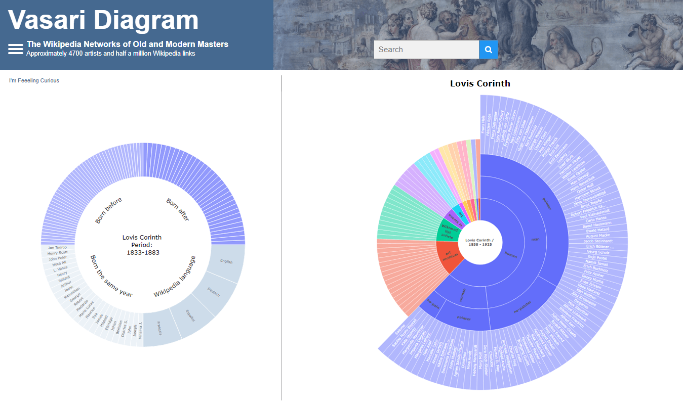
Francis Lapique and Temenuzhka Dimova ended up using our Sunburst Chart solution in their Vasari Diagram, a fascinating asset for art history researchers and enthusiasts. This project lets anyone explore which people and topics various painters are connected with.
Read our interview where Francis describes the Vasari Diagram project and how AnyChart is used, and check it out!
AnyChart: Hello Francis! To begin with, could you please introduce yourself and your teammate to our community?
Francis Lapique: Hello! I am one of the two people who created the Vasari Diagram project. My name is Francis Lapique. I am a retired computer engineer living in Lausanne (Switzerland) and a co-founder of the Jacques Edouard Berger Foundation for art archives and media collection. The Vasari Diagram project connects two of my main interests: data visualization and art heritage.
My teammate on the Vasari Diagram is Temenuzhka Dimova. She is an art historian with a Ph.D. in early modern art from the University of Strasbourg (France), currently a postdoc at the University of Vienna. In 2019, Temenuzhka published an amazing book, Le langage des mains dans l’art. The Vasari project relates to her interest in applying modern technologies to understand the perception of art history in modern societies.
A: Why did you decide to make the Vasari Diagram and for whom it can be useful?
FL: We wanted to explore how painters relate to each other and thought it would be a good idea to analyze for each painter which Wikipedia articles are linking to their page. In a nutshell, what we made is a reversed Wikipedia. So we decided to name this project after Giorgio Vasari, a 16th-century painter credited with the invention of the genre of the encyclopedia of artistic biographies and often called the first art historian.
Because the Vasari Diagram makes it easy to reveal unusual connections between historical figures (from different or the same periods), it can be a very effective tool for academic research. Thanks to the user-friendly interface we also aim to reach a broader audience who would enjoy exploring the network of their favorite painter.
A: What is this project now — could you please describe it in brief?
FL: The Vasari Diagram is an interactive data visualization tool that makes the networks and semantic links of old and modern painters easy to analyze.
You can see what historical and contemporary personalities, including but not limited to other painters, they are connected with, as well as topics, movements, museum collections, and so on. It allows you to visually compare the reference networks of individual masters, evaluate their place in the Wikipedia space, and identify their predominant semantic fields.
The project is available in four different Wikipedia languages: English, French, German, and Spanish. The networks may vary a lot depending on the language.
A: Is it complete or do you keep working on something?
FL: Currently, the Vasari database covers 4,742 painters. We are going to extend it to 7,000 within the nearest future. We’re also exploring the possibility to display different modalities of networks between them. Using a dimensionality reduction approach we aim to group the painters according to the connections they share. For instance, two painters with a lot of connections in common will tend to cluster together. Preliminary results indicate that the painters tend to cluster according to the regular classification used in Art History, but not only. Some painters are grouped in a nonconventional way, which reveals modern and unknown connections, beyond the historical and stylistic context.
A: Sunburst charts are the centerpiece of your project. Why did you choose this type of data visualization?
FL: Sunburst charts have great aesthetic qualities and offer the possibility to see at a glance all the references before proceeding to a deeper examination. Moreover, the circular shape perfectly embodies the idea of social circles and networks developed around the painter.
A: Could you please tell us some more about the technical aspect?
FL: We use the development platform Jupyter. We scan all Wikipedia articles in four languages — English, French, German, and Spanish — and create a directed graph from the hyperlinks connecting the pages. Once the data frame with the connections is established, the data is plotted in a sunburst chart.
A: Why did you choose AnyChart?
FL: We initially picked Plotly, but it appeared to have trouble handling the large dataset of the Vasari diagrams, causing instability. So we needed a better solution in that regard and in the end we moved to AnyChart. With your JavaScript library, the Vasari plotting is very robust.
A: What do you think we should add or improve?
FL: We would appreciate even more flexibility regarding the chart tooltip configuration.
A: Do you recommend using our JavaScript charting library for interactive data visualization in projects like yours?
FL: We can definitely recommend AnyChart. It is very stable with large datasets, has many chart examples that are useful, and provides good customer service.
If you want to share your AnyChart story, please contact us.
Check out other cool customer stories on our blog and don’t miss out on our selected case studies.
- Categories: AnyChart Charting Component, Big Data, Charts and Art, HTML5, JavaScript, Success Stories
- No Comments »