 Leading the enterprise data visualization market, AnyChart is also widely used by not-for-profit organizations in sectors such as education. Stephen Blackwell from Yarra Hills Secondary College (Australia) has recently shown us another great example of such an application.
Data walls have become a widespread practice in schools across the globe, letting teachers track and benchmark student progress to create effective learning environment. In many cases, they are just physical. For Yarra Hills, Stephen created a digital one that supercharges the overview with the help of well-thought-out visualizations powered by our JavaScript charting library.
Stephen kindly agreed to tell us about his Digital Data Wall project and how AnyChart is implemented. Read our fresh interview below. As you can imagine the original web app is for internal use only, but if you want to take a glance here is a copy with de-identified student data (password anychArt) and this is an example of an individual student profile. (Stack: PHP/MySQL.)
AnyChart: Hi Stephen! Let’s introduce you to our community, to begin with. Can you tell us a little bit about yourself, please?
Stephen Blackwell, Yarra Hills Secondary College: G’day and greetings from Australia! My name is Stephen Blackwell and I am a high school teacher with 40 years experience in the classroom. I am currently responsible in my school for leading the strategic use of data in teaching and learning, and in training staff to be data aware.
A: Great, thank you! So, how did you come up with the idea of this project?
SB: One of our school leaders created a data wall in our staffroom. She spent an entire day cutting out pictures of students and then arranging them on a wall to show where they were positioned with respect to their literacy levels. Whilst a useful tool to have, I was concerned that this took a significant amount of time, was a static display so it did not easily reflect changes to the data, only showed literacy data when the school had many other data sets available, and finally, there was an issue with how private the data was displayed on a wall in the staff room.
My goal has been to produce a digital version of a data wall that addresses each of my concerns.
A: How does your Digital Data Wall look now in reality?
SB: An online, secure app that allows staff to bring up a year level, class or individual student and see not only the literacy data, but numeracy, writing skills, attendance data and more. It is easily updated with new data and presents the information in a visually appealing and clear manner.
A: Could you please shed more light on how it is used and where it helps?
SB: Teachers are given time at the beginning of each year to look at their classes and determine which students may require differentiation to meet their needs and abilities.
Currently staff have secure access to student data from any web-enabled device. Feedback has been very positive and I have been guided by staff needs when adding more functionality. Data is only worthwhile if it is used and in the past we have collected data digitally but failed to make it available. Our digital data wall has succeeded in bringing the data to our teachers in a manner that they can easily use in planning for classes.
At present the digital data wall is for staff only but my goal is to give each student access to their own data. They would then use this to create personal learning goals and monitor their progress. Students owning and using their own data is a powerful tool.
A: What role does data visualization play here?
SB: In the past what data we have received has often been in a spreadsheet or worse, in a PDF. Tables of data are not helpful in seeing trends or getting a quick overview of where a student is in their learning. Statistical analysis of data can be powerful but not if you do not have a strong background in math. However, the use of data to drive teaching and learning has become a key tool that we are expected to make good use of in our classrooms. Transforming data into information using data visualizations has proved to be very important as it provides accessibility to the data in a way that provides our teachers with a new tool to add to their repertoire.
A: What made you pick AnyChart? Were you looking for a certain chart type or feature?
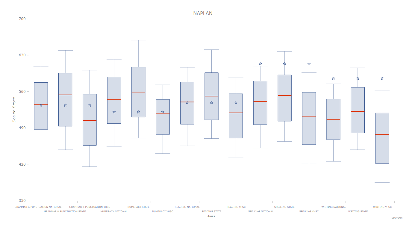
SB: I had found a number of products that create data visualizations but none were flexible enough or provided the breadth of charts that I was looking for. In particular, I had data that I wanted to show as a box and whisker plot and could only find one product that allowed me to do what I envisaged — AnyChart.
A: That would be great to learn more about the technical side of the Digital Data Wall. What is your technology stack and was it easy enough to run AnyChart in it?
SB: We host our digital data wall on our own web server running IIS. The site is written in PHP with MySQL and we use Bulma as the CSS framework.
Whilst AnyChart looked daunting at first sight (as did all of the charting products I looked at), the well documented examples provided made modifying the charts relatively straight forward. Each example can be loaded directly into an online playground and manipulated with a live output screen providing a very easy way to try out a chart before installing the code.
A: What did you like the most about using our JavaScript charting library in your project?
SB: AnyChart gave me access to charts I couldn’t find elsewhere. It also provided tools to “play” with a chart allowing me to see if it would do what I was looking for. It was easy to plug in my own data to see how it would look and then copy the code. It was a simple matter then of replacing the dummy code with data extracted from MySQL.
A: What do you believe we should improve?
SB: The charts I have used have had good internal documentation but some of the more complex gauges for example lack this. For me it has not been a problem and I like exploring and experimenting to find out how the code works but if I were pressed for time, better documentation would be appreciated.
That being said, there is good documentation provided outside of the code in the AnyChart Documentation section of the web site.
A: How would you recommend AnyChart when someone asks you which JS charting library to use for data visualization?
SB: AnyChart is an obvious choice as it provides flexibility and range. The AnyChart staff are extremely helpful and very easy to work with.
A: Thank you very much for your answers! Good luck with everything!
You are also more than welcome to see the Yara Hills Secondary College case study we have just published and check out other selected case studies.
Read more customer stories in our blog.
If you would like to share your AnyChart story, please contact us.
- Categories: AnyChart Charting Component, Big Data, HTML5, JavaScript, Success Stories
- No Comments »