 Out-of-the-box error bars and the ability to create a cool error chart without hassle have always been a major attraction of AnyChart, among other great features prompting developers to choose our JavaScript charting library. If you want to look at some real-world examples of such visualizations in action, Shen DeShayne, a partner at SunnyByte has recently brought a new interesting use case for them to our attention. The American Indian & Alaska Native Cancer Data website, his web development agency built for the University of New Mexico, represents information in interactive error charts powered by AnyChart. Learn more about the project and how our JS library is used, from a quick interview. (Stack: Craft CMS/Vue.js.)
AnyChart: Hi Shen! Let’s begin with a quick intro: What is SunnyByte?
Shen DeShayne: At SunnyByte, we make web development experiences simple and pain-free. We partner with agencies and companies to act as the development extension of their team to ensure their project, be it a website, app build, data integration or anything in between is a success! We specialize in Craft CMS which we used in this project to provide a simple interface for editing content and charting data. We are a verified Craft CMS Partner development agency based in Los Angeles.
A: What is the Native American Cancer Data project and how did you get involved?
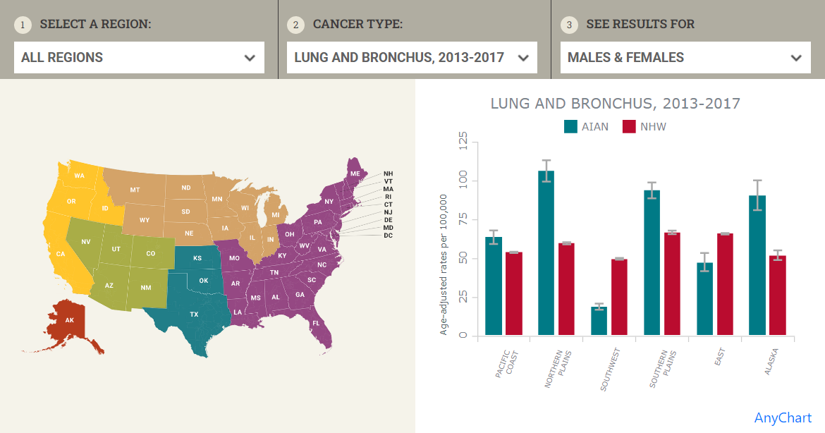
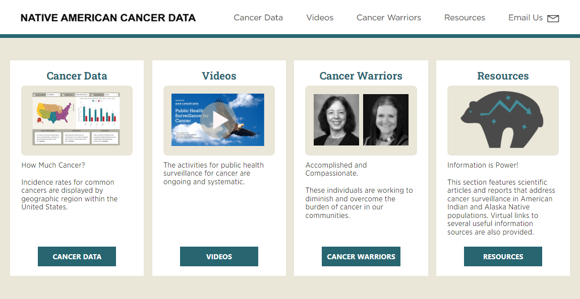
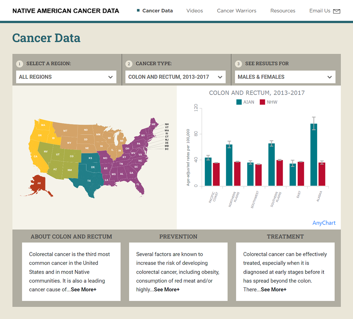
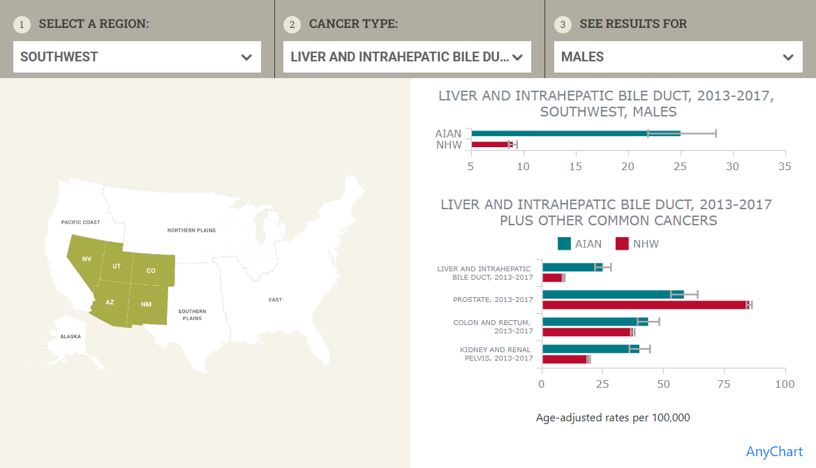
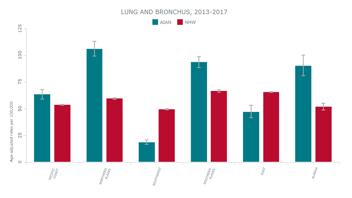
SD: American Indians and Alaska Natives (AIAN) living in different regions of the United States get and die from cancer at different rates. An agency partner of ours, Seasons Communications, working on a project with The University of New Mexico, came to us to ask about building an information center to present highly-annotated cancer surveillance data and educational information to support cancer control efforts in AIAN communities across the U.S. It is now available at nativeamericancancerdata.org.
A: How helpful is data visualization? Why is it needed in this project?
SD: The data visualization allows AIAN to quickly understand their risk profile and learn about prevention and treatment. This original data was only available in difficult-to-use data warehouses and provided limited filtering and sorting.
A: How do you use AnyChart?
SD: AnyChart was the only charting tool that provided the ability to slice and dice the data we needed. Most importantly it allowed us to provide visitors with multi-series bar charts and column charts that included error bars to indicate the uncertainty of the cancer data.
A: What is your stack for this project?
SD: The site is built using Craft CMS on the backend to allow for non-technical users to update chart data and edit other content on the site. On the frontend, it’s built using TailwindCSS and Vue.js to provide interactivity.
A: What did you like most about our JavaScript charting library?
SD: Not only was AnyChart kind enough to sponsor the project, but it was also the only JavaScript charting library that met our requirements.
A: Do you have any complaints or ideas on what we should improve?
SD: No complaints, the library’s documentation is completely sufficient to get moving quickly.
A: How would you recommend AnyChart to someone else?
SD: AnyChart is a robust, very well-documented paid charting library that allows you to focus on shipping new features and not fighting with your tools!
Also check out the Sunnybyte case study just added to our selected case studies.
Don’t miss out on other cool customer stories.
Want to share your AnyChart story? Let us know!
- Categories: AnyChart Charting Component, Big Data, HTML5, JavaScript, Success Stories
- No Comments »