 We continue to support initiatives addressing the pandemic crisis by providing them with a full-featured free license for any of our data visualization tools. Today we are honored to be among the first to talk about a new project that joined this program, an innovative COVID-19 risk assessment app and framework called Pandemonium where all charts and maps are powered by AnyChart.
Built by Quantum Risk Analytics, Inc., a charitable nonprofit founded by MIT alumni, Pandemonium uses sophisticated machine learning algorithms to more accurately model the disease spread and provide a highly personalized evaluation of infection risks. It’s not yet publicly launched as the developers want to add a few more major features and data sources before the official release. But the app is already in the testing phase that the team encourages anyone to join.
We asked Richard Hamlin, CEO at Quantum Risk Analytics, Inc., to tell us more about Pandemonium, how it works, and how our data visualization solutions are used. Read on to know all the details.
AnyChart: To start with, can you please briefly tell our community about yourself, your team, and your work?
Richard Hamlin: I am the CEO of Quantum Risk Analytics, Inc. and its Lead Model/Software Developer. I grew up mostly in New York and have degrees from MIT and UC Berkeley.
Quantum Risk Analytics, Inc., is a New York-based charitable non-profit all-volunteer organization founded by MIT alumni to help mitigate the impact of large-scale emergencies such as the COVID-19 pandemic and future epidemics. Our initial project, Pandemonium, is an extensive modeling framework for infectious disease transmission and propagation and a risk assessment app.
We have had officers and other volunteers from North America, Europe, and Asia. We have had interns as well as a few Research Science Institute students that we mentored.
Project Overview
A: How did the idea of Pandemonium first come?
RH: My brother called me one day early in the pandemic and suggested that I develop an epidemiological model in Python. He had a new Ph.D. hire who was stuck in the UK due to travel restrictions and he thought he could help me with it. I was not immediately convinced that my skills were needed given that career epidemiological modelers existed, but I thought about it.
I realized that there was an unmet need for quality personal risk information freely accessible to everyone: most people lack a good understanding of transmission risk in specific situations. Also, I had an unusual combination of very pertinent skills (from fluid mechanics and software development to combinatorial optimization and quantum machine learning) that most epidemiological modelers do not.
So, I started to put together a team with a couple of my MIT alumni friends and sought advice from another friend who had retired from the Harvard School of Public Health.
A: How exactly did you see it would be used and by whom?
RH: We primarily aimed to develop an advanced model and app with a simple UI that anyone could use for free to assess their own COVID-19 risks and risks that they pose to others based on their own circumstances, history and plans. With such detailed information, our personal risk assessment app would turn the vague, often highly inaccurate notion of risk that most people have into more concrete, scientifically based numbers, serving to educate people on how their risks are quantitatively affected by factors they can control, thereby resulting in a reduction of cases and deaths. Moreover, people could optimize their mitigation efforts, so they would not be taking great pains to avoid minimal risks of exposure just to render those insignificant by inadvertently opening themselves up to a much greater risk of exposure.
The underlying modeling framework that we are developing (upon which our app is built) will be made available to researchers, public health departments, and everyone else, by making it open source. Health departments would be able to use custom scripts with it to perform various extensive analyses as well as incorporate the more detailed data they possess. Other model developers would be able to plug their models into our framework to gain the combined capabilities of all the other types of submodels that it includes, as well as those intrinsic in the framework itself. This should foster greater collaboration.
With this structure in place, and with certain tweaks, it can be readily adapted for the next epidemic as well, and even the seasonal flu, so its lifetime is not limited to that of COVID-19.
A: Where is this project now?
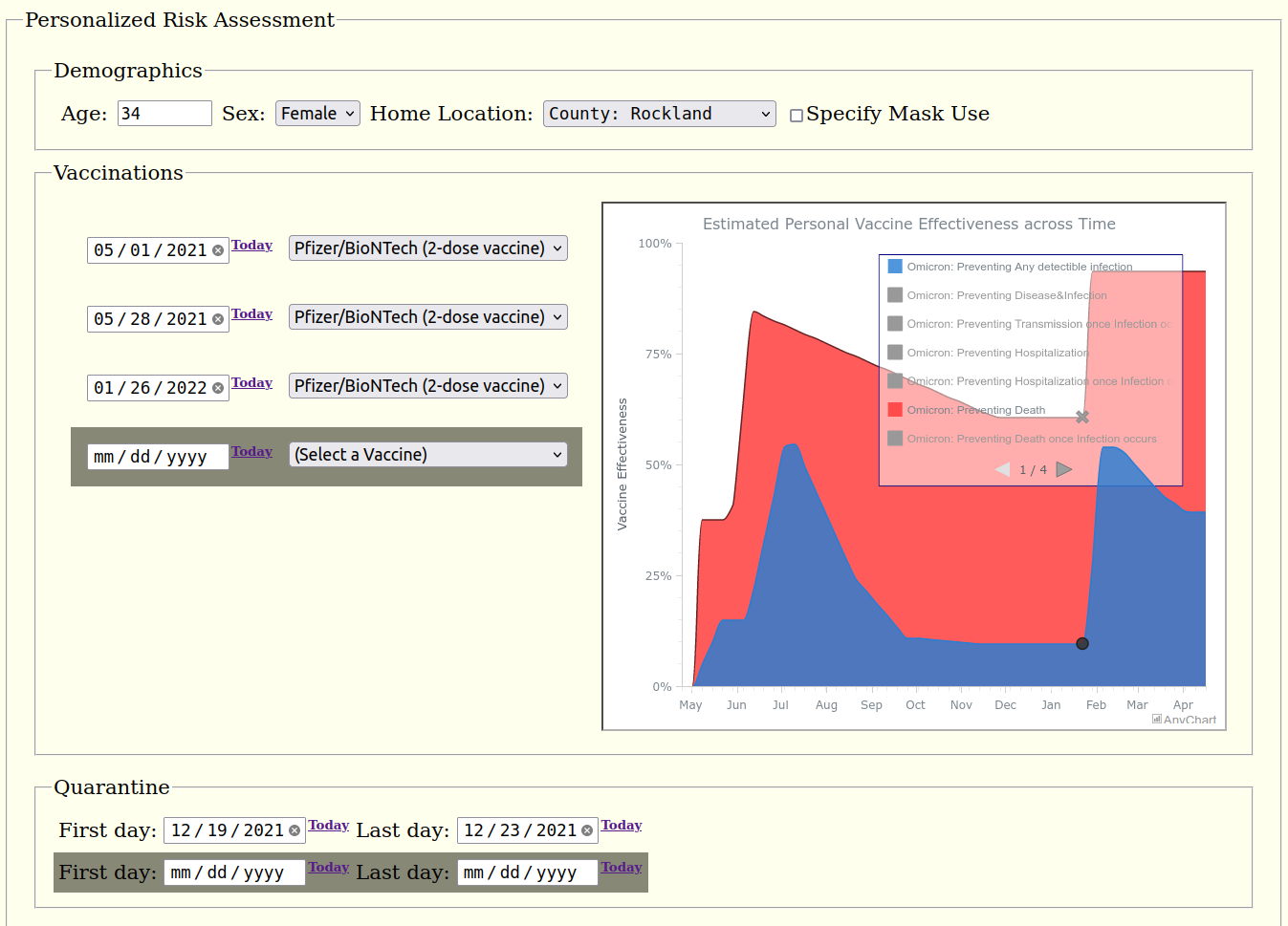
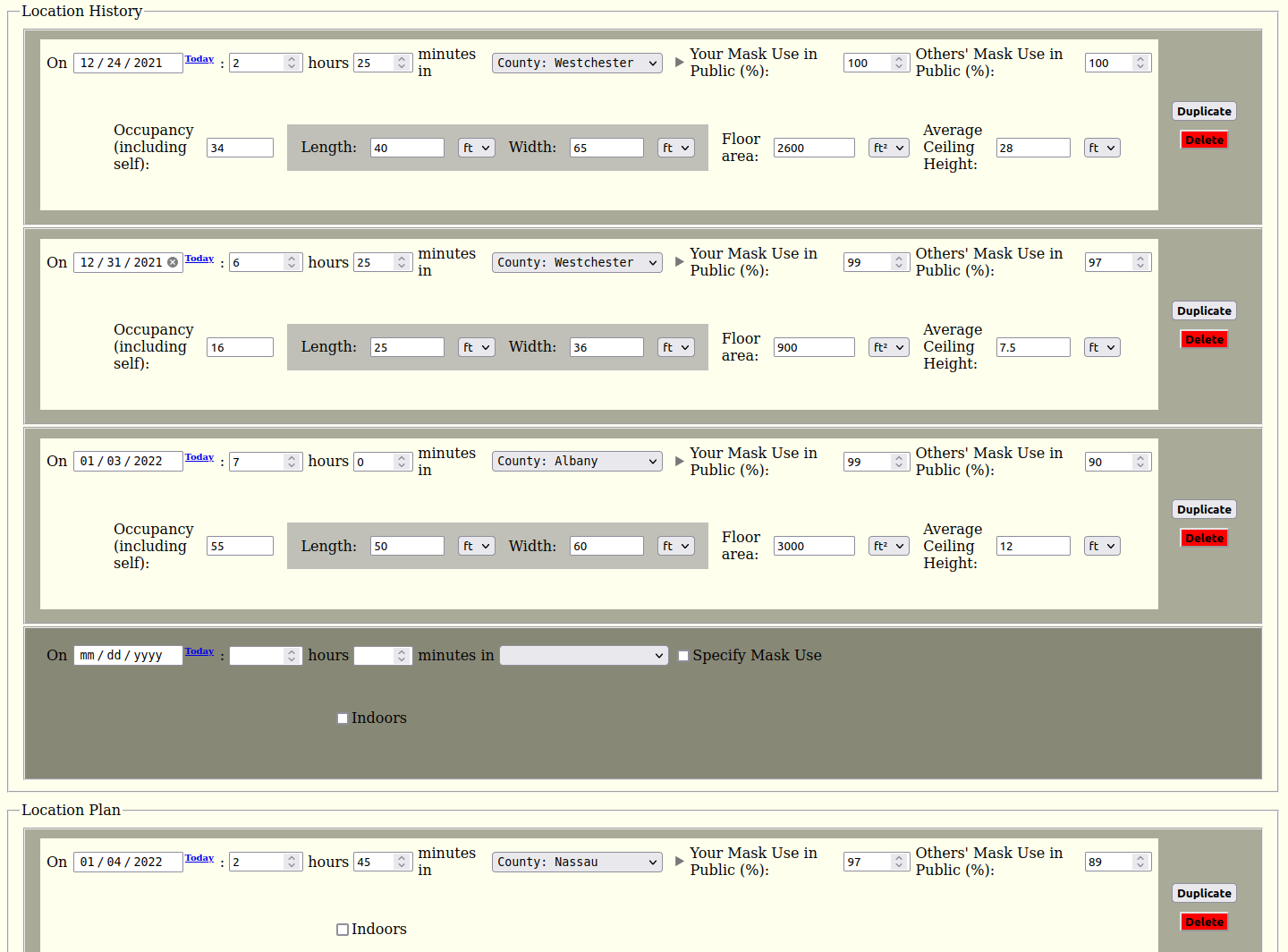
RH: Currently, users enter their details (such as where they have been and are planning to go, and the size and crowdedness of indoor spaces they visit, etc.) into a form on a web page. We use this information to compute the user’s accumulated risks of infection and fatal infection over a period of time. It is still in the development phase and we are testing our prototype app with outside test users in the US. (We welcome anyone interested in helping us test the app to email us at testing@pandemonium.dev.)
We have the foundation of our framework in place with its core functionality. This includes, among other features:
- integration of the micro-mechanistic transmission model(s) with the macro-epidemiological model
- modeling individuals alongside hierarchical geographic regions and demographic groups
- crucially, the ability to represent the arbitrary movement of people between regions through dynamic coupling
- integration of vaccination effectiveness and risk factor modeling.
A: What do you plan to add or improve next?
RH: We will soon be adding some critical features to the app.
First, we will enable data for multiple individuals and their interactions to be entered into the app simultaneously. (The underlying model already supports this, but the UI needs to be expanded.)
Second, we are going to provide individual users with the opportunity to share their encrypted data with others they meet to avoid a lot of unnecessary re-entries. Users will be able to hide certain private details when they share, while those details will remain part of the app’s overall risk calculations.
Third, we plan to apply some advanced AI techniques to improve and accelerate vaccine effectiveness (VE) modeling specifically, since published VE data is scarce, inconsistent, often not timely, and time-consuming to gather and consolidate manually.
Finally, we’ll enable the use of personal COVID-19 testing results of various types. This will help people understand how to best incorporate testing (especially the timing of tests) into their risk mitigation strategy, given their own specific schedules and exposures, and how others’ test results impact those.
That is just a sampling of the most important features we’ll roll out soon. We also plan to expand the scope and depth of data that we are using, including more localized and demographic data, as well as to start expanding to other countries. (Currently, we are testing our prototype app only in the US.)
Before we deploy the app, we will be migrating our prototype Sqlite3 database to PostGIS (and later to HDF5 as well). We also plan to replace our prototype UI with a much slicker web UI and ultimately a mobile version of the app too. And we plan to release our source code around the time we deploy our app in the cloud for general use.
A: Looks truly impressive. Do you possess sufficient resources to get all this done soon enough?
RH: There is really a lot of work involved in all this, and it does take time to implement all of these features. That is why we are planning to roll out a feature-limited version of the app (including personal vaccine effectiveness and risk factor estimates) in the meantime, so people can start benefiting from that sooner. And we actually need more highly skilled volunteers to help us complete it all more quickly. Anyone interested should email contact@pandemonium.dev. There are certain positions we’re eager to fill that are described on our website, but we can use people with skills and for jobs not specifically posted about too. We are also looking for large cloud hosting providers to donate their cloud computing resources to enable us to scale up quickly.
A: Awesome! We also encourage everyone to engage and take part.
RH: Thank you very much!
Technical Details
A: It would be interesting to delve into the technical side of Pandemonium. Please describe the underlying technology.
RH: Currently the core technology underlying our risk assessment app and modeling framework is Bayesian inference via Pyro, a Python-based probabilistic programming language (PPL), but we plan to also use quantum machine learning (QML) in the future.
We build on the Pyro Epidemiology contribution package, a general stochastic compartmental inference and projection model framework. Most of the complexity needed to support all of our features is layered on top of this. It translates the data from the database and user into the flattened mathematical problem, runs/integrates underlying models, and translates back the results to correspond to the original hierarchical structures for returning/saving.
Our framework leverages object-oriented programming (OOP) and is very flexible and extensible, with interchangeable submodels and multiple types of coupling factors. The basic framework of the model allows for an arbitrary degree of demographic and spatial refinement and time-dependent interactions.
Micromodels, such as others’ aerosol airborne transmission models, are easily incorporated. We have implemented and incorporated MIT professor Martin Bazant’s well-mixed room model, based on “A guideline to limit indoor airborne transmission of COVID-19.”
Pandemonium supports vaccine effectiveness models of arbitrary complexity. These are isolated from other, dependent models, minimizing computational cost.
The ancillary mask compliance model uses the Tensorflow and Keras frameworks with convolutional neural networks and transfer learning to determine whether each person in a social media image is wearing a mask. This will be used for each geographic area to better estimate mask usage from publicly posted photos than survey data provides and thereby enable us to more accurately assess risk. The contextualizer will distinguish between candid and staged photos in order to reduce sampling biases.
Risk modeling adds another layer on top of the macro model with integrated submodels.
User schedule optimizations will be performed using a proxy objective function.
A: Can you tell us more about your stack?
RH: Data is automatically extracted and fed into our database from various sources utilizing PyGit, fsspec, sodapy, as well as Selenium and ChromeDriver for web scraping.
Our prototype database uses SQLite 3, but we plan to use PostGIS (PostgreSQL) and HDF5 in production.
Our prototype UI is AJAX-based and pyjs enables our client-side code to be written in Python.
AnyChart is used for data visualization, for both our maps and charts.
Docker provides the thin-container isolation and a consistent build process and server-side environment in which
the app is run and will enable us to launch into the cloud.
Twisted Trial is our testing framework. Selenium will soon be used for our UI automated testing.
Apache2 is our web server running on Ubuntu 20.04. FastAPI will be our web framework.
Buildbot with Git hooks will be used for automating builds with the unit and integration testing.
Git is our version control system.
A: What data do you use and where do you take it?
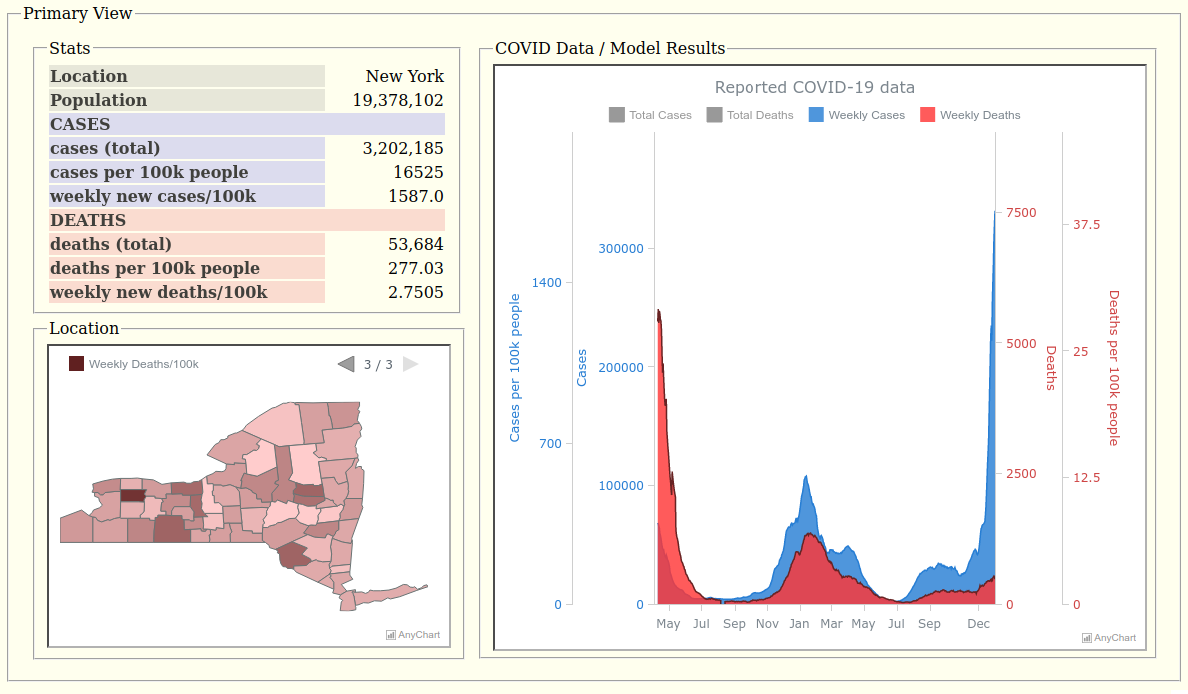
RH: The primary data is cases and deaths at the state and county level, which comes from The New York Times.
But certain localities have data that overrides the NY Times. For New York City, for example, we take data from the NYC Department of Health and Mental Hygiene. For North Carolina, from the NC Department of Health and Human Services.
In order to provide case/death rate data (per 100,000 people), and more generally to estimate how the population is demographically distributed and how limited COVID-19 demographic data is distributed between specific demographic groups, we use the data from the Census Bureau.
We also use US vaccination data from the CDC COVID Data Tracker, mask usage estimates from The New York Times (based on roughly 250,000 interviews conducted by Dynata from July 2 to July 14, 2020), and FIPS codes for all counties from the Natural Resources Conservation Service.
Parameters such as vaccine effectiveness come from many and often-changing sources.
Data Visualization
A: What is the role of data visualization in Pandemonium?
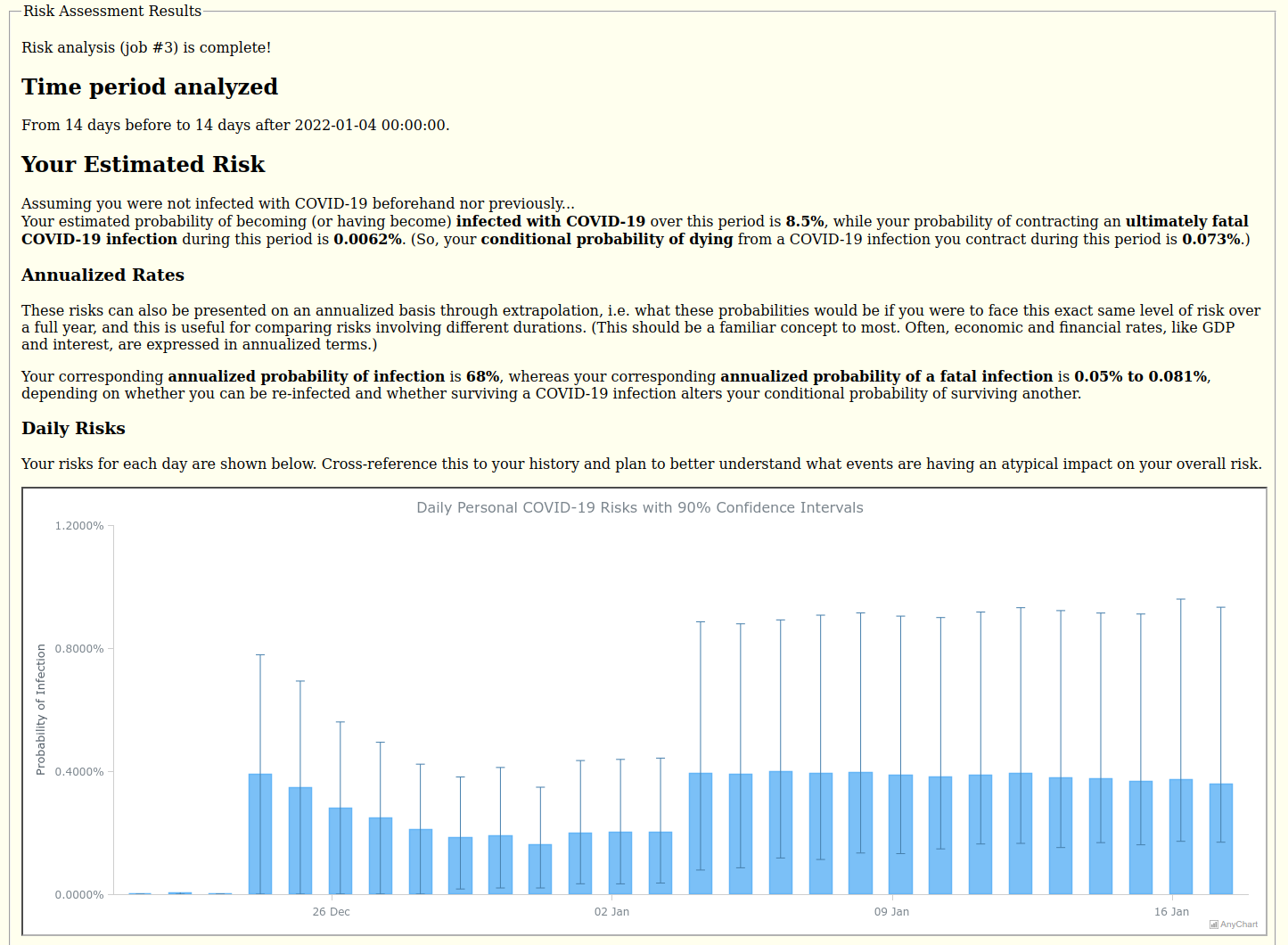
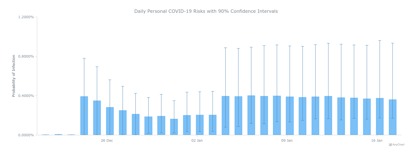
RH: Data visualization enables users to quickly see the current prevalence data and trends and history of reported COVID-19 data as well as their computed daily risk estimates. Seeing how days compare should help users better understand what events are having an atypical impact on their overall risk, and error bars show the uncertainty in the risk.
A: Let’s talk about how you use AnyChart then. Which chart types appear in this project?
RH: We have a choropleth map to show county-by-county COVID data as well as an area graph of the historical COVID data for the state overall. These are multi-series charts to enable us to show different data (cases and deaths) as well as in different forms (for instance, weekly rates versus cumulative counts).
For the results, we provide a column chart with error bars of the estimated probability of contracting COVID-19 on each day along with the 90% confidence intervals based on all of the stochastic samples.
A: How do you work with the data for visualization?
RH: All of the visualization data is converted to JSON by the server in response to requests made via the loadJsonFile() method, available with the data adapter script, for the state map and chart in our Primary View, and sent along with the whole chart configuration for Daily Risk Results.
A: Which specific features appeared to be particularly helpful?
RH: Being able to have multiple series and to control the legend and how it responds to user input and its pagination is most helpful so that the data can be presented compactly in multiple forms that users can switch between.
Having multiple axes and scales and being able to tweak the scales is also very helpful to allow us to overlay what would otherwise require multiple charts. Cases and deaths differ by two orders of magnitude, so these are best viewed with two different scales, if not a log scale. (Though tempted to use a common log scale for both, I feared that semi-log plots may not be familiar enough to many non-technical people, and our personal risk app is being designed to be used by anyone, so I opted for two linear scales.) But since the population is effectively constant, we are able to show the case and death rates (per 100,000 people) on the same chart by simply adding two more scales. The death scales are subtly compressed back down a bit to provide more separation between cases and deaths to be more discernible and visually appealing, however. To best view the weekly rates (being dwarfed by the cumulative) on the same chart, the user must specifically select those in the legend, thereby deselecting and hiding the cumulative series and allowing the scale ranges to recalculate for both the weekly series only, because it would be too cluttered to add another four scales to the chart for those!
A: Great! So, how did you find AnyChart and why did you choose our JS charting library?
RH: I studied reviews of various graphing libraries to find the best to meet our needs. It appeared that AnyChart would be the easiest with which to get started of the top contenders, and would be free for us given our not-for-profit status, which was important because we started out with no money at all. (Another option would hit a limit for mapping data, after which we would start incurring usage fees.)
A: We are constantly improving our solutions to make sure our customers always have the best of possible, and any feedback on that is highly appreciated. From your point of view, what should we add or change next?
RH: Since you ask, I actually have a few suggestions. First, I would like to see non-states like DC included in the US state maps.
Second, the addition of Zip-Code Tabulation Area (ZCTA) maps for the US would be great.
Third, I would like to avoid using iframes, especially for drill-down maps, so that the selection of a region in the map can be communicated directly with the other client-side UI code, so that it can respond directly.
Finally, I would like an easy way to standardize how the map appears between various web browsers. Simply fixing the dimensions of the container to a certain number of pixels and having the same data and code for the chart does not guarantee these look the same on different platforms, but I think it should. Legend pagination is not necessarily the same (which makes it difficult to set the proper page) and legend text size may differ so that on some platforms it overruns the pagination arrows and on others it does not.
A: If someone asks you which JavaScript (HTML5) charting library to use for interactive data visualization, will you recommend AnyChart?
RH: I will recommend they use AnyChart if it best meets their particular needs. In addition to what I already said, I have found AnyChart’s support to be very responsive and helpful. I really did not expect much from their support considering that we have a free license, but I received better service than many companies offer their paid customers!
COVID-19 THOUGHTS
A: In conclusion, could you please share what you think about how the COVID-19 crisis has unfolded? A few words?
RH: Absolutely. It is what I am thinking about most these days. There is clearly a large disconnect between government and people. One-size-fits-all policies and guidance have not been effective. More needs to be done to educate people so they can make smart decisions for themselves, appropriately weighing their particular circumstances. Our app is designed to help people do that.
A: Thanks a lot for the compelling interview! We wish you and your team every success with Pandemonium and all your future work!
Using AnyChart? Want to share your story? Feel free to reach out!
Don’t miss other awesome customer stories on our blog as well as selected case studies.
- Categories: AnyChart Charting Component, AnyMap, Big Data, Dashboards, HTML5, JavaScript, Success Stories
- No Comments »