 “Numbers have an important story to tell. They rely on you to give them a clear and convincing voice,” Stephen Few once said. We are glad to share with you several new cool data-driven storytelling examples that nicely demonstrate how the appropriate visualization can make data speak.
Today in Data Visualization Weekly:
- Winter Olympics medal count from different angles;
- democracy at risk, globally;
- visualizing missing and incomplete data (tips and examples);
- women’s giant slalom race at the 2018 Olympics.
Data Visualization Weekly: February 9, 2018 – February 16, 2018
Winter Olympics Medal Count from Different Angles
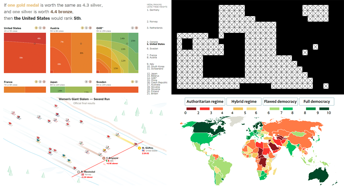
The Upshot, the New York Times’ division focused on data-driven storytelling, dug into the essence of the Winter Olympics as a competition between nations and how to treat the overall results. In fact, country rankings based on the medal count are always considered unofficial, and it is easy to learn why by looking at an interactive visualization in the “Which Country Leads in the Medal Count?” article. Basically, everything greatly depends on what value gold, silver and bronze medals have in your mind.
Democracy at Risk, Globally

The latest edition of Democracy Index presented by The Economist Intelligence Unit states that a “democratic recession” remains a worldwide trend. In particular, over 50% of the 167 countries being monitored in terms of political regime based on 60 indicators received lower scores than earlier. Check out the “Democracy continues its disturbing retreat” article on The Economist to learn more. Here you can select a country using the choropleth map or the dropdown menu and see what democracy-health index it has been given this time and earlier.
Missing and Incomplete Data Visualization: Tips and Examples

Nathan Yau’s articles and visualizations are frequently featured in Data Visualization Weekly. This time, unsurprisingly, we cannot help meeting you with another great piece published on his merited data visualization blog FlowingData: “Visualizing Incomplete and Missing Data.” As the title suggests, there you’ll find tips on how to best display missing and incomplete data on charts, accompanied by a number of vivid examples.
Women’s Giant Slalom Race at 2018 Olympics Visualized

Last but not least, the New York Times made a cool sped-up animation of the two runs of the women’s giant slalom event at the 2018 Pyeongchang Olympics. Serving as a great illustration in the “Mikaela Shiffrin’s Gold Rush Begins With a Bang” article, it beautifully shows how skiers were completing the course, from start to finish.
***
Thanks for your attention! Stay tuned for interesting data visualization examples from around the Web!
- Categories: Data Visualization Weekly
- No Comments »