 Another week is about to end, and another four interesting data visualization based story examples are waiting for your attention. Data Visualization Weekly is back to the AnyChart blog!
Check out what we’ve featured today:
- what Americans spend money on, by income level;
- when sakura blossom season starts where in Japan;
- radioactive drinking water across the US;
- Roger Federer’s tennis career and success.
Data Visualization Weekly: February 2, 2018 – February 9, 2018
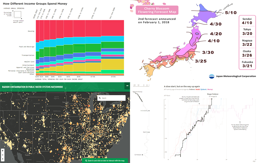
What Americans Spend Money on, by Income Level
Statistics and data visualization expert Nathan Yau continues a series of researches into the American society and what life is to them. This another insightful data visualization based story is about how people in the US spend the money they get in a year, by income level.
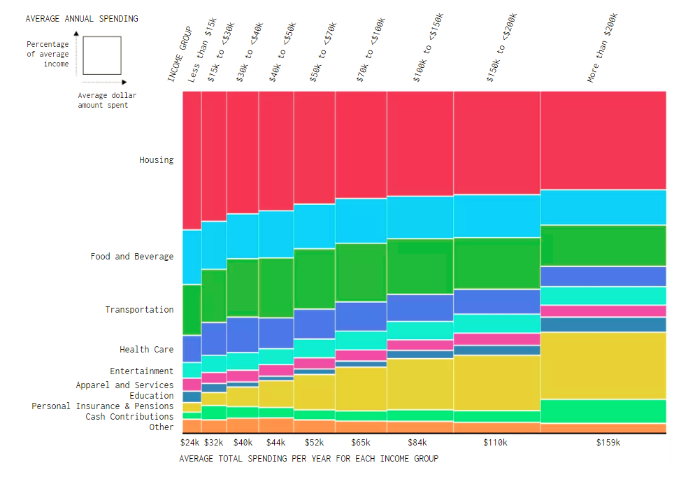
Calendar Map Showing When Sakura Blossom Season Starts Where in Japan
Japan’s iconic sakura flowers are expected to start blooming up to almost a week earlier than it has usually happened. The Japan Times published a map that visualizes on what days the sakura blossom season will begin where in the country, based on a forecast of Japan Meteorological Corporation released at the very beginning of February.
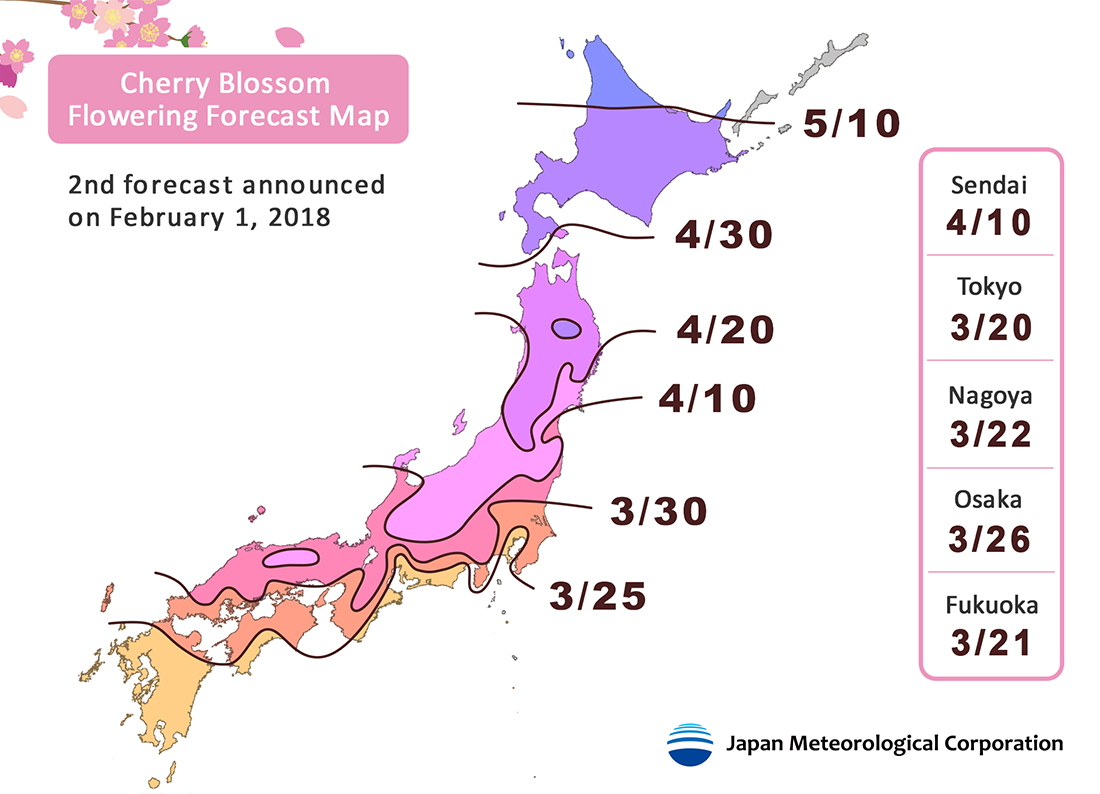
Radioactive Drinking Water Across America
The Environmental Working Group (EWG) made public the results of its investigation into the radioactive contamination of the drinking water across the United States of America. The researchers found out that it takes place, to a good extent, in all the states. Furthermore, over 50% of the entire drinking water supply in the US contains elements that are radioactive, and the most common among them is radium. Check out EWG’s interactive map displaying the level of radium contamination all over the US to learn whether the drinking water in your location is good enough in this regard.
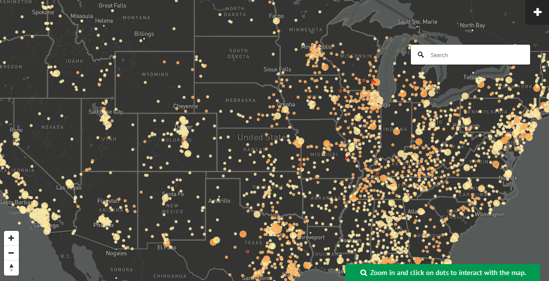
Data Visualization Based Story of Roger Federer’s Tennis Career
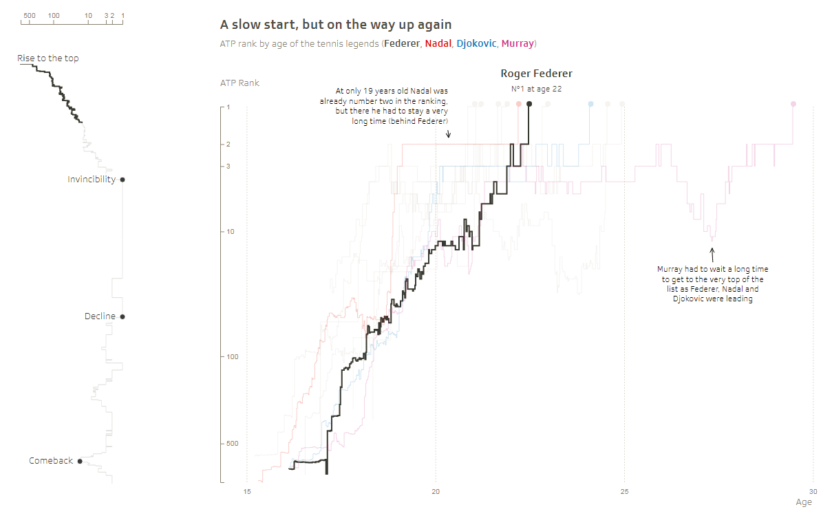
Swiss broadcasting company Schweizer Radio and Fernsehen created a data visualization based story of famous tennis player Roger Federer’s career and success. Check out this cool project and take a look at how his accomplishments are compared to other prominent tennis celebrities along the timeline and more.
***
That’s all for now, guys. See you next week when a new DataViz Weekly post finds its way to our blog.
In the meantime, we cannot help recalling our major news of the week: AnyChart was named the best in JavaScript and awarded with a 2018 DEVIES at DeveloperWeek in Oakland, CA! You can read about all the winners named the leaders in devtech innovation on DZone.
Happy weekend!
- Categories: Data Visualization Weekly
- No Comments »