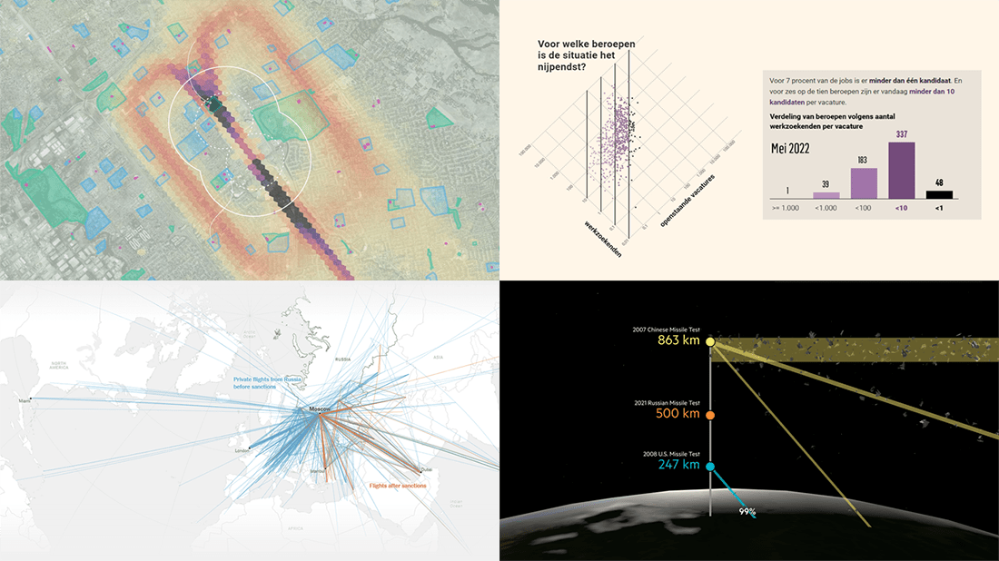
 Good visual graphics are helpful in telling good stories based on data. Want to see some fantastic examples? Check out the best visual data stories of all we’ve recently come across, in a brand new issue of DataViz Weekly!
- Lead emissions around small airports in America — Quartz
- Labor shortage in Belgium — De Tijd
- Geography of Russian private jet flights — NYT
- Space debris and its danger — FT
Data Visualization Weekly: June 10, 2022 — June 17, 2022
Lead Emissions Around Small Airports in America
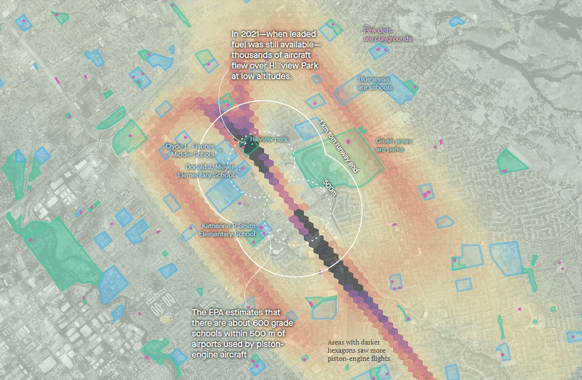
Millions of Americans living near the country’s 13,100 general aviation airports are exposed to airborne lead as thousands of small airplanes still use leaded fuel. This heavy metal is dangerous to human health and especially harmful to children.
Investigating the issue, David Yanofsky and Michael J. Coren of Quartz mapped the flight paths of small, piston-engine aircraft around the top lead-emitting airports in the United States. They also marked the location of schools, playgrounds, and parks. The result is a (searchable) collection of lead exposure maps.
Check out the maps and the findings on Quartz.
Labor Shortage in Belgium
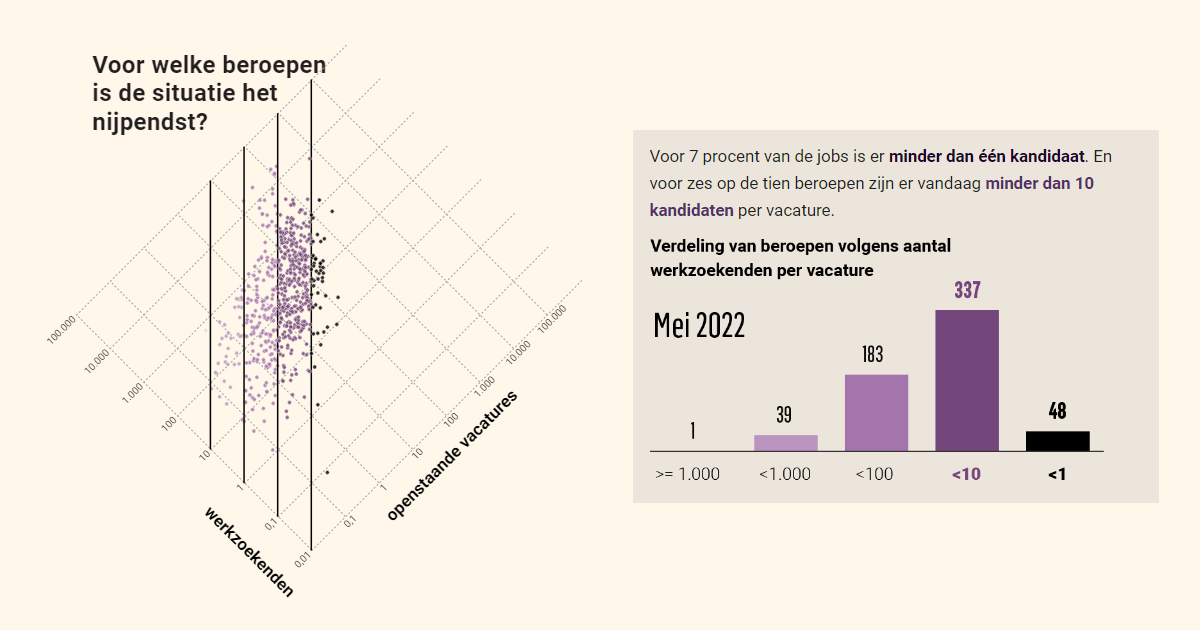
Labor shortages are increasing in Belgium. The number of vacancies grows, but the pool of available job seekers continues to shrink.
Thomas Roelens and Olaf Verhaeghe of De Tijd dug into the situation in the Belgian labor market. Their story features several interesting visualizations that shed light on what has been happening. Pay attention to a cool scatter plot representing the ratio between vacancies and candidates across professions for May 2022. Later, as you scroll, you’ll see the same visualization for May 2019. In the end, there is an interactive map where you can explore the degree of labor shortages for individual occupations across the country.
Look at the visualizations and learn more on De Tijd.
New Geography of Russian Private Jet Flights
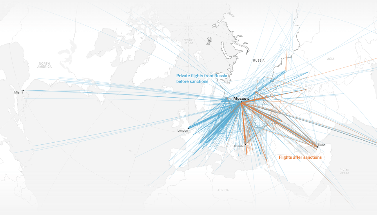
Before February 24th, private jets of Russia’s superwealthy taking off in Moscow used to fly to Milan, Paris, Geneva, London, and other locations on the West more frequently than anywhere else. After that Thursday, their destinations shifted to Middle East and Central Asia.
Pablo Robles and Agnes Chang of The New York Times visualized the geography of the Russian elite’s air travels before and after the introduction of Western sanctions over the military actions on the Ukrainian territory. Dubai in the United Arab Emirates became the most popular destination for private flights from Russia, followed by Turkey, Kazakhstan, and Azerbaijan.
See the data graphics revealing how flight patterns of rich Russians have changed, on the NYT.
Space Debris and Its Danger
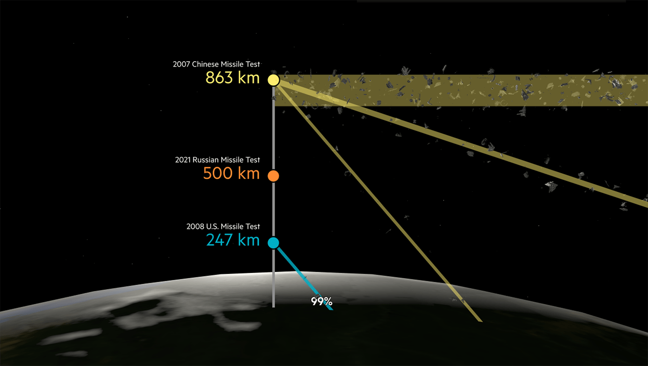
There are roughly 9,000 metric tonnes of litter flying around Earth. Nearly 70% of that debris is actually in low orbit, home to the International Space Station, the Hubble telescope, and other science missions.
The Financial Times, namely Sam Learner and Peggy Hollinger, showed why that is a problem and how the continuing increase in space garbage threatens the future. In their amazing visual story, you will also find out where this garbage comes from, all with the help of wow explanatory graphics.
Delve into the issue of space debris by scrolling this fantastic piece of storytelling on FT.com.
***
Hope you liked these awesome, eye-catching visual data stories!
Love good charts, maps, and infographics? Stay tuned for Data Visualization Weekly!
- Categories: Data Visualization Weekly
- No Comments »