 With data everywhere around us, it is imperative to know how to quickly create visualizations that help reveal trends and patterns in it. Today, let’s learn how to build a scatter chart in just a few lines of simple JavaScript code!
Scatter charts, or scatter plots, are designed to identify a correlation between typically two variables. In such graphics, the data is visualized as a set of points usually displayed as markers. The position of each marker indicates the values of the variables along the horizontal and vertical axes.
In this tutorial, we will be visualizing international and domestic sales of the 1000 highest-grossing Hollywood movies as of January 2022. So, get your popcorn and start watching the JS scatter chart development!
Creating Scatter Chart with JavaScript
Building interactive scatter charts from scratch can be difficult and time-consuming. But it is not a problem at all if you use JavaScript the right way.
Generally speaking, there are four basic steps you need to take to get a JS-based scatter chart up and running. Here they are.
1. Create a basic HTML page with a container
First of all, we need a web page with a container where our future scatter chart will be displayed.
Create an HTML file (or feel free to open an existing one of your own). Include a block-level element, provide it with a unique id that will be referenced later, and set its width and height. Here’s a basic example of how all this can look:
<html>
  <head>
    <title>JavaScript Scatter Chart</title>
    <style type="text/css">
      html, body, #container {
        width: 100%; height: 100%; margin: 0; padding: 0;
      }
    </style>
  </head>
  <body>
    <div id="container"></div>
  </body>
</html>
As you see, we’ve got a very basic HTML page with a <div> element whose id is set as “container” and both width and height are 100% so that the JavaScript scatter chart is displayed over the entire screen (these values can be specified as per preference and requirement).
2. Include the necessary scripts
Second, include all the scripts needed for creating the plot in the <head> section of the HTML page.
To build this scatter chart, let’s use AnyChart JS Charts. It is a very flexible JavaScript charting library with extensive documentation, a lot of readymade JS chart examples, and integration templates for many popular tech stacks.
The AnyChart JS charting library is modular, and its Base module will be more than enough in this case. The data we will visualize are stored in a JSON file, and the Data Adapter script will let us load it from there in a straightforward manner.
So, we only need to reference these two JS files.
<html>
  <head>
    <title>JavaScript Scatter Chart</title>
    <script src="https://cdn.anychart.com/releases/8.11.0/js/anychart-base.min.js"></script>
    <script src="https://cdn.anychart.com/releases/8.11.0/js/anychart-data-adapter.min.js"></script>
    <style type="text/css">
      html, body, #container {
        width: 100%; height: 100%; margin: 0; padding: 0;
      }
    </style>
  </head>
  <body>
    <div id="container"></div>
    <script>
      // This is the place for the entire JS scatter chart code.
    </script>
  </body>
</html>
3. Connect the data
Third, load the data you want to represent.
In this tutorial, we will use the scatter charting technique to visualize data from the Top 1000 Highest Grossing Movies dataset on Kaggle. I took the sales figures along with the titles of the movies and put them all in a JSON file.
AnyChart supports multiple ways to load data to charts. When it comes to data in a JSON file, for example, it is easy to add it using the loadJsonFile() method:
anychart.data.loadJsonFile(
  "https://gist.githubusercontent.com/shacheeswadia/dceaadd5fb4ea27cd9975ff39e9f98f4/raw/6baac571527d9b13e397cfb3d982d7942246dcc0/scatterPlotData.json",
  function(data) {
    // The main scatter plot visualization code will be here.
  }
);
4. Write the visualization code
Now, let’s get to the main part of having an interactive JS scatter chart appear on our web page. Actually, it will only take a few lines of straightforward code.
Add the anychart.onDocumentReady() function that will enclose all the scatter plotting JavaScript code, making sure that the page is fully loaded before the visualization is executed. Then load the data the way described in the previous step.
anychart.onDocumentReady(function () {
  anychart.data.loadJsonFile(
    "https://gist.githubusercontent.com/shacheeswadia/dceaadd5fb4ea27cd9975ff39e9f98f4/raw/6baac571527d9b13e397cfb3d982d7942246dcc0/scatterPlotData.json",
    function (data) {
      // The following JS code comes here.
    }
  );
});
Next, create a scatter chart instance (using the built-in scatter() function) and define markers (there are various options for the marker type, but let’s adhere to the classic circle shape).
let chart = anychart.scatter();

let marker = chart.marker(data);
marker.type("circle").size(2);
It is important to specify what kind of values are plotted along each axis. So, let’s set the titles for both:
chart.yAxis().title("International sales ($ in millions)");
chart.xAxis().title("Domestic sales ($ in millions)");
Similarly, let’s also title the entire data visualization:
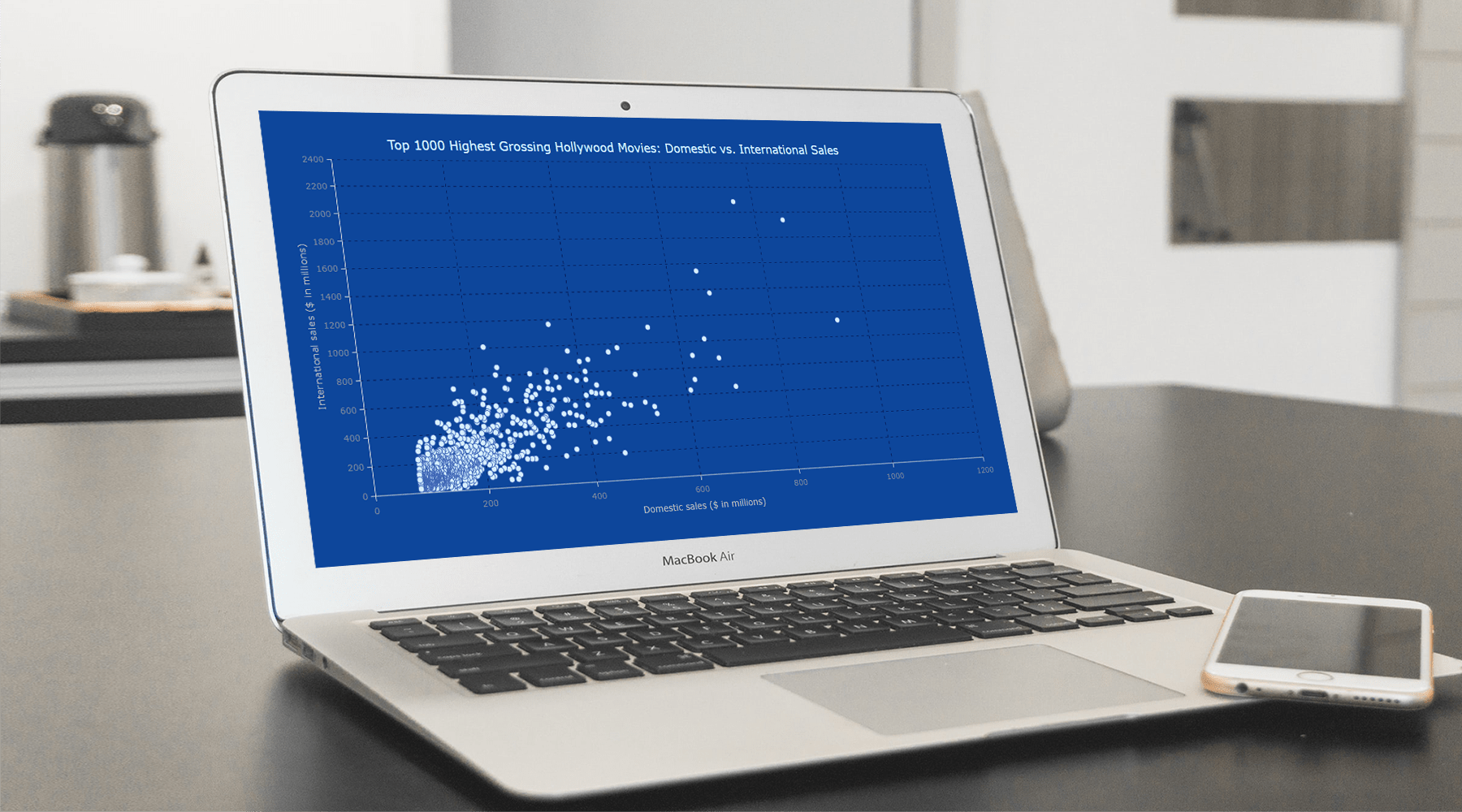
chart.title("Top 1000 Highest Grossing Hollywood Movies: Domestic vs. International Sales");Now, simply reference the container’s id and command to draw the chart.
chart.container("container");
chart.draw();
That’s it! A beautiful, fully functional, interactive scatter chart is created with just these few lines of JavaScript code and can be embedded as is into any web page or app!
The initial version is available on AnyChart Playground. We can see that there is a definite correlation between domestic and international sales, but there are some outliers as well.
JS Scatter Chart Customization
A basic scatter chart is ready. Now, let’s see how we can make it more informative and aesthetically better.
A. Improve the tooltip
Each dot represents a movie, and the current scatter plot looks good enough to illuminate the general trend. But what if we want to dive deeper and see which movie is represented with one individual point or another?
Let’s add the movie titles to the tooltip so we could see them when the dots are hovered over with the mouse.
marker.tooltip().titleFormat(function () {
  return this.getData("title");
});
It is also a good idea to clarify what the displayed values mean.
marker
.tooltip()
.format(function () {
  return (
    "\nTOTAL SALES: " +
    "$" +
    this.getData("totalSales") +
    "M" +
    "\nDomestic sales: " +
    "$" +
    this.x +
    "M" +
    "\nInternational sales: " +
    "$" +
    this.value +
    "M"
  );
});
B. Modify the scale
By default, the maximum and minimum values on the axes are automatically calculated based on the values in the data. Right now, 2400 is the maximum on the Y-axis, while the maximum on the X-axis is only 1200. Let’s make both maximums the same (2200) and also increase the number of ticks along the axes by setting the interval between them to 200.
chart.xScale().minimum(0).maximum(2200).ticks({ interval: 200 });
chart.yScale().minimum(0).maximum(2200).ticks({ interval: 200 });
The entire code for this version of our JS scatter chart can be found on AnyChart Playground.
For the next steps, let’s keep these more frequent ticks but revert to the automatic calculation of the maximum scale values as it apparently provides a better view of the data points.
C. Add grid lines
The scatter chart is representing quantitative data, and adding a grid should make it easier to understand the values. Let’s enable grid lines for both axes and style the stroke appearance.
// enable the grid lines
chart.yGrid(true);
chart.xGrid(true);

// customize the grid stroke
chart.yGrid().stroke({ color: "#071d58", dash: "4 5" });
chart.xGrid().stroke({ color: "#071d58", dash: "4 5" });
D. Aesthetic changes
Finally, it’s time to make some simple, yet effective modifications to enhance the look of the scatter chart. Let’s set a custom background color:
chart.background().fill("#0d468f");To increase the visual contrast, it will be good to customize the markers by editing the initial marker configuration line in the code:
marker.type("circle").size(4).fill("#c6e3f9").stroke("#3e5ca6");Since the background is darker now, let’s also modify the colors of the scatter chart and axis titles using HTML.
// set the chart title
chart
  .title()
   .enabled(true)
  .useHtml(true)
  .text(
    '<span style = "color: #c6e3f9; font-size:18px;">Top 1000 Highest Grossing Hollywood Movies: Domestic vs. International Sales</span>'
  );

// set the titles of the axes
chart
  .yAxis()
  .title()
  .enabled(true)
  .useHtml(true)
  .text(
    '<span style = "color: #b3b3b3;">International sales ($ in millions)</span>'
  );
chart
  .xAxis()
  .title()
  .enabled(true)
  .useHtml(true)
  .text(
    '<span style = "color: #b3b3b3;">Domestic sales ($ in millions)</span>'
  );
Voilà! We now have a lovely, insightful, JavaScript-based scatter chart to make our data speak!
Take a look at how enthralling the scatter chart visualization looks now! Check it out on AnyChart Playground.
Conclusion
Now you see it is easy — and fun — to create scatter charts with JavaScript (HTML5). Look at the scatter documentation to continue learning.
There are tons of different other chart types available. So, try out a scatter plot, and then don’t miss out on other options for your data visualization. Please ask any questions and feel free to suggest another chart type for the next tutorial.
AnyChart is thankful to Shachee Swadia, a freelance data visualization developer, for producing this wonderful guest post.
Don’t miss out on another great scatter plot tutorial on our blog, where data analyst Wayde Herman visualizes the popularity of cats vs. dogs in the U.S. by state.
Check out more JavaScript charting tutorials on our blog.
Would you like to create some cool guest post for us? Let us know!
- Categories: AnyChart Charting Component, Big Data, HTML5, JavaScript, JavaScript Chart Tutorials, Tips and Tricks
- No Comments »