 Dataviz is a wonderful, powerful tool that helps us perceive the information better. From simple static charts to impressive complex interactive visualization projects, various solutions can be useful to communicate and study trends and big pictures as well as to drill down to specific details, depending on the situation and objectives.
Follow Data Visualization Weekly on our blog to see some good examples of dataviz and how it assists in revealing something hidden and telling interesting stories.
Here’s what we are featuring this time:
- 2 words for tea in the world (tea if by sea, cha if by land);
- how technology companies own your typical day;
- US Federal Reserve’s new data visualization tools;
- interactive visualization of the blockchain technology.
Data Visualization Weekly: January 12, 2018 – January 19, 2018
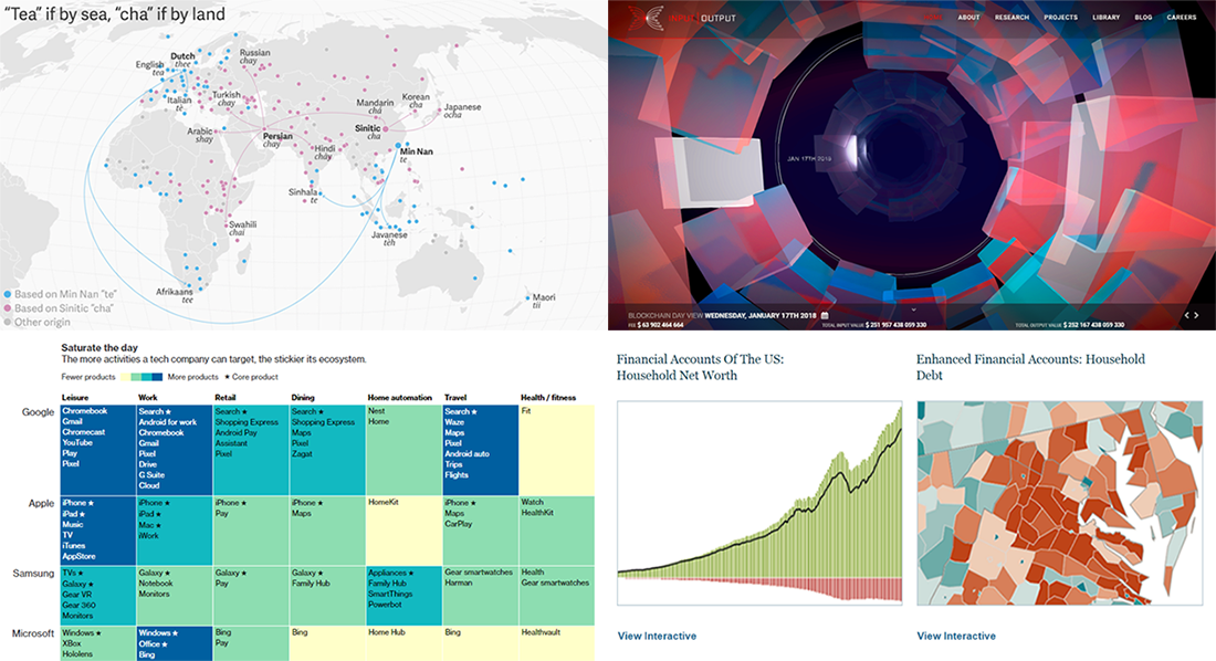
2 Words for Tea in the World
Check out an interesting fact. Around the world, there are basically 2 major versions of how people write and pronounce tea in their language. One of them is similar to the English word: tè in Italian, thé in French and so on. The second word is one or another variation of cha: chay in Russian and Hindi, chai in the language of Swahili, etc. Take a look a research on Quartz, illustrated by a dot map with tea trade routes. It is great at explaining why.
How Tech Companies and Their Products Own Your Typical Day
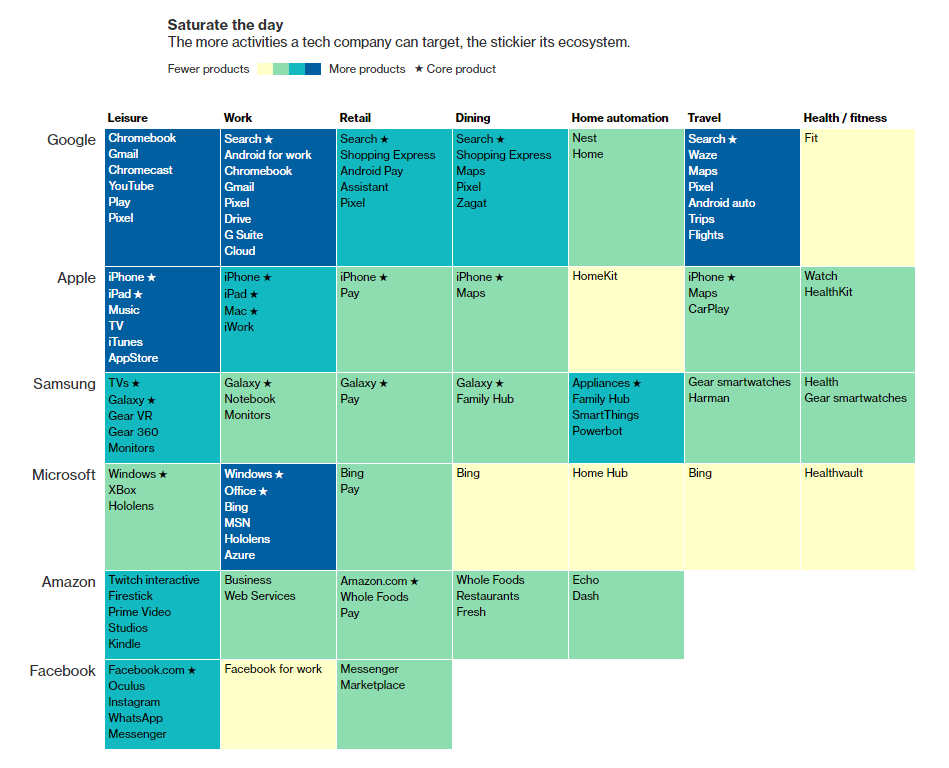
Bloomberg explains how a typical day of an American looks in terms of what technology products are used when. Making good use of data visualization, the authors show how Google, Apple, Samsung, Microsoft, Amazon and Facebook fight for every single minute of our lives: in leisure, work, retail, dining, home automation, travel, health. You’ll find more charts in this article on Bloomberg.
Federal Reserve Data Visualization Tools
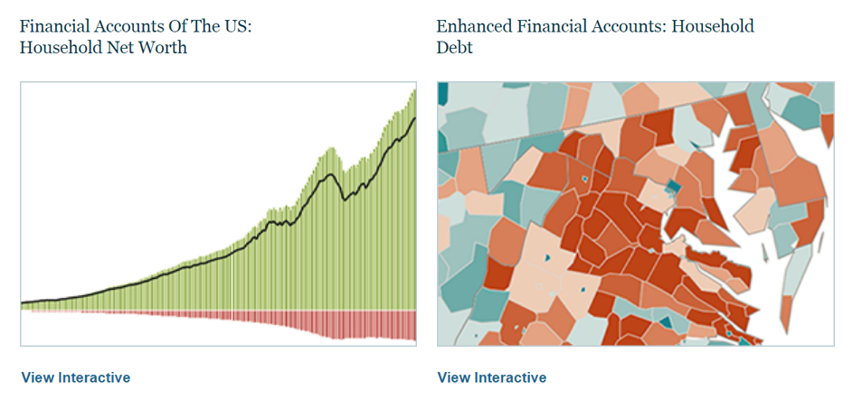
The Federal Reserve began to add interactive data visualization tools to help people make sense of financial statistics. So far, there are three chart projects published, providing insights into the US state and local pensions as well as household net worth and debt. Data is available for download.
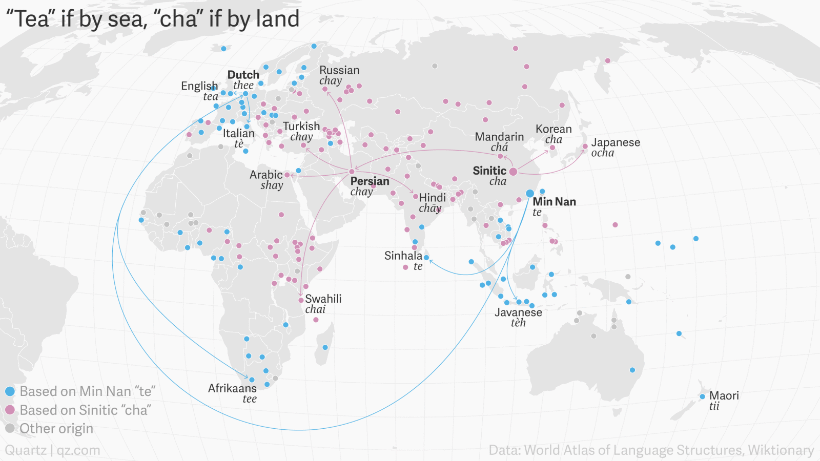
Interactive Visualization of Blockchain Technology

Technology company Input Output in collaboration with design studio Kuva launched an impressive interactive visualization showing the Bitcoin blockchain technology and how it works. Here you can check the details on every single block and see the history.
***
Welcome back in a week to check out the next issue of DataViz Weekly. In case you are interested to learn more about charts and how to use them, look for more of great content right here, on the AnyChart JS Charts blog! You can learn how to choose the right chart type, build a simple interactive JavaScript (HTML5) chart, create advanced data visualizations and so on. You are also welcome to check out 2017’s last DataViz weekly featuring highlights of the 2017 year in dataviz.
- Categories: Data Visualization Weekly
- No Comments »