The new 2018 year is coming very soon, and now is a great time to look back and remember the highlights from data visualization in 2017.
A few words about our solutions to start with. After the very productive year of 2016, we at AnyChart JS Charts did a lot in 2017, too. 4 major releases full of new features! After versions 7.13.0 and 7.14.0, we launched the brand new, 8th generation of our JavaScript charting libraries, featuring a modular system and custom JS builder (8.0.0). In December 2017, we released AnyChart 8.1.0. In addition, we published a number of plugins (for Qlik, Android, Angular, Ionic and more) and technical integration samples for popular technology stacks, released Chartopedia and the brand new Playground with a whole bunch of chart examples added to our documentation, API reference and galleries. And even more.
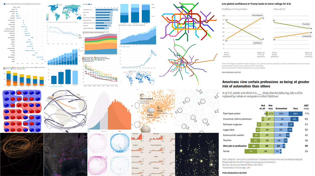
A lot of great charts and infographics were created in 2017 by various people and companies from around the world. In the present, this year’s last Data Visualization Weekly post, we’ll tell you about 4 year-in-review articles featuring the most interesting visualizations of 2017:
- 10 Best Projects in Data Visualization in 2017 — FlowingData.
- Quartz: Top 5 Charts in 2017, According to Reddit — Quartz.
- Year of 2017 in 12 Charts — The World Bank.
- 17 Striking Findings in 2017 — Pew Research.
Data Visualization Weekly: Review of 2017
FlowingData: 10 Best Projects in Data Visualization in 2017
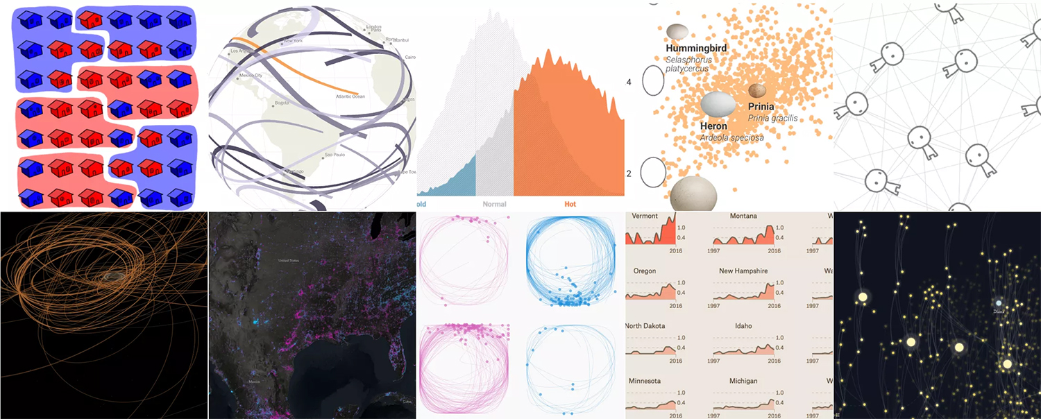
Famous data visualization expert Nathan Yau shared his favorite projects that saw the light in 2017. Here’s a list of all the 10 honorable mentions on FlowingData:
- Gerrymandering math explained by Olivia Walch using comics along with data.
- The Cassini satellite’s travel path, by Brian T. Jacobs and Nadia Drake.
- How people actually draw a circle, by Nikhil Sonnad and Thu-Huong Ha.
- Disappeared and new lights on Earth as seen from space, by John Nelson.
- Visualizing the evolution of trust in the game form, by Nicky Case.
- The mystery of eggs’ shape difference unveiled, by Jia You and Sarah Crespi.
- Data Sketches by Shirley Wu and Nadieh Bremer.
- The Pudding, by the Polygraph team.
- Every total solar eclipse in your lifetime, by Denise Lu.
- Rise of summer temperatures, by Adam Pearce and Nadja Popovich.
- Using a feather to visualize 10 inaugural speeches of 6 US presidents, by Periscopic.
- Map of the best places in the US to watch the total solar eclipse, by Joshua Stevens.
Quartz: Top 5 Charts in 2017, According to Reddit

Data Is Beautiful is an extremely popular subreddit on Reddit, devoted to the graphical representation of the information by means of charts, maps, and other forms. Quartz highlights 5 visualizations that collected the most upvotes in 2017. They are:
- Map of the Berlin subway and its real-world geography, by Vinzenz Aubry.
- How many people were killed in Africa vs. Europe, by valouhhh.
- A child’s sleep patterns during the very first few months after birth, by Andrew Elliot.
- Correlation between the number of cardiac-related deaths and the location of Waffle House restaurants, by DR-ROBERT-J.
- Google search popularity of “solar eclipse” and “my eyes hurt” in New York state before and after the total solar eclipse, by superpaow.
The World Bank: Year of 2017 in 12 Charts
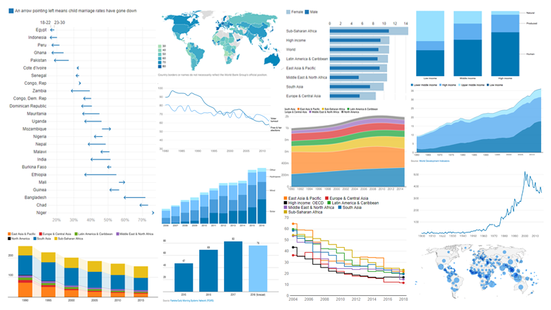
The World Bank picked 12 charts to show 2017 in the global economy and related issues.
- How many people worldwide are in the urgent need of food assistance.
- Global carbon dioxide (CO2) emission by countries’ income level.
- The number of natural disasters and socioeconomic resilience scores.
- Shares of human, natural and produced capital in countries’ wealth by countries’ income level.
- How bigger wages become with every new year of schooling.
- How many children worldwide are stunted.
- Child marriage rates.
- Change in the youth population globally.
- The number of mammal species threatened in each country.
- Decline in elections judged fair and voter turnout worldwide.
- How much time on the average is needed to start a business (by region).
- Renewable power sources in electricity generation capacity.
Pew Research: 17 Striking Findings in 2017
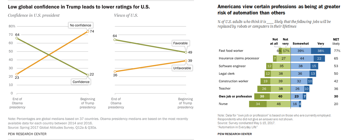
Pew Research Center is well-known for studies and research in various fields. Take a look at the 17 findings that its team found most outstanding in 2017:
- As partisan divides over political values widen, other gaps remain more modest.
- Low global confidence in Trump leads to lower ratings for the US.
- About 40% of Americans live in a gun-owned household; 30% personally own a gun.
- Democrats and Republicans are more divided on media’s watchdog role than at any point since 1985.
- Muslims are projected to be the fastest-growing major religious group.
- Among Americans with Hispanic ancestry, share that identifies as Hispanic or Latino falls across immigrant generations.
- Women are more likely than men to point to societal factors when it comes to gender differences.
- Americans view certain professions as being at greater risk of automation than others.
- Republicans’ views of the impact of the colleges have turned much more negative since 2015.
- Without future immigrants, working-age population of the US would decrease by 2035.
- Coverage of Donald Trump’s first 60 days delivered a greater share of negative assessments than coverage of previous presidents.
- A growing share of Americans are ‘unpartnered’.
- Majorities of many nationalities among Europe’s asylum applicants were waiting for decisions at the end of 2016.
- About 80% of Americans say they understand the risks and challenges of police work, but 86% of police say the public doesn’t.
- Young adults use streaming services most to watch television.
- Most whites think white people get little or no advantage from their race.
- Science knowledge is closely related to expectations for harm from climate change among Democrats, but not among Republicans.
***
Check out these articles to see a lot of really interesting charts and projects in data visualization in 2017. To get started with our feature-rich JS charts libraries for creating beautiful dataviz in HTML5, see the Chart Documenation and API Reference. On our blog, you’ll also find several quick basic JavaScript charting tutorials. For tutorials based on advanced data visualization tasks, take a look at the Challenge AnyChart! feature. Here you can also learn how to choose the right chart type. And, of course, stay tuned at Data Visualization Weekly for further inspirations!
We at AnyChart wish you all the best for the new year!