 Check out another recap of new cool data visualization examples within the framework of our DataViz Weekly feature!
As always, let’s start with a quick list of what we’ve prepared for your review this time:
- how different groups of Americans live;
- analyzing broadband data (and what can go wrong);
- support for populist right parties in European countries;
- 10 charts showing the rapid growth of AI.
Data Visualization Weekly: January 19, 2018 – January 26, 2018
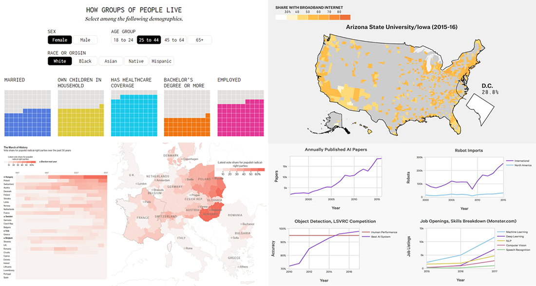
Life of Different Groups of American People, in New Cool Data Visualization
Nathan Yau’s new cool data visualization allows us to learn how different groups of people in the US live. It is possible to select sex, age and race (origin) to look into the details about the corresponding part of the population: how many people from a certain group are married, employed, widowed, own children, has healthcare coverage and so on. Data is taken from the American Community Survey.
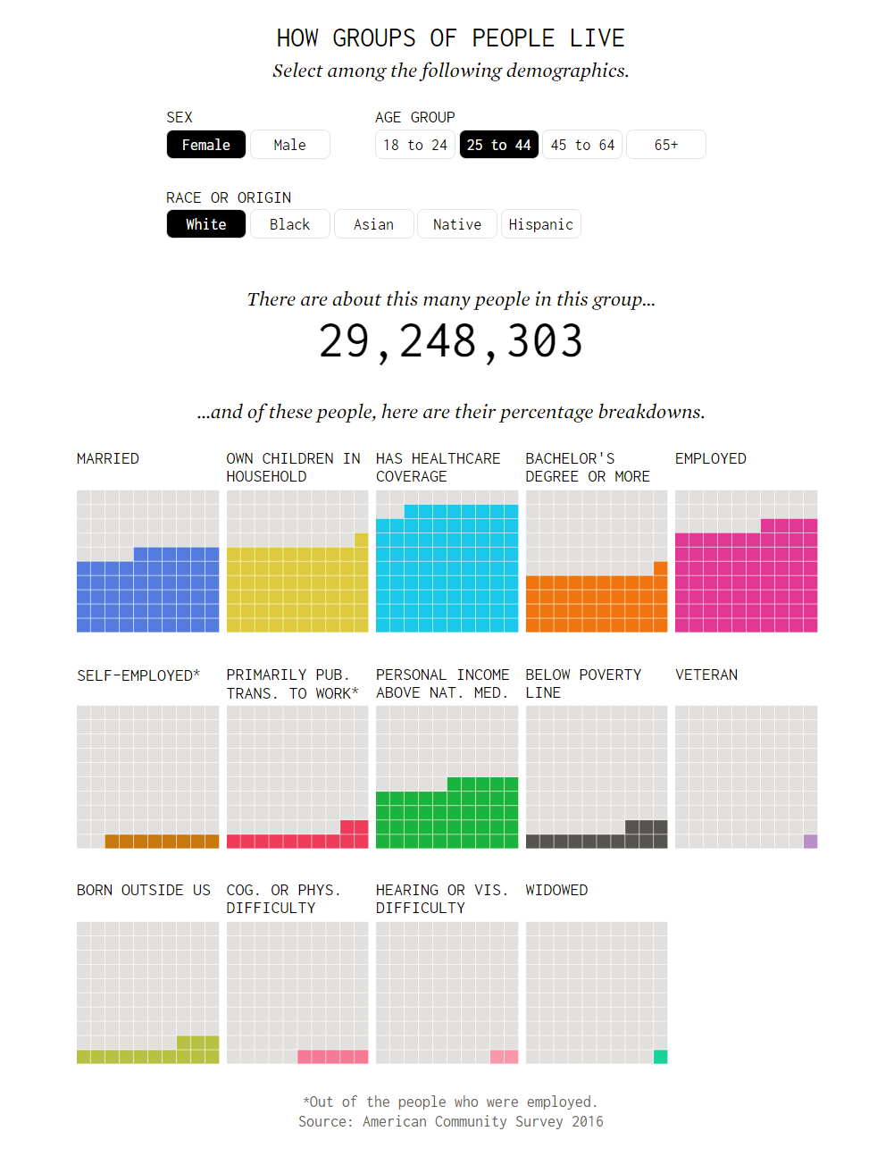
Broadband Data: What Went Wrong
FiveThirtyEight published an insightful story revealing the bottlenecks of the broadband Internet access data analysis they’d had. The article explains what exactly went wrong and where the reality is as well as displays a lot of visualizations to illustrate the problem with data.
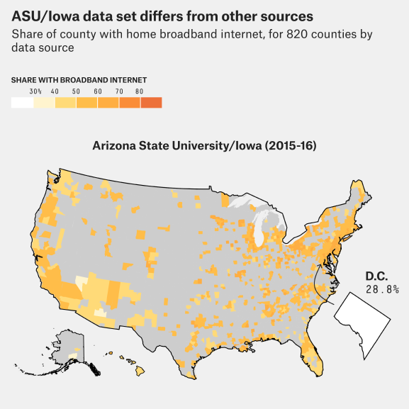
Support for Right Parties in Europe
Bloomberg studied the European election data over the past 30 years and found out that populist right political parties enjoy the highest support now than ever within that time framework. Check out the maps and charts in the article that nicely unveil this and the details.
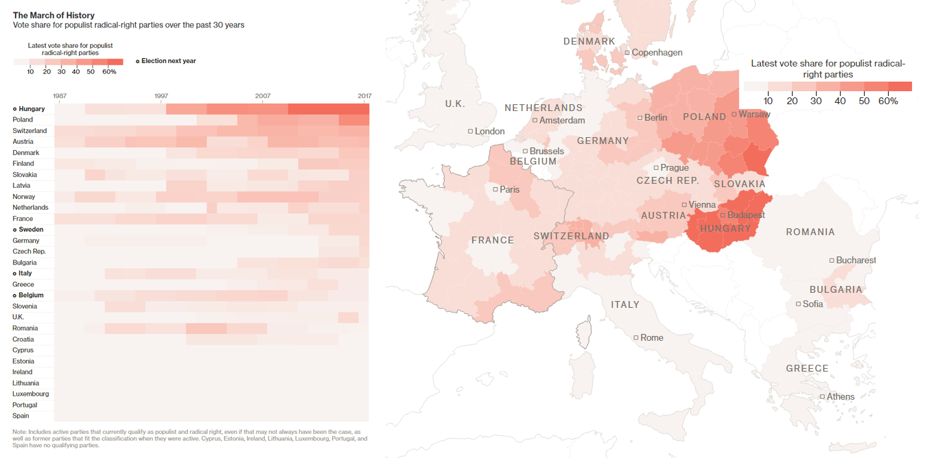
Ten Charts Showing Rapid Growth of AI
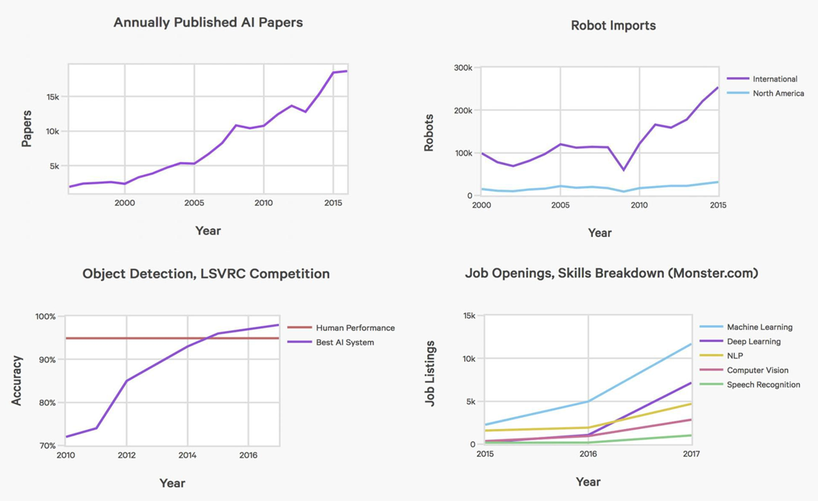
The AI Index 2017 Report assembled a number of different data sets that are helpful in understanding the state and the future of Artificial Intelligence. Take a look at 10 interesting charts from the report, published on Forbes, providing a perspective on AI’s growth.
***
Thank you for staying tuned at Data Visualization Weekly! Have an amazing weekend time!
- Categories: Data Visualization Weekly
- No Comments »