 Yay! We are already living in the new 2018 year! And may it bring you plenty of success, joy and happiness!
In the meantime, we at AnyChart continue our Data Visualization Weekly series of articles devoted to some of the interesting data visualization projects and standalone charts and infographics we’ve recently come across. This time, let’s recall the last year once again and see how it looked for:
- the teaching profession,
- UK citizens,
- energy and
- Apple.
Data Visualization Weekly: December 29, 2017 – January 5, 2018
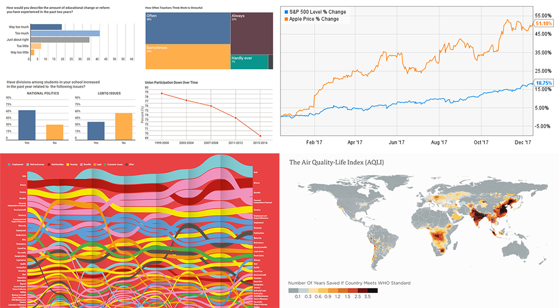
State of Teaching Profession in 2017 in 10 Charts
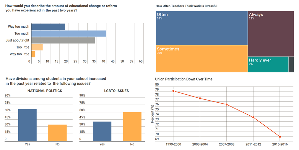
Education Week presented a new year-in-review article, featuring ten charts. These are based on many different data and are helpful in understanding how the teaching profession felt in 2017. Check out the article to see what teachers think about their job, why they leave, how they participate in a union, what’s become different in schools and other insights.
UK’s 2017 Year of Worries in 1 Chart
![]()
WIRED shared a visualization showing what people in the UK were worried about throughout the 2017 year. The chart is based on data about popular search queries at the Citizens Advice website. Take a look at its high-resolution version.
Visual Story of Energy in 2017 in 10 Charts
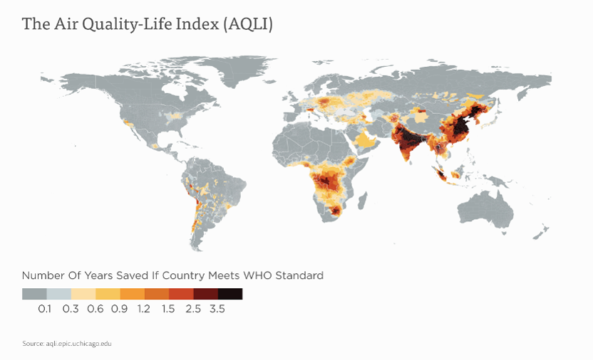
The Univerity of Chicago’s Energy Policy Institute published charts telling us the story of energy in the 2017 year. Check out their ten favorite visualizations that graphically represent some of the last year’s important topics and revelations on them.
Apple’s Successful Fiscal 2017 Year in 4 Charts
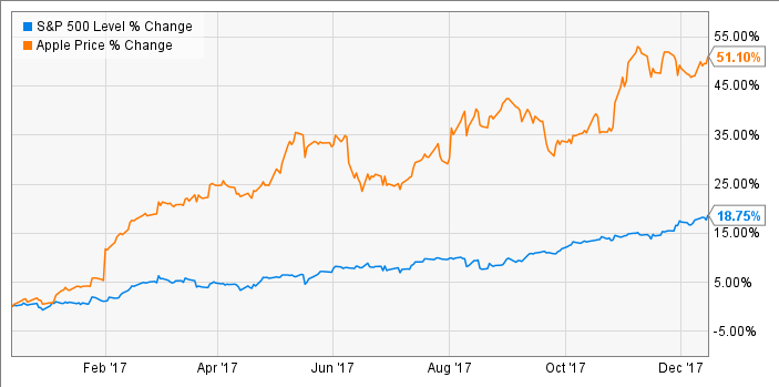
The fiscal 2017 year was very successful for Apple, bringing the times of intense growth back again. Take a look at these 4 simple, yet meaningful charts that display how Apple stocks rose as well as the company’s two fastest growing product segments and their performance, product revenue composition and iPhone revenue dynamics.
***
You’ll find some more charts and infographics about 2017 in our last year’s final Data Visualization Weekly post, along with a short summary of what we at AnyChart did in January–December 2017: Data Visualization in 2017: Highlights – DataViz Weekly.
Welcome to the new year! We wish you all the best in the new 2018 year!
- Categories: Data Visualization Weekly
- No Comments »