 Here we are with a new selection of great examples showing the power of data visualization in action, whether for exploring or explaining. See which projects made it to this edition of DataViz Weekly:
- Flight delays and cancellations in Northern California — San Francisco Chronicle
- Real-time UK temperature tracker — Dan Harris and Ed Hawkins
- Threats to whale migration — Blue Corridors Initiative
- Maha Kumbh Mela crowds in petals — Reuters
Data Visualization Weekly: May 30, 2025 — June 6, 2025
Flight Delays and Cancellations in Northern California
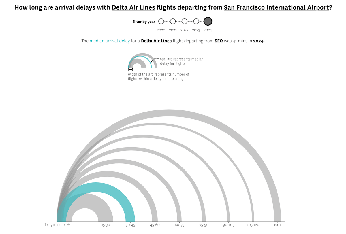
Flying from the Bay Area? Your chances of experiencing a delay or cancellation may vary depending on the airline you choose and the airport you depart from.
The San Francisco Chronicle analyzed data from FlightAware on more than 1.4 million departures from four major Northern California airports — San Francisco, Oakland, San Jose, and Sacramento — between 2020 and 2024. The resulting visual story offers insight into trends in flight reliability across both carriers and hubs.
After choosing an airline and an airport, readers can view how that carrier ranks by delay and cancellation rates at that location. The visualizations include circular gauges that display reliability both across airlines at a specific airport and across airports for a selected airline. A bubble strip plot positions the chosen carrier against others at the same airport, and arc charts show the typical lengths of arrival delays.
Take a look at the article on the San Francisco Chronicle, by Rachel Swan and Andrew Williams.
Real-Time UK Temperature Tracker
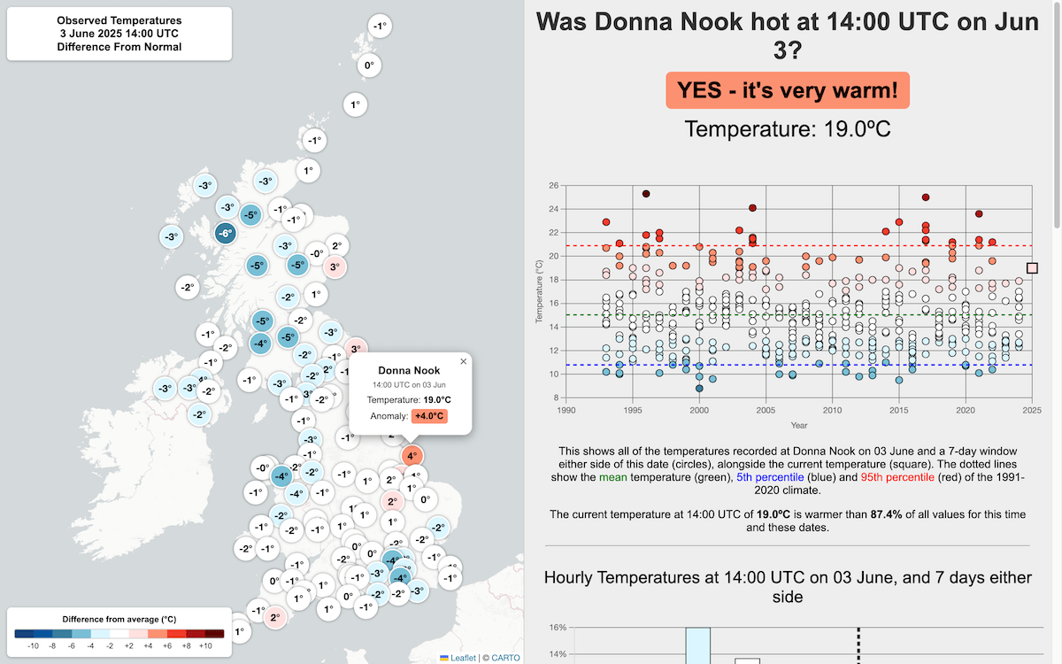
How warm is it in the UK right now compared to what is typical for this time of year/day? A newly launched interactive tool answers that question by putting current temperatures into historical perspective.
Created by Dan Harris and Ed Hawkins, the site uses hourly data from weather stations across the United Kingdom and compares each observation with the 1991–2020 average for the same time of year/day. Color-coded circles on a map show how much warmer or cooler it is at each location right now (or on any chosen day). Clicking a point reveals individual station data, long-term distributions, 24-hour comparisons, and daily maximums, offering a clear sense of how today’s weather stacks up against recent decades.
Explore the tool at istheukhotrightnow.com and read more about it here. According to the authors, it was inspired by isithotrightnow.com, a similar Australian project by Mat Lipson, Steefan Contractor, and James Goldie.
Threats to Whale Migration
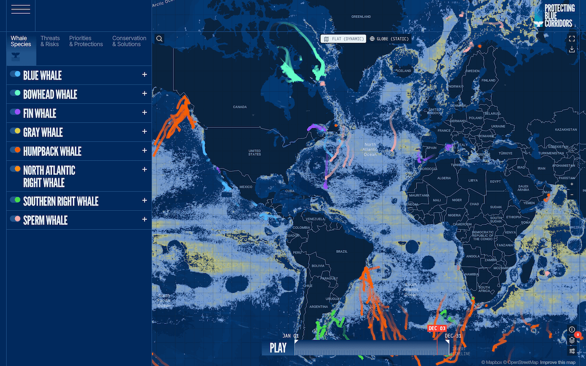
Whales travel vast distances across the world’s oceans. But their migratory routes often overlap with areas of intense human activity.
To visualize these intersections and support conservation, the WWF and partners created an interactive map based on over 30 years of satellite tracking data. It shows where whales migrate and what risks they encounter, overlaying their paths with data on threats like ship traffic and fishing. The project also highlights possible actions to protect these routes.
Check out the website of the Protecting Blue Corridors initiative.
Maha Kumbh Mela Crowds in Petals
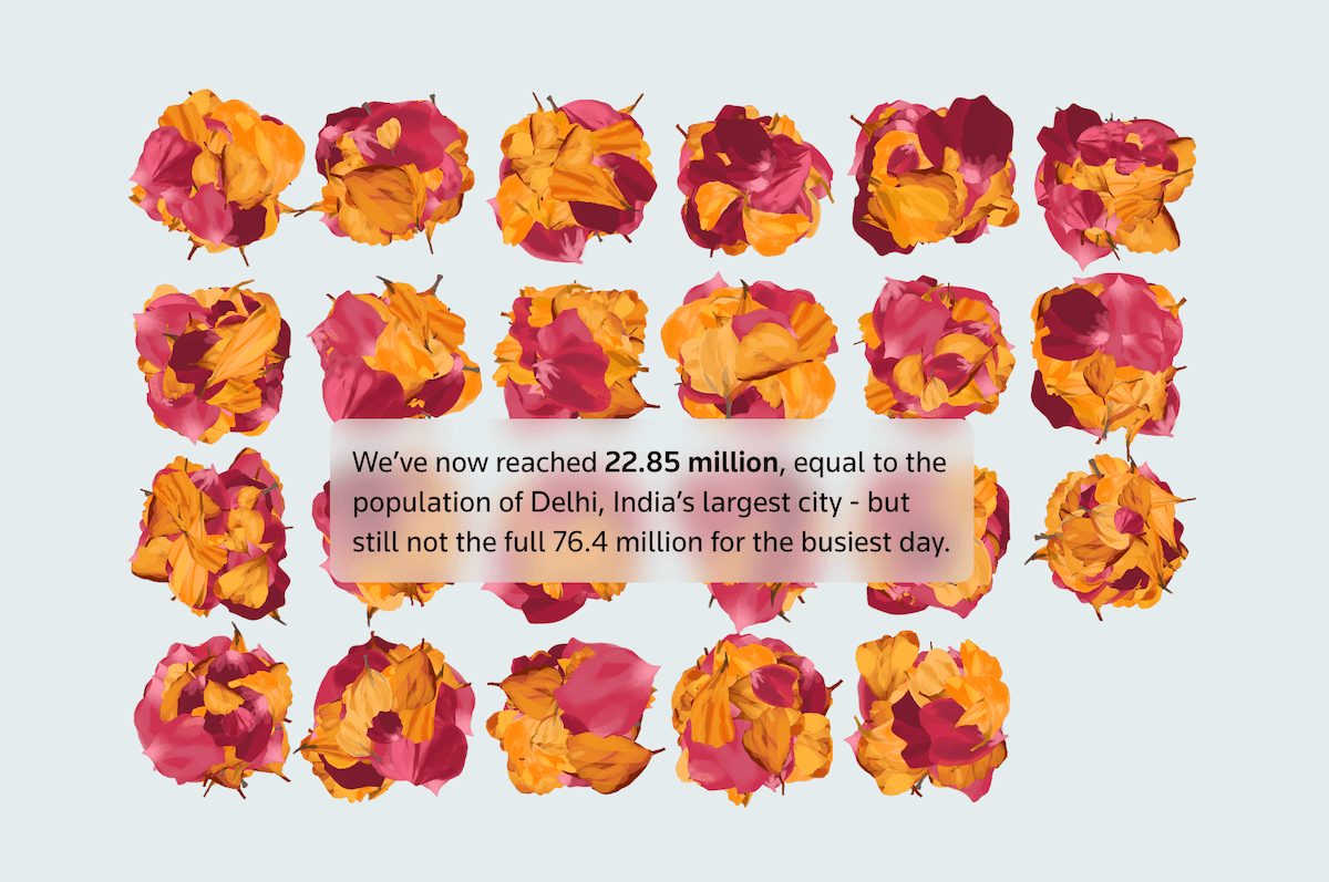
India’s Maha Kumbh Mela is considered the largest gathering of people on Earth. But what does that really look like?
Reuters published a visual story that puts this year’s overwhelming 663 million visits into perspective. A striking visual metaphor helps convey the immense scale of this 45-day Hindu festival held in Prayagraj: One flower petal stands for 10,000 people. As you scroll, petals multiply, periodically annotated with global population comparisons to place the growing total in context.
See the story on Reuters, by Sudev Kiyada, Dea Bankova, Rebecca Pazos, and Mayank Munjal
Wrapping Up
These examples remind us just how powerful data visualization can be when it comes to making data more understandable and engaging. Stay tuned for more in Data Visualization Weekly — where we regularly spotlight the best and most interesting examples of how charts, maps, and other visuals help bring data to life.
- Categories: Data Visualization Weekly
- No Comments »