 Hey data visualization lovers, ready for a new dose of inspiration? Welcome back to DataViz Weekly, where we spotlight the most interesting new projects in which charts and maps help make sense of data visually. Take a look at what stood out to us this time around:
- Ukraine’s energy crisis revealed by city lights — Bloomberg
- Far-right electoral growth across Europe — elDiario.es
- U.S. guns for Mexican cartels — The Conversation
- History of Lubartów’s Jewish population — WeDoData
Data Visualization Weekly: May 23–30, 2025
Ukraine’s Energy Crisis Revealed by City Lights
Ukraine has rebuilt an energy grid that’s more resilient — and greener — than what it had before Russia’s invasion.
?: https://t.co/7r3lD04Kyp pic.twitter.com/J8L4D2TK1M
— Bloomberg Graphics (@BBGVisualData) May 27, 2025
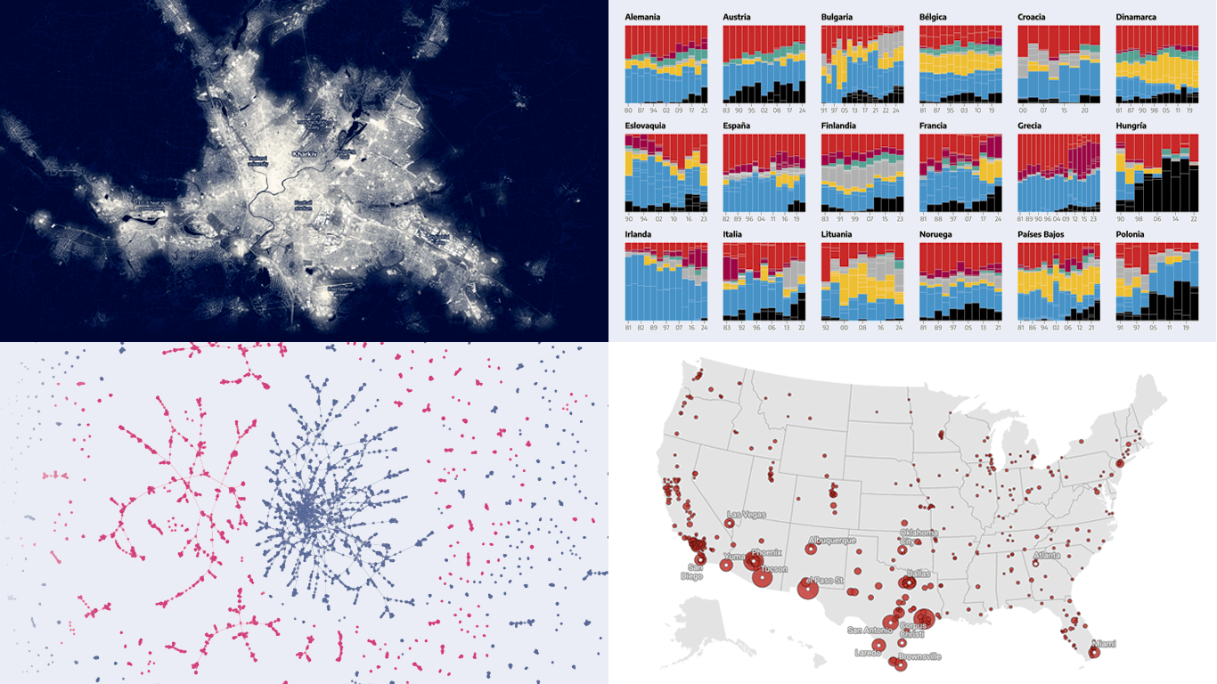
Ukraine’s power infrastructure has been under relentless attack for more than three years. The scale of the damage is now visible from space, in the literal dimming of its cities after dark.
Bloomberg visualized NASA’s nighttime satellite imagery to compare light intensity across Ukraine between autumn 2021 and autumn 2024. The animated map above shows Kharkiv, where nighttime brightness fell by 94 percent, one of the sharpest declines in the country. Similar maps highlight changes in Dnipro, Zaporizhzhia, Odesa, Kyiv, and Ukraine as a whole.
The article also includes a bubble map pinpointing the areas with the greatest damage to energy infrastructure. It then explores how Ukraine is adapting by reengineering its power grid and moving away from a centralized system, using column charts, slope charts, and other visualizations.
Check out the article on Bloomberg, created by Olesia Safronova, Volodymyr Verbianyi, Krishna Karra, Demetrios Pogkas, and Julia Janicki.
Far-Right Electoral Growth Across Europe
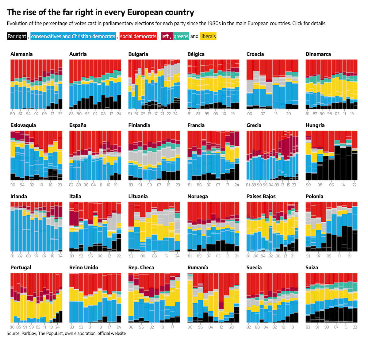
Support for far-right parties has increased in nearly every European country that held general elections over the past couple of years. In several cases, the rise has been especially sharp.
elDiario.es examined recent electoral results using data from ParlGov and Popu-list to track changes in support for far-right parties. The analysis begins with a chart of horizontal arrows comparing vote shares in elections held since January 2023 to those in previous cycles between 2018 and 2022. A choropleth map follows, showing their current parliamentary strength by country.
Further down, a set of percent stacked column charts illustrates vote trends for all major political groups across more than two dozen countries from the 1980s to today, with detailed breakouts for Germany, Portugal, Romania, and Austria.
See the story on elDiario.es, by Raúl Sánchez, Icíar Gutiérrez, Víctor Honorato, and María Ramírez.
U.S. Guns for Mexican Cartels
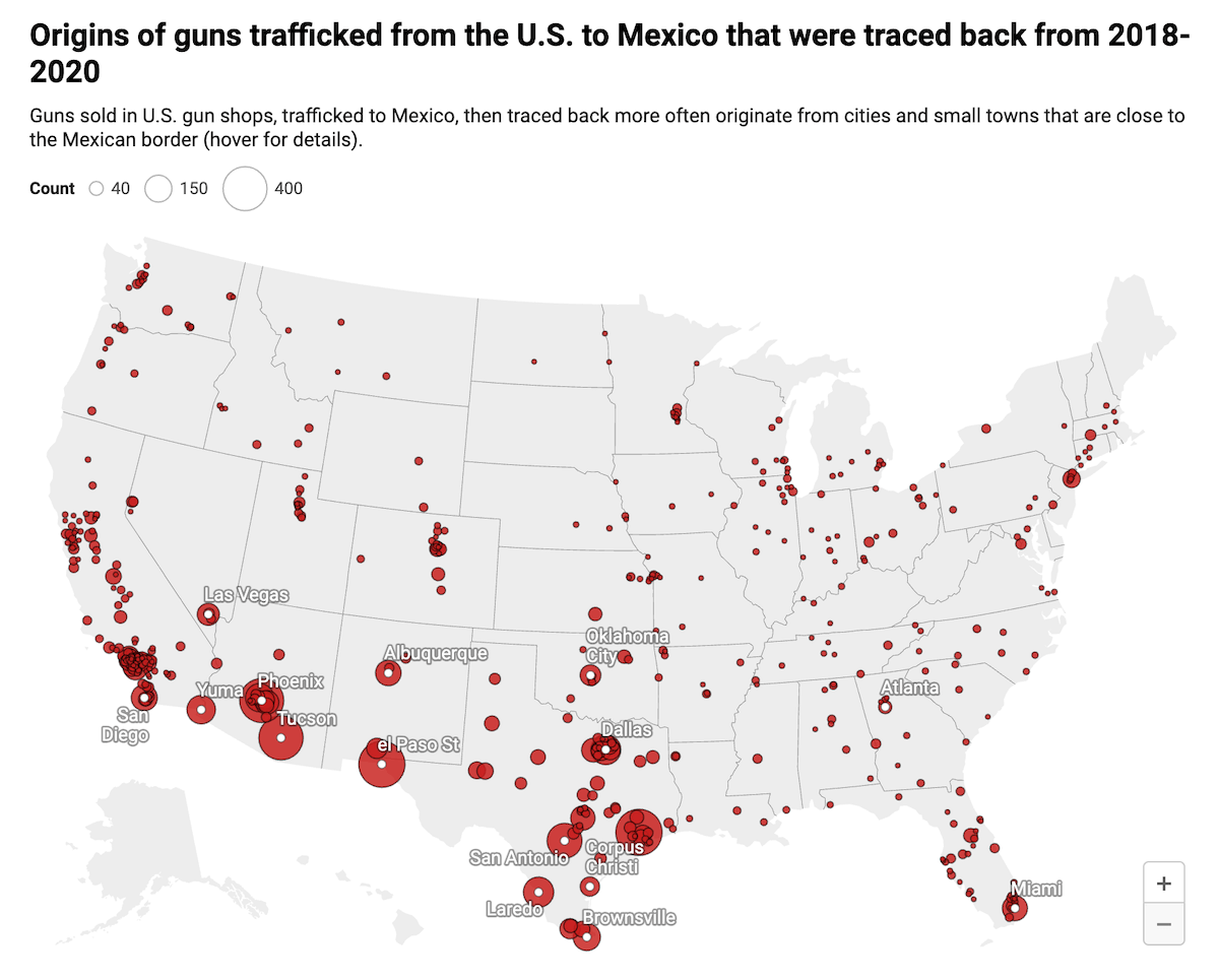
A large number of firearms used by criminal groups in Mexico have been traced back to legal purchases in the United States. A new investigation visualizes the scale, origins, and flow of this cross-border trafficking.
The Conversation published a detailed analysis by investigative journalist Sean Campbell and University of San Diego professor Topher McDougal, who examined how U.S.-purchased firearms ended up in Mexico. Drawing from leaked Mexican government firearm trace records, U.S. court documents, and other data, they estimate that about 135,000 guns were trafficked south in 2022 alone.
The bubble map above shows the U.S. locations where those firearms were originally sold. Other visuals like bar charts, line plots, and choropleth maps offer further insight into trafficking dynamics and related patterns.
Discover more on The Conversation.
History of Lubartów’s Jewish Population
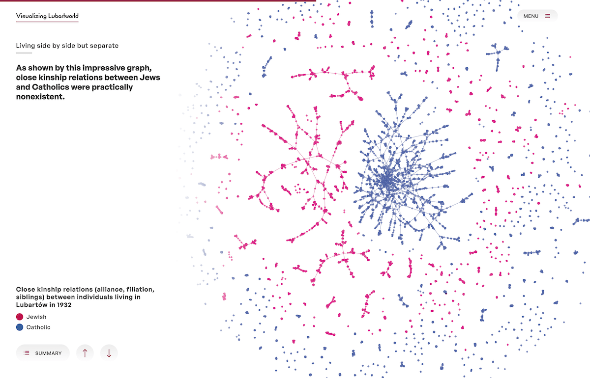
Lubartów, a small town in eastern Poland, was once home to a vibrant Jewish population that made up nearly half of its residents in the 1930s. The years that followed brought dramatic upheaval, profoundly altering the lives and paths of this community.
WeDoData, a France-based data visualization agency, created an interactive data-driven scrollytelling project called Visualizing Lubartworld, which presents what is described as the collective biography of the Jews of Lubartów across the twentieth century.
Based on long-term academic research led in France by the School for Advanced Studies in the Social Sciences (EHESS) and the French National Centre for Scientific Research (CNRS), the story unfolds in three chapters, using various visuals — maps, network diagrams, Sankey charts, and more— alongside historical documents and photographs.
It begins with a demographic snapshot of the town in the 1930s, follows the wartime displacements, and concludes with a visualization of global migration flows from Lubartów between the 1890s and 1950s on an animated 3D globe.
Explore the project at visualizing-lubartworld.org.
Wrapping Up
Thanks for following along as we spotlight some of the most notable new visual data projects out there. We will be back soon with more examples showing how data can be brought to light through thoughtful design. Stay tuned for Data Visualization Weekly!
- Categories: Data Visualization Weekly
- No Comments »