 Welcome to DataViz Weekly, where we highlight strong examples of data visualization in action. Take a look at the projects that stood out to us this week:
- Global defense industry at record highs — Reuters
- Climate-driven rise in home insurance costs — The New York Times
- Interactive Star Wars galaxy map — Tim Sircoloumb
- Sizes of life on Earth — Neal Agarwal

Data Visualization Weekly: December 5–12, 2025
Global Defense Industry at Record Highs

Global military spending hit a record high in 2024 as wars and other conflicts pushed many countries to increase defense budgets. That extra spending meant record revenue for defense companies around the world.
Reuters lays out the situation with data from the Stockholm International Peace Research Institute (SIPRI) in a sequence of visuals. A stacked area chart shows global military spending over time, and bubbles plot year over year changes by country. Line charts track defense related market indexes, while bar charts compare arms revenue across the countries where top companies are based. Circle-based views, including circle packing charts, show how arms revenue from the top companies is split by region. The final section uses stacked column charts to break out U.S. foreign military sales and financing.
Check out the article on Reuters, by Kripa Jayaram and Sumanta Sen.
Climate-Driven Rise in Home Insurance Costs
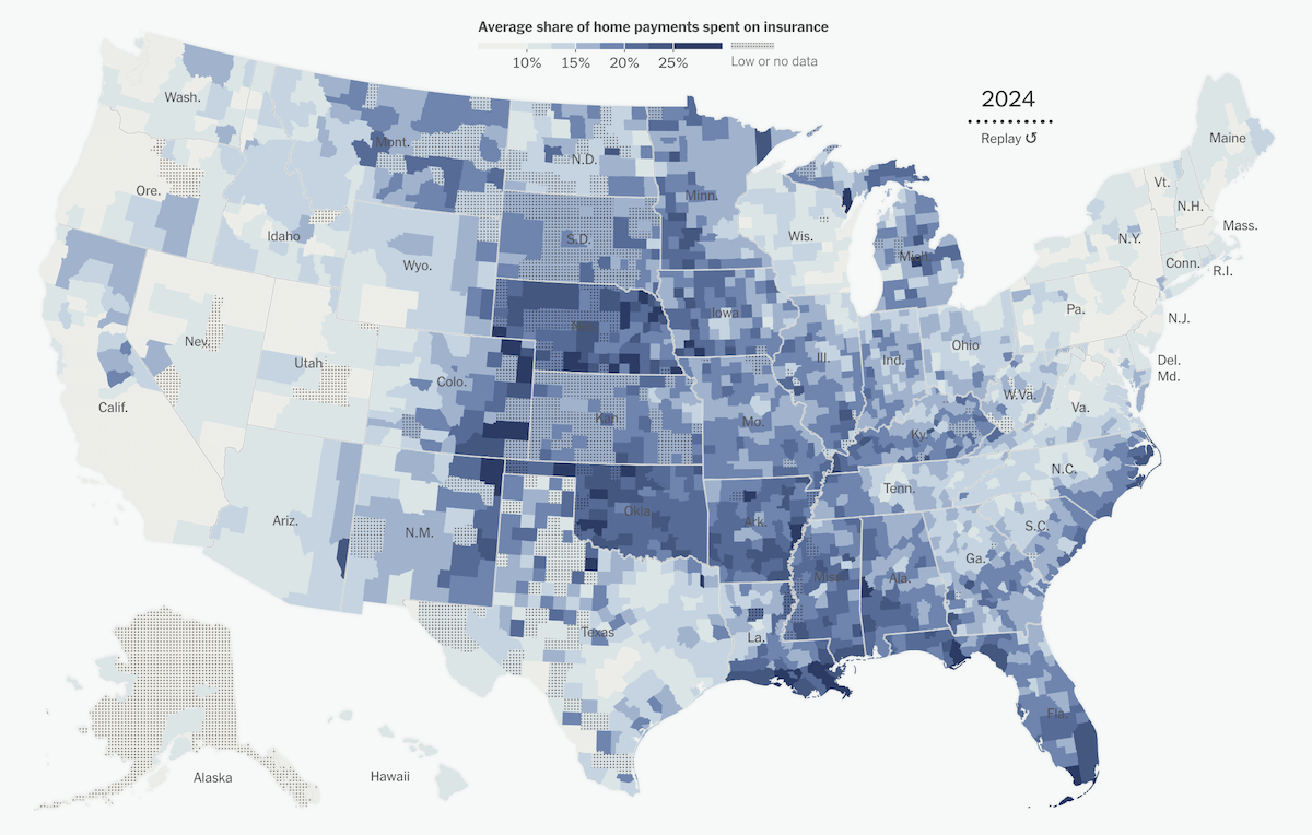
Home insurance has become much more expensive in parts of the United States where hurricanes, wildfires, and other climate-related hazards are common. Higher premiums are also putting pressure on home values in some of the most disaster-prone areas.
The New York Times examines this shift using data from a recent study by Benjamin Keys and Philip Mulder, who analyzed tens of millions of home payments. The article features animated choropleth maps that show how the situation evolved across the country for each year from 2014 to 2024. One displays average annual home insurance premiums, while the other shows the share of housing payments that goes to insurance. And because everything here turns on change over time, line charts were hard to avoid.
See the piece on The New York Times, by Mira Rojanasakul and Claire Brown.
Interactive Star Wars Galaxy Map

Star Wars has grown into a vast fictional universe with countless planets, sectors, and regions. That galaxy has also become a popular setting for tabletop roleplaying campaigns, where players run their own adventures in a familiar space.
Tim Sircoloumb created an interactive Star Wars galaxy map tailored for those games. The online starmap lets you pan and zoom around named worlds and regions, see major hyperspace lanes that link different parts of the galaxy, and quickly focus on well-known planets, core worlds, and remote systems that many fans will recognize. Registered users can also access built-in tools that tie into the map, including a dice roller for game sessions and premium features like route planning for plotting trips between systems.
View the map on Galaxy Dice Roller.
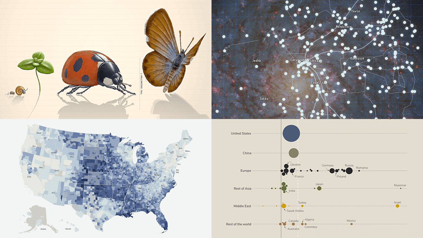
Sizes of Life on Earth
Made a site comparing the sizes of living things 🙂
The great Julius Csotonyi spent 5 months painting over 60 illustrations for the site, no ai used pic.twitter.com/8z9InrkHVQ
— Neal Agarwal (@nealagarwal) December 10, 2025
Countless life forms have existed on Earth. Their sizes span an enormous range, from microscopic organisms to giant ones that spread across entire landscapes.
Neal Agarwal turned this diversity into an interactive size scale that you scroll through from smallest to largest. The visualization shows illustrated examples at different points on the scale, covering microscopic structures, present-day species, and prehistoric creatures. Each entry uses a typical size drawn from available ranges, and many living species are tagged with conservation status such as endangered, while extinct species include approximate periods when they existed.
Explore the project at neal.fun.
Wrapping Up
From record defense spending and climate-driven home insurance costs to a galaxy map built for RPG sessions and an interactive scale of life on Earth, these projects show how visualization can let data talk in very different ways. Together, they are among the most compelling of all we have seen lately, both for what they show and how they invite exploration.
Stay connected for more visual data brilliance on Data Visualization Weekly.
- Categories: Data Visualization Weekly
- No Comments »