 2019 was very fruitful for the world of data visualization. We saw a lot of charts, maps, and infographics on all kinds of topics published here and there. Today we would like to invite you to recall some of the most top-notch data visualization projects. Enjoy these four awesome collections of the best charts of the past year:
- FlowingData’s picks for the best data visualization projects of 2019
- The Pudding’s favorite visual and data-driven stories of 2019 (the Pudding Cup winners)
- FiveThirtyEight’s 56 best (“and weirdest”) charts made in 2019
- Visual Capitalist’s top infographics of 2019
Best Charts of 2019 in Data Visualization Weekly: January 3, 2019 — January 10, 2019
Best Data Visualization Projects of 2019 — FlowingData

Nathan Yau, whose charts we had highlighted last year in DataViz Weekly quite often, selected ten data visualization works of 2019 that he loved the most.
- 3D elevation + 1878 USGS Yellowstone Geology Map (by Scott Reinhard)
- Gerry (by Ben Doessel and James Lee)
- Climate coverage on The New York Times
- Something’s Wrong (by Willikin Wolf)
- Taste the Rainbow (by Possibly Wrong)
- The Sleep Blanket (by Seung Lee)
- Maps of America’s wicked weather and deadly disasters (by Tim Meko, The Washington Post)
- The Atlas of Moons (by National Geographic)
- Try to impeach this? Challenge accepted! (by Karim Douïeb)
- Genesis (by Thomas Lin Pedersen)
The resulting collection is organized on Nathan Yau’s blog FlowingData in the awards-like style, and there you will find links to even more cool data visualization projects as honorable mentions.
Best Visual and Data-Driven Stories of 2019 — The Pudding

The Pudding’s team picked their favorite data visualization essays created in 2019 and named them the winners of the third-annual Pudding Cup. All the three projects are non-commercial.
- Can one earthquake trigger another on the other side of the world? (by Will Chase)
- The Unwelcomed (by Mohamad A. Waked)
- Shape of the Game: Tottenham vs Man United (by Vignesh Shenoy)
Best Charts Made by FiveThirtyEight in 2019
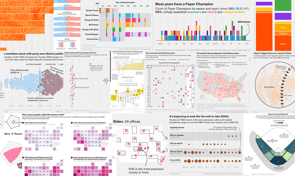
FiveThirtyEight’s visual journalists selected a few dozen of what they called their “most creative (and most unusual) creations” from hundreds of original graphics made by the team in 2019.
It would be useless to list them all here. So we simply invite you to check out the collection on FiveThirtyEight right away.
Visual Capitalist’s Top Infographics of 2019
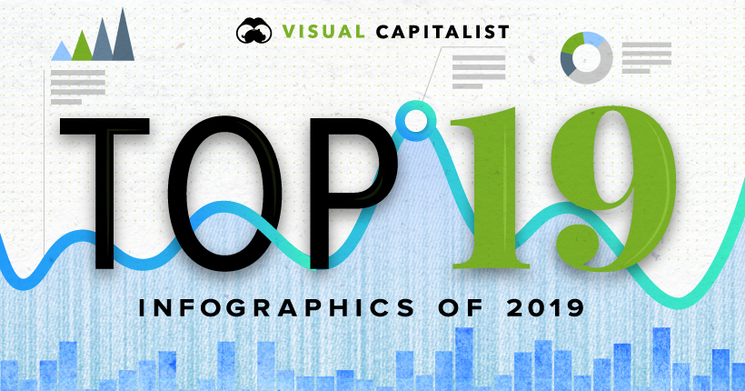
Over the course of 2019, Visual Capitalist published more than 300 posts on diverse topics. For their “Best Of” collection, the team identified the most popular infographics according to the number of views and also included their own favorites. In addition to that, they praised one more visualization that their subscribers had named the best during a poll.
- How Tech Giants Make Their Billions
- $69 Trillion of World Debt in One Infographic
- The Entire History of Tesla in 5 Minutes
- Ranking the Top 100 Websites in the World
- The Most Hyped Technology of Every Year From 2000-2018
- 70 Years of China’s Economic Growth In One Chart
- Visualizing the Happiest Country on Every Continent
- All of the World’s Carbon Emissions in One Chart
- The Countries With the Highest Housing Bubble Risks
- Walmart Nation: Mapping America’s Biggest Employers
- The World’s Biggest Oil Discoveries Since 1868
- The Race to Invest in the Space Economy
- Visualizing Corruption Around the World
- The Game of Life: Visualizing China’s Social Credit System
- The History of Esports
- A History of Revolution in U.S. Taxation
- Where the World’s Banks Make the Most Money
- The 20 Internet Giants That Rule the Web
- How Does Your Personality Type Affect Your Income?
- Viewer’s Choice: The Largest Economies in 2030
***
You can rest assured the new year will bring us a lot of new awesome data visualizations and choosing the best charts and infographics in 2020 will hardly become easier. Which is great! Stay tuned for Data Visualization Weekly and we will keep you posted on new data visualization projects worth seeing.
Thank you 2019! Welcome 2020!
- Categories: Data Visualization Weekly
- 2 Comments »