 A Venn diagram is a form of data visualization that uses shapes, generally circles, to show the relationships among groups of things. In this chart type, overlapping areas show commonalities while circles that do not overlap show the traits that are not shared.
Introduced by John Venn, an English mathematician, logician, and philosopher, Venn diagrams are also called set diagrams or logic diagrams since they show possible logical relations between elements of different sets. When drawing such charts, we will most probably be dealing with two or three overlapping circles, since having only one circle would be boring, and having four or more circles quickly becomes really complicated.
Not only are these diagrams good visualizations as a concept, but they also provide a great opportunity to represent qualitative data and a bit of graphic humor. Basically, they are easy and fun to build and use. I’ll show you right now!
Read this tutorial to learn how to easily create a visually appealing and informative Venn diagram for your website or app with the help of JavaScript. All the code used and demonstrated along the tutorial will be freely available for you to play with.
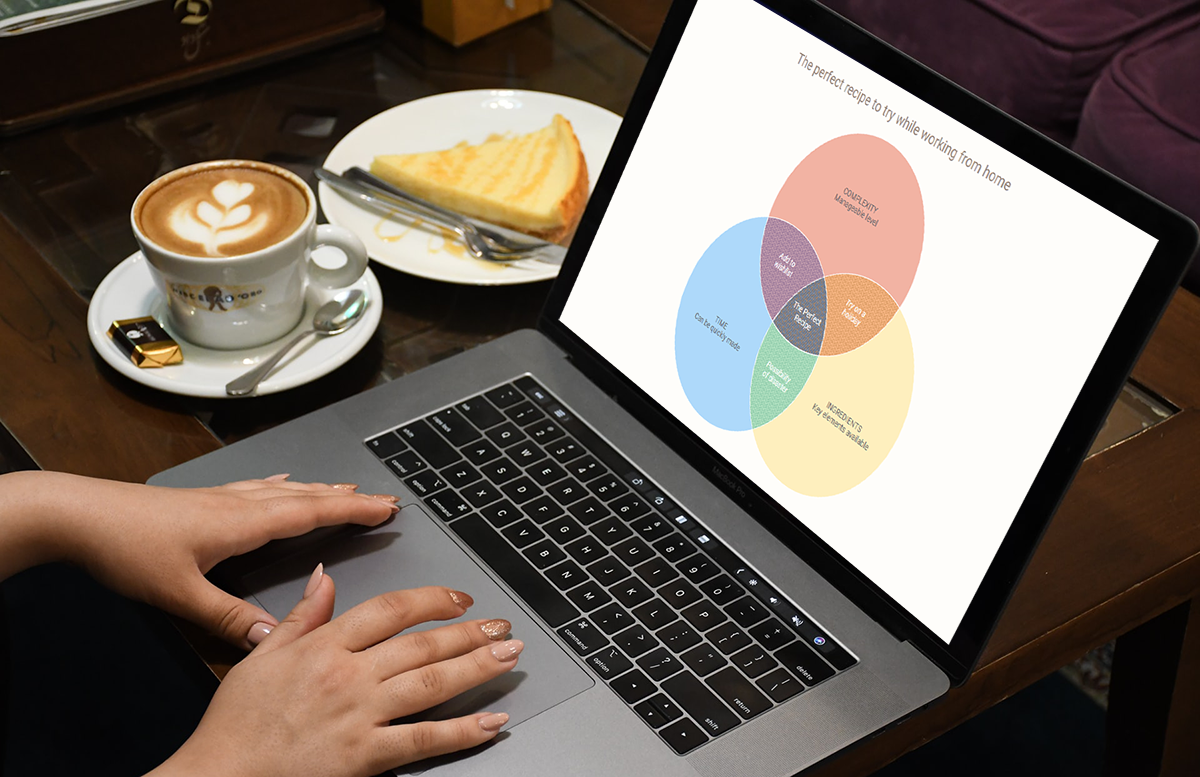
During the ongoing coronavirus pandemic, with working from home and avoiding food from outside, many of us have become amateur chefs. So, let us use a JS-based Venn diagram to find out what kind of recipe would be the best to try out on a working day — this is going to be a delightful use case to explore!
Spoiler: Venn Diagram To Be Developed
Before we begin, I decided to stimulate your appetite for a cool data visualization and learning experience and show you how the final interactive JavaScript Venn diagram will look.
Check it out and follow the charting tutorial!
4 Simple Steps to Basic JS Venn Diagram
Venn diagrams are a treat for the visualizers and the audience — they provide great value and quick insights while being straightforward to make and understand.
Let us see how we can make a Venn diagram using JavaScript (HTML5). It may not be as easy as creating circles on a paper napkin with different colored sketch pens (to compare dogs and cats maybe!). But believe me, it is almost that simple and definitely more exciting when you are doing things right.
We’ll start with a very basic Venn diagram and then customize it.
Actually, you should follow these 4 steps to build a beautiful JavaScript chart of literally any kind, including a Venn diagram:
- Create an HTML page for the chart.
- Include the necessary JavaScript files.
- Add the data.
- Write the JS code for the diagram.
1. Create an HTML page
Create a basic HTML page with a block-level element where the Venn diagram will be rendered. This div element will hold the chart and is given a unique id to reference it later.
<!DOCTYPE html>
<html>
  <head>
    <title>JavaScript Venn Diagram</title>
    <style type="text/css">
      html,
      body,
      #container {
        width: 100%;
        height: 100%;
        margin: 0;
        padding: 0;
      }
    </style>
  </head>
  <body>
    <div id="container"></div>
  </body>
</html>
The width and height of the container are set to 100% so that the chart fills the whole screen. You can set other values to change the size of the graphic as necessary.
2. Include the necessary JavaScript files
To create a JavaScript chart, it is necessary to link the appropriate JS scripts that are going to be used to develop it. These files have to be included inside the <script> tag in the <head> section of the HTML page.
Feel free to choose a JS library for data visualization as there are plenty of them out there and the approach is quite universal. In this tutorial, I will be using AnyChart. It is a flexible and powerful JavaScript charting library which makes it quite easy and fast to visualize data in robust graphs, so even beginners will be fine. For the Venn diagram, we will only need its core library module that is necessary for all charts and the dedicated module for creating this specific chart type.
You can download the required scripts and add them to the HTML page or include the CDN links as we do here for simplicity.
<!DOCTYPE html>
<html>
  <head>
    <title>JavaScript Venn Diagram</title>
    <script src="https://cdn.anychart.com/releases/8.9.0/js/anychart-core.min.js"></script>
    <script src="https://cdn.anychart.com/releases/8.9.0/js/anychart-venn.min.js"></script>
    <style type="text/css">
      html,
      body,
      #container {
        width: 100%;
        height: 100%;
        margin: 0;
        padding: 0;
      }
    </style>
  </head>
  <body>
    <div id="container"></div>
    <script>
      // All the code for the chart will come here
    </script>
  </body>
</html>
Note: We add a script tag in the body where we will write our code for creating the chart.
3. Add the data
Data is what makes the chart, and therefore, it’s an essential aspect of the visualization. A great advantage of AnyChart is that it provides various ways to add data. In this Venn diagram, we are using simple data so we can directly include the data into our page.
Every chart renders data in a specific form so it is important to make sure that we have the data in the way that makes sense for rendering the Venn diagram. It is very intuitive so nothing to be scared of.
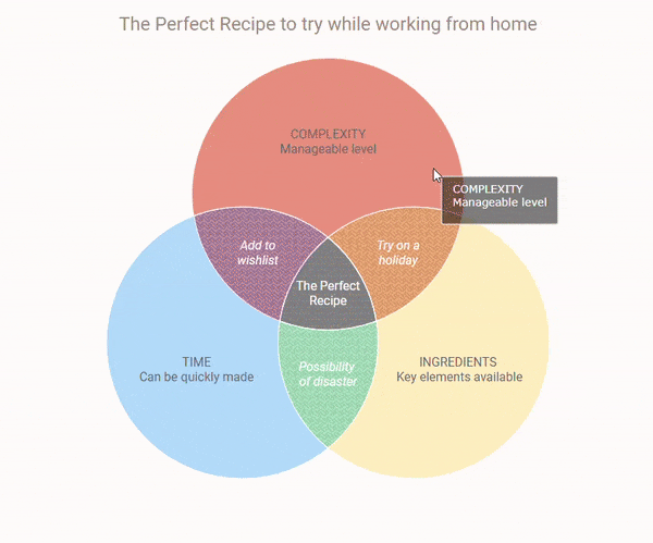
Our data is about the 3 facets that we consider while choosing a recipe to try out during these work-from-home times. A perfect recipe is one that has all the 3 favorable characteristics.
We list out the 3 attributes in consideration as 3 data points and the intersections of 2 combinations as well as all 3 of them as other separate data points.
The Venn diagram accepts an array of data so we structure the data likewise.
data = [
  {
    x: 'A',
    value: 100,
    name: 'TIME \n Can be quickly made'
  },
  {
    x: 'B',
    value: 100,
    name: 'INGREDIENTS \n Key elements available'
  },
  {
    x: 'C',
    value: 100,
    name: 'COMPLEXITY \n Manageable level'
  },
  {
    x: ['A', 'C'],
    value: 25,
    name: 'Add to \n wishlist'
  },
  {
    x: ['A', 'B'],
    value: 25,
    name: 'Possibility \n of disaster'
  },
  {
    x: ['B', 'C'],
    value: 25,
    name: 'Try on a \n holiday'
  },
  {
    x: ['A', 'B', 'C'],
    value: 25,
    name: 'The perfect \n recipe'
  }
]
The data points are given a value to indicate the amount of overlapping and non-overlapping. Since our data is qualitative, we have given each overlap the same value. The name indicates the description of each data point. The \n symbol seen in the description is a newline character that inserts a line break.
4. Write the JS code for the Venn diagram
Now that everything is in place, we are ready to see the magic happen! With just a few lines of code, we will have our basic Venn diagram ready.
All the JavaScript code is placed inside the <script> tag in the body of our HTML page. The first thing we do is add a function enclosing all the code, which makes sure that the code will only execute once the page is ready.
<script type="text/javascript">
  anychart.onDocumentReady(function() {
    // All the code for drawing the chart will come here
  });
</script>
Next, we add the data and create the chart using that data. Then we set the container to reference our previously added HTML element and draw the chart.
anychart.onDocumentReady(function () {
  var data = [{data}];

  // create venn diagram
  var chart = anychart.venn(data);

  // set container id for the chart
  chart.container('container');

  // initiate chart drawing
  chart.draw();
}
Our Venn diagram is drawn but we add just 2 more lines of code to give the chart a title and format the labels to represent the intersecting data text instead of values since that makes more sense for our subjective data.
// set chart title
chart.title('The perfect recipe to try while working from home');

// set labels settings
chart.labels().format('{%Name}');
Have a look at the result:
Check out this basic Venn diagram with the full JS/CSS/HTML code on Playground or CodePen.
Isn’t it a delight to see a fully functional, good looking, interactive Venn diagram created with JavaScript in so few lines of code?
Customizing Venn Diagram (To Make It Even More Awesome)
The AnyChart library provides a plethora of options to tweak the appearance of data visualizations. Whatever you do, there is always room for improvement, and we can definitely change a few things in our JS Venn diagram to make it more engaging, highlight some certain points, add functionality to understand the data better, or just polish the aesthetics to suit our taste!
The easiest way to change the look of the data viz is to try the various color themes that AnyChart offers. This can be done simply by adding the desired theme to the head of the page and then referencing it in the code.
<script src="https://cdn.anychart.com/releases/8.9.0/themes/pastel.min.js"></script>// set chart theme
anychart.theme('pastel');Let’s look at some other quick modifications in this tutorial:
- Overall chart appearance improvement.
- Custom colors for each data point.
- Font change.
- Special effects.
1. Overall chart appearance improvement
We will make some small changes here and there to refine the Venn diagram visualization. Again, you will see how easy it is to make these changes.
Since our Venn diagram shows the data points text on the chart, we do not really need the legend.
// disable legend
chart.legend(false);Then, let’s add a stroke to the circles that will make the intersecting areas stand out.
// set chart stroke
chart.stroke('1 #fff');And modify the text sizing, styling, and positioning to enhance the title and labels.
// set chart title
chart
.title()
.enabled(true)
.fontSize(24)
.padding({ bottom: 25 })
.text("The perfect recipe to try while working from home");
// set labels settings
chart
.labels()
.fontSize(14)
.fontColor("#5e6469")
.hAlign("center")
.vAlign("center")
.fontWeight("500")
.format("{%Name}");
// set intersections labels settings
chart
.intersections()
.labels()
.fontStyle("italic")
.fontColor("#fff")
.format("{%Name}");There you go:
Check out this half-way customized Venn diagram with the full JS/CSS/HTML code on Playground or CodePen.
2. Custom colors for each data point
When we want a different color for each of the data points, the best way is to add the color property to the data. In AnyChart, we can specify not only the colors for each area but also the colors on hovering and selecting those areas.
Let’s add normal, hovered, and selected properties to our data, as well as specify the fill color and opacity.
Here’s an example for data point A:
{
x: 'A',
value: 100,
name: 'TIME \n Can be quickly made',
normal: {fill: "#8ecafb 0.7"},
hovered: {fill: "#8ecafb 1"},
selected: {fill: "#8ecafb 1"}
}3. Font change
We can use existing fonts or add Google Fonts the way we’ll do it here. We’ll simply link the stylesheet of a Google font that we’d like to use in the head of the page and then specify that font family wherever we want to apply it.
<link href="https://fonts.googleapis.com/css2?family=Roboto:ital@0;1&display=swap" rel="stylesheet">// add this in the code
.fontFamily('Roboto, sans-serif')4. Some special effects
To spice up our JavaScript Venn diagram, let’s add a texture fill in the intersecting areas and some interesting text in the chart tooltip.
Since the tooltip text and texture fill color will be specific to each data point, we’ll include that in the data.
Here’s an example for one of the intersection data points:
{
x: ['A', 'C'],
value: 20,
name: 'Add to\n wishlist',
tooltipTitle: 'Add to wishlist',
tooltipDesc: 'Add the ingredients in the next shopping list',
normal: {fill: "#a98caf 0.6"},
hovered : {fill: "#a98caf 1"},
selected: {fill: "#a98caf 1"},
hatchFill:{
type:"weave",
color: "#8b6b92"
}
}Include this change in the code:
// set tooltip settings
chart.tooltip()
.titleFormat('{%tooltipTitle}')
.format("{%tooltipDesc}")
.background().fill("#000 0.5");Check out the final interactive JavaScript-based Venn diagram with all these customizations! For your convenience, its full code is right below the embedded interactive graphic.
<!DOCTYPE html>
<html>
<head>
<title>JavaScript Venn Diagram</title>
<script src="https://cdn.anychart.com/releases/8.9.0/js/anychart-core.min.js"></script>
<script src="https://cdn.anychart.com/releases/8.9.0/js/anychart-venn.min.js"></script>
<script src="https://cdn.anychart.com/releases/8.9.0/themes/pastel.min.js"></script>
<link href="https://fonts.googleapis.com/css2?family=Roboto:ital@0;1&display=swap" rel="stylesheet">
<style type="text/css">
html,
body,
#container {
width: 100%;
height: 100%;
margin: 0;
padding: 0;
}
</style>
</head>
<body>
<div id="container"></div>
<script>
anychart.onDocumentReady(function () {
// set chart theme
anychart.theme('pastel');
var data = [
{
x: 'A',
value: 100,
name: 'TIME \n Can be quickly made',
tooltipTitle: 'TIME \n Can be quickly made',
normal: {fill: "#8ecafb 0.7"},
hovered: {fill: "#8ecafb 1"},
selected: {fill: "#8ecafb 1"}
},
{
x: 'B',
value: 100,
name: 'INGREDIENTS \n Key elements available',
tooltipTitle: 'INGREDIENTS \n Key elements available',
normal: {fill: "#ffeaa6 0.7"},
hovered: {fill: "#ffeaa6 1"},
selected: {fill: "#ffeaa6 1"}
},
{
x: 'C',
value: 100,
name: 'COMPLEXITY \n Manageable level',
tooltipTitle: 'COMPLEXITY \n Manageable level',
normal: {fill: "#ee957f 0.7"},
hovered: {fill: "#ee957f 1"},
selected: {fill: "#ee957f 1"}
},
{
x: ['A', 'C'],
value: 20,
name: 'Add to \n wishlist',
tooltipTitle: 'Add to wishlist',
tooltipDesc: 'Add the ingredients in the next shopping list',
normal: {fill: "#a98caf 0.6"},
hovered: {fill: "#a98caf 1"},
selected: {fill: "#a98caf 1"},
hatchFill: {
type:"weave",
color: "#8b6b92"
}
},
{
x: ['A', 'B'],
value: 20,
name: 'Possibility \n of disaster',
tooltipTitle: 'Possibility of disaster',
tooltipDesc: 'Keep a backup ready',
normal: {fill: "#9fdebe 0.8"},
hovered: {fill: "#9fdebe 1"},
selected: {fill: "#9fdebe 1"},
hatchFill: {
type:"weave",
color: "#83c3a3"
}
},
{
x: ['B', 'C'],
value: 20,
name: 'Try on a \n holiday',
tooltipTitle: 'Try on a holiday',
tooltipDesc: 'When there is no other work pending',
normal: {fill: "#f5b57c 0.8"},
hovered: {fill: "#f5b57c 1"},
selected: {fill: "#f5b57c 1"},
hatchFill: {
type:"weave",
color: "#d09259"
}
},
{
x: ['A', 'B', 'C'],
value: 30,
name: 'The Perfect \n Recipe',
tooltipTitle: 'The Perfect Recipe',
tooltipDesc: 'Easy to follow and fast to cook with whatever is in the kitchen',
label: {enabled:true, fontStyle: 'normal'},
normal: {fill: "#8392ab 0.9"},
hovered: {fill: "#8392ab 1"},
selected: {fill: "#8392ab 1"},
hatchFill: {
type:"percent40",
color: "#5f6b7d"
}
}
];
// create venn diagram
var chart = anychart.venn(data);
// set chart title
chart
.title()
.enabled(true)
.fontFamily('Roboto, sans-serif')
.fontSize(24)
.padding({ bottom: 30 })
.text('The Perfect Recipe to try while working from home');
// set chart stroke
chart.stroke('1 #fff');
// set labels settings
chart
.labels()
.fontSize(16)
.fontColor('#5e6469')
.hAlign("center")
.vAlign("center")
.fontFamily('Roboto, sans-serif')
.fontWeight('500')
.format('{%Name}');
// set intersections labels settings
chart
.intersections()
.labels()
.fontStyle('italic')
.fontColor('#fff')
.format('{%Name}');
// disable legend
chart.legend(false);
// set tooltip settings
chart
.tooltip()
.titleFormat('{%tooltipTitle}')
.format("{%tooltipDesc}")
.background().fill("#000 0.5");
// set container id for the chart
chart.container('container');
// initiate chart drawing
chart.draw();
});
</script>
</body>
</html>See this customized Venn diagram with the full JS/CSS/HTML code on Playground or CodePen.
Conclusion
This tutorial shows you how to quickly whip up a Venn diagram and make it more appealing with the various enhancements. You can play around with colors, patterns, and other possible customization alternatives. To learn more about the Venn diagram as a chart type, see its profile on Chartopedia.
Some working knowledge of HTML and JavaScript is always helpful. But as we saw, creating visualizations with a robust JavaScript charting library with pre-built chart types and out-of-the-box features is so simple that even without any technical knowledge, it is easy to make useful and beautiful interactive charts. Also, the great thing about AnyChart specifically is that there are extensive documentation and other resources to help create and customize the visualizations without hassle.
We at AnyChart are glad to thank Shachee Swadia, an experienced data designer, for creating this amazing tutorial.
If you want to write a compelling guest post for our blog, get in touch.
To continue learning and practicing with data visualization, check out other JavaScript charting tutorials and see the full list of charts you can build and main features you can make use of with AnyChart. Then, have fun creating stunning visualizations, in a quick and effortless way.
- Categories: AnyChart Charting Component, HTML5, JavaScript, JavaScript Chart Tutorials, Tips and Tricks
- 2 Comments »
Comments (2)
Thanks for this wonderful post and wonderful description. You’re a champion! How can I add hyperlinks or bottoms into the different circles of the Venn diagram?
Hi Kaleb. Thank you very much for your feedback! We are happy you like this Venn diagram tutorial.
Regarding your question, you can achieve that by using event listeners. Check out this example we have made to let you quickly see how this option can work.
If you need further assistance, please contact our Support Team directly and one of our engineers will be more than happy to help you out.