 It is Friday the 13th. But don’t worry about the irrational! Check out the four really cool data visualization projects we have discovered around the web these days and you will be fine, entertained, and inspired.
Today on DataViz Weekly:
- Codebase visualization in packed bubble charts — GitHub OCTO
- Climate change impacts through 2099 — Climate Impact Lab
- Shifts in U.S. time use patterns during the pandemic — Nathan Yau
- 50 years of social change in England and Wales — ONS
Data Visualization Weekly: August 6, 2021 — August 13, 2021
GitHub Codebase Visualization in Packed Bubble Charts
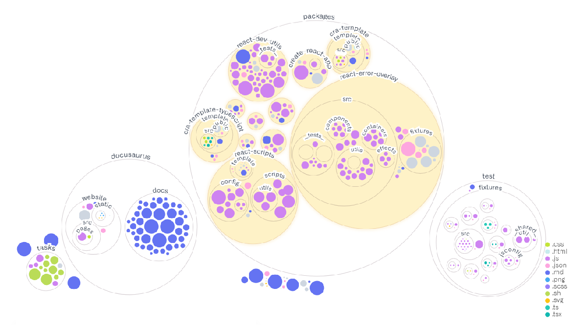
When you are looking at a GitHub repository that you are not yet familiar with, how quickly can you find the code for some specific function? Generally, is there a more helpful way to represent the codebase than the typical folder-and-file view?
Amelia Wattenberger, a staff engineer at GitHub’s Office of the CTO (OCTO), made use of packed bubbles to visualize the codebase structure. And this technique appears to actually work really well at providing a better overview.
For example, the picture above shows how the Facebook/Create-React-App repo looks when folders and files are displayed as nested circles. The type and size of the files are represented by the color and size of the circles, respectively.
Check out Amelia’s article on GitHub OCTO to learn more and try out this way of codebase visualization for your own repos. Here is how some of ours look, for example:
Climate Change Impacts Through 2099
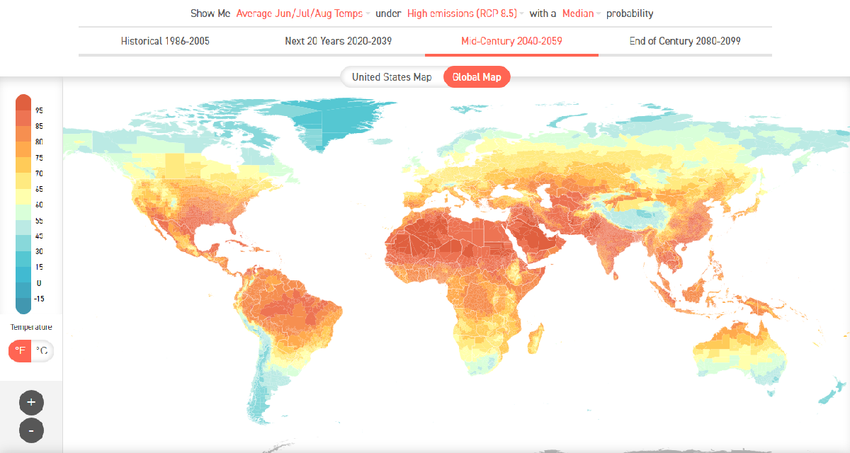
If you are wondering how climate change is going to affect you personally, take an especially close look at this new fascinating interactive data visualization project. Based on a complex projection methodology and made public by Climate Impact Lab just about now, the Climate Impact Map provides a detailed picture of what influence increasing temperatures and greenhouse gas emissions will have across the globe through the end of the 21st century.
You can easily make the map display the expected shifts in the average summer, winter, and annual temperatures. As well as in the number of cold (under 32°F) and warm (over 95°F) days year-wise. Switch between “Absolute Level” and “Change From Historical” views depending on exactly what you want to understand. The project also allows you to explore the mortality costs predicted by experts, in the percentage of GDP.
In addition to the global map, there is a separate map for the United States.
Shifts in American Time Use During Pandemic
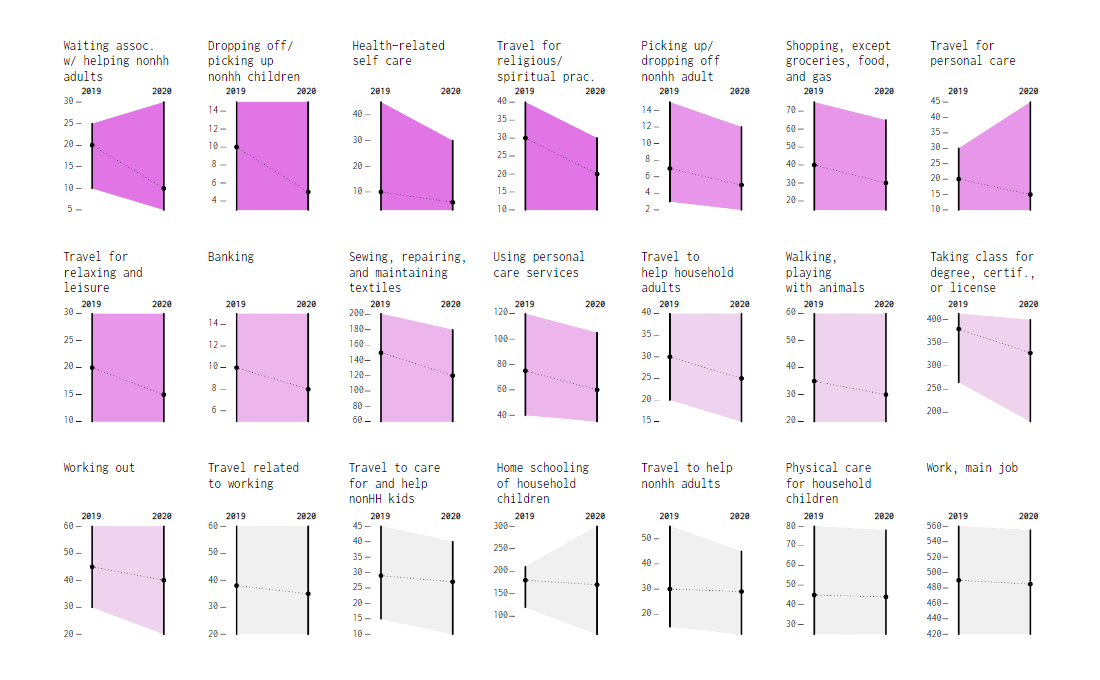
It should go without saying that the pandemic changed how we spent our time. The United States Bureau of Labor Statistics (BLS) recently published the 2020 American Time Use Survey results which allow us to look into these shifts and find out their amount registered for individual activities.
Nathan Yau’s slope charts nicely highlight what was different in 2020 compared to 2019 and by how much. For example, the picture above shows the activities where Americans spent less time during the first pandemic year than before. The more purple the fill, the sharper the decline. Shapes like one for home schooling of household children indicate a significant divide across the board.
Check out more charts with explanations on FlowingData.
50 Years of Social Change in England and Wales
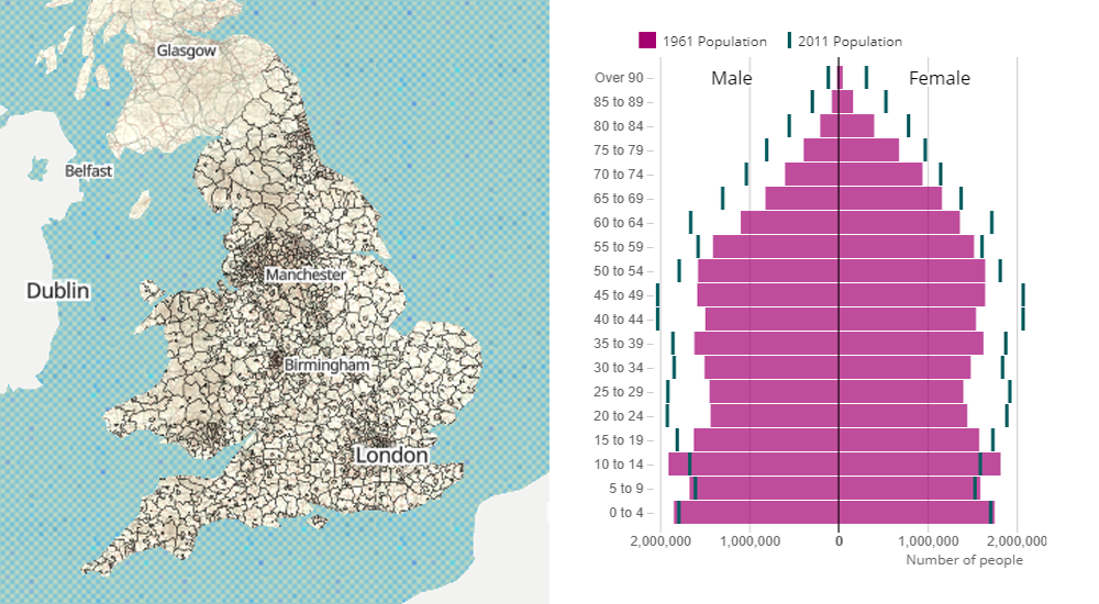
In 1961, life in England and Wales was dramatically different from the current times. Some of the shifts can now be clearly seen and analyzed even at a local level thanks to Office for National Statistics.
Aiming to explore social change, the agency digitized data from the 1961 Census Small Area Statistics using OCR technologies and help from more than 2,800 volunteers. Then the data was visualized in several interactive maps, providing tools for side-by-side comparisons with the figures from the 2011 Census, the latest completed British census as of now.
Look at what the new ONS data visualizations reveal about how the norms across England and Wales changed over the fifty years from 1961 to 2011 when it comes to population age, home ownership, marriage status, and more.
***
It is always a pleasure to see you on our blog! Stay tuned for awesome data visualization examples, tutorials, case studies, and more!
- Categories: Data Visualization Weekly
- No Comments »