 A clear step-by-step guide for building an interactive JS Circle Packing Chart to visualize the top 100 most streamed songs on Spotify.
Want to learn to visualize hierarchical data in stunning circle packing charts that can be added to a web page or app in a hassle-free manner? Don’t feel overwhelmed and just follow my stepwise data visualization tutorial! Using a cool example of data on the top 100 most streamed songs on Spotify, I will show you how to easily create and customize a great-looking interactive circle packing chart with JavaScript.
What Is a Circle Packing Chart
Let me start by giving you a brief about what a circle packing chart is and how it is used.
Also known as a circular tree, a circle packing chart is basically a treemap showcasing hierarchical data, where circles denote nodes and sub-nodes are circles inside the node circle.
The size of the circle denotes the value of the node.
The circular packing representation denotes hierarchy well, providing a convenient visual breakdown by groups and subgroups.
Previewing the Circle Packing Chart That Will Be Produced
Take a look at what I am going to build — the final JS circle packing chart that will be created by the end of the tutorial — and come along on this musical ride!
Building a JS Circle Packing Chart in 4 Simple Steps
An embeddable circle packing chart looks exciting but challenging to create. However, there are many JavaScript charting libraries specifically designed to help everyone build various data visualizations. And once you’ve found one which provides a built-in circle packing option out of the box, it is usually pretty quick and straightforward to get such an interactive chart conjured up even if you are a beginner with (yet) limited coding skills.
Technically, the steps, which the entire process of creating a circle packing data visualization consists of, remain more or less the same with any JS charting library. In this tutorial, I will be using AnyChart for illustration. It is pretty easy to start off, with detailed documentation and many ready-to-use examples that can work as a good starting point for quickly building a chart of any type, including this one. Also important, the library is free for non-commercial use.
So, the basic steps to create a JS Circle Packing Chart number four and are as follows:
- Make an HTML page for the chart.
- Include the necessary JS files.
- Add the data.
- Write the required JavaScript code for drawing the chart.
1. Create an HTML page
The first thing I do is create a basic HTML page where the chart will be placed. Next, I create an HTML block element, div and assign it an ID attribute like “container” to easily identify it later in the code.
<!DOCTYPE html>
<html lang="en">
  <head>
    <meta charset="utf-8">
    <title>JavaScript Circle Packing Chart</title>
    <style type="text/css">
      html, body, #container {
        width: 100%;
        height: 100%;
        margin: 0;
        padding: 0;
      }
    </style>
  </head>
  <body>
    <div id="container"></div>
  </body>
</html>
I define the styling of the block such that the chart renders over the whole page by giving the height and width attributes the value of 100%. Feel free to specify it the way you want to do your task, of course.
2. Include the necessary JavaScript files
Then, I need to add the scripts I am going to use to create the circle packing chart I want to develop. It is usually possible to reference the necessary files from the CDN of the library you are using or download them to your local machine.
To create this chart in this tutorial, I am employing the AnyChart library. It has a modular structure that makes it easy to only connect the chart types and features you require at the moment, reducing the size of the running JavaScript code. In this case, I need the core module together with the specific circle packing module. So I include both in the head section of the HTML page created in the first step.
<!DOCTYPE html>
<html lang="en">
  <head>
    <meta charset="utf-8">
    <title>JavaScript Circle Packing Chart</title>
    <script src="https://cdn.anychart.com/releases/8.11.0/js/anychart-core.min.js"></script>
    <script src="https://cdn.anychart.com/releases/8.11.0/js/anychart-circle-packing.min.js"></script>
    <script src="https://cdn.anychart.com/releases/8.11.0/js/anychart-data-adapter.min.js"></script>

    <style type="text/css">
      html, body, #container {
        width: 100%; height: 100%; margin: 0; padding: 0;
      }
    </style>
  </head>
  <body>
    <div id="container"></div>
    <script>
      // All the code for the JS Circle Packing Chart will be here.
    </script>
  </body>
</html>
3. Add the data
I decided to visualize the 100 most streamed songs on Spotify using a dedicated dataset from Kaggle. I reworked the data a little bit to make it look the way I need and saved it in a JSON file.
To load the data from the JSON file, I will utilize a handy module called Data Adapter. So I include it in the list of the referenced scripts in the head section and use the anychart.data.loadJsonFile function to add this data file in the code.
Now that all the preparations are done, let’s get on to the last step for creating this impressive, interactive, JS-based packed circle chart!
4. Write the JavaScript code for your chart
Some background knowledge of web development technologies like HTML and JavaScript is always an advantage when creating visualizations and writing code that may seem complicated. However, it can take just as few as about 6 to 7 lines of code to create a circle packing chart this way. So it is not going to be complicated at all anyway. Isn’t that music to your ears?
Initially, I add a function that encloses all the code, ensuring it is executed once the page is ready. Then I include the data inside this function.
Now I define a function with the data parameter and map the data using the data.tree function. I add the mapped data to the circlePacking function.
anychart.onDocumentReady(function () {
  anychart.data.loadJsonFile('https://gist.githubusercontent.com/shacheeswadia/17dc3b3d4ac9b63ac5ac6833944f3a94/raw/07c4bec103d22ec2824453a33d41868fd476db3d/dataPackedCircles.json',
    function(data) {
      var treeData = anychart.data.tree(data, 'as-table');
      var chart = anychart.circlePacking(treeData);
    }
  );
});
Finally, I also make a title, add a reference to the previously defined container, and draw the resulting circle packing chart.
anychart.onDocumentReady(function () {
  anychart.data.loadJsonFile('https://gist.githubusercontent.com/shacheeswadia/17dc3b3d4ac9b63ac5ac6833944f3a94/raw/07c4bec103d22ec2824453a33d41868fd476db3d/dataPackedCircles.json',
    function(data) {

      // add data
      var treeData = anychart.data.tree(data, 'as-table');

      // create a circle packing chart instance
      var chart = anychart.circlePacking(treeData);

      // add a chart title
      chart.title("Top 100 most streamed songs on Spotify by genre")

      chart.container('container');
      chart.draw();

    }
  );
});
Tada! A fully functional circle packing chart is built with so little effort!
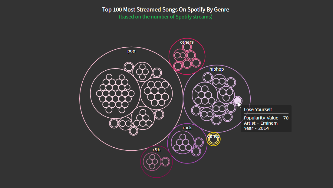
The pop genre is clearly visible as the most popular among Spotify’s 100 most streamed songs. I am more of a dance genre person myself, and you may be a rock or rhythm and blues fan. But unsurprisingly, pop and hip-hop are the definite crowd favorites.
You can find the entire code of this basic JavaScript packed circle chart on CodePen [and on AnyChart Playground.)
Customizing a JS Circle Packing Chart
The initial version of this JavaScript-based circle packing chart definitely looks pretty and can be used right away. But I also want to show you some simple ways to make a data visualization of this type even more impressive, stylish, and powerful.
Color modification
To add a bit more jazz to the chart, I change the colors of the bubbles. Using one of AnyChart’s pre-built design themes this can be done very easily. I choose the “dark glamour” theme, so I add its script and set the theme in the code.
<script src="https://cdn.anychart.com/releases/8.11.0/themes/dark_glamour.min.js"></script>

...

anychart.theme('darkGlamour');
I want to give a transparent background effect to the circles, so I set the background and the fill for the circles as the same color. I thicken the strokes for the circles and set the color of the stroke to the theme color.
chart.background('#333');

chart.fill('#333');

chart.stroke(function () {
  return {
    thickness: 2,
    color: this.sourceColor
  };
});
Title improvement
To make the title more prominent, I use HTML specifying the font size and color. I also add a second line to make a subtitle.
chart
  .title()
  .enabled(true)
  .useHtml(true)
  .text(
    '<span style = "color: #fff; font-size:20px;">Top 100 most streamed songs by genre</span>' +
    '<br/><span style="color:#1db954; font-size: 18px;">(Based on the number of Spotify Streams)</span>'
  );
Check out this customized version of the JS packed circles chart here [or on AnyChart Playground.]
Tooltip formatting
One of the best ways to make an interactive data visualization more informative is to add more details to the tooltip. The dataset contains information about the artist and the year of each song, along with its popularity value. So I include all this information in the tooltip of the circle packing chart using HTML.
chart
  .tooltip()
  .useHtml(true)
  .titleFormat('{%name}')
  .format( function(){
    let dataValue = this.item.ka;
    if(this.depth == 2){
      return '<span style = font-size:14px;">Popularity Value - ' + dataValue.value + '</span>' +
      '<br/>lt;span style = font-size:14px;">Artist - ' + dataValue.artist + '</span>' +
      '<br/><span style = font-size:14px;">Year - ' + dataValue.year + '</span>'
    }else{
      return '<span style = "color: #fff; font-size:14px;">Popularity Value - ' + this.value + '</span>'
    }
  });
That’s all! An elegant and enlightening JavaScript Circle Packing Chart is designed and ready to serve.
Check out the entire code with all the customizations on CodePen [or on AnyChart Playground.]
Conclusion
You can see how building a creative chart like the packed circles is so uncomplicated. There are tons of different types of data visualization that you can learn to create using various JS charting libraries. Or start by looking into other chart options available in AnyChart.
Let me know if you have any questions about building this chart or any other doubts. Music is good for the soul and creating visualizations is good for the mind, so let’s listen to more songs and build more charts!
Published with the permission of Shachee Swadia. Originally appeared on Level Up Coding with the title “How to Create a Circle Packing Chart Using JavaScript” on January 3, 2022.
Don’t miss out on our other JavaScript charting tutorials.
If you have an idea for an interesting guest post, you’re more than welcome to let us know about it!
- Categories: AnyChart Charting Component, Big Data, HTML5, JavaScript, JavaScript Chart Tutorials, Tips and Tricks
- No Comments »