 In 2021, there were 53 Fridays. It means a total of 53 DataViz Weekly roundups came out during the year, putting a spotlight on some of the most interesting charts, maps, and infographics from around the web. Today, on the first Friday of 2022, we invite you to remember — or get to know in case you missed something — the very best data visualizations of 2021.
As in previous “best of year” collections (2020, 2019, 2018), we decided not to reinvent the wheel but to take a quick look at renowned experts’ picks. Now, check out four lists of the best projects — from Nathan Yau, Kenneth Field, Terence Shin, and DataJournalism.com.
Best Data Visualization Projects of 2021 — Nathan Yau
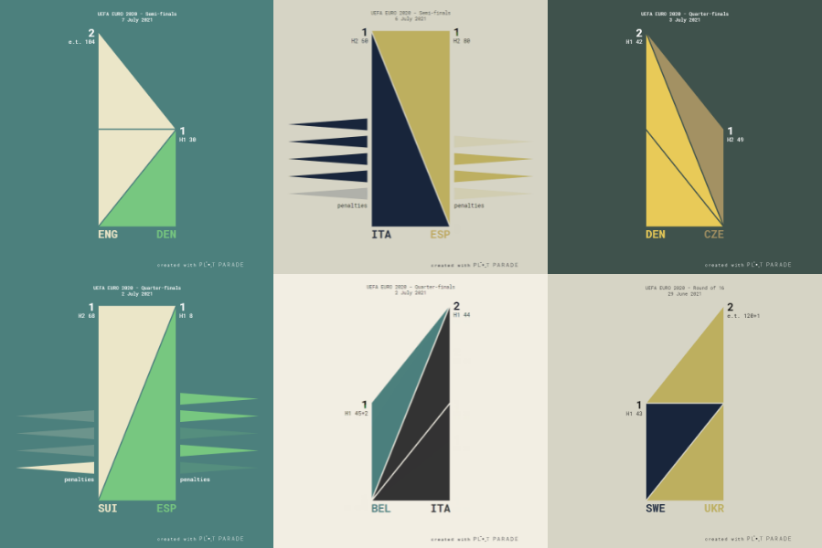
Statistician and data visualizer Nathan Yau selected eleven projects as his personal favorites and used an awards-like style of presenting each. For example, Krisztina Szűcs’s “UEFA 2020 Chart Gallery” (featured on DataViz Weekly in July) is listed as the “Best Fresh Visualization of Soccer Matches,” “Africa’s Rising Cities” by The Washington Post (featured in December) as the “Best Walk-Through Showing Scale of Unfamiliar Areas to Most,” and so on. Some categories also include runner-ups. The entire list of the best data visualizations of 2021 mentions seventeen projects.
Best Atlas of Things That Are Difficult to See in Real Life
- Atlas of the invisible — by James Cheshire and Oliver Uberti
Best Demonstration of a Big Ship Stuck in a Canal
- Ever Given ever ywhere — by Garrett Dash Nelson
Runner-ups:
- Steer through the Suez Canal — by Sarah-Grace Mankarious and Marco Chacón for CNN
- Scale-a-tron — by Stamen
- How the Ever Given was freed from the Suez Canal: A visual analysis — by Atthar Mirza, Júlia Ledur, and Ruby Mellen for The Washington Post
Best Overview of Visualization Research That Is Not Overly Pedantic
- The science of visual data communication: What works — by Steven L. Franconeri, Lace M. Padilla, Priti Shah, Jeffrey M. Zacks, and Jessica Hullman
Runner-up:
- alt.VIS workshop at IEEE VIS 2021
Best Fresh Visualization of Soccer Matches
- UEFA 2020 chart gallery — by Krisztina Szűcs
Runner-up:
- All the passes — by Karim Douïeb
Best What-If Reopening Scenario
- Why opening windows is a key to reopening schools — by The New York Times
Runner-up:
- What will it be like when we go back to the office? — by Sarah Slobin and Feilding Cage for Reuters
Best Use of Step-Wise Moving Bubbles
- This is how everyday sexism could stop you from getting that promotion — by Jessica Nordell and Yaryna Serkez for The New York Times Opinion Section
Best Gratuitous Use of 3-D Modeling to Satisfy a Curiosity
- The fry universe — by Chris Williams
Best Walk-Through Showing Scale of Unfamiliar Areas to Most
- Africa’s rising cities — by The Washington Post
Best Bat Illustrations with Traditional Charts
- Bats and the origin of outbreaks — by Julia Janicki and Simon Scarr, with illustrations by Catherine Tai, for Reuters
Best Way to See Where a Raindrop Ends Up
- River runner — by Sam Learner
Best Deep Dive Into How the Ultrawealthy Make and Spend Money
- The secret IRS files — by ProPublica
Best Maps of 2021 — Kenneth Field
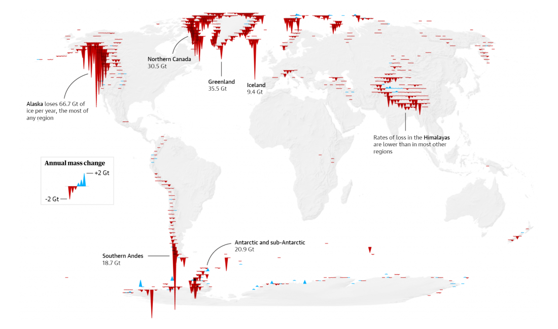
Cartographer Kenneth Field included (also) seventeen projects in his selection of favorite maps. You can see one of them shown in the image above, “Global Glacier Loss” by Niko Kommenda from The Guardian. The last on the list is a map produced by Kenneth himself: “Screwed,” an awesome physical multivariate thematic map of the 2020 U.S. presidential election results, which totally deserves being praised as one of the best map-based data visualizations of 2021, too.
- Stamen 2020 headquarters — by Catalina Plé
- 500,000 lives lost — by NBC News
- Population change by US state since 2010 — by Adrian Blanco and Tim Meko for The Washington Post
- Global glacier loss — by Niko Kommenda for The Guardian
- San Marino bus map — by Jug Cerovic
- It’s coming home — by Dan Willan-Vasey
- Algonquin canoe trip — by Warren Davison
- Tokyo Olympics opening ceremony drone globe — by NBC Sports
- Atlas of the invisible — by James Cheshire and Oliver Uberti
- St. Vincent Island — by Aaron Koelker
- Arctic warming — by Greg Fiske, Woodwell Climate Research Center
- The lost treasures of Isla del Coco — by Jakob Listabarth
- La Réunion — by Institut Geographique National (IGN, France)
- Murky waters: Unmapped areas of seafloor — by Andrew Douglas Clifford
- Deception Island — by Centro Geográfico del Ejercito / Army Geographic Centre (CEGET, Spain)
- Penguinland — by Danai-Maria Kontou
- Screwed — by Kenneth Field
The 10 Best Data Visualizations of 2021 — Terence Shin
Data scientist Terence Shin shared a list of the ten data visualizations that he believes are the best in 2021. All the highlighted projects had been exhibited in the r/dataisbeautiful subreddit, and here, each is provided with a link to the corresponding post. “I wanted to share visualizations that were not only unique, but also ones that were relevant with particular trends this year, like COVID, climate change, and more,” he explained in a quick introduction.
- Alcohol consumption over time — by Sjoerd Tilmans
- 221 years of health and wealth — by James Eagle
- A 3-D map of Earth’s fiber optic cable network — by Tyler Morgan-Wall
- COVID cases in the US — by Velimir Gasparovic
- Choropleth map of COVID in the US — by David A. West
- Housing prices over time — by James Eagle
- A map of all mental disorders — by James Eagle
- China’s CO2 emissions — by Peter Gorman
- Where does our plastic go? — by Patrick Drake and Alana Sharp
- The top 100 artists from 1960 to 2020 — by u/takeasecond
Best Data Journalism Projects of 2021 — DataJournalism.com
Data visualization is an integral part of data journalism, making it easier to provide a clear understanding of complex situations along with an immediate and profound impression. So we are also glad to show you this one more cool “best of year” selection. The team of DataJournalism.com made their choice of the (twelve) best data journalism projects of 2021.
- Pandora Papers — by ICIJ
- Afghanistan, visualising 20 years of war — by Al Jazeera
- Hot and humid Olympic summer — by Reuters Graphics
- Digital violence: How the NSO Group enables state terror — by Forensic Architecture
- The underwater ‘hotspot’ feeding La Palma’s volcano will create new islands — by El País
- Following the science — by The Pudding
- COVID-19 Vaccination Tracker — by Reuters
- America’s food safety system failed to stop a Salmonella epidemic. It’s still making people sick — by ProPublica
- Sexual violence in Singapore — by Kontinentalist
- The climate crisis, by the numbers: Your guide to humanity’s greatest challenge — by BuzzFeed News
- Visualised: Glaciers then and now — by The Guardian
- What it takes to understand a variant — by The New York Times
***
A lot of great charts, maps, and infographics were created in 2021. Let’s see what 2022 will be in that regard! Stay tuned for DataViz Weekly on the AnyChart blog for regular updates on the most interesting and simply the best data visualizations as they come out around the internet!
You can check out previous “best of year” collections here: 2020, 2019, 2018. To recall 2021 in data graphics, see our last week’s 2021 year in review post in case you missed it.
All the best in 2022!
- Categories: Data Visualization Weekly
- No Comments »