 For this DataViz Weekly, we have curated a collection of wonderful new visual storytelling examples from around the web. Take a look through and check them out!
- Rapid urban growth in Africa — The Washington Post
- Maritime activities in the North Sea — TU Delft
- All provisions of the Build Back Better Act — The Upshot
- Climate pledges after COP26 — The Guardian
Data Visualization Weekly: November 26, 2021 — December 3, 2021
Rapid Urban Growth in Africa
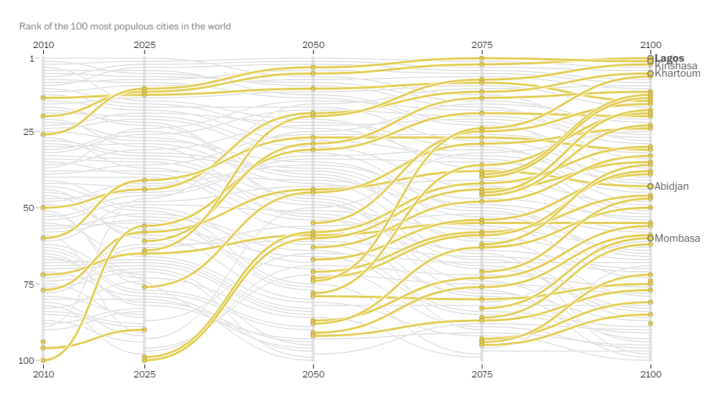
Asia is home to the majority of the world’s most populous cities. However, things are going to change already very soon. Researchers expect Africa to remain the only continent with a growing population by the end of the century. Accompanied by a slowdown in today’s major urban areas around the world, it will result in 13 of the world’s 20 biggest megalopolises being in Africa in 2100.
You can find out more about how Africa is becoming the center of the global urban future in an impressive visual storytelling piece on The Washington Post. Dylan Moriarty and Júlia Ledur did a great job working with data and graphics to show how huge the projected growth of African cities is going to be. The article also zooms in to five of them to delve into the forces shaping the rapid urban rise on the continent: Lagos (Nigeria), Khartoum (Sudan), Kinshasa (Congo), Mombasa (Kenya), and Abidjan (Ivory Coast).
For example, there you can take a better view and tour of the chart displayed above, which represents how the ranking of the world’s 100 most populous cities is expected to change (see the PDF here if you want). But there is really much more to check out both in terms of facts and trends and how such big stories can be told using various visuals.
Maritime Activities in North Sea
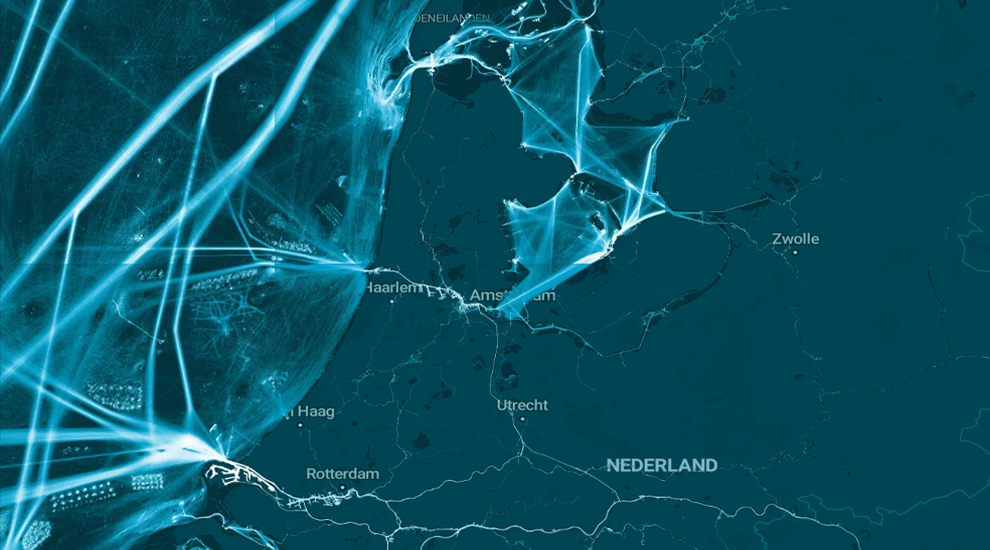
The North Sea off the coast of the Netherlands is actually very busy. A stunning new project shows it at a glance, providing a comprehensive view of the bustle in and around that area.
Researchers at Delft University of Technology (TU Delft) and Deltares, led by Solange van der Werff, managed to create a uniquely detailed map of the maritime traffic activities off the Dutch coast using the automatic identification system (AIS) data provided by Rijkswaterstaat along with the computational power of Microsoft’s Planetary Computer. It displays a total of nearly four billion points collected over a four-month period with a resolution of only a couple of meters per pixel.
Presented to wide audiences in a compelling visual storytelling project, the map zooms and pans as you scroll, highlighting the main shipping routes along with wind farm locations, dredging work sites, cables and pipelines, and more. In this way, it is possible to get a clear understanding of which space is already in use and to what extent, which should help plan future developments in that part of the North Sea.
Build Back Better Act Provisions

Following months of negotiations, the Build Back Better Act was finally passed by the U.S. House of Representatives. Designed to fulfil a large part of President Joe Biden’s domestic agenda on tackling the social safety net and climate change, the bill is worth about $2.2 trillion.
For everyone who wants to understand where this money is projected to come from and go to, The New York Times’s The Upshot published a story that outlines its provisions in a fascinating visual format. Created by Quoctrung Bui and Alicia Parlapiano, the piece is centered around a treemap representing spending and tax cuts on the left and how the bill is paid for on the right. As you scroll through the table, which is based on estimates from the Congressional Budget Office, the chart remains at the top and highlights the categories being viewed: families, climate, health care, immigration, and so on.
It is also possible to explore the interactive treemap itself by hovering over the nested rectangles and reading the details about the corresponding parts in the tooltip.
Climate Pledges After COP26
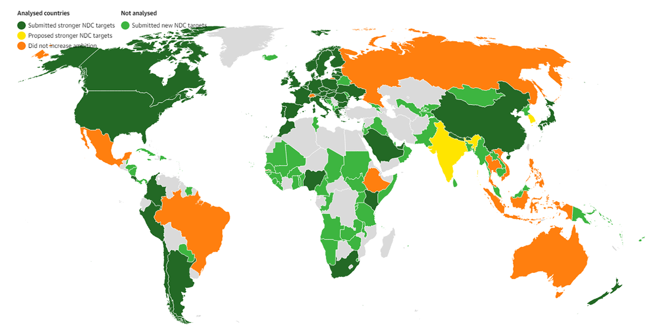
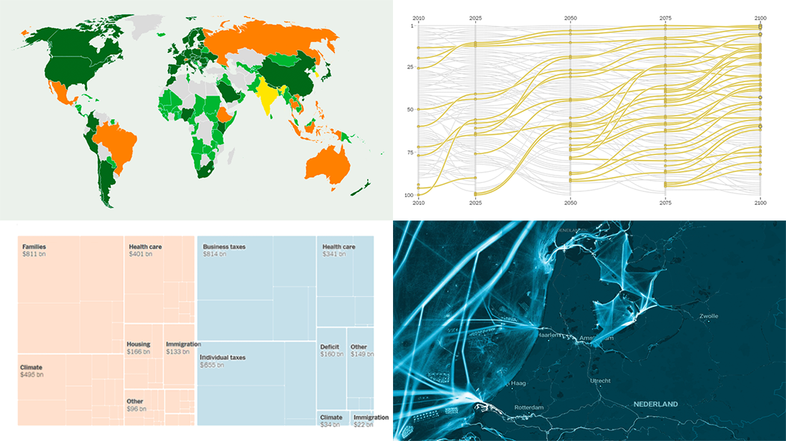
According to Climate Action Tracker assessments, the 2021 United Nations Climate Change Conference (COP26) did not result in any major country getting aligned with holding global warming down to the 1.5°C threshold often referred to as critical. However, some progress was still made.
The Guardian made a great visual guide to how COP26 changed the dial on the climate crisis. First and foremost, a choropleth map is used for an at-a-glance representation of which countries improved their emissions-cutting pledges by submitting stronger targets for so-called Nationally Determined Contributions (NDC), and which didn’t. Additionally, it displays how sufficient the latest pledge of each analyzed country is, in the tooltip, and then turns into packed circles showing that explicitly.
Learn about the outcome of COP26 in terms of new and current climate pledges in this cool visual story told by Jonathan Watts, Pablo Gutiérrez, Ashley Kirk, and Seán Clarke.
***
If you love good data visualizations and visual storytelling, stay tuned for Data Viz Weekly and don’t miss an issue!
- Categories: Data Visualization Weekly
- 1 Comment »