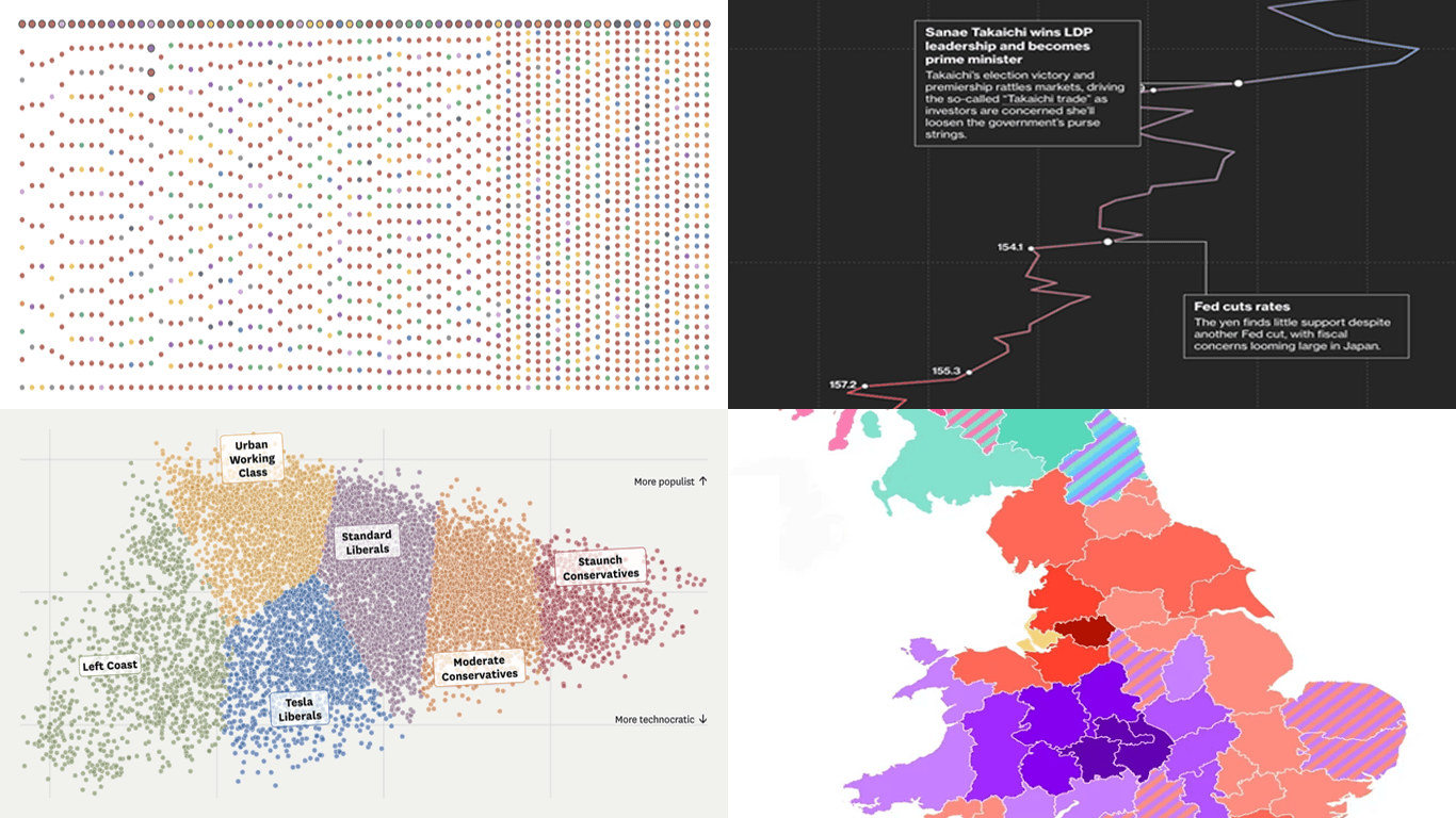
Every week brings more charts, maps, and visual stories into view. In DataViz Weekly, we pick out recent data visualization work that feels worth a closer look, whether for the subject, the design choices, or the way the data is brought into focus. Here is what we are featuring this time:
- 70 years of Eurovision lyrics — Giuseppe Sollazzo
- California politics beyond left and right — San Francisco Chronicle
- The Japanese yen under pressure — Bloomberg
- Britain’s second city debate — YouGov

Data Visualization Weekly: May 22–29, 2026
70 Years of Eurovision Lyrics
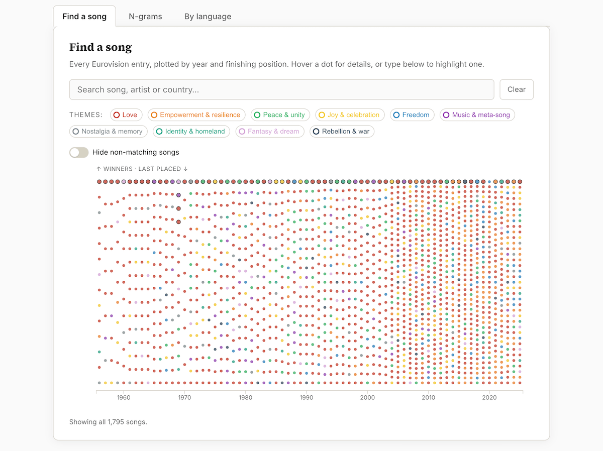
The Eurovision Song Contest has been staged almost every year since 1956. Its entries draw attention for their performances and staging, less so for what the lyrics actually say.
Giuseppe Sollazzo classified all 1,795 songs performed between 1956 and 2025 into ten lyrical themes, from love and joy to rebellion and war, and built the piece around a single dot plot. Each dot is one song. The columns run by year from left to right, and inside each column the songs are ordered by result, with the winner at the top. As the reader scrolls, the dots hold their positions and only change color. They turn first by theme. Love in red fills most of the chart, while empowerment rises from the 2010s. The dots then recolor by language, tracing how English spread, pulled back under the contest’s national-language rules, and returned to dominance after 1999.
A run of line charts measures each theme’s share of songs per year, including a love-against-empowerment pair whose gap closes over time. A set of word-frequency line charts then follows single words across the decades, plotting pairs such as man against woman and war against peace. The piece ends with an interactive visualization. Three tabs let the reader search any song, plot one word against another, and split the field by language.
Explore the project on puntofisso.net, by Giuseppe Sollazzo.
California Politics Beyond Left and Right
Political maps usually sort communities along one line, from left to right. That framing can miss differences that do not fall neatly on the spectrum.
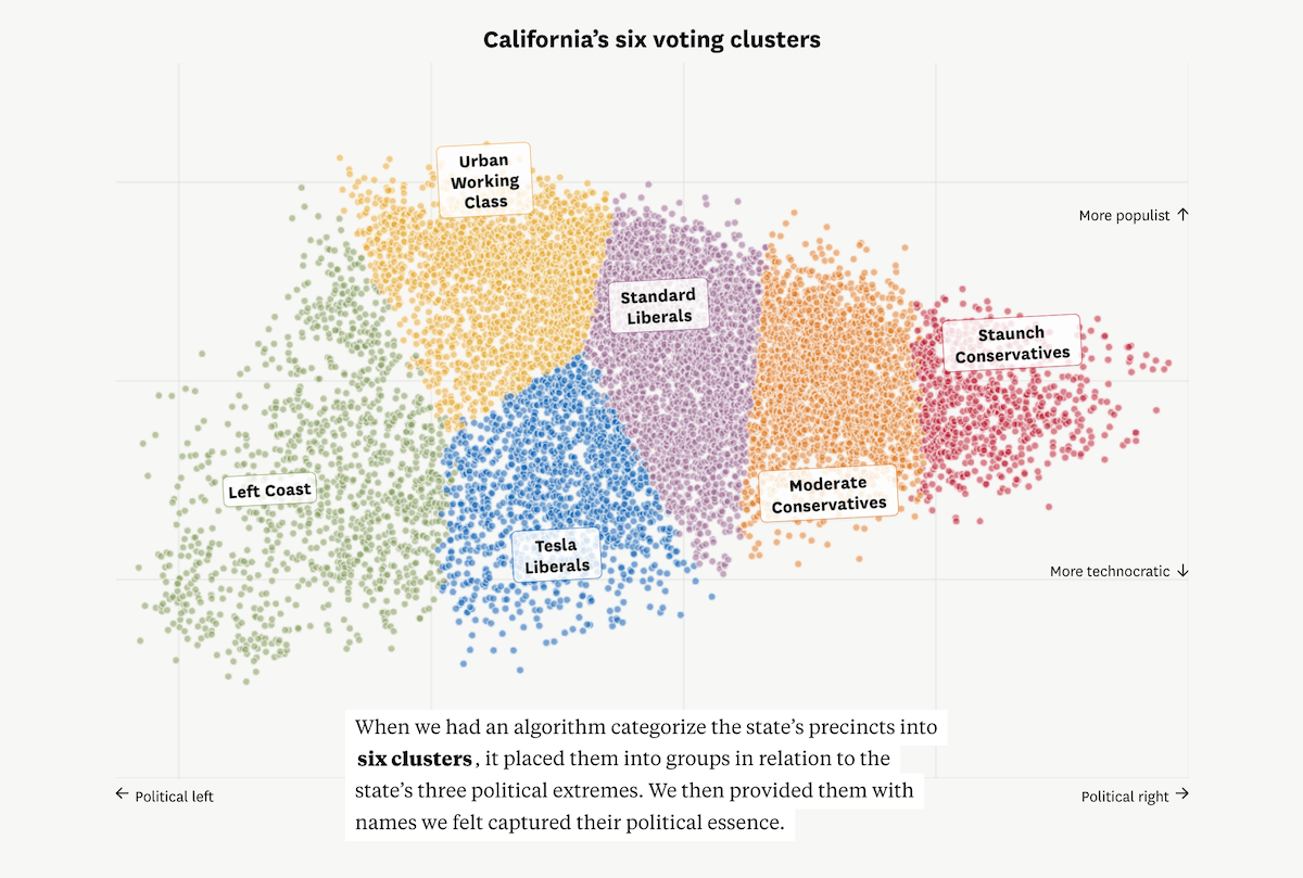
The San Francisco Chronicle analyzed how California precincts voted on 65 ballot measures between 2016 and 2024, then used those patterns to place each precinct in a two-dimensional space. The centerpiece is a scrollytelling scatter plot. It opens as a single horizontal spread of 10,600 dots, one per precinct, arranged left to right by partisanship, with the pile thickest in the middle. A second axis then lifts the dots into a full scatter plot, adding a vertical populist-to-technocratic dimension. Three corners take shape. Two are on the left, one populist and one technocratic, and the third is on the right.
The same scatter then fills with color as the precincts are grouped into six clusters, each given a name by the Chronicle, from Left Coast to Staunch Conservatives. An interactive version closes the piece. A dropdown switches between any of the 65 propositions and recolors every dot on a diverging orange-to-teal scale from no to yes, showing which coalitions formed on each measure.
See the story on the San Francisco Chronicle, by Aseem Shukla and Nami Sumida.
Japanese Yen Under Pressure
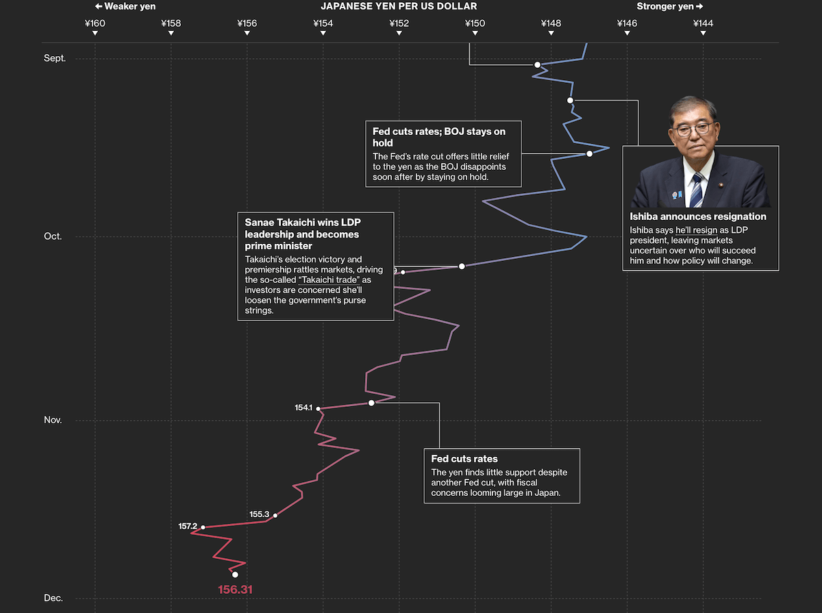
The Japanese yen has lost ground against the US dollar over the past year. In late April 2026, Japan stepped into the currency market to slow the decline. A persistent gap between low interest rates at home and higher returns available abroad has been one of the main pressures.
Bloomberg traced the year through a vertical line chart that runs down the page rather than across it. Time flows from top to bottom, from May 2025 to May 2026, while the horizontal axis carries the exchange rate, a weaker yen to the left and a stronger yen to the right. The line drifts leftward as the currency loses value, reaching the 160-per-dollar level that prompted the intervention. As the reader scrolls, annotated callouts attach to points along the line. They mark Bank of Japan rate decisions, leadership changes in Tokyo, and the late-April move into the market. The most recent reading sits at the bottom.
Check out the piece on Bloomberg, by John Cheng and Christopher Udemans.
Britain’s Second City Debate
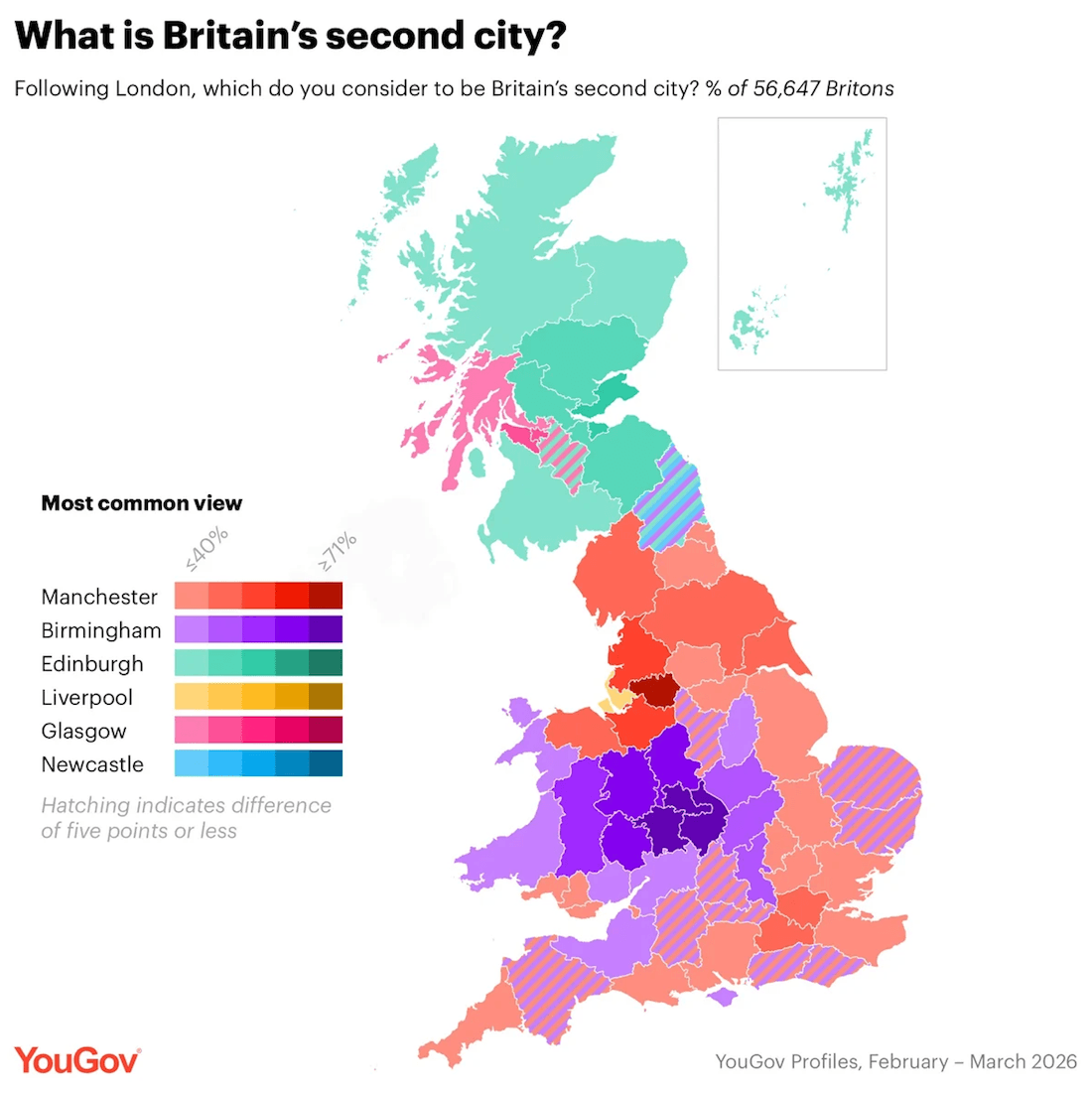
London is Britain’s capital and by far its largest city. Which city counts as second has no official answer. Manchester and Birmingham are the usual contenders, with a few other cities staking an occasional claim.
YouGov surveyed more than 56,000 Britons and mapped the answers across the country. The main visual is a choropleth map of Great Britain colored by each area’s most common response. Hue identifies the city, so Manchester reads red, Birmingham purple, and Edinburgh green, while the shade deepens with the size of the local majority. Hatching marks the places where the top two answers sit within five points of each other. Birmingham’s support concentrates around the West Midlands, Manchester’s spreads more broadly, and Scotland leans toward Edinburgh and Glasgow.
Small-multiple choropleth maps then break the question out city by city, first for the three leading contenders and then for outside candidates such as Cardiff, Liverpool, and Newcastle, each shaded by the share who chose it. Bar and column charts cover the rest of the findings, including how strong a case the public gives each city, how the answer divides by age, and which factors people weigh most.
Look at the article on YouGov.
Wrapping Up
That is it for this week’s selection of recent data visualization work worth a closer look. We will be back next Friday with more charts, maps, and visual stories in DataViz Weekly.
- Categories: Data Visualization Weekly
- No Comments »