Vasari Diagram Visualizes Wikipedia Networks of Painters with AnyChart JS
September 29th, 2022 by AnyChart Team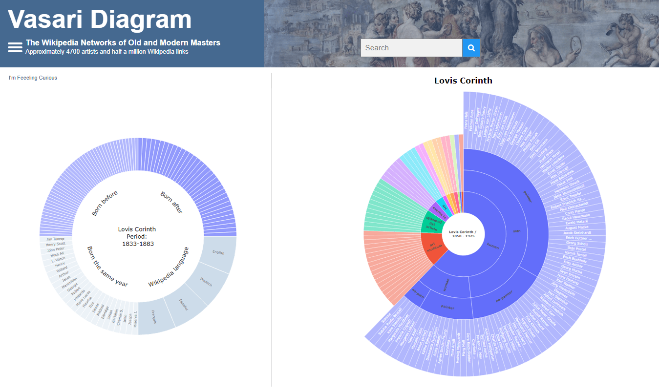 There are numerous cases where our customers first picked a different JavaScript charting library to operate data visualization in their projects but then could not get absolutely what they wanted, and in the end, switched to AnyChart and are happy with their new and final choice. Here is one of such examples.
Francis Lapique and Temenuzhka Dimova ended up using our Sunburst Chart solution in their Vasari Diagram, a fascinating asset for art history researchers and enthusiasts. This project lets anyone explore which people and topics various painters are connected with.
Read our interview where Francis describes the Vasari Diagram project and how AnyChart is used, and check it out!
- Categories: AnyChart Charting Component, Big Data, Charts and Art, HTML5, JavaScript, Success Stories
- No Comments »
How to Make Timeline Chart (in JavaScript)
August 4th, 2022 by Shachee Swadia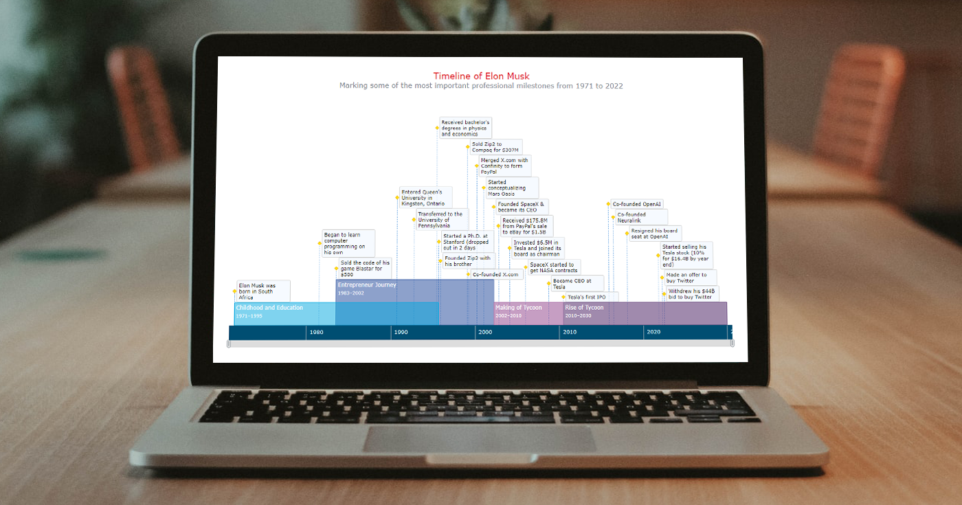 A timeline chart is an excellent way to represent important events and periods in chronological order. Now, let me teach you how to easily create an elegant interactive visualization like that using JavaScript!
To make this tutorial both helpful and entertaining, I decided to take real data. Join me as I visualize the life of Elon Musk in a JS timeline chart step by step, focusing on the most important events in his career as an entrepreneur and investor.
Read the JS charting tutorial »
- Categories: AnyChart Charting Component, HTML5, JavaScript, JavaScript Chart Tutorials, Tips and Tricks
- No Comments »
Building Scatter Chart in JavaScript
June 17th, 2022 by Shachee Swadia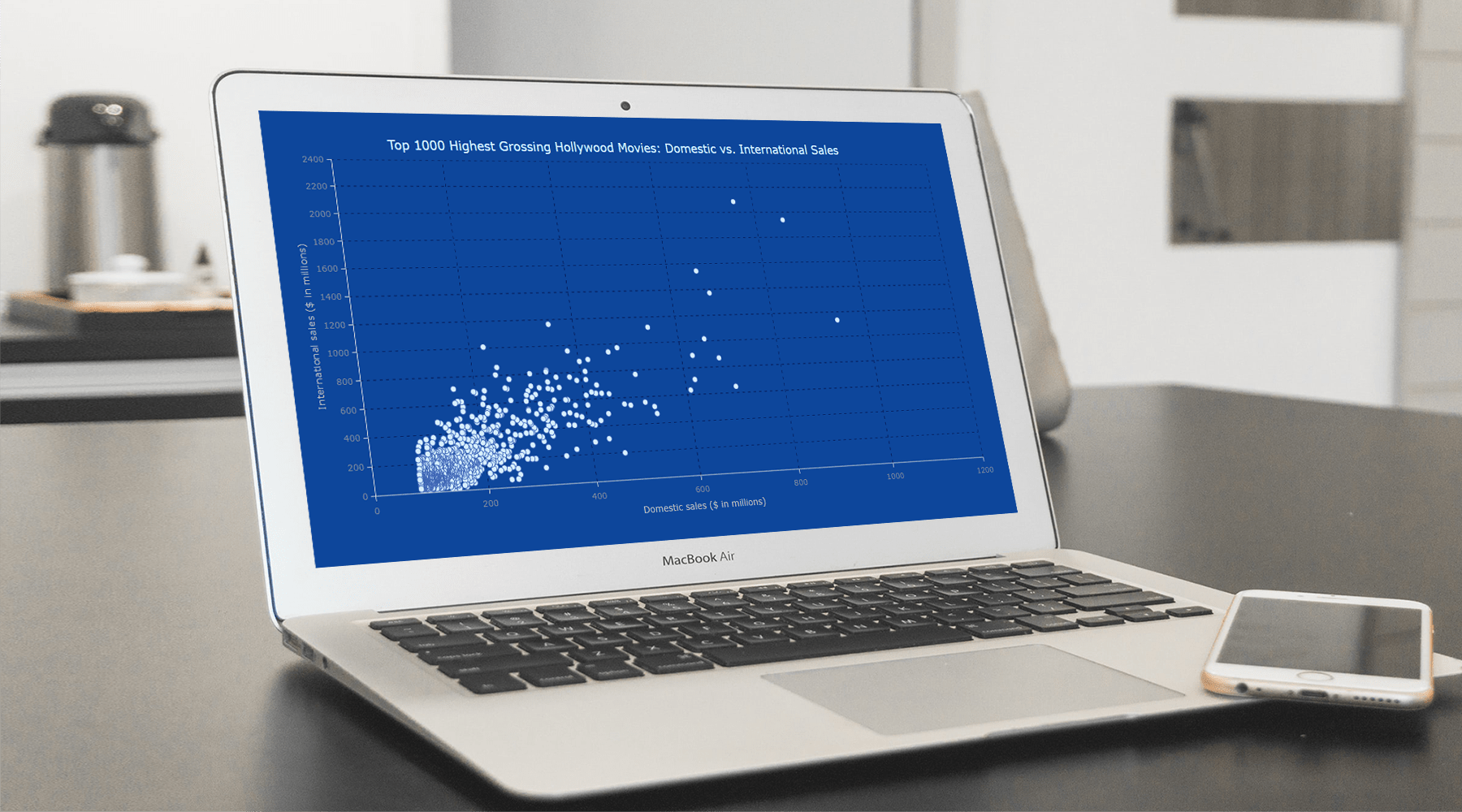 With data everywhere around us, it is imperative to know how to quickly create visualizations that help reveal trends and patterns in it. Today, let’s learn how to build a scatter chart in just a few lines of simple JavaScript code!
Scatter charts, or scatter plots, are designed to identify a correlation between typically two variables. In such graphics, the data is visualized as a set of points usually displayed as markers. The position of each marker indicates the values of the variables along the horizontal and vertical axes.
In this tutorial, we will be visualizing international and domestic sales of the 1000 highest-grossing Hollywood movies as of January 2022. So, get your popcorn and start watching the JS scatter chart development!
Read the JS charting tutorial »
- Categories: AnyChart Charting Component, Big Data, HTML5, JavaScript, JavaScript Chart Tutorials, Tips and Tricks
- No Comments »
How to Create Stacked Chart with JavaScript
April 12th, 2022 by Shachee Swadia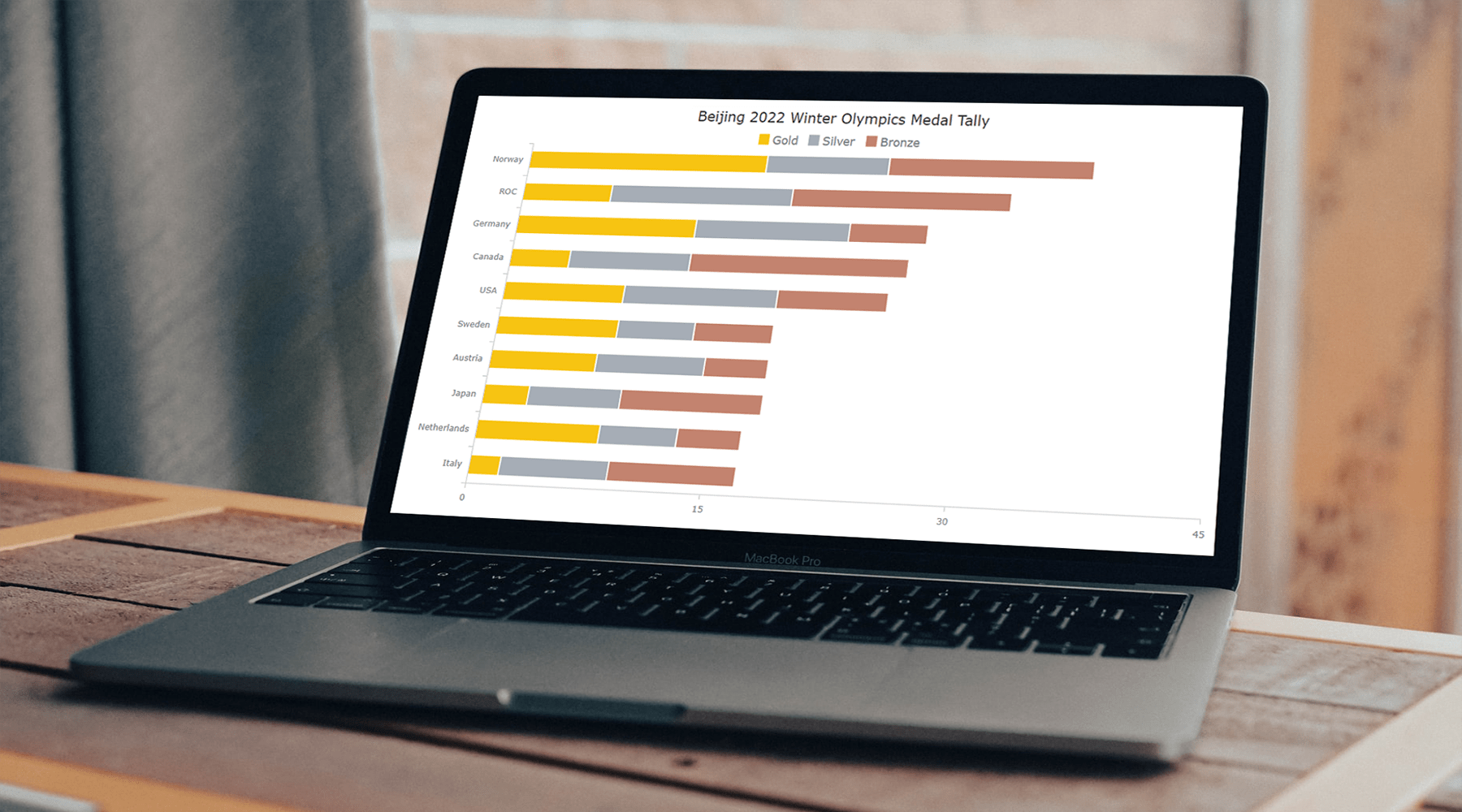 Data visualization is a skill vital for analysts and developers in the current times. Stacked charts are one of the most widely used chart types, and now I want to tell you what they are and how to build such graphics with ease using JavaScript. In the main tutorial part, I will be creating different versions of a stacked chart, providing comprehensive step-by-step instructions to let you learn fast. My visualizations will offer a look at the medal counts for the top 10 countries on the final Beijing 2022 Winter Olympics leaderboard so you also have fun as you follow along.
Read the JS charting tutorial »
- Categories: AnyChart Charting Component, HTML5, JavaScript, JavaScript Chart Tutorials, Tips and Tricks
- No Comments »
How to Build Circle Packing Chart in JavaScript
March 15th, 2022 by Shachee Swadia A clear step-by-step guide for building an interactive JS Circle Packing Chart to visualize the top 100 most streamed songs on Spotify.
Want to learn to visualize hierarchical data in stunning circle packing charts that can be added to a web page or app in a hassle-free manner? Don’t feel overwhelmed and just follow my stepwise data visualization tutorial! Using a cool example of data on the top 100 most streamed songs on Spotify, I will show you how to easily create and customize a great-looking interactive circle packing chart with JavaScript.
Read the JS charting tutorial »
- Categories: AnyChart Charting Component, Big Data, HTML5, JavaScript, JavaScript Chart Tutorials, Tips and Tricks
- No Comments »
Beijing Olympics Medal Trackers — DataViz Weekly
February 25th, 2022 by AnyChart Team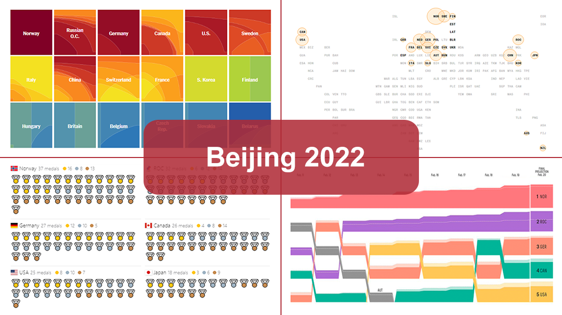 Following sixteen days of thrilling, action-packed competition, the Beijing 2022 Winter Olympics officially came to an end on Sunday, February 20. Norway finished at the top of the leaderboard, with 16 gold and 37 total medals won by its athletes at the Games.
During the Tokyo 2020 Summer Olympics that took place just six months before, we published a special edition of DataViz Weekly looking at four awesome medal trackers produced by The New York Times’s The Upshot, Bloomberg, Axios, and FiveThirtyEight. These interactive data visualization projects were brought back for the Beijing 2022 Winter Olympics. So now, we invite all lovers of charts and sports to look at their newest editions. They offer a frictionless way to explore medal counts and country standings after the Games with the help of stunning visualizations.
- Categories: Data Visualization Weekly
- 1 Comment »
Building Stock Chart with JavaScript
February 24th, 2022 by Shachee Swadia Data visualization is vastly applied in various fields. One such domain is financial trading, where stock charts are essential for smart market data analysis and decision making. Whether you invest in stocks or not, I am pretty sure that you have come across such graphics or even might need to build one right now. So, would you like to know how to make a stock chart? I’m ready to show you an easy path using the Tesla stock price data and JavaScript! Come along with me throughout this tutorial and you’ll learn how to quickly create elegant, interactive JS stock charts like the one you see in the picture.
Read the JS charting tutorial »
- Categories: AnyChart Charting Component, AnyStock, Big Data, Financial Charts, HTML5, JavaScript, JavaScript Chart Tutorials, Stock Charts, Tips and Tricks
- No Comments »
SunnyByte Chooses AnyChart for Native American Cancer Data Visualization
February 16th, 2022 by AnyChart Team Out-of-the-box error bars and the ability to create a cool error chart without hassle have always been a major attraction of AnyChart, among other great features prompting developers to choose our JavaScript charting library. If you want to look at some real-world examples of such visualizations in action, Shen DeShayne, a partner at SunnyByte has recently brought a new interesting use case for them to our attention. The American Indian & Alaska Native Cancer Data website, his web development agency built for the University of New Mexico, represents information in interactive error charts powered by AnyChart. Learn more about the project and how our JS library is used, from a quick interview. (Stack: Craft CMS/Vue.js.)
- Categories: AnyChart Charting Component, Big Data, HTML5, JavaScript, Success Stories
- No Comments »
Best New Charts and Maps Not to Miss — DataViz Weekly
February 4th, 2022 by AnyChart Team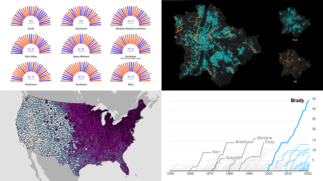 Are you sure you have seen all the best new charts and maps? Let’s see. Check out our new DataViz Weekly roundup and make sure you have not missed these four fascinating data visualization projects!
- Accuracy of Punxsutawney Phil’s and other animal meteorologists’ weather predictions — FiveThirtyEight
- The coldest day of the year across the United States — NOAA NCEI
- Tom Brady’s stellar career in American Football — The Upshot
- Budapest street names — ATLO
- Categories: Data Visualization Weekly
- No Comments »
Visualizing Data on Income, Volcano Eruption, Shopping, Climate — DataViz Weekly
January 28th, 2022 by AnyChart Team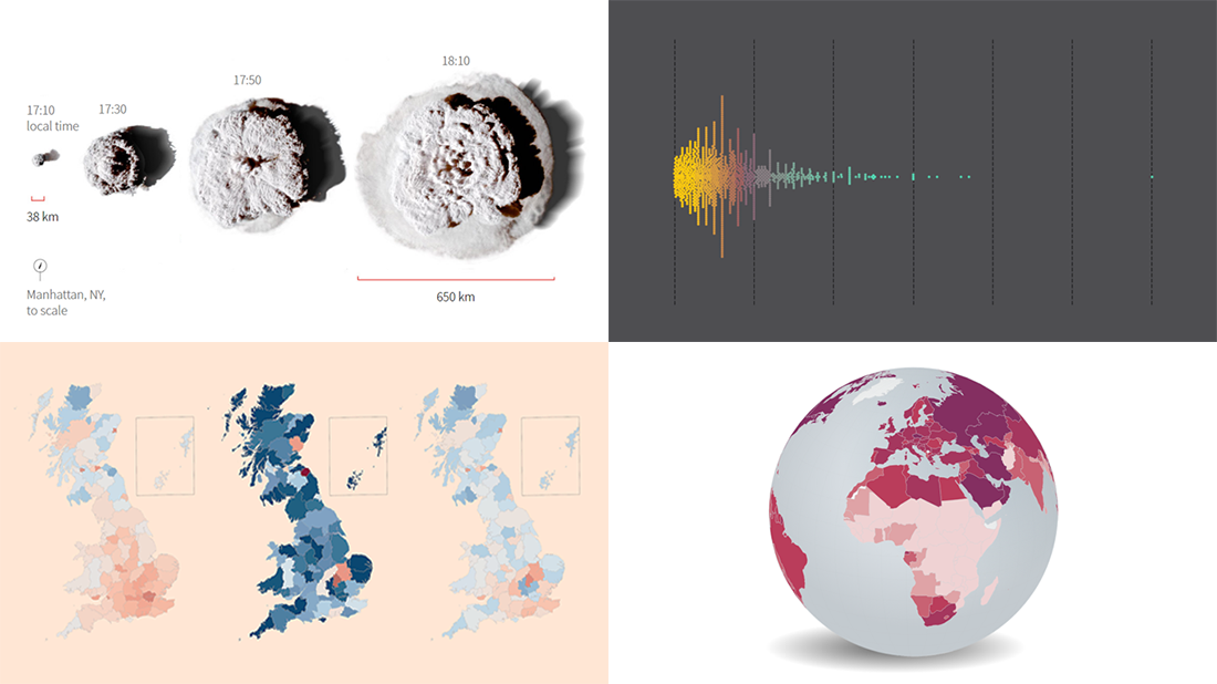 Continuing our regular roundups of the most interesting charts, maps, and infographics, we are glad to spotlight a bunch of new awesome projects for your inspiration. Today on DataViz Weekly:
- Americans’ annual personal income — Nathan Yau
- Tonga eruption’s true scale — Reuters
- High street crisis in Great Britain — The Financial Times
- Climate change drivers and sufferers — Der Tagesspiegel
- Categories: Data Visualization Weekly
- No Comments »