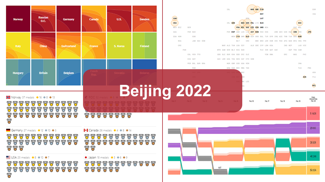
 Following sixteen days of thrilling, action-packed competition, the Beijing 2022 Winter Olympics officially came to an end on Sunday, February 20. Norway finished at the top of the leaderboard, with 16 gold and 37 total medals won by its athletes at the Games.
During the Tokyo 2020 Summer Olympics that took place just six months before, we published a special edition of DataViz Weekly looking at four awesome medal trackers produced by The New York Times’s The Upshot, Bloomberg, Axios, and FiveThirtyEight. These interactive data visualization projects were brought back for the Beijing 2022 Winter Olympics. So now, we invite all lovers of charts and sports to look at their newest editions. They offer a frictionless way to explore medal counts and country standings after the Games with the help of stunning visualizations.
Data Visualization Weekly: February 18, 2022 — February 25, 2022
The Upshot: “Beijing Olympics: Who Leads the Medal Count?”
![]()
To understand what country did best at the Beijing 2022 Winter Olympic Games, first, you should make it clear for yourself how to count medals. Do you only care about the total number of medals? Or would you like to take only gold medals into account? Or do you want to apply a certain weight to each medal type and look at the results from that perspective?
The New York Times’s The Upshot lets you see all possible outcomes based on how you decide to look. Interactive heatmap-like visualizations created by Josh Katz display all the places in the leaderboard each country takes based on different ways of measuring the relative worth of a gold to a silver (the vertical axis) and a silver to a bronze (the horizontal axis).
Take a look at this project on The Upshot. It is really fun to explore these visualizations and see how the rankings of countries on the right change as you hover over the plots.
Bloomberg: “Who Won at the Beijing Winter Olympic Games”
![]()
Bloomberg’s Beijing 2022 Olympics medal tracker is great at providing a general overview of the medal count along with some peculiar historical insight.
The first thing you see as you open it is an interactive map grid. You can switch the toggle to make it show the distribution of medals by gold or total medals won. Additionally, the same kind of view is available for the Pyeongchang 2018 and Sochi 2014 Winter Games. As this visualization nicely communicates, the Northern Hemisphere’s countries prevailed in the past three Winter Olympics including Beijing 2022; in the Southern Hemisphere, New Zealand and Australia were the only countries whose athletes succeeded to win medals.
There is actually much more to see. Check it out on Bloomberg.
Axios: “The Winter Olympics Medal Tracker”
![]()
Axios uses a pretty simple, yet effective visual technique to show the medal counts by country. Each medal won is pictured as one medal respectively colored in gold, silver, or bronze. Such a way of visualization makes up a cool view of the number of medals the competing nations took home from Beijing 2022.
Medals can be sorted by medal rank — then gold medals go first, then silver, then bronze. Or by date — then they are shown in chronological order. As you move the cursor over a medal, the tooltip displays the details: who won it, when, in what sport and event, and which country the athlete represented.
Explore the visualization on Axios.
FiveThirtyEight: “Which Countries Are Doing Better — Or Worse — Than Expected At The Beijing Olympics?”
![]()
FiveThirtyEight’s Beijing 2022 medal tracker was especially worth watching during the Games. But it is nonetheless interesting to take a close look at after their conclusion.
This tool was designed to make it easy to track the countries’ actual medal-winning progress against expected. Each country was given a medal probability prediction for each event based on how its athletes had performed throughout the past three Winter Olympics. This allowed FiveThirtyEight to add expected medal earning for upcoming events on top of the actual progress and therefore see if a country is running better or worse than that.
Now you can look at how each country’s medal count went compared to the predictions along the entire timeline of Beijing 2022. Head to FiveThirtyEight to check that out.
***
These Beijing 2022 Olympics medal tracking projects are not only excellent resources to learn about how the Winter Games unfolded. They are amazing examples of both beautiful and informative interactive data visualizations in action. You are more than welcome to see them for information, fun, or inspiration for your own graphics.
Stay tuned for DataViz Weekly where we curate the most interesting new data visualizations.
- Categories: Data Visualization Weekly
- 1 Comment »