 Are you sure you have seen all the best new charts and maps? Let’s see. Check out our new DataViz Weekly roundup and make sure you have not missed these four fascinating data visualization projects!
- Accuracy of Punxsutawney Phil’s and other animal meteorologists’ weather predictions — FiveThirtyEight
- The coldest day of the year across the United States — NOAA NCEI
- Tom Brady’s stellar career in American Football — The Upshot
- Budapest street names — ATLO
Data Visualization Weekly: January 28, 2022 — February 4, 2022
Accuracy of Punxsutawney Phil’s and Other Animal Meteorologists’ Weather Predictions
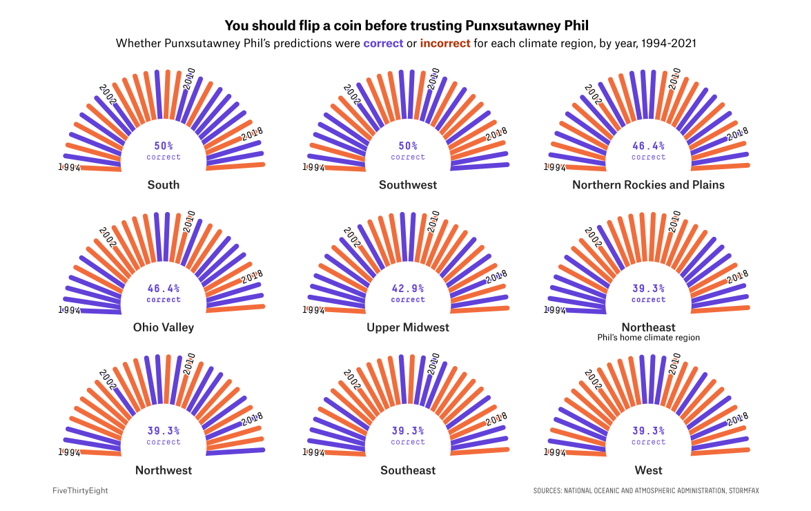
This year on February 2, Punxsutawney Phil did not see his own shadow once he came out of his home in the early morning. We all know that, according to the Groundhog Day canon, it means winter is going to stick around for another six weeks. But are Phil’s predictions worth trusting?
Well, statistics say they are not. FiveThirtyEight’s Kaleigh Rogers and Simran Parwani compared Phil’s forecasts to real climate data from the National Oceanic and Atmospheric Administration (NOAA) for the period from 1994 to 2021. What was found is that the famous groundhog had been only 36% accurate judging nationwide and still not more than 50% correct in a more granular, by-region view. In addition, they looked at how other popular animal meteorologists had performed: Buckeye Chuck, General Beauregard Lee, Jimmy the Groundhog, Lander Li, Stormy Marmot, Snohomish Slew, Prairie Dog Pete, and Chuck Wood.
Read more and check out the awesome visualizations on FiveThirtyEight.
Coldest Day of Year Across United States
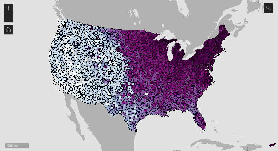
Do you know exactly what time of the year is the coldest where you live? Americans can now find it out right away and without hassle using a dedicated map built at NOAA.
Experts from NOAA National Centers for Environmental Information (NCEI) used data from the 1991–2020 United States Climate Normals to identify what day of the year has the lowest minimum temperature on average, called it the “coldest day,” and mapped that out in an interactive format.
When looking at the visualization, you can notice some interesting regional differences at a glance. The most striking one is that the lowest temperatures in the East are typically reached later than in the West (where they usually happen in December). For example, the climatological coldest day of the year in downtown Los Angeles is December 19. In Washington, D.C., it’s January 23. Search for a place to discover when its lowest temperatures occur.
Learn more about the project and explore the map on NOAA’s Climate.gov website.
Tom Brady’s Stellar Career in American Football
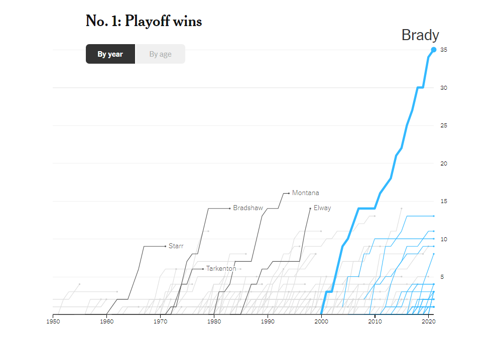
Thomas Edward Patrick Brady Jr., a legendary American football quarterback, announced his retirement from the National Football League on Tuesday. It ends an outstanding twenty-two-year career that has led him to wide recognition as the greatest quarterback in history.
To illuminate Tom Brady’s stature, The New York Times’s The Upshot published a series of interactive data graphics that visually stack up his major achievements against those of his peers. There are four line charts in total. They compare Brady with over 300 other quarterbacks in four measures of cumulative career stats: playoff wins, passing touchdowns, passing yards, and Pro Bowl selections. Each chart can be viewed by year or by age.
See the charts and don’t miss out on learning about the context, in a story by Josh Katz, Kevin Quealy, and Alanis Thames on The Upshot.
Budapest Street Names
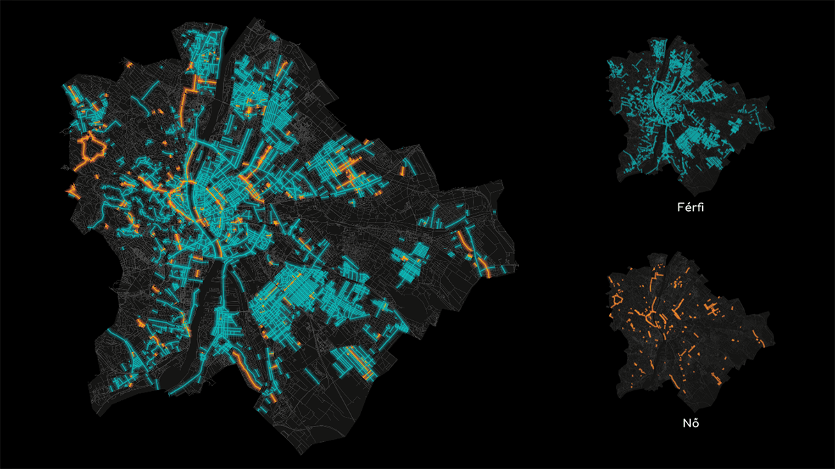
In Budapest, the capital of Hungary, there are more streets and squares named after fictional characters than after real women. How are we so sure? We have just learned that from a cool new data visualization work titled “Names and spaces.”
ATLO, the visual and data journalism team of Hungarian investigative center Átlátszó, looked at the names of more than two thousand public spaces in Budapest named after a person, real or fictitious, and created a fascinating interactive data visualization project allowing anyone to explore them. There, you will find multiple maps of Budapest that represent a breakdown of all those streets and squares by gender, occupation, fictitiousness, and other categories.
Take a look into the names of Budapest’s streets (and other public places).
***
We appreciate your attention and hope you will stay tuned for Data Visualization Weekly! Have a nice day!
- Categories: Data Visualization Weekly
- No Comments »