 Data visualization is vastly applied in various fields. One such domain is financial trading, where stock charts are essential for smart market data analysis and decision making. Whether you invest in stocks or not, I am pretty sure that you have come across such graphics or even might need to build one right now. So, would you like to know how to make a stock chart? I’m ready to show you an easy path using the Tesla stock price data and JavaScript! Come along with me throughout this tutorial and you’ll learn how to quickly create elegant, interactive JS stock charts like the one you see in the picture.
What Is a Stock Chart?
Most of you may know the basics, but to ensure that we are all on the same page, I will briefly tell you what a stock chart is.
A stock chart basically represents the price or volume movements of a stock over time by plotting the price or volume figures over the Y-axis and the time period over the X-axis.
Stock charts play a very important role in helping investors spot trends and make the right buy and sell decisions in the fast-paced financial markets.
The most common chart type used to depict stocks is the candlestick stock chart. But you can also use open-high-low-close (OHLC), line, area, column, or other forms of series visualization depending on a particular case and task.
Stock Chart to Be Created
Tesla is a company that is always in the news. It has grown exponentially over the years and that is pretty much reflected in its stock value over time. So, I am going to build a stock chart to showcase the price movement of Tesla Inc. for this tutorial. I will also show you how to add various technical indicators and illustrate the effect of the recent hype surrounding the selling of stocks by Elon Musk.
Here is a peek at the final version of the JavaScript stock chart to get you all pumped up for the upcoming steps.
Building a Stock Chart with JavaScript
Creating an interactive stock chart from scratch can be quite a daunting task but becomes much easier and faster with an appropriate data visualization tool. For example, there are some useful JavaScript charting libraries that have the capability to create financial graphics, and you can work with whichever suits your needs.
In this tutorial, I am using one of the good ones — the AnyChart JS library, which has some great options for stock charts along with neat documentation for them and is free for any non-commercial and educational use.
Although it is not necessary, some skills with HTML and JavaScript can help understand the concepts faster. But everything is quite straightforward and will be vastly explained, so there is nothing to worry about even if you are a novice.
The opening bell has rung, and it’s time to create the stock chart!
1. Make an HTML page
The first thing I do is create an HTML page to hold the chart and add a div element to render the chart. This block element should be given a unique id so it can be referenced in the code later.
I also set the styling of the div where I define the width and height as 100% with 0 margins and padding. This will display the stock chart over the entire screen.
<!DOCTYPE html>
<html lang="en">
  <head>
    <meta charset="utf-8">
    <title>JavaScript Stock Chart</title>
    <style type="text/css">
      html, body, #container {
        width: 100%;
        height: 100%;
        margin: 0;
        padding: 0;
      }
    </style>
  </head>
  <body>
    <div id="container"></div>
  </body>
</html>
2. Add the required scripts
Since I am using a charting library, I need to reference the appropriate JS scripts from that library for the stock chart. Remember that these scripts are included in the head section of the HTML page.
For a stock chart, I need to add multiple scripts. Firstly, I include AnyChart’s ‘core’ and ‘stock’ modules. Next, I add the Data Adapter module that helps load the data. Finally, I include the UI and Exports modules for user interface elements and to enable export features that let you save the chart as an image or extract the underlying data to a data file.
For the stock UI features to work properly, I also need to link the appropriate stylesheets.
<!DOCTYPE html>
<html lang="en">
  <head>
    <meta charset="utf-8">
    <title>JavaScript Stock Chart</title>
    <script src="https://cdn.anychart.com/releases/8.11.0/js/anychart-core.min.js"></script>
    <script src="https://cdn.anychart.com/releases/8.11.0/js/anychart-stock.min.js"></script>
    <script src="https://cdn.anychart.com/releases/8.11.0/js/anychart-data-adapter.min.js"></script>

    <script src="https://cdn.anychart.com/releases/8.11.0/js/anychart-ui.min.js"></script>
    <script src="https://cdn.anychart.com/releases/8.11.0/js/anychart-exports.min.js"></script>

    <link href="https://cdn.anychart.com/releases/8.11.0/css/anychart-ui.min.css" type="text/css" rel="stylesheet">
    <link href="https://cdn.anychart.com/releases/8.11.0/fonts/css/anychart-font.min.css" type="text/css" rel="stylesheet">

    <style type="text/css">
      html, body, #container {
        width: 100%; height: 100%; margin: 0; padding: 0;
      }
    </style>
  </head>
  <body>
    <div id="container"></div>
    <script>
      // All the code for the JS Stock Chart will come here
    </script>
  </body>
</html>
3. Prepare the data
In this stock chart, I want to visualize daily stock price data for Tesla Inc. (TSLA), so I take it from Yahoo Finance and the CSV data file here.
All the preparations are done now, so let’s start the trading or in our case writing the JavaScript stock charting code!
4. Write the necessary JavaScript code
To start with, I enclose the code within a function called anychart.onDocumentReady(). This ensures that the code will not be executed till the page is fully loaded. Next, I load the data file using the anychart.data.loadCsvFile() function.
I then create a data table and add the loaded data to it but before I can use this data for my stock chart, I need to map it. Since I am creating a candlestick stock chart, I map the open, high, low, and close values.
anychart.onDocumentReady(function () {
  anychart.data.loadCsvFile(
    'https://gist.githubusercontent.com/shacheeswadia/cd509e0b0c03964ca86ae7d894137043/raw/5f336c644ad61728dbac93026f3268b86b8d0680/teslaDailyData.csv',
    function (data) {
      // create data table on loaded data
      var dataTable = anychart.data.table();
      dataTable.addData(data);

      // map loaded data for the candlestick series
      var mapping = dataTable.mapAs({
        open: 1,
        high: 2,
        low: 3,
        close: 4
      });
    }
  );
});
Now, I define the stock chart, plot it, and set the gridlines. As numbers are important when looking at stock data values, I enable all the gridlines for better readability.
// create stock chart
var chart = anychart.stock();

// create first plot on the chart
var plot = chart.plot(0);

// set grid settings
plot.yGrid(true).xGrid(true).yMinorGrid(true).xMinorGrid(true);
Now comes the main part of creating the series. This is done by using the candlestick drawing function with the mapping that I defined earlier. I give the series a name and add a legend icon.
var series = plot.candlestick(mapping)
        .name('Tesla');

series.legendItem().iconType('rising-falling');

// create scroller series with mapped data
chart.scroller().candlestick(mapping);
Stock charts have values over a long period of time. So I add a scroller series under the main chart that enables the user to specify the date range and take a closer look at the values of that data. I set a one-year range for default display.
To make it easier for the user, I provide both a range picker where the user can manually enter dates and a range selector where the commonly used time periods can be selected with just a click.
// set chart selected date/time range
chart.selectRange('2020-11-27', '2021-11-26');

// create range picker
var rangePicker = anychart.ui.rangePicker();

// init range picker
rangePicker.render(chart);

// create range selector
var rangeSelector = anychart.ui.rangeSelector();

// init range selector
rangeSelector.render(chart);
Finally, I give the chart a title, reference the previously defined chart container, and draw the chart.
// sets the title of the chart
chart.title('Tesla Inc. Stock Chart');

// set container id for the chart
chart.container('container');

// initiate chart drawing
chart.draw();
That’s the closing bell and a beautiful, functional stock chart is created!
You can quickly figure out the stock prices of Tesla have been fluctuating in the past year, but the overall trend is positive. Hover over the chart to see a functional tooltip showing the date along with open, high, low, and close values. This is one of the many useful features already available here.
You can see this initial JS stock chart version on CodePen [and on AnyChart Playground] with the full code.
Customizing the JavaScript Stock chart
This interactive stock chart already looks pretty good and showcases useful information that can be delved into with ease. But, this is just the beginning.
Follow along as I’ll show you how to customize the JS stock chart by adding more features (changing series, adding technical indicators, annotations, and more) and fine-tuning its visualization, all in just a handful of streamlined actions.
A. Series type and conditional coloring
A stock chart is most commonly represented with candlesticks. But it’s not compulsory. Here, I want to show you how to quickly switch the type of data visualization from a candlestick stock chart, where all the four values are displayed (open, high, low, and close), to a line graph, where you can specify which value you want to plot (by default it’s the first value, i.e. the opening price in this case). Since only one value is represented, the mapping that I did earlier is not required here.
So, I simply specify the series as “line” and directly pass the datatable as the parameter.
To showcase the rising and falling prices in the line stock chart, I add conditional coloring where I specify the color of the line to be red if the price is decreasing and green if it’s going up. This can be very conveniently done using the in-built risingStroke and fallingStroke functions. The options to specify are the stroke color, stroke width, stroke type, and stroke endings.
I also change the scroller series to the line graph representation.
// create and setup line series
var lineSeries = plot.line(dataTable)
  .name('Tesla');

// set rising/falling and normal stroke settings
lineSeries.risingStroke('#2FA85A', 3, null, 'round', 'round');
lineSeries.fallingStroke('#EE4237', 3, null, 'round', 'round');

// create scroller series
chart.scroller().line(dataTable);
You can take a closer look at this new JS stock chart version on CodePen [and on AnyChart Playground]. In the next steps, I go back to plotting the candlestick series to represent the data.
B. Technical indicators: EMA and Envelope
Traders and investors often rely on technical analysis to identify trends, understand whether a financial instrument is overbought or oversold, and decide when to sell or buy. And there are multiple technical indicators out there that can be helpful in that. Let’s see how to quickly add them to stock charts.
I want to include two popular technical indicators: Exponential Moving Average (EMA) and Envelope. Both these indicators can be very easily drawn with quite minimal code.
All I have to do is map the data value that I want to use, which I specify as the closing value, indicate the stroke width and color, and the EMA line gets plotted over the candlestick chart. I can indicate the EMA period and the default is 50 if no custom value is set.
Similarly, for the Envelope indicator, I just specify the plotting, and the lower and higher band lines are drawn over the chart.
// create EMA indicators with period 50
plot
  .ema(dataTable.mapAs({ value: 4 }))
  .series()
  .stroke('1.5 #455a64');

// create envelope indicator
chart.plot().env(mapping);
Check out how this JS stock chart version with EMA and Envelope looks below. You are also welcome to play with its interactive version (and its full code) on CodePen [or on AnyChart Playground], where you can, for example, hide and show these additional technical indicator lines by clicking on the corresponding legend items.
C. MACD indicator
MACD or Moving Average Convergence Divergence is a momentum indicator generally plotted with a signal line. It is calculated with 26 and 12 period EMA and indicates buy or sell signs when it crosses above or below the signal line respectively.
I plot the MACD indicator as a separate plot representing the MACD line, the signal line, and a histogram as an area chart below the candlestick chart. The first thing I do is disable the X-axis for the candlestick chart since I will have that in the MACD plot. Now, I define a second plot and map the data values.
Next, I set the series type as an area histogram and define the stroke and fill settings for positive and negative values. Lastly, I just set the height of this plot as 40% of the total.
// second plot to show macd values
var indicatorPlot = chart.plot(1);

// map the values
var macdIndicator = indicatorPlot.macd(mapping);

// set series type for histogram series.
macdIndicator.histogramSeries('area');

macdIndicator
  .histogramSeries()
  .normal()
  .fill('green .3')
  .stroke('green');

macdIndicator
  .histogramSeries()
  .normal()
  .negativeFill('red .3')
  .negativeStroke('red');

// set second plot's height
indicatorPlot.height('40%');
D. Awesome Oscillator
The Awesome Oscillator (AO) indicates the strength or weakness of an instrument by comparing the market momentum with the overall stock price fluctuation over a larger time reference.
I also plot this indicator as a second chart below the main chart, just like in the previous step. I am just showing you this to bring home the point of how various technical indicators can be plotted quite easily.
As I did for the MACD plot, similarly, I define the second plot and map the data using the ao function here for the awesome oscillator indicator.
I specify the colors of the stroke lines as green for rising and red for falling prices and set the height of the chart to 40%.
// create awesome oscillator series
var aoIndicator = indicatorPlot.ao(mapping);

// set rising and falling stroke settings
aoIndicator.series().risingStroke('green');
aoIndicator.series().fallingStroke('red');

// set second plot's height
indicatorPlot.height('40%');
If you hover over either of the top or bottom charts, you will see two icons on the top right that let you move that plot up or down as well as make it render full screen hiding the other chart.
You can play around with these JS stock chart versions on CodePen, with the MACD plot here [and on AnyChart Playground] and the AO plot here [and on AnyChart Playground].
E. Color palette
An easy and effective way to make your stock chart look personalized is to change the colors of the chart. The AnyChart library has pre-built design themes, so I’ll just need to add the necessary script to the head section and simply set it in the code. Here, I apply a monochrome theme.
<script src="https://cdn.anychart.com/releases/8.11.0/themes/monochrome.min.js"></script>

...

// set chart theme
anychart.theme('monochrome');
See how sophisticated and polished the stock chart looks!
Now, in the final customization, I will show you one more cool thing that is often demanded in stock charts.
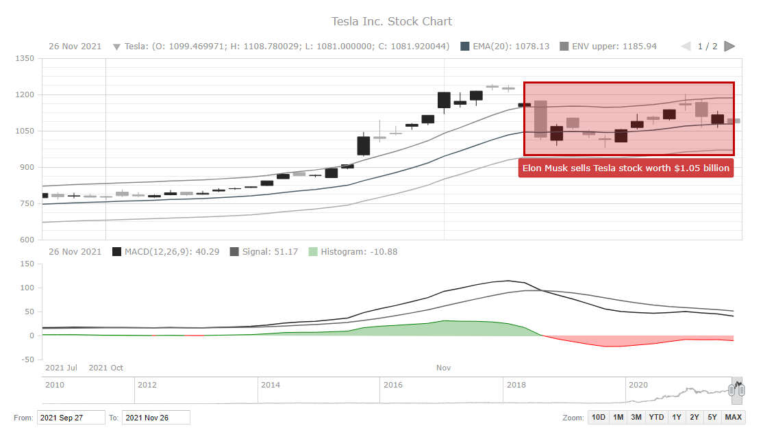
F. Illustrating and annotating
In stock charts, it may be needed to add custom objects that additionally display or highlight something. For example, in the AnyChart JS library, there is a useful feature that lets you create drawings and annotations.
I will show you here how to highlight a specific period and also provide it with an explanatory note. I will showcase the time when the stock prices of Tesla fell due to Elon Musk selling a bunch of his own stocks.
To start, I define the annotation and then create a rectangle. I set the various parameters like the width and height of the rectangle along with the dates that indicate the starting and ending of the rectangle. I also set the stroke and fill values where I choose the red color from the company’s logo.
Next, I create the annotation label below the rectangle. I again define where to start the label, the dimensions, the colors, and, of course, the text.
// create annotation rectangle
annotation.rectangle({
  // X - part of the first anchor
  xAnchor: '2021-11-08',
  // Y - part of the first anchor
  valueAnchor: 950,
  // X - part of the second anchor
  secondXAnchor: '2021-11-26',
  // Y - part of the second anchor
  secondValueAnchor: 1250,
  // set stroke settings
  stroke: '3 #c20000',
  // set fill settings
  fill: '#c20000 0.25'
});

// create annotation and set settings
annotation
  .label()
  .xAnchor('2021-11-26')
  .valueAnchor(950)
  .anchor('right-top')
  .offsetY(5)
  .padding(6)
  .text('Elon Musk sells Tesla stock worth $1.05 billion')
  .fontColor('#fff')
  .background({
    fill: '#c20000 0.75',
    stroke: '0.5 #c20000',
    corners: 2
  });
This was just a simple illustration. If you want to learn more about how such drawing and annotation options can look and work in real life, play with this demo tool.
And that wraps up the customizations, and a lovely, interactive, and insightful JS stock chart is all done. Take a look at the final version below. Doesn’t it look like something you will put your money on? You can look into the full HTML/CSS/JavaScript code and keep customizing this stock chart to your liking on CodePen [or on AnyChart Playground].
Conclusion
As you can see, creating a stylish interactive stock chart with technical indicators and annotations looks complicated initially but can be quite hassle-free and convenient in reality. JavaScript charting libraries are many, and the process of building a stock chart is similar for most of those that support this chart type. So you can choose which one to use based on your requirements and particular tasks.
In this tutorial, I showed you how to create one type of stock chart — candlestick — and explained how to quickly change the series making a line one out of it. But there are also other interesting stock chart types that you can look at closer by yourself, for example, here.
Go on then, create stock charts and see if you can predict what will happen next. Of course, no particular stock can be a sure shot bet in the stock markets. But learning how to plot one is definitely guaranteed to be a winning decision! Please get in touch if you need any help.
Published with the permission of Shachee Swadia. Originally appeared on Better Programming with the title “Build a Stock Chart Using AnyChart JavaScript Library” on January 4, 2022.
See more about stock charts on Chartopedia, a free guide to chart types. Check out other JavaScript charting tutorials.
Would you like to create a cool guest post for our blog? We can’t wait to hear from you to discuss your ideas.
- Categories: AnyChart Charting Component, AnyStock, Big Data, Financial Charts, HTML5, JavaScript, JavaScript Chart Tutorials, Stock Charts, Tips and Tricks
- No Comments »