 Data visualization is a skill vital for analysts and developers in the current times. Stacked charts are one of the most widely used chart types, and now I want to tell you what they are and how to build such graphics with ease using JavaScript. In the main tutorial part, I will be creating different versions of a stacked chart, providing comprehensive step-by-step instructions to let you learn fast. My visualizations will offer a look at the medal counts for the top 10 countries on the final Beijing 2022 Winter Olympics leaderboard so you also have fun as you follow along.
What Is Stacked Chart?
A stacked chart is a variation of a bar chart, a column chart, or an area chart that provides a look at the composition of total values to enrich comparisons (or over-time tracking) in visual data analysis.
Stacked charts are effective when you need to graphically aggregate parts of a (changing) whole.
Stacked Chart Types
There are two major types of stacked charts: value-based and percentage-based.
A value stacked chart — or simply a stacked chart — represents totals by category while offering a bird’s-eye view of the composition by series, all in absolute values. Such graphics are helpful for comparing totals across several categories and, at the same time, understanding the role of each series in the differences revealed during a quick visual analysis.
A percent stacked chart — sometimes also called a 100% stacked chart — visualizes percentages instead of absolute values. It represents totals by category as 100% and individual data points within the series as proportions in relation to the whole. Such plots are ideal for observing how the contribution of a certain series changes from category to category when absolute totals themselves are not to take into account.
Depending on the initial, base form of a series visualization, such a graphic can be called a stacked bar chart, a stacked column chart, or a stacked area chart — or, respectively, a percent stacked bar chart, a percent stacked column chart, or a percent stacked area chart.
Don’t miss out on reading an awesome article about stacked bar charts on Smashing Magazine, for example, to get a deep dive into how this stacked chart type works and should be used the right way.
Stacked Chart Example That Will Be Built
Now, it’s time for the tutorial itself! I will explain how to create a cool interactive stacked chart without hassle using JavaScript.
The first stacked chart to be built in the tutorial is an interactive stacked column chart. After that, I’ll show you how to customize it in a few lines of code. Finally, you will learn how to convert a stacked column chart into a percent stacked column chart and into a stacked bar chart, which will also be extremely straightforward.
Still under the impression of last month’s Beijing 2022 Winter Olympics, I decided to look at the 10 countries with the most Olympic medals won, visualizing how many total medals — and gold, silver, and bronze — their athletes took home.
Take a look at the final JavaScript-based stacked chart that I will get by the end of this tutorial!
Building JavaScript Stacked Chart
An impressive JS stacked chart can be built in just 4 simple steps.
- Create a basic HTML page.
- Include the necessary JS files.
- Add the data.
- Write the required JavaScript code.
1. Create a basic HTML page
First things first. I create a basic HTML page. To define a place where I want to put the stacked chart that I will make, I include a block element (<div>) and give it an ID (“container”) to easily refer to this <div> later in the code.
<html>
  <head>
    <title>JavaScript Stacked Chart</title>
    <style type="text/css">
      html, body, #container {
        width: 100%; height: 100%; margin: 0; padding: 0;
      }
    </style>
  </head>
  <body>
    <div id="container"></div>
  </body>
</html>
Then, I set the width and height of the container element to 100% to render the stacked chart over the full web page. It goes without saying that you can adjust these parameters to your liking.
2. Include the necessary JavaScript files
Next, I need to reference all scripts that will be used to create my stacked chart. I will do it in the <head> section of the HTML page I’ve just created.
In this tutorial, I am using AnyChart. It is a lightweight JS (HTML5) charting library with many options for chart types, including stacked charts, and for what you want to get from their look and feel. And it can be a good fit for beginners in data visualization development for the web because of thorough documentation and many ready-to-use chart examples.
AnyChart has a modular system, which allows you to minimize the amount of JavaScript code executed on your web page by connecting only those chart types and features that you will actually use, not the entire library. To build a stacked chart of literally any Cartesian type, the base module is enough. Let me obtain it from the CDN (alternately, of course, you can download it if you want).
<html>
  <head>
    <title>JavaScript Stacked Chart</title>
    <script src="https://cdn.anychart.com/releases/8.11.0/js/anychart-base.min.js"></script>
    <style type="text/css">
      html, body, #container {
        width: 100%; height: 100%; margin: 0; padding: 0;
      }
    </style>
  </head>
  <body>
    <div id="container"></div>
    <script>
      // All the code for the JS stacked chart will come here.
    </script>
  </body>
</html>
3. Add the data
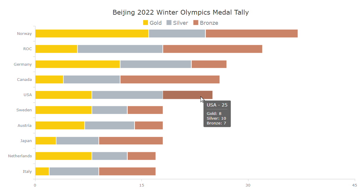
Let’s take data on medal counts by country from the Olympic medal table available on the official Beijing 2022 Winter Olympics website. Since this data is uncomplicated and limited, I will directly add it to the code in the form of an array of arrays. (Multiple other ways to load data are also at your service, of course.) The numerical values coming after the country name will stand for the number of medals won — gold, silver, and bronze, respectively.
let data = anychart.data.set([
  ['Norway',16,8,13],
  ['ROC',6,12,14],
  ['Germany',12,10,5],
  ['Canada',4,8,14],
  ['USA',8,10,7],
  ['Sweden',8,5,5],
  ['Austria',7,7,4],
  ['Japan',3,6,9],
  ['Netherlands',8,5,4],
  ['Italy',2,7,8]
]);
The stage for a JS-based stacked chart is all set as now we’ve got a web page, scripts, and data. Now, it’s time for the main event, so get ready to add some JavaScript code for the visualization!
4. Write the required JavaScript code
Before doing anything else, I add an enclosing function ensuring that the JS code inside of it runs only once the page is ready. The first thing I include is the data from step 3.
anychart.onDocumentReady(function () {

  // create a dataset
  let data = anychart.data.set([
    ['Norway',16,8,13],
    ['ROC',6,12,14],
    ['Germany',12,10,5],
    ['Canada',4,8,14],
    ['USA',8,10,7],
    ['Sweden',8,5,5],
    ['Austria',7,7,4],
    ['Japan',3,6,9],
    ['Netherlands',8,5,4],
    ['Italy',2,7,8]
  ]);

  // everything else goes here

});
A JavaScript-based stacked column chart is quite straightforward to create and believe me, it’s just a few lines of easy-to-understand code!
Since I am showcasing three different types of medals, I need three series, each representing gold, silver, and bronze medals. Firstly, I map the data for each series.
// map the data for the first series
let firstSeriesData = dataSet.mapAs({ x: 0, value: 1 });

// map the data for the second series
let secondSeriesData = dataSet.mapAs({ x: 0, value: 2 });

// map the data for the second series
let thirdSeriesData = dataSet.mapAs({ x: 0, value: 3 });
Then, I create a column chart instance and specify that I want to stack the values over the Y scale.
// create a column chart instance
let chart = anychart.column();

// stack values on y scale.
chart.yScale().stackMode('value');
Next, I create all three series with the mapped data.
// store series
let series;

// create the first series with the mapped data
series = chart.column(firstSeriesData);

// create the second series with the mapped data
series = chart.column(secondSeriesData);

// create the third series with the mapped data
series = chart.column(thirdSeriesData);
Lastly, I give a title to the chart, set the container ID (remember it from the first step — that’s where it is needed), and draw the resulting stacked chart.
// set the chart title
chart.title("Winter Olympics 2022 Medal Tally");

// set the container id for the chart
chart.container('container');

// initiate chart drawing
chart.draw();
It’s over — a fully functional JS stacked chart with column series is ready!
It has been an easy-to-follow process for creating a beautiful JavaScript stacked chart in a jiffy, isn’t it? And now, you can see at a glance how European nations are dominating the Olympic medal race and can delve into other details to analyze.
This basic version of the stacked chart with the full JS/CSS/HTML code is available on AnyChart Playground.
Actually, the resulting visualization already looks good to me. But let me show you how you can customize this stacked chart in case you ever need it.
Customizing Stacked Chart
Once you’ve created a basic JavaScript stacked chart, customizing it is even less tricky. Here are some possible tweaks that you might like to make.
1. Series name
The stacked chart contains three series indicating individual medal types. But why does someone has to guess which one is where?
To avoid any confusion, I want to name each series according to the type of medal it represents. Then these names will be specified in the tooltip showing up when the mouse cursor hovers over the corresponding series — instead of meaningless “Series 0,” “Series 1,” and “Series 2.”
So, I create a function that takes the series and the name as the parameters and sets the name of the series based on the obtained value. Then I simply pass the series and the name of that series for each series.
// a function to set the series names
let setupSeries = function (series, name) {
  series.name(name);
};

// create the first series with the mapped data
series = chart.column(firstSeriesData);
setupSeries(series, "Gold");

// create the second series with the mapped data
series = chart.column(secondSeriesData);
setupSeries(series, "Silver");

// create the third series with the mapped data
series = chart.column(thirdSeriesData);
setupSeries(series, "Bronze");
2. Color palette
A really effective way of making a chart look more impressive and personalized as well as highlighting something in data is using relevant colors. In my JS stacked chart, I can simply pick the colors for each series according to the medal type.
To do this, I add the color parameter to the function created in the previous step and pass the corresponding color for each series — to make it look like gold, silver, or bronze, respectively. When hovered, I let it turn to a darker shade of the same color.
// a function to configure label, padding, and color settings for all series
let setupSeries = function (series, name, color, hoveredColor) {
  series.name(name).stroke("2 #fff 1").fill(color);
  series.hovered().stroke("1 #fff 1").fill(hoveredColor);
};

…

// create the first series with the mapped data
series = chart.column(firstSeriesData);
setupSeries(series, "Gold", "#f9cd0e", "#dfb80c");

// create the second series with the mapped data
series = chart.column(secondSeriesData);
setupSeries(series, "Silver", "#afb7c0", "#9aa0a6");

// create the third series with the mapped data
series = chart.column(thirdSeriesData);
setupSeries(series, "Bronze", "#cc8469", "#ae7058");
Now, it is so much more intuitive. You can quickly understand which country won how many medals of each type. For example, I can immediately see that Norway’s athletes took home not only the most total medals but also the most gold ones.
3. Legend
For my current stacked chart, the colors are pretty obvious. Nonetheless, I will show you how to add a legend that indicates exactly what each color represents.
Actually, it is very easy as you can simply enable the legend and it will appear automatically. I also want to specify the font size of the legend and add a bit of top padding. But it can still be just one straightforward line of code.
chart.legend().enabled(true).fontSize(16).padding([10, 0, 0, 0]);3. Title enhancement
To make it all more pronounced, I add some formatting to the stack chart title. I increase the font size, give it a darker color, and set a larger padding.
chart.title().fontSize(20).fontColor("#2b2b2b").padding([5, 0, 0, 0]);Check out how lovely this enhanced version of the JS-based stacked column chart looks! Here is the full code with all the recent modifications.
4. Tooltip improvement
I feel that a tooltip is a great way to share more information with the reader. In this example of a JavaScript stacked chart, I will add the total number of medals won by each country to the tooltip along with the types of the medals.
Before that, I want to make sure that a single tooltip — one for all series — shows up when the mouse cursor is moved to any part of a column. This can be achieved with the “union” tooltip display mode.
chart.tooltip().displayMode("union");Now, I format the stacked chart’s title so it displays the total number of medals along with the corresponding country’s name. To do this, I create a function and add medal count values for each type.
chart.tooltip().titleFormat(function(e){
  return this.x + ' - ' + this.points[0].getStat('categoryYSum');
});
Now the tooltip is so much more intuitive and informative!
You can find the full code for this JavaScript stacked chart here.
So, it is a cool interactive stacked column chart built with JS. But what about other types of stacked charts? As a bonus, I will also show you how to easily make two other variations: a percent stacked column chart and a stacked bar chart.
5. Percent stacked column chart
When you need to focus on composition rather than totals, a percent stacked chart comes to shine. With this data visualization technique, all eyes are on percentages.
To turn a value-based stacked column chart into a percentage-based stacked chart, all you need is to replace “value” with “percent” when specifying the mode of stacking. So easy!
chart.yScale().stackMode("percent");Check out the code for this JavaScript percent stacked column chart here.
6. Stacked bar chart
If you like horizontal bars more than vertical — or, for example, if series names are just too long and do not fit well — you may like to create a stacked bar chart instead of a stacked column chart. Well, it is far from rocket science as well and can be done in exactly the same manner.
Right now, I just change column to bar everywhere.
let chart = anychart.bar();
…
series = chart.bar(firstSeriesData);
…
series = chart.bar(secondSeriesData);
…
series = chart.bar(thirdSeriesData);
The resulting interactive JavaScript stacked bar chart is the final visualization of my JS stacked chart tutorial! You are more than welcome to play with the code of this version on AnyChart Playground and add your own one to your website or app.
Conclusion
As you see, it is simple to quickly create and customize a JS stacked chart. Indeed, the process does not require too much technical knowledge or experience. Please get in touch if you have any questions.
Now, do you want to see how other chart types can be built with ease? Check out a series of JavaScript charting tutorials many of which were created by me, too!
The Olympic Games are always an inspiration. As a matter of fact, it is easier to create great interactive data visualizations than to win such top-class medals. So get going and score a win with some beautiful and insightful charts and dashboards!
We are thankful to Shachee Swadia, a freelance data visualization developer, for writing this amazing article about stacked charts.
Got an idea for a guest post? We will be happy to hear from you about it!
Don’t miss out on seeing our other JavaScript charting tutorials
- Categories: AnyChart Charting Component, HTML5, JavaScript, JavaScript Chart Tutorials, Tips and Tricks
- No Comments »