 Continuing our regular roundups of the most interesting charts, maps, and infographics, we are glad to spotlight a bunch of new awesome projects for your inspiration. Today on DataViz Weekly:
- Americans’ annual personal income — Nathan Yau
- Tonga eruption’s true scale — Reuters
- High street crisis in Great Britain — The Financial Times
- Climate change drivers and sufferers — Der Tagesspiegel
Data Visualization Weekly: January 21, 2022 — January 28, 2022
Annual Personal Income of Americans
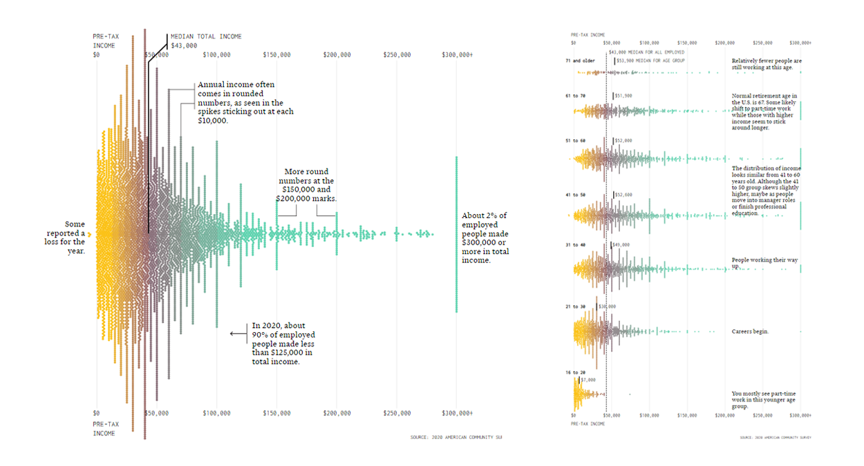
According to data from the U.S. Census Bureau, the median annual income of all workers in America in 2020 was $43,000. But as with any statistics like this, it is just a midpoint encouraging you to look into the distribution.
Nathan Yau used a beeswarm technique to create a more detailed representation based on data from the 2020 American Community Survey. Putting median total pre-tax income along the horizontal axis, he displayed how many of the employed people made a corresponding amount of money in 2020 and annotated some points that are worth taking note of. After the big one, smaller beeswarm charts show a breakdown by age group: 16 to 20, 21 to 30, 31 to 40, 41 to 50, 51 to 60, 61 to 70, and 71 and over.
Check out the beautiful visualizations and read the conclusions that can be drawn based on them, on FlowingData.
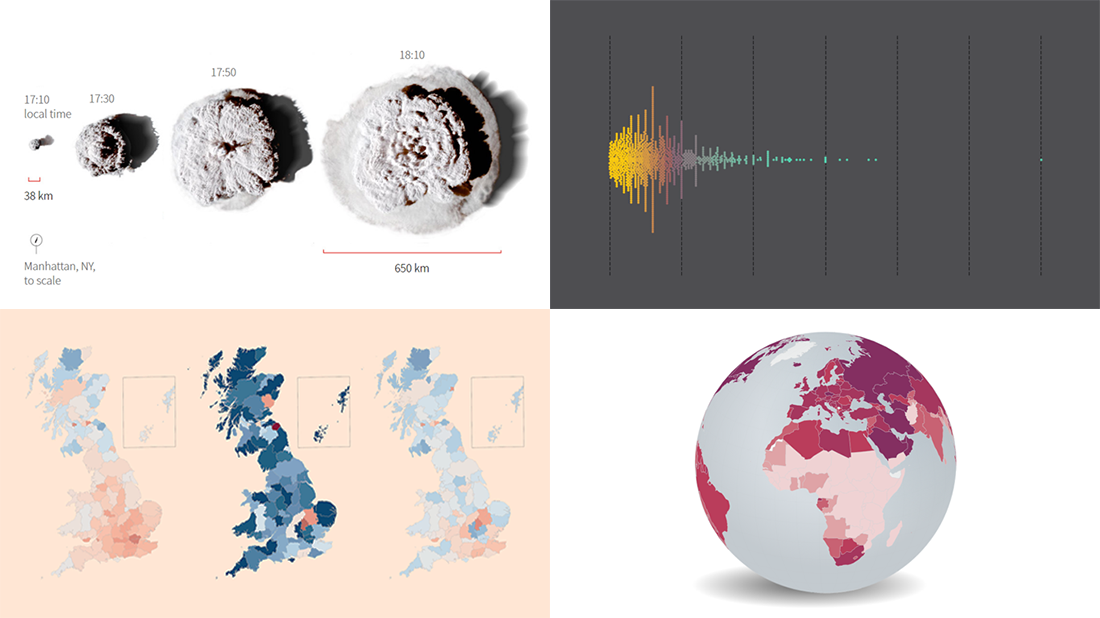
True Scale of Tonga Eruption
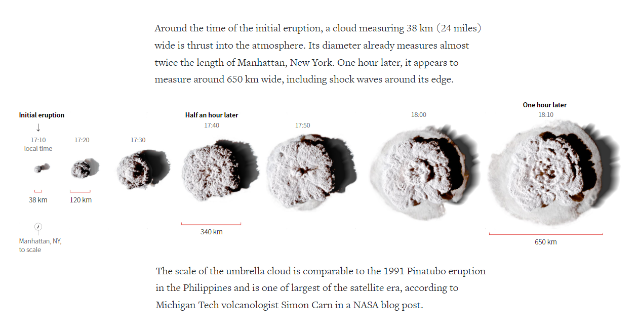
NASA says the recent eruption of Hunga Tonga–Hunga Ha’apai, a submarine volcano in the Southern Pacific Ocean, was hundreds of times more powerful than the Hiroshima nuclear explosion in terms of the amount of the released energy. In just one hour, the blast cloud grew to about 400 miles (650 kilometers) wide.
Understanding such a huge scale gets much easier when comparing it with something you know and can imagine pretty well. Manas Sharma and Simon Scarr from Reuters made a great job of visually communicating how big the eruption was. Using satellite imagery, they showed how the umbrella cloud generated by the Tonga eruption grew over one hour and added a (properly scaled) picture of the Manhattan island to the bottom left corner for quick comparison. They did not stop at that, however, and also placed the volcanic cloud animation over a number of well-known areas: Great Britain, Spain, Florida, California, and more.
Go ahead and see the story to realize the actual scale of the Tonga eruption and get impressed, on Reuters.
High Street Crisis in Great Britain
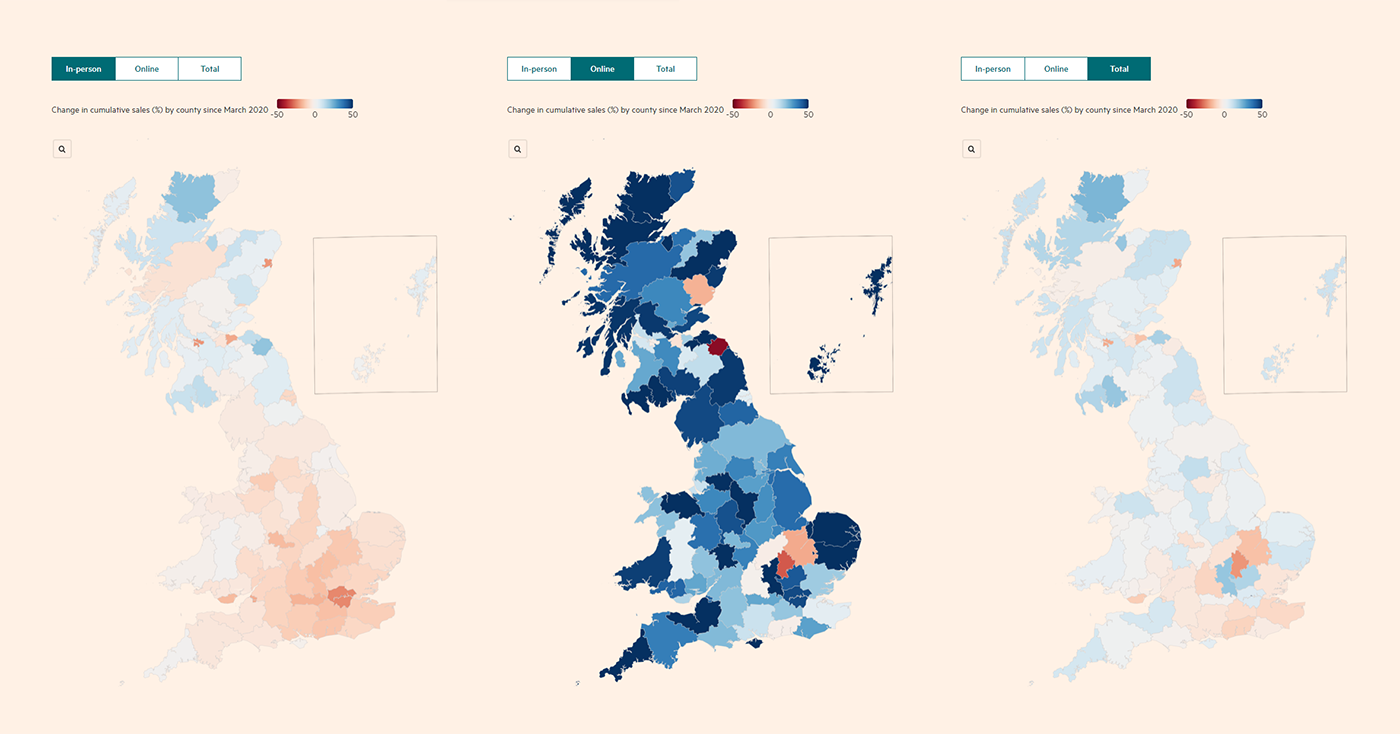
Lockdowns and work-from-home imperatives of the last two years have led the high streets to a severe crisis. However, the strictness of public health measures appears to not necessarily determine how the shops fare.
The Financial Times obtained exclusive data that reveals granular detail on British spending patterns down to a very local level. And now it has a cool interactive choropleth map along with several illuminating charts letting readers explore how retail outlets in their area have been affected by the pandemic when it comes to change in cumulative sales, including in-person and online.
Look into the graphics and don’t miss out on reading to make sure you know the context, on the FT.
Climate Change Drivers and Sufferers
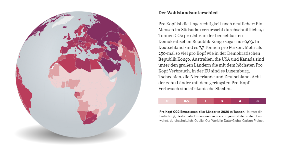
Climate change is not a matter of the future. It is already impacting our entire planet, including areas that can hardly be to blame for carbon dioxide emissions.
Der Tagesspiegel, a German daily, took a look at what countries are the largest contributors to the climate crisis, as well as which ones suffer from its consequences the most. The injustice is actually striking. Wealthy countries have contributed to climate change especially strongly. Africa has caused only about three percent of all CO2 emissions. But, home to 14% of the global population and warmer (and dryer) climate, this continent is particularly vulnerable.
Take a deep dive into the increased climate risks already faced by African countries compared to developed nations, with the help of an interactive globe visualization that greatly illustrates the story as you scroll. On Der Tagesspiegel.
***
Our next Data Visualization Weekly roundup will be published next Friday. Stay tuned, and meanwhile, have a great time!
- Categories: Data Visualization Weekly
- No Comments »