Creating Bullseye Chart with JS to Visualize the COVID-19 Vaccine Pipeline
March 25th, 2022 by Shachee Swadia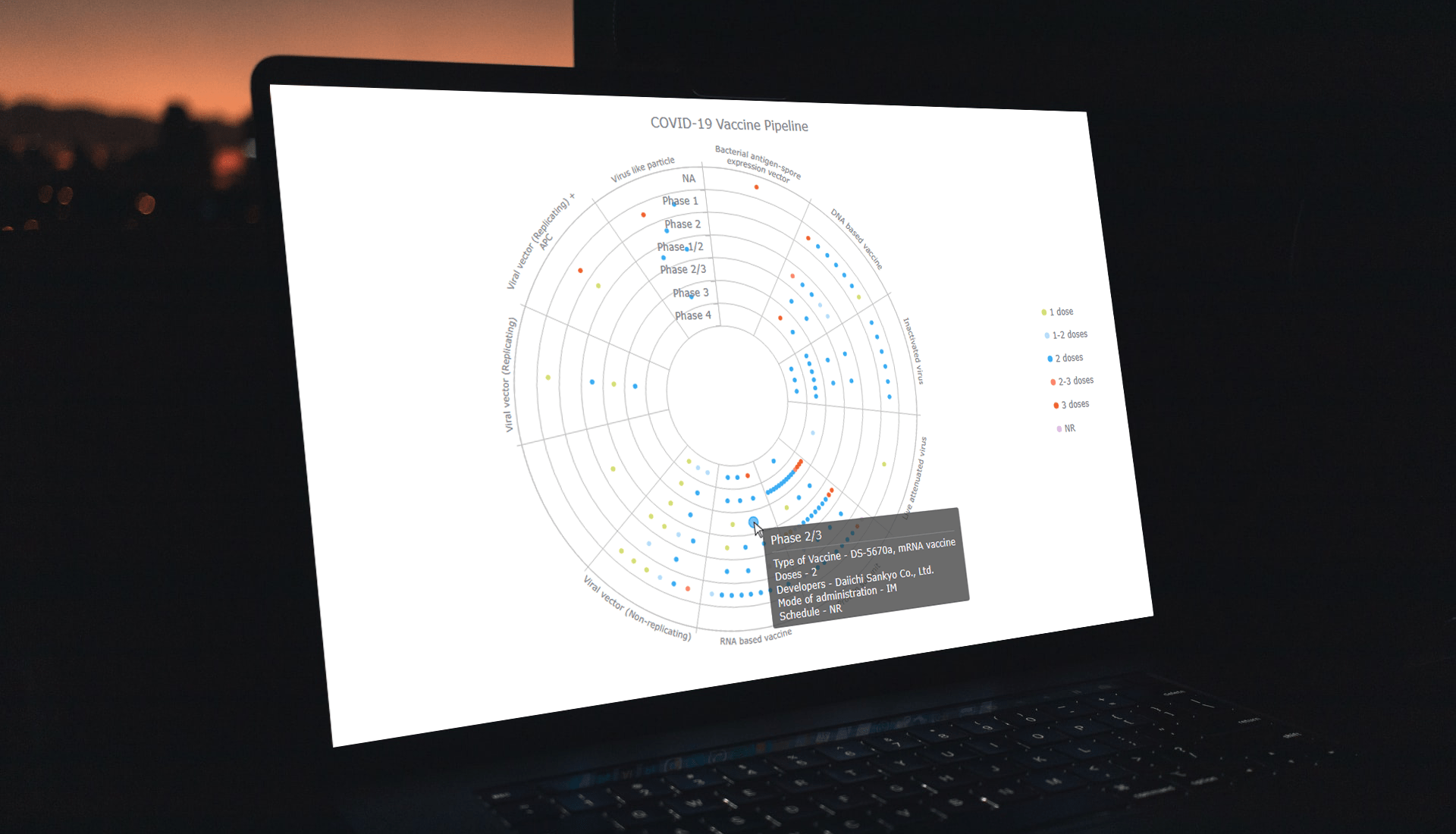 Visualizing data across a set of concentric rings, bullseye charts are widely used in drug pipeline and clinical trials data analysis. This tutorial will explain how to create this type of diagram with JavaScript. What’s more, you’ll see an excellent, typical example of an interactive bullseye chart in action!
I collated detailed information about all the COVID-19 vaccine candidates currently undergoing clinical studies from the WHO’s vaccine tracker. Now, join me as I plot it all in an interactive JS-based bullseye chart, by vaccine type and development phase!
Read the JS charting tutorial »
- Categories: AnyChart Charting Component, Big Data, Business Intelligence, HTML5, JavaScript, JavaScript Chart Tutorials, Tips and Tricks
- No Comments »
Visualizing Gender, Cycling, Polling & Climate Data — DataViz Weekly
March 18th, 2022 by AnyChart Team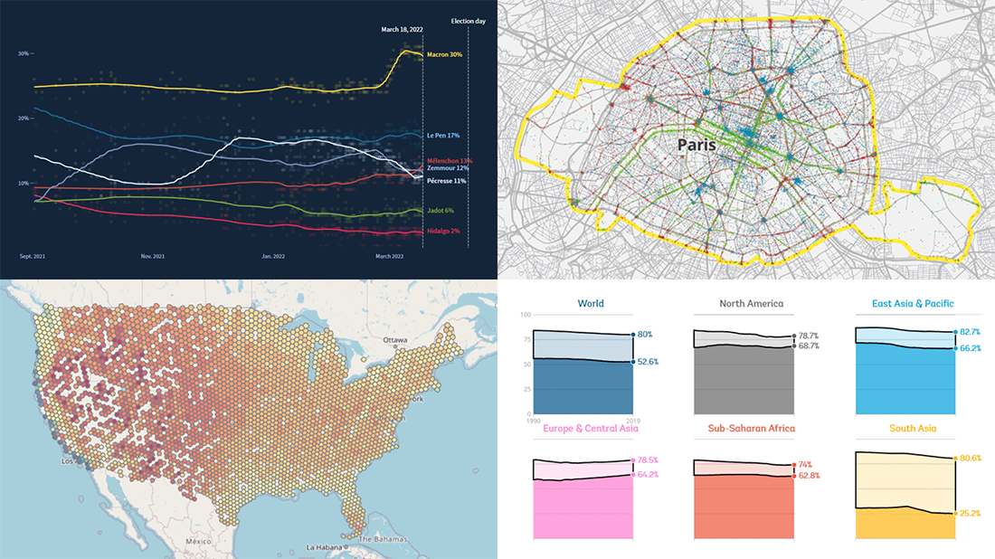 Friday is a lucky day for all fans of data visualization: DataViz Weekly is out! Join us as we look at some great examples of charts and maps published out there just recently.
- World Bank Gender Data Portal — The World Bank
- Cycling environment across France — FUB
- French presidential election polls — Reuters
- Ideal climate finder — Luke Champine
- Categories: Data Visualization Weekly
- No Comments »
How to Build Circle Packing Chart in JavaScript
March 15th, 2022 by Shachee Swadia A clear step-by-step guide for building an interactive JS Circle Packing Chart to visualize the top 100 most streamed songs on Spotify.
Want to learn to visualize hierarchical data in stunning circle packing charts that can be added to a web page or app in a hassle-free manner? Don’t feel overwhelmed and just follow my stepwise data visualization tutorial! Using a cool example of data on the top 100 most streamed songs on Spotify, I will show you how to easily create and customize a great-looking interactive circle packing chart with JavaScript.
Read the JS charting tutorial »
- Categories: AnyChart Charting Component, Big Data, HTML5, JavaScript, JavaScript Chart Tutorials, Tips and Tricks
- No Comments »
Impressive New Data Graphics on Abortions, Homes, Names, Land — DataViz Weekly
March 11th, 2022 by AnyChart Team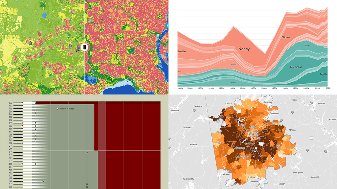 DataViz Weekly is here with another batch of impressive data graphics worth looking at and exploring! Today, we are eager to tell you about the following four new projects:
- Burden of abortion across the United States — FiveThirtyEight
- Real estate investor activity in the 40 major American cities in 2021 — The Washington Post
- Historical popularity of baby names in the U.S. since the 1880s — Namerology
- Australia land cover in detail — Geoscience Australia
- Categories: Data Visualization Weekly
- No Comments »
Most Interesting Visualizations to Check Out and Learn From — DataViz Weekly
March 4th, 2022 by AnyChart Team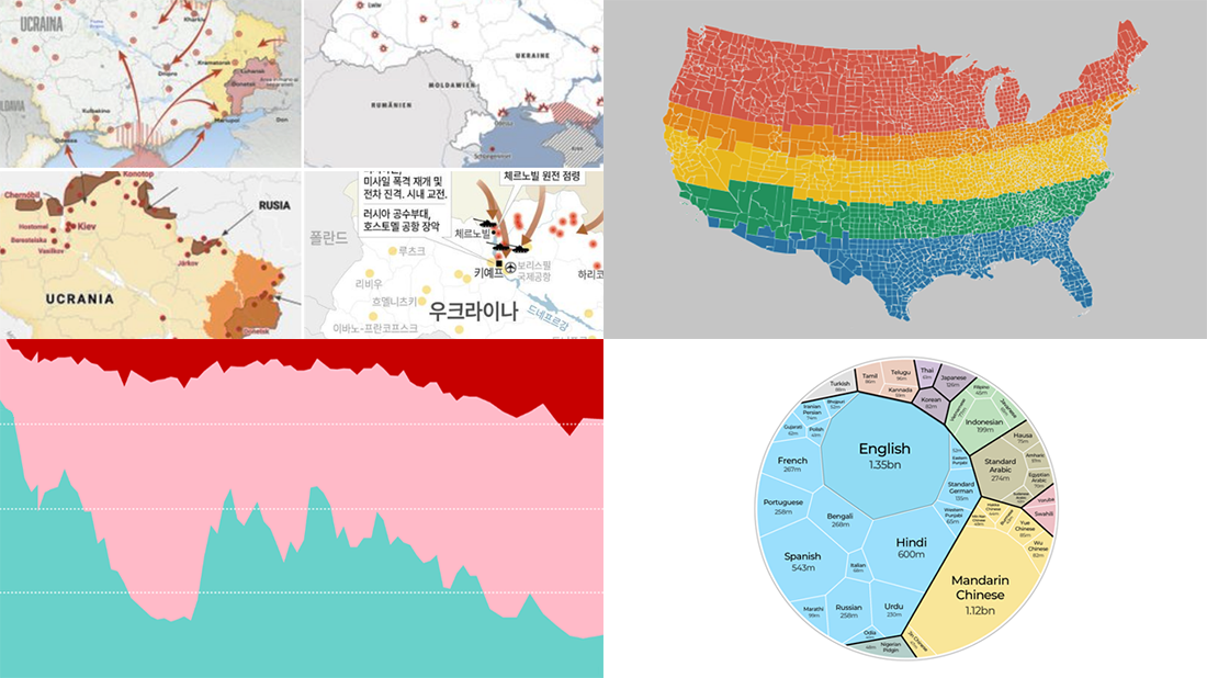 We are glad to continue our DataViz Weekly blog feature where we curate some of the most interesting and topical visualizations from around the internet. Check out a new selection:
- Russia–Ukraine conflict in maps — Lisa Charlotte Muth’s thread on Twitter
- The world’s most popular languages — Al Jazeera
- Dividing the U.S. by equal populations — Engaging Data
- Lifestyle changes during COVID-19 lockdowns — The Guardian
- Categories: Data Visualization Weekly
- No Comments »
Beijing Olympics Medal Trackers — DataViz Weekly
February 25th, 2022 by AnyChart Team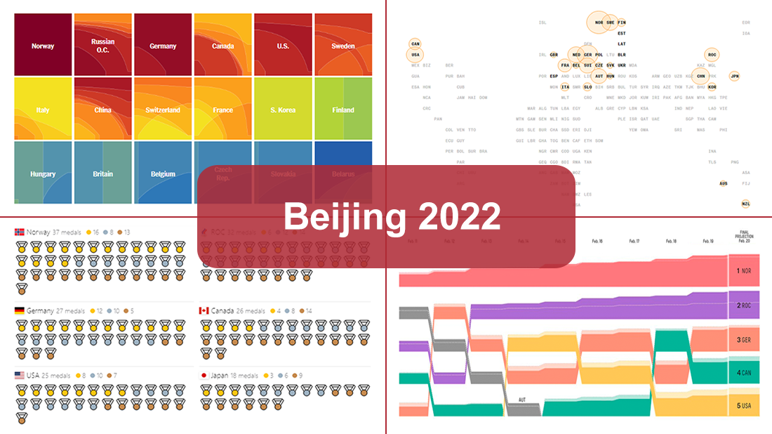 Following sixteen days of thrilling, action-packed competition, the Beijing 2022 Winter Olympics officially came to an end on Sunday, February 20. Norway finished at the top of the leaderboard, with 16 gold and 37 total medals won by its athletes at the Games.
During the Tokyo 2020 Summer Olympics that took place just six months before, we published a special edition of DataViz Weekly looking at four awesome medal trackers produced by The New York Times’s The Upshot, Bloomberg, Axios, and FiveThirtyEight. These interactive data visualization projects were brought back for the Beijing 2022 Winter Olympics. So now, we invite all lovers of charts and sports to look at their newest editions. They offer a frictionless way to explore medal counts and country standings after the Games with the help of stunning visualizations.
- Categories: Data Visualization Weekly
- 1 Comment »
Building Stock Chart with JavaScript
February 24th, 2022 by Shachee Swadia Data visualization is vastly applied in various fields. One such domain is financial trading, where stock charts are essential for smart market data analysis and decision making. Whether you invest in stocks or not, I am pretty sure that you have come across such graphics or even might need to build one right now. So, would you like to know how to make a stock chart? I’m ready to show you an easy path using the Tesla stock price data and JavaScript! Come along with me throughout this tutorial and you’ll learn how to quickly create elegant, interactive JS stock charts like the one you see in the picture.
Read the JS charting tutorial »
- Categories: AnyChart Charting Component, AnyStock, Big Data, Financial Charts, HTML5, JavaScript, JavaScript Chart Tutorials, Stock Charts, Tips and Tricks
- No Comments »
Check Out These Great New Visual Data Stories — DataViz Weekly
February 18th, 2022 by AnyChart Team Eager to see some great visualizations? We’re here to tell you about four new data stories that are definitely worth checking out! See which projects made it to this DataViz Weekly and read on.
- Bubble tea versions in a visual breakdown — Taiwan Data Stories
- Age of democracies worldwide — Our World in Data
- Women in news headlines — The Pudding
- Redlining’s lasting legacy — FiveThirtyEight
- Categories: Data Visualization Weekly
- No Comments »
SunnyByte Chooses AnyChart for Native American Cancer Data Visualization
February 16th, 2022 by AnyChart Team Out-of-the-box error bars and the ability to create a cool error chart without hassle have always been a major attraction of AnyChart, among other great features prompting developers to choose our JavaScript charting library. If you want to look at some real-world examples of such visualizations in action, Shen DeShayne, a partner at SunnyByte has recently brought a new interesting use case for them to our attention. The American Indian & Alaska Native Cancer Data website, his web development agency built for the University of New Mexico, represents information in interactive error charts powered by AnyChart. Learn more about the project and how our JS library is used, from a quick interview. (Stack: Craft CMS/Vue.js.)
- Categories: AnyChart Charting Component, Big Data, HTML5, JavaScript, Success Stories
- No Comments »
Recalling Most Awesome Recent Data Visualizations — DataViz Weekly
February 11th, 2022 by AnyChart Team It’s Friday, time to recall the most awesome data visualizations of all that have caught our attention over the past week. So everyone, welcome to DataViz Weekly!
- Decline of English on Spotify — The Economist
- English Premier League contenders for the Champions League qualification — The Athletic
- Carbon footprint of food — Der Tagesspiegel
- Air temperature change in every U.S. county — The Guardian
- Categories: Data Visualization Weekly
- No Comments »