 Eager to see some great visualizations? We’re here to tell you about four new data stories that are definitely worth checking out! See which projects made it to this DataViz Weekly and read on.
- Bubble tea versions in a visual breakdown — Taiwan Data Stories
- Age of democracies worldwide — Our World in Data
- Women in news headlines — The Pudding
- Redlining’s lasting legacy — FiveThirtyEight
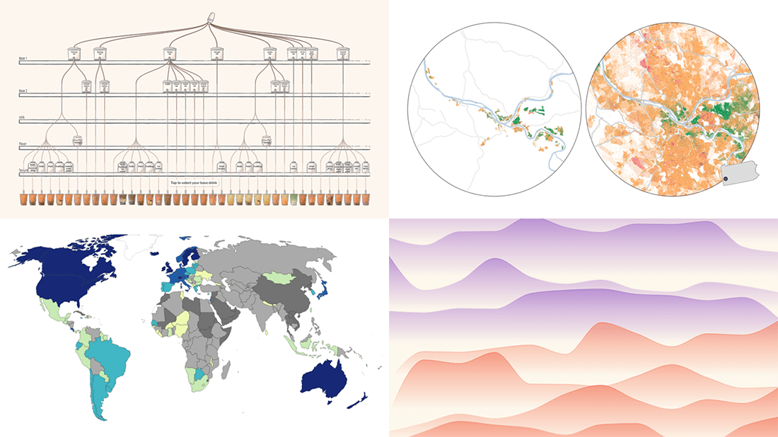
Data Visualization Weekly: February 11, 2022 — February 18, 2022
Bubble Tea Versions in Visual Breakdown
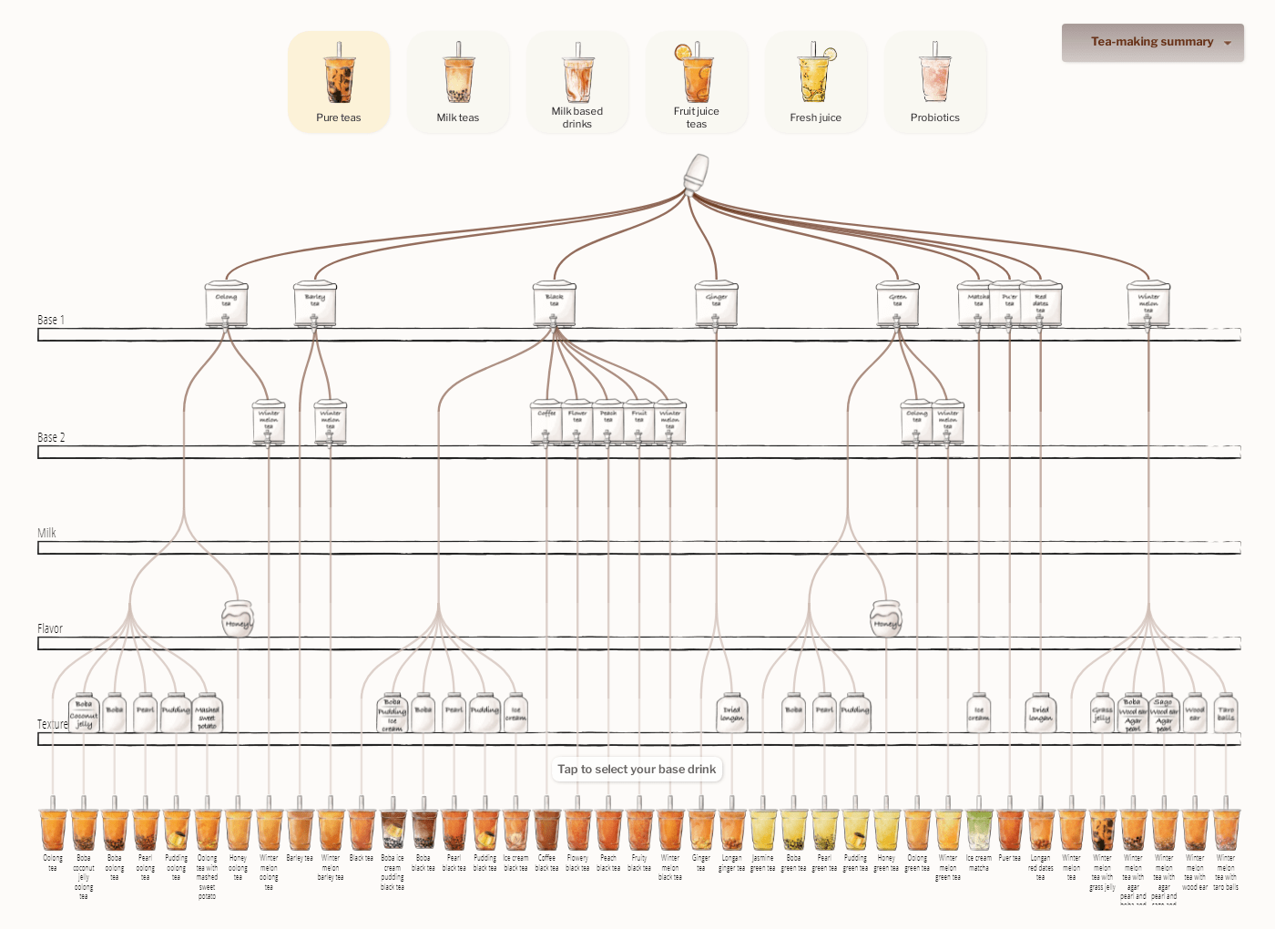
Bubble tea, or simply boba, is an iconic Taiwanese tea-based drink that has become popular around the world. There are many if not countless variations of it based on what kind of base liquid, milk, and toppings are used. You can actually customize boba to your very own liking.
Investigating the variety of bubble tea versions, data visualization designers Julia Janicki and Daisy Chung analyzed menus of the five most popular boba shops in Taiwan. Then they broke down each drink by ingredient and made a fascinating interactive graphic showing 157 unique combinations of base, milk, flavor, and textures at a glance. They did not even stop at that and created an entire virtual, interactive tea-making tool. First, you pick a base drink — one of those 157 variations. After that, you choose from three additional toppings, seven levels of temperature, and five levels of sweetness. All these options were found to allow for 12,775,875 possible versions of boba.
Look at that, compose your own combination, and enjoy your personal, fully customized virtual bubble tea.
Age of Democracies Worldwide
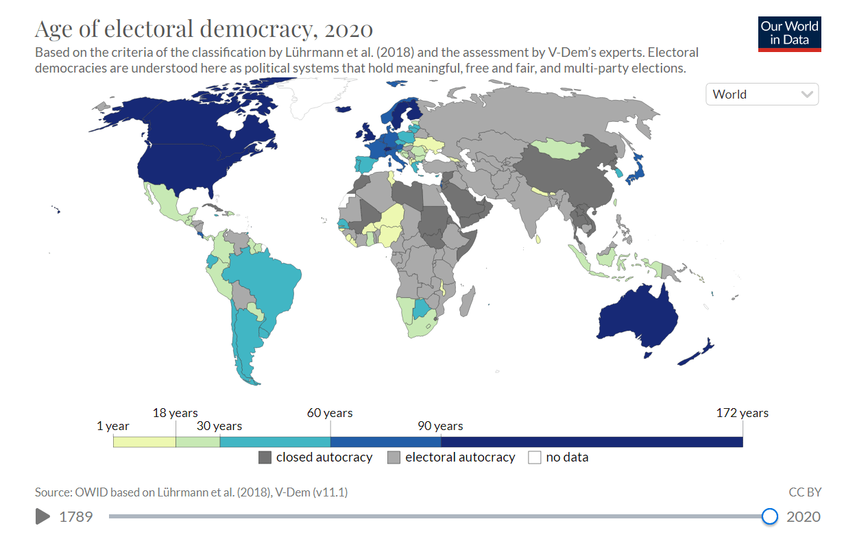
Young people that live in democratic countries may actually think authoritarianism is a long-forgotten story. However, that feeling is far from always being right.
Bastian Herre of Our World in Data looked at the globe through the lens of forms of government using the Regimes of the World (RoW) classification and data from the Varieties of Democracy (V-Dem) project. In his research, it was found that, in addition to the fact that just over half of countries are democratic nowadays, dictatorship is far from a truly distant memory in almost all those that are. Moreover, many democracies appear to be as young as less than a generation old, and when it comes to distinguishing between different types, liberal democracy is even more recent attainment.
Explore the age of democracies across the world as of now and since 1789 in choropleth maps and bar charts.
Women in News Headlines
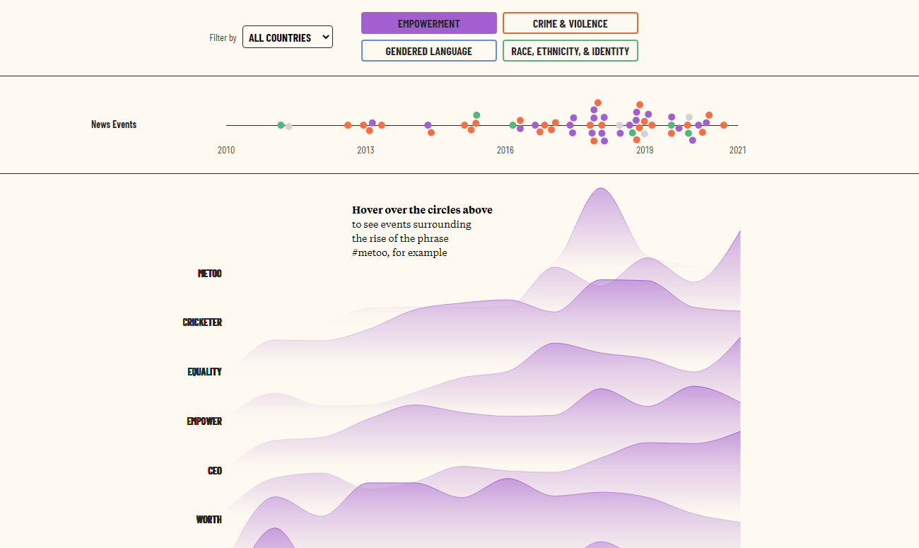
According to the latest “Who Makes the News?” report of the Global Media Monitoring Project (GMMP), women are much less represented in the news than men. And that has not really shifted since 2010.
Leonardo Nicoletti and Sahiti Sarva decided to elaborate on this topic and see what it looks like when women make the news and how have headlines changed as time goes by. Using keywords associated with women (girl, lady, mother, and so on), they explored more than 380,000 headlines published in 2005–2021 by the top English-speaking news media outlets in the United States, the United Kingdom, South Africa, and India (186 publications overall).
Check out their amazing visual essay on The Pudding.
Lasting Legacy of Redlining
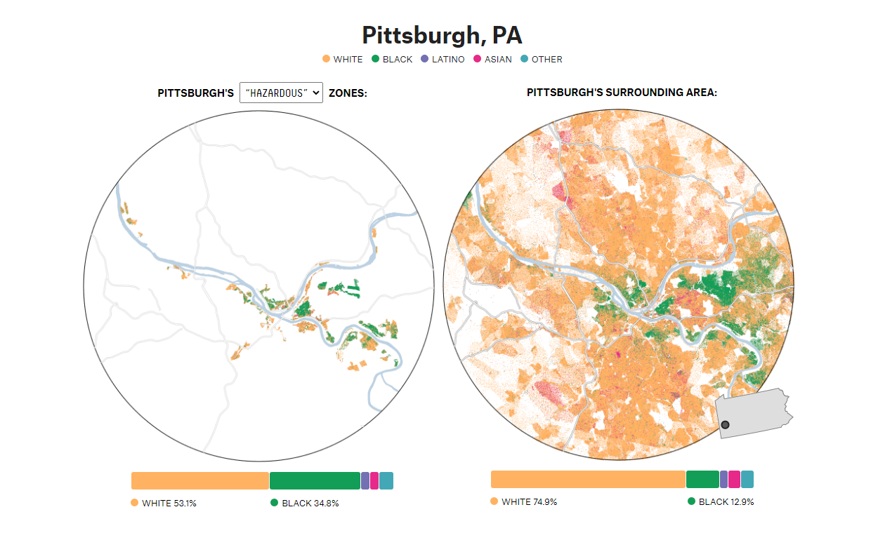
It has already been more than 50 years since the use of redlining was completely banned. But the impact of that discriminatory practice is still felt in the lasting segregation within American cities.
FiveThirtyEight’s visual journalists Ryan Best and Elena Mejía attempted to better understand the legacy of redlining. For that purpose, they analyzed the demographics of 138 metro areas across the United States using data from the University of Richmond’s Mapping Inequality project along with the 2020 Census and found that almost all formerly redlined areas remain disproportionately Black, Asian, or Latino while nearly two-thirds of greenlined areas continue to be (overwhelmingly) White.
See their visual story with maps in a special project on FiveThirtyEight and use an interactive data visualization tool at the bottom to identify how segregated a particular city is.
***
Your interest in good data visualizations is precious! Stay tuned for DataViz Weekly where we curate the most awesome charts, maps, and infographics from around the internet.
- Categories: Data Visualization Weekly
- No Comments »