 Friday is a lucky day for all fans of data visualization: DataViz Weekly is out! Join us as we look at some great examples of charts and maps published out there just recently.
- World Bank Gender Data Portal — The World Bank
- Cycling environment across France — FUB
- French presidential election polls — Reuters
- Ideal climate finder — Luke Champine
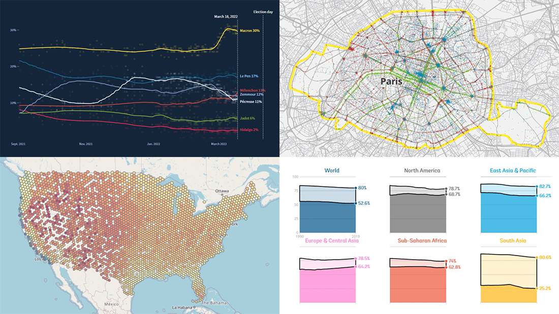
Data Visualization Weekly: March 11, 2022 — March 18, 2022
World Bank Gender Data Portal
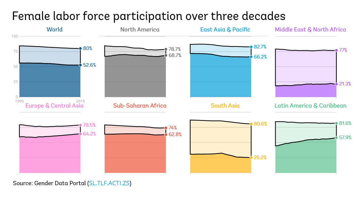
Despite many countries making efforts to achieve gender equality, the world is still likely to have a way to go on that issue.
Aiming to make it easier for researchers, policymakers, and all other stakeholders to get and analyze gender information, the World Bank carried out a major redesign of its Gender Data Portal. The project now offers a total of more than 900 indicators, country profiles, and narratives. Compelling data visualizations are provided throughout all of it.
Check out the new data, visualizations, and stories on the World Bank’s Gender Data Portal.
Cycling Environment Across France
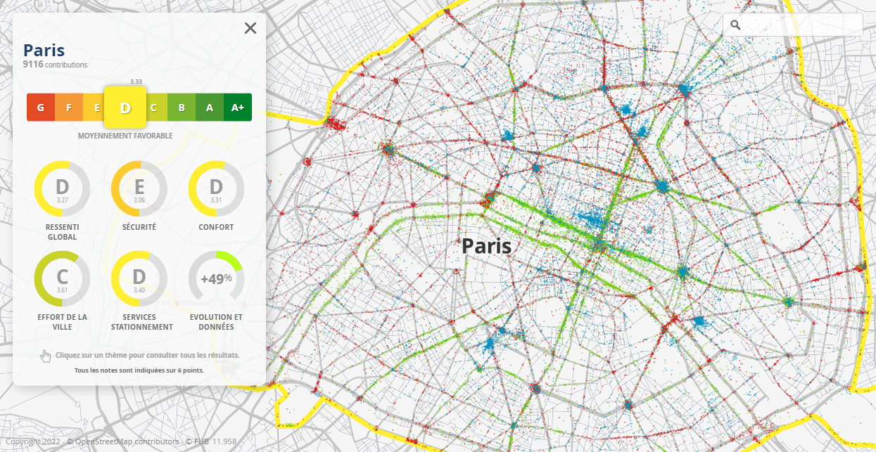
Within the framework of the Cycling Cities Barometer project, the French Federation of Bicycle Users (FUB) conducted a survey asking people all over France to rate the cycling climate in their municipalities. There were 26 questions in total, grouped into five themes: general impression, service infrastructure, safety, comfort, and municipal efforts.
The results are now ready and presented to the public using an interactive map. More than 1,500 municipalities — only those which received at least 50 responses — are colored according to their cycling climate score. Click on a town to see its final ranking’s breakdown by category, as well as to view which places local cyclists consider to require improvement (see this other map for a focus on that aspect).
Explore the cycling climate across France, on the Baromètre des Villes Cyclables website.
French Presidential Election Polls
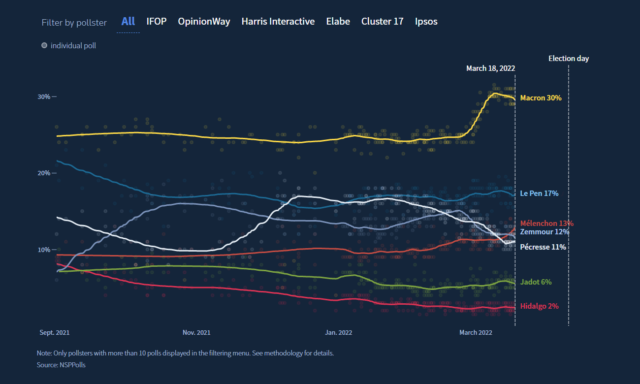
Three weeks before the first round of the 2022 presidential election in France, current president Emmanuel Macron leads in opinion polls. But anyway it looks like the second round is inevitable as the 50% vote threshold will hardly be crossed.
Reuters created an interactive tracker for French election polls. Featuring beautiful visualizations designed by Dea Bankova, the project allows you to see the current voting intentions and how they have changed since September 2021. Sourced from NSPPolls, the data comprises figures from multiple pollsters. The technique of local polynomial regression was implemented to fit curve lines over individual poll data points.
Find out how candidates rank in the latest polls and how their support has changed, on Reuters.
Ideal Climate Finder
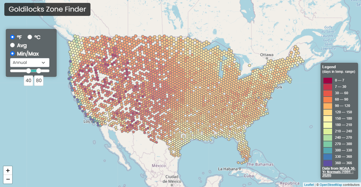
When you realize you want to move to a new place, the first thing to do is decide where. For everyone who takes climate into account, there is a cool utility.
Luke Champine created an interactive mapping tool that can help you find the most habitable area for yourself based on what kind of weather you want to have. Just define your preferences for an ideal air temperature, annual or in a certain month. The map will let you quickly understand the locations with the highest number of days with that sort of weather based on NOAA’s data from the 1991–2020 U.S. Climate Normals.
Goldilocks Zone Finder — that is the name of the project — covers only the United States. But feel free to create a similar tool for a different country as the code is available on GitHub.
***
Stay tuned for our weekly roundups of the most awesome data visualizations. All the best!
- Categories: Data Visualization Weekly
- No Comments »