 It’s Friday, time to recall the most awesome data visualizations of all that have caught our attention over the past week. So everyone, welcome to DataViz Weekly!
- Decline of English on Spotify — The Economist
- English Premier League contenders for the Champions League qualification — The Athletic
- Carbon footprint of food — Der Tagesspiegel
- Air temperature change in every U.S. county — The Guardian
Data Visualization Weekly: February 4, 2022 — February 11, 2022
Decline of English on Spotify
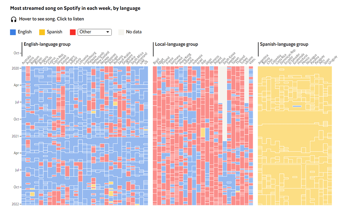
In the world of music, the global popularity of English has been unrivaled. However, nothing is forever. Although 47 of the 50 most streamed songs on Spotify over the past 5 years are in the English language, its dominance appears to be in decline.
The Economist delved into the evolution of music tastes and linguistic preferences across the globe using Spotify data. Analyzing thousands of hits in 70 countries, its journalists found that all listeners could be grouped into three large clusters according to what kind of tracks they enjoy: one where English prevails, one with the dominance of Spanish, and one that mainly likes songs in local languages. The declining trend for English was identified across all the three groups and emerged as especially striking within the latter two.
The elegant charts on The Economist will tell you more. An interactive matrix at the end of the story, which represents the most streamed song on Spotify in each of the 70 countries every week from late 2016 to early 2022, is totally worth special attention and will even let you listen to all these tracks.
English Premier League Contenders for Champions League Qualification
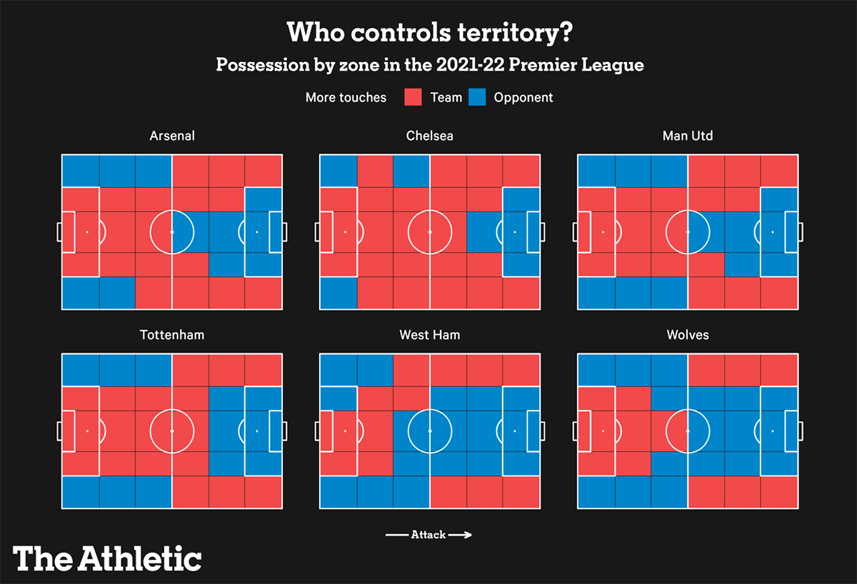
The top four teams in the English Premier League (EPL) qualify for the group stage of the UEFA Champions League, the most prestigious soccer club tournament in Europe. The current two leaders, Manchester City and Liverpool, are likely to stay ahead of the others. But which clubs have the best chances to complete the top four?
The Athletic looked at various data for the six teams that are currently placed 3rd to 8th in the EPL competition to see how the top-four race can unfold for them: Arsenal, Chelsea, Manchester United, Tottenham Hotspur, West Ham United, and Wolverhampton Wanderers. There are multiple interesting visualizations in the article, representing different metrics for comparison. You can see one of them in the image above. This visualization greatly highlights the zones on the field in which the teams have more touches than their opponents.
Check out the article on The Athletic to not miss out on its cool graphics showing credentials of the Champions League qualification contenders in the Premier League.
Carbon Footprint of Food
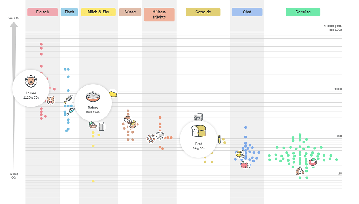
Scientists calculated that about 34% of all carbon dioxide emissions come from food, distributed over all stages of its cultivation, processing, and transportation. Do you wonder how climate-friendly your meals are and which products are particularly harmful?
Der Tagesspiegel made a cute visual story exploring the carbon footprint of popular food products using data from Swiss company Eaternity. Some facts revealed and illuminated with the help of a beautiful chart, which gets zoomed in and out and annotated as you scroll down the piece, may actually come as a surprise. For example, a vegetarian diet is not always more climate-friendly than eating meat.
See the article on Der Tagesspiegel. The visualization it centers around is available for your own exploration at the end of the scrollytelling part. There is also a very cool calculator ready to serve you further.
Air Temperature Change in Every U.S. County
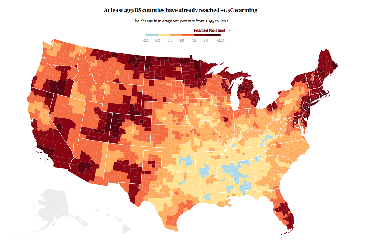
So, what about climate change? How bad is it already?
The Guardian has an answer for the United States. The newspaper published an interactive choropleth map displaying the change in air temperature at the county level based on data collated from the National Oceanic and Atmospheric Administration (NOAA) by Alaska-based climate scientist Brian Brettschneider. The figures show that one-third of Americans are experiencing above-average warming right now. And at least 499 counties have already seen an air temperature rise of 2.7 F (1.5 C) or even more compared to the pre-industrial era.
Explore the map, and don’t miss out on an interactive Mekko chart showing what percentage of each U.S. state’s population lives in counties that have heated up by at least 2.7 F (1.5 C) since 1895, on The Guardian.
***
That’s all for now, folks. Now, check out these cool data visualization projects by yourself. And stay tuned for DataViz Weekly!
- Categories: Data Visualization Weekly
- No Comments »