 Visualizing data across a set of concentric rings, bullseye charts are widely used in drug pipeline and clinical trials data analysis. This tutorial will explain how to create this type of diagram with JavaScript. What’s more, you’ll see an excellent, typical example of an interactive bullseye chart in action!
I collated detailed information about all the COVID-19 vaccine candidates currently undergoing clinical studies from the WHO’s vaccine tracker. Now, join me as I plot it all in an interactive JS-based bullseye chart, by vaccine type and development phase!
Bullseye Chart Preview
Are you wondering what the resulting chart looks like? Take a sneak peek right below! Then follow along, and you’ll learn how to build this fascinating JavaScript-based bullseye chart showing the COVID-19 vaccine landscape at a glance!
Building a JavaScript Bullseye Chart
The process of creating a bullseye chart with JavaScript can be split into four fundamental steps:
- Create an HTML page.
- Include scripts.
- Connect data.
- Do some JavaScript coding.
Now, check out how it goes in reality step by step!
1. Create a basic HTML page
The first thing I do is create a basic web page with a block-level HTML element (<div>) to hold the future bullseye chart.
To easily reference the <div> element later in the code, I provide it with an id value.
I also set its height and width parameters as 100%. As a result, my bullseye chart will render across the whole HTML page.
<html>
  <head>
    <title>JavaScript Bullseye Chart</title>
    <style type="text/css">
      html, body, #container {
        width: 100%; height: 100%; margin: 0; padding: 0;
      }
    </style>
  </head>

  <body>
    <div id="container"></div>
  </body>
</html>
2. Include scripts
Now, I need to reference all scripts that will be used to create the bullseye chart I have in mind. That goes to the page’s <head> section.
There are many JavaScript charting libraries out there, collections of pre-written JavaScript code intended to facilitate the development of data visualizations. However, not all of them support bullseye charts. One of those that have this type of graph is AnyChart, which is free for non-commercial use and pretty simple to get started with, so I decided to use it as an example in this tutorial.
To make a bullseye chart, I need the library’s core and polar modules.
<html>
  <head>
    <title>JavaScript Bullseye Chart</title>
    <script src="https://cdn.anychart.com/releases/8.11.0/js/anychart-core.min.js"></script>
    <script src="https://cdn.anychart.com/releases/8.11.0/js/anychart-polar.min.js"></script>
    <style type="text/css">
      html, body, #container {
        width: 100%; height: 100%; margin: 0; padding: 0;
      }
    </style>
  </head>

  <body>
    <div id="container"></div>
    <script>
      // All the JS bullseye chart code goes here.
    </script>
  </body>
</html>
3. Connect data
So. I took vaccine data from the COVID-19 vaccine tracker and landscape section of the World Health Organization’s website and curated it into a JSON file.
To load the data file, I will use a handy Data Adapter utility. So I reference it together with the other scripts. Then I will simply connect the dataset using the data.loadJsonFile function.
Now that we’ve got a holder page, scripts, and data for the visualization, let me show you how to code a lovely interactive JavaScript bullseye chart!
4. Do some JS coding
Although bullseye charts may seem quite fancy, it is not very complicated to build such a data visualization using a JavaScript charting library. I am going to explain each move and leave explanatory notes in the code itself.
So, to start with, I add a function enclosing all the code, which makes sure that everything inside it will execute only after the page is ready, and then load the data from the JSON file.
anychart.onDocumentReady(function () {
  anychart.data.loadJsonFile(
    "https://gist.githubusercontent.com/shacheeswadia/3cc96d8ed792bfa0c04fbd3825816fde/raw/606c2646df568f30bd39dc01fcd4efe6e92b3bac/vaccineData.json",
    function (data) {...}
  );
});
Then, I create a polar chart instance.
var chart = anychart.polar();I want my bullseye chart to have a hole in the center, so I set the inner radius.
chart.innerRadius(80);Next, I specify both the Y scale (for clinical research phases) and the X scale (for vaccine types) as ordinal and define the order in which I want the values to show up.
// y scale shows phases
// set it as ordinal
chart.yScale("ordinal");

// define the order of values on the scale
chart
  .yScale()
  .values([
    "Phase 4",
    "Phase 3",
    "Phase 2/3",
    "Phase 1/2",
    "Phase 2",
    "Phase 1",
    "NA"
  ]);

// x scale shows vaccine types
// set it as ordinal
chart.xScale("ordinal");

// define the order of values on the scale
chart
  .xScale()
  .values([
    "Bacterial antigen-spore expression vector",
    "DNA based vaccine",
    "Inactivated virus",
    "Live attenuated virus",
    "Protein subunit",
    "RNA based vaccine",
    "Viral vector (Non-replicating)",
    "Viral vector (Non-replicating) + APC",
    "Viral vector (Replicating)",
    "Viral vector (Replicating) + APC",
    "Virus like particle"
  ]);
After that, I add a function that will set a series with the given properties, creating a marker series (one marker will stand for one vaccine), beautifying the series name to be shown based on the number of doses, setting the series size, name, id, and finally, returning the series.
// set a series with the given properties
function createSeries(seriesId) {
  // create a series
  const series = chart.marker();

  // the name for display is beautified
  const seriesName =
    seriesId +
    (seriesId == "NR" ? "" : seriesId == 1 ? " dose" : " doses");

  // set the size, name, id
  series.size(2).name(seriesName).id(seriesId);

  return series;
}
Next, I create a function that will take care of adding the marker series with the given data. First, I set the number of doses from the data as the series ID. Then, I check if such a series already exists, and if it does not, I create one with the series ID using the function I have configured just before. After that, I add the data into the series and specify the x and y values so that the type of the vaccine is on the X scale and the clinical trial phase is on the Y scale. Finally, once the function is defined, I loop through the data-set point by point.
// add a marker series with the given data
function addPoint(item) {
  // the number of doses is a series id
  const seriesId = item["Number of doses"];

  // check if there is a series like we need
  var series = chart.getSeries(seriesId);

  // if there is no such series we create and configure it
  if (series == null) {
    series = createSeries(seriesId);
  }

  // add the data into the series
  series
    .data()
    .getDataSets()[0]
    .append({
      x: item["Vaccine platform description"],
      y: item["Phase"],
      ...item
    });
}

// loop through the dataset
// point by point
data.forEach((vaccine) => addPoint(vaccine));
Since the amount of data I am visualizing in a bullseye chart is large and there will be multiple points in almost every sector of the diagram, I distribute the markers equally to avoid overlap.
// spread bullets throughout a sector
chart.spreadValues("valueEqual");
Almost done! The last things I do are add a title and draw the resulting bullseye chart in the container.
// set the chart title
chart.title("COVID-19 Vaccine Pipeline");

// set the chart container id
chart.container("container");

// draw the resulting bullseye chart
chart.draw();
That’s it! A stunning interactive JS-based bullseye chart is ready with just a few lines of code!
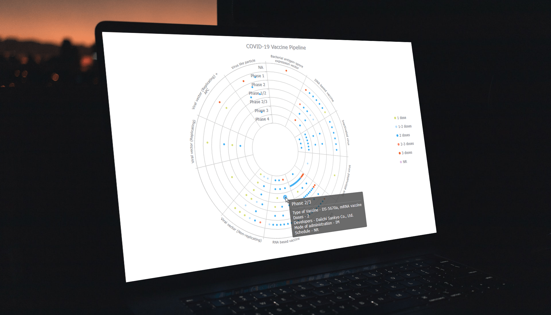
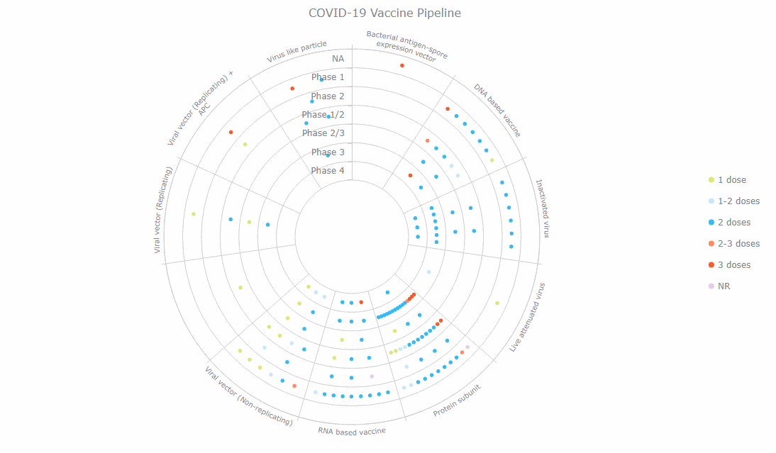
The bullseye chart shows that the vast majority of all COVID-19 vaccines currently in clinical studies belong to the Protein subunit type. Some of them are already in phase 3, and it looks like we can expect a lot of them to become available soon.
The interactive version of this (initial) JavaScript bullseye chart is available on CodePen and Playground with the full source code.
Customizing a JavaScript Bullseye Chart
Now, let me show you how to add some functional and aesthetic changes to make such a JavaScript-based bullseye chart even better-looking and more insightful.
1. Modify the markers
I want to tweak the look of the markers first.
To reduce the clutter, I make all of them displayed as circles.
chart.markerPalette(["circle"]);Then I define a custom color palette. Since all my series are created based on the number of doses, the colors are automatically updated with the defined palette where the color of each marker corresponds to the series type.
chart.palette([
  "#dce778",
  "#c8e4fb",
  "#35baf6",
  "#ff8b66",
  "#f55d2c",
  "#e7cbeb"
]);
2. Add a legend
I am coloring the markers based on a parameter, so I’d better provide the bullseye chart with a legend indicating what each color represents.
I define the legend and specify its position, layout, and alignment.
let legend = chart.legend();
legend.enabled(true);
legend.position("right");
legend.itemsLayout("vertical");
legend.align("center");
Additionally, the type and size of the legend items go to the function responsible for setting the series.
series.legendItem().iconType("circle").iconSize(8);The newly customized JavaScript bullseye chart with the modified markers and the legend is available on CodePen and Playground.
3. Improve the tooltip
There is a lot more information about each vaccine in the data, and I want to show it all in the tool-tip. That will make my bullseye chart even more informative.
I make the phase appear in the title of the tool-tip, and using the getData function, I access the other information associated with each data point and include it.
chart
  .tooltip()
  .titleFormat("{%y}")
  .format(function () {
    return (
      "Type of Vaccine - " +
      this.getData("Type of candidate vaccine ") +
      "\n Doses - " +
      this.getData("Number of doses") +
      "\n Developers - " +
      this.getData("Developers ") +
      "\n Mode of administration - " +
      this.getData("Route of administration") +
      "\n Schedule - " +
      this.getData("Schedule")
    );
  });
Voila! An enthralling and informative JavaScript bullseye chart is all done! Explore it interactively and play around with its entire code on CodePen or Playground.
Conclusion
The bullseye chart type is perfect for visualizing such data as clinical studies by phase, and now you see, it can be pretty straightforward to create in JavaScript. Do let me know if you have any questions or suggestions.
We wish the world could be free from deadly viruses and other infections. But while we are where we are, let’s get our vaccines and be all healthy for creating some exciting, useful visualizations!
Published with the permission of Shachee Swadia. Originally appeared on Hacker Noon with the title “How to Create Bullseye Charts with JS: COVID-19 Vaccine Pipeline” on March 1, 2022.
See other JavaScript charting tutorials.
Contact us if you’ve got an idea of a cool guest post.
- Categories: AnyChart Charting Component, Big Data, Business Intelligence, HTML5, JavaScript, JavaScript Chart Tutorials, Tips and Tricks
- No Comments »