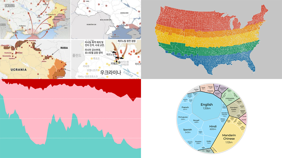
 We are glad to continue our DataViz Weekly blog feature where we curate some of the most interesting and topical visualizations from around the internet. Check out a new selection:
- Russia–Ukraine conflict in maps — Lisa Charlotte Muth’s thread on Twitter
- The world’s most popular languages — Al Jazeera
- Dividing the U.S. by equal populations — Engaging Data
- Lifestyle changes during COVID-19 lockdowns — The Guardian
Data Visualization Weekly: February 25, 2022 — March 4, 2022
Russia–Ukraine Conflict
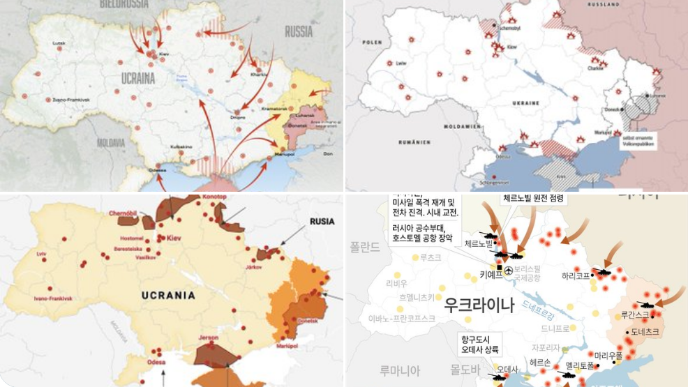
Russia’s ‘special military operation’ in Ukraine has been a shock for many people worldwide.
There are numerous data visualizations trying to describe the situation, mainly built in the form of maps. They’re claimed to show the advance of troops, the location of strikes and explosions, and so on.
On Twitter, Lisa Charlotte Muth from Datawrapper maintains a special thread collecting links to all maps about the Ukraine conflict that she comes across. It already includes dozens and is continually updated with new ones. Check it out and feel free to add missing links (if any).
Most Popular Languages
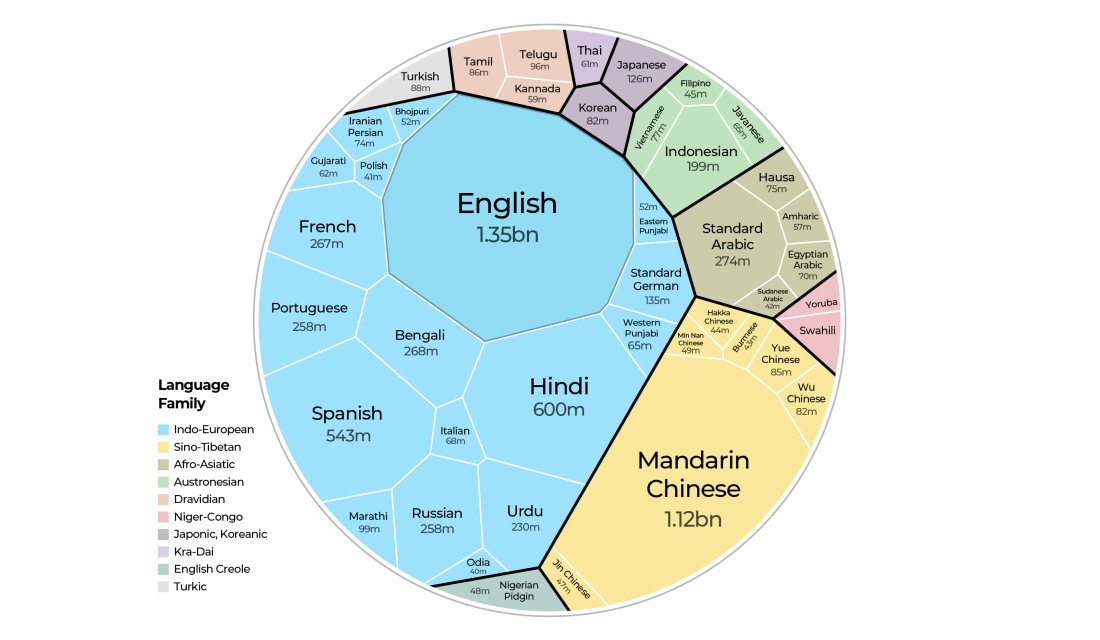
According to Ethnologue, English is the world’s most widespread language if you take into account both native (first-language) and non-native speakers all together. Mandarin Chinese goes second.
On the occasion of International Mother Language Day celebrated in late February, Al Jazeera posted a Voronoi diagram that graphically puts the most spoken languages on the scale for easy comparisons. All the represented languages are grouped into language families. For example, you can see at a glance that the Indo-European one is by far the largest.
In addition, Al Jazeera’s journalists asked people across the globe to share popular expressions in their native languages along with their meanings. So right there, you can also listen to idioms in 25 different languages and find out what they mean.
U.S. Divisions by Equal Populations
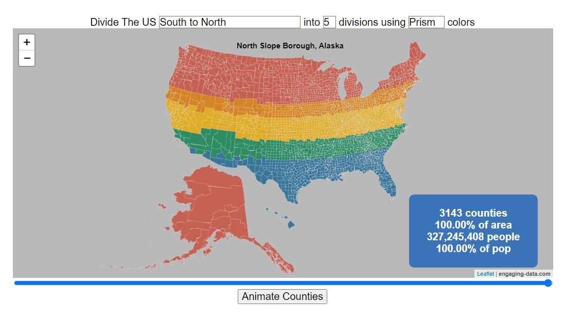
The United States population density is roughly 95 people per square mile. And it goes without saying that it greatly varies across counties.
A new interactive mapping project published on the Engaging Data website surfaces interesting insights into the U.S. population density data. It lets you visually split the United States into a number of areas with equal populations across several different dimensions. For example, the image above depicts a division into five segments in the south-to-north direction. The project is based on county-level population data as of 2018, sourced from the U.S. Census Bureau.
Select the criteria you want to apply, press “Animate Counties,” and enjoy the view and exploration.
Lifestyle Changes During COVID-19
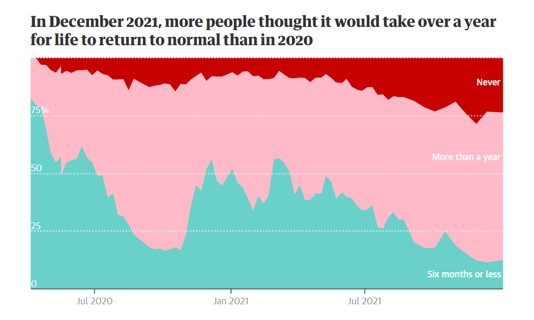
Now that COVID-related restrictions are being lifted around the world, it is a good time to look back and see what has shifted in our lifestyles during the pandemic. Some changes, by the way, are likely here to stay.
The Guardian made multiple charts providing a quick understanding of the shifts in people’s lives in the United Kingdom. In particular, they show patterns for working, traveling, shopping, housing, socializing, and other habits.
You are welcome to look through the charts and compare what they reveal with your own lifestyle changes.
***
Hungry for more visualizations worth checking out? Don’t miss out on looking at our previous DataViz Weekly roundups and stay tuned.
- Categories: Data Visualization Weekly
- No Comments »