 DataViz Weekly is here with another batch of impressive data graphics worth looking at and exploring! Today, we are eager to tell you about the following four new projects:
- Burden of abortion across the United States — FiveThirtyEight
- Real estate investor activity in the 40 major American cities in 2021 — The Washington Post
- Historical popularity of baby names in the U.S. since the 1880s — Namerology
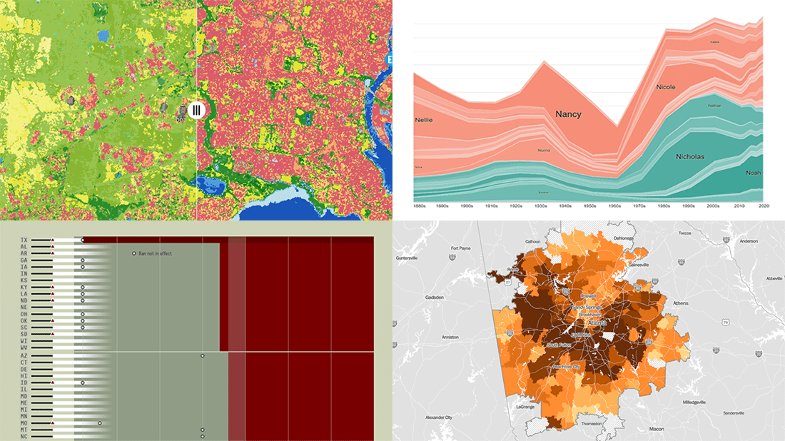
- Australia land cover in detail — Geoscience Australia
Data Visualization Weekly: March 4, 2022 — March 11, 2022
Burden of Abortion Across America
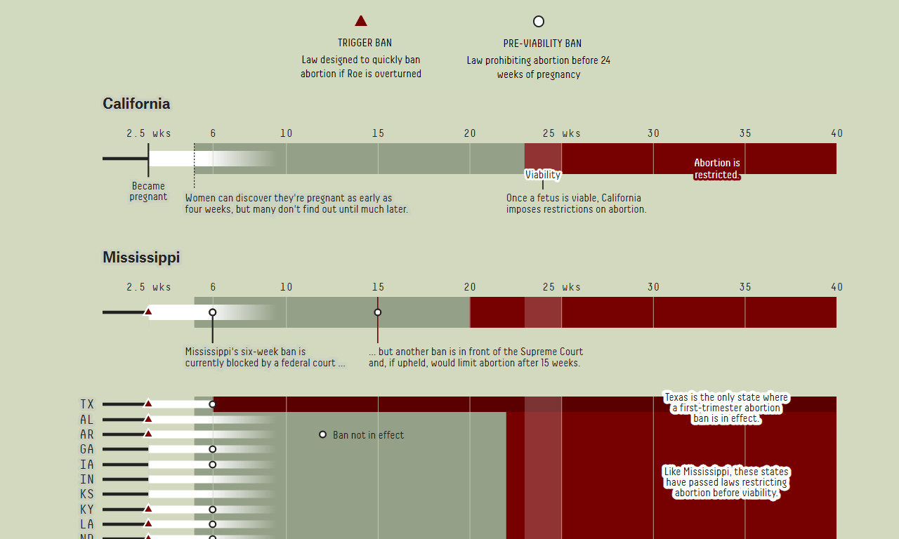
Although access to safe and legal abortion is a constitutional right in the United States, it turns out to be one that comes with an asterisk.
FiveThirtyEight’s Amelia Thomson-DeVeaux and Anna Wiederkehr took a deep dive into the current regulations and reality in this field to better understand and communicate the (undue) burden that many women in America face when attempting to get an abortion. There are a number of great visualizations in their story. For example, you can explore the (varying) restrictions by state in a cool interactive graphic — a part of it is displayed above. Also, don’t miss out on a bivariate choropleth map representing access to abortion clinics across the country based on estimated travel time and congestion, by county.
The story has a lot more to show and explain. Check it out on FiveThirtyEight.
Real Estate Investor Activity in Major U.S. Cities in 2021
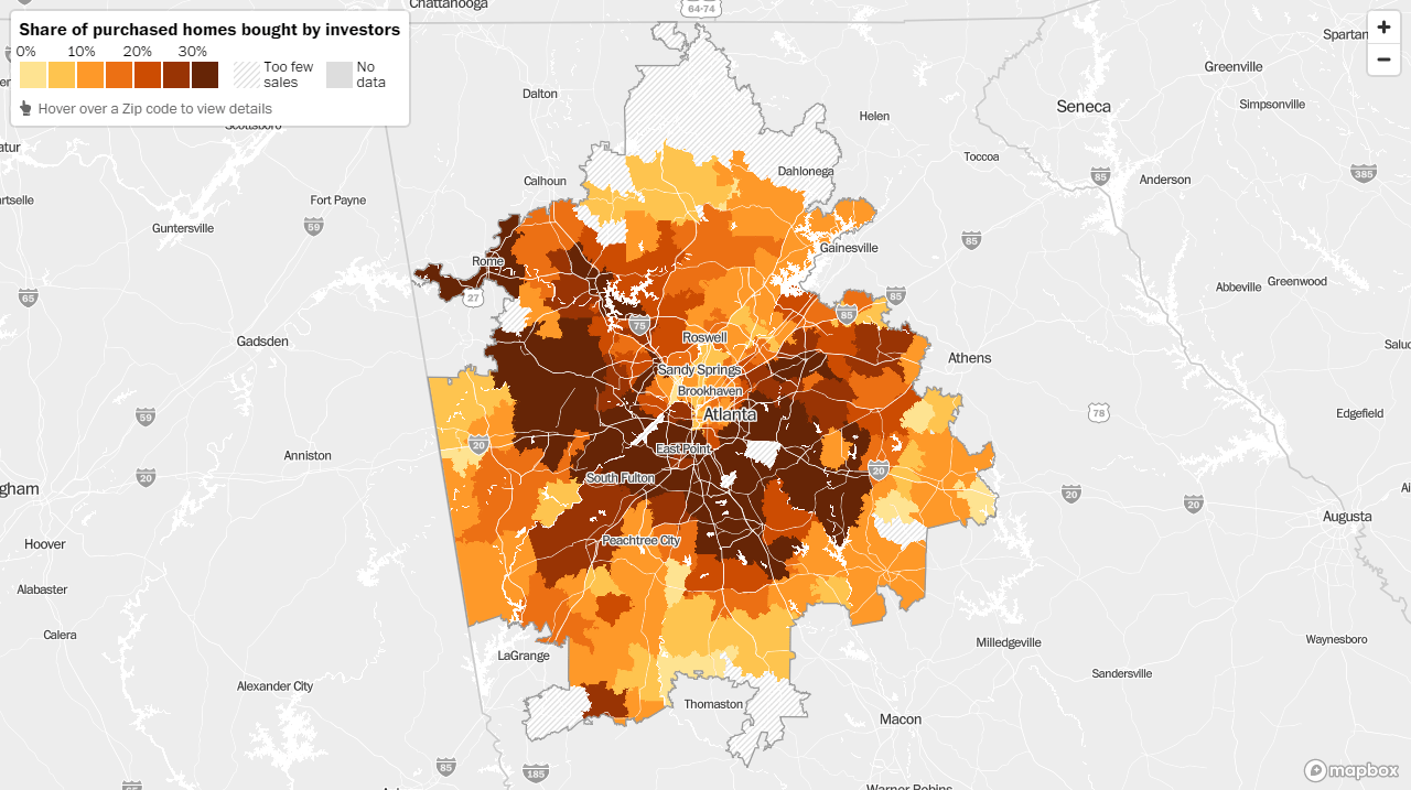
According to new data from Redfin, a Seattle-based real estate brokerage company, about 15% of all homes sold in the United States’ 40 major metropolitan areas in 2021 were purchased by investors. It is a record-high percentage for at least the last two decades.
The Washington Post’s Jonathan O’Connell and Kevin Schaul delved into Redfin’s data to see how this investor activity had differed from city to city and neighborhood to neighborhood. Their analysis revealed unequal levels. In particular, neighborhoods where a majority of residents are Black as well as southern cities appeared to have been targeted by investors especially heavily.
Explore the data for the top forty metro areas using an interactive map and look at a couple of charts, on The Post.
Historical Popularity of Baby Names in America Since 1880s
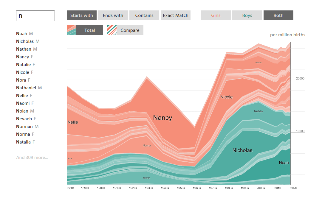
In 2020, Liam and Olivia were the most common names for newborns in the United States. If you wonder how popular they had been a hundred years ago, a new cool tool will help you learn about that (and not only).
Laura, Martin, and Eve Wattenberg created NameGrapher, an interactive data visualization project making it easy to explore historical trends in the popularity of baby names in the United States. You can search for a name and track its popularity since the 1880s, or opt for a look at several names starting with, ending with, or containing particular letters. The results are visualized in a stacked area chart (for totals, stacking up the usage of all fitting names) or a line chart (for over-time comparisons).
Feel free to have fun with it on Namerology.
Australia Land Cover in Detail
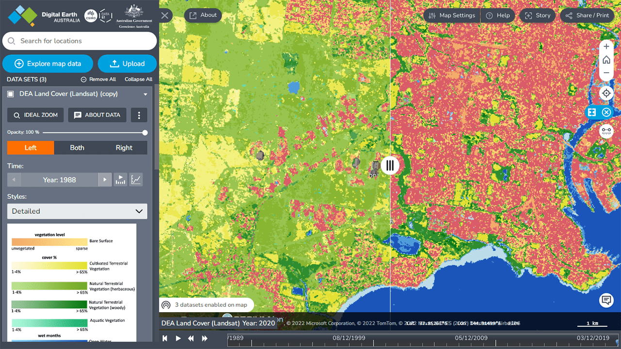
Last but not least, let’s take a close look at Australia.
Geoscience Australia published an amazing land use data visualization within the framework of its Digital Earth Australia project. Featuring a collection of annual land cover maps spanning from 1988 to 2020, it lets anyone find out how every piece of the Australian land is utilized and discover changes from the previous years, at a 25-meter resolution. Six basic classes and over eighty detailed sub-classes of land cover are represented, each with its own color.
See what kinds of land Australia consists of and take a historical tour, on the DEA website.
***
We hope you like these cool data graphics! Stay tuned for our Data Visualization Weekly roundups!
- Categories: Data Visualization Weekly
- No Comments »