20+ Electoral Maps Visualizing 2020 U.S. Presidential Election Results — DataViz Weekly Special Edition
November 6th, 2020 by AnyChart Team All eyes on election maps! Yes, they could be misleading. And even widely misleading. But it can be at least so fascinating to look at them, especially at times like this! So, we have curated a list of over twenty reputable resources — as of now, to be precise, 24 and counting! — where you can watch the live results of the 2020 United States Presidential election in compelling data visualizations. At the same time, it is a great chance for you to investigate and understand how election maps (and some other graphics) can look and work in practice.
💡 See also: 2024 U.S. Election Maps (November 2024).
Vote counts may be different on different platforms and update as more data becomes available out there — it’s absolutely okay. The election results are still partial. Over the coming days, all numbers will be adjusted to match the real, final vote count. Just in case: We’ve added only reliable sources — notable, reputable media outlets.
Without further ado, check out maybe the most important data visualizations these days! (Electoral vote count numbers in the text last updated on November 9th, 2020, for each source.)
- Categories: Data Visualization Weekly, News, Third-Party Developers
- 3 Comments »
Fresh Examples of Data Visualization Best Practices in Action — DataViz Weekly
October 9th, 2020 by AnyChart Team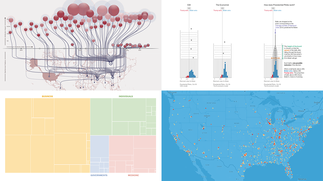 DataViz Weekly is here featuring a selection of new compelling projects with awesome charts and maps. Check out some of the coolest fresh examples of data visualization best practices in action!
- $4 trillion coronavirus bailout under the microscope — The Washington Post
- Presidential Plinko — Matthew Kay, Northwestern University
- Allegations of foreign interference in the 2020 U.S. election — DFRLab
- American streets named after athletes — ESPN
- Categories: Data Visualization Weekly
- No Comments »
New Maps and Charts Showing Power of Data Visualization — DataViz Weekly
September 11th, 2020 by AnyChart Team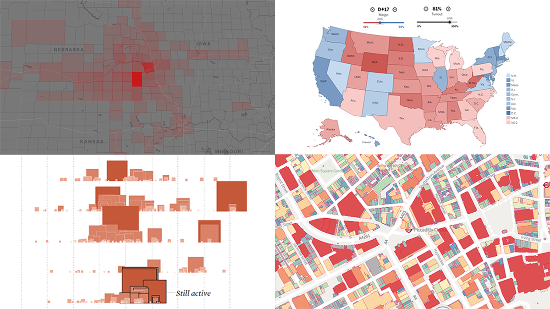 The long wait is over! DataViz Weekly is here bringing some of the best new maps and charts from all over the web to the spotlight! Look at these amazing examples that show the power of smart data visualization:
- College football fan movement and COVID-19 risk — ESPN
- California wildfires over the past 17 years — FlowingData
- London solar opportunities — UCL Energy
- Voter scenarios for the U.S. presidential election — The Washington Post
- Categories: Data Visualization Weekly
- No Comments »
4 Great Examples of Data Visualization in Action — DataViz Weekly
August 28th, 2020 by AnyChart Team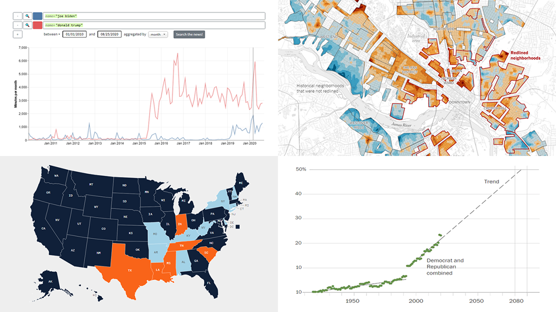 We’ve curated another four great examples of data visualization in action. Would you like to learn about them and check them out right now? Wait no longer! Below is a list of the projects highlighted in the new DataViz Weekly — just give it a glance and go ahead!
- Exploring a link between racism in the housing policy and hotter neighborhoods — The New York Times
- Analyzing the content of cable TV news — Stanford University
- Tracking gender inequality in American politics — The Washington Post
- Summarizing voting rules for the 2020 U.S. election by state — NBC News
- Categories: Data Visualization Weekly
- No Comments »
New Information Visualization Projects Not to Be Missed — DataViz Weekly
August 14th, 2020 by AnyChart Team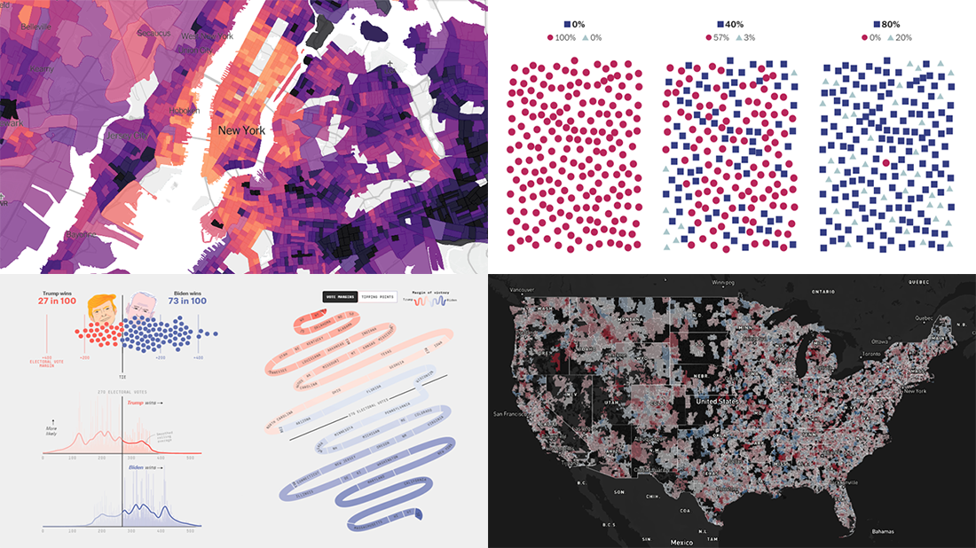 Look at these new cool information visualization projects and notice how different techniques help explore and communicate data, in practice.
Today in DataViz Weekly:
- FiveThirtyEight’s 2020 U.S. presidential election model — FiveThirtyEight
- Herd immunity simulations — The Washington Post
- Unemployment in the United States at the census tract level — The Upshot
- Home prices in America — Realbloc
- Categories: Data Visualization Weekly
- No Comments »
Impressive Charts on Age, Energy, Climate, and Music — DataViz Weekly
August 7th, 2020 by AnyChart Team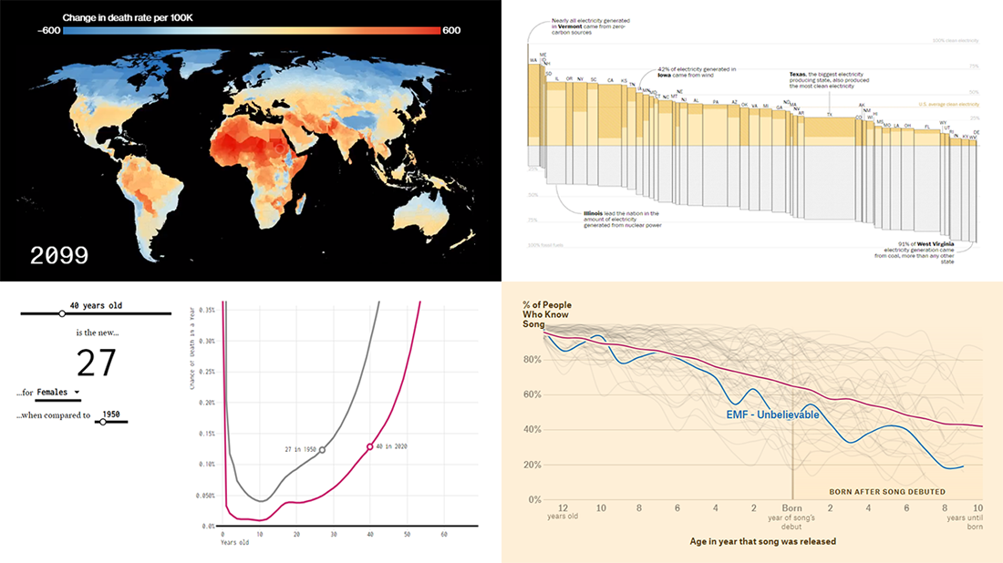 Lately, we’ve come across a lot of new impressive charts all over the internet. Here are some of the most interesting ones — check them out and you’ll see the real power of data visualization in action! Today in DataViz Weekly:
- New age for your age — FlowingData
- Electricity generation in the U.S. states by fuel source — The Washington Post
- Mortality consequences of climate change and income inequality — Bloomberg Green
- 1990s music recognition across generations — The Pudding
- Categories: Data Visualization Weekly
- No Comments »
New Coronavirus Data Visualization Projects Worth Seeing — DataViz Weekly
May 29th, 2020 by AnyChart Team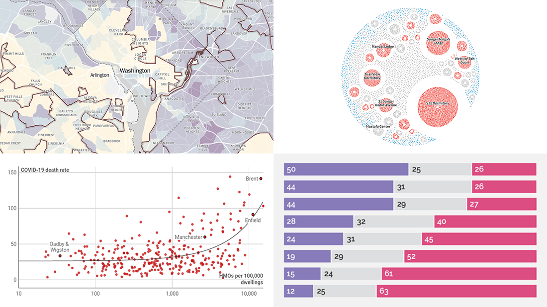
Waiting for a new serving of interesting chart examples? DataViz Weekly is here! Check out new coronavirus data visualization projects from around the web that we’ve found worth seeing:
- Anatomy of the COVID-19 outbreak in Singapore — Reuters
- Health disparities in communities of color across the United States as revealed by COVID-19 — The Washington Post
- Bill Gates coronavirus conspiracy theory in public opinion — Yahoo News
- Link between the housing crisis and COVID-19 deaths in the United Kingdom — Inside Housing
- Categories: Data Visualization Weekly
- No Comments »
Charting COVID-19 Data and Models — DataViz Weekly
May 15th, 2020 by AnyChart Team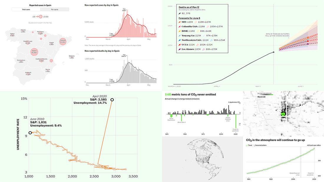 Check out new interesting examples of charting COVID-19 data in action. We have seen a lot of visualizations over the past few days and selected the following projects to share with you today in DataViz Weekly:
- Fatality models for the United States – FiveThirtyEight
- Impact on climate change – Bloomberg Green
- (Now broken) correlation between the stock market and unemployment rates in America – The Washington Post
- Situation in Spain – The New York Times
- Categories: Data Visualization Weekly
- No Comments »
Creative Visualizations on Climate, Protests, Jobs, and Wildlife — DataViz Weekly
March 27th, 2020 by AnyChart Team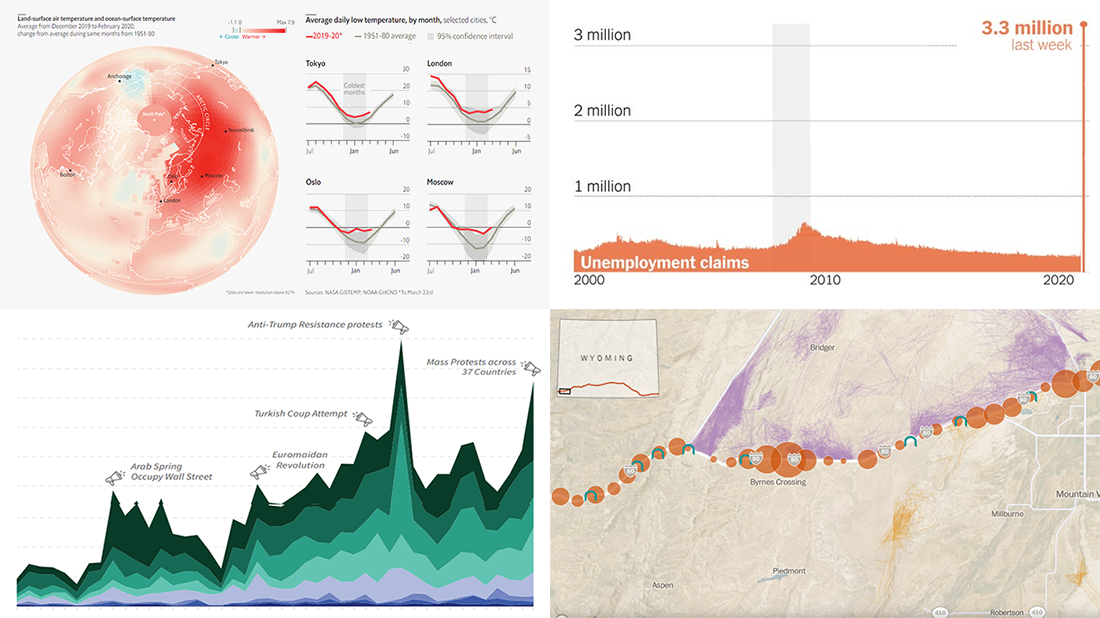 The new issue of DataViz Weekly puts a spotlight on some of the most interesting new creative visualizations from around the Web. Last week, we made a focus on COVID-19 charts. This time, we get along without the coronavirus subject. Well, mostly.
Here is what’s on DataViz Weekly this Friday:
- Winter temperatures in the northern hemisphere — The Economist
- Mass political protests worldwide — Center for Strategic and International Studies
- Spike in joblessness in the United States of America — The New York Times
- Wyoming wildlife corridors — The Washington Post
- Categories: Data Visualization Weekly
- No Comments »
Coronavirus in US in Charts and Maps — DataViz Weekly
March 20th, 2020 by AnyChart Team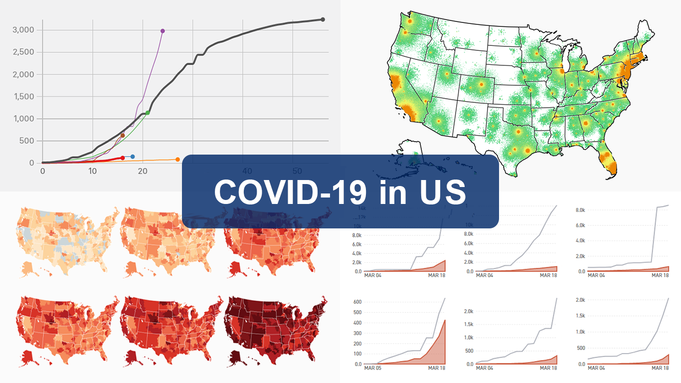 As the novel coronavirus pandemic is in full swing, COVID-19 is now by far the most topical issue on the global agenda. So it’s no surprise that the vast majority of the data visualization projects we’ve come across this week are about the outbreak. That’s why the new DataViz Weekly article is entirely devoted to the same subject — the coronavirus.
We are quite sure many of you have already seen some if not all of the best dashboards, charts, and trackers of the global COVID-19 outbreak from Johns Hopkins University, The New York Times, Financial Times, Business Insider, The Guardian, Bloomberg, and others. Awesome animated simulations from The Washington Post’s Harry Stevens, showing why epidemics like this spread exponentially and how social distancing could help to flatten the curve of COVID-19 cases, have almost certainly came to your attention and does not need to be presented additionally.
Headquartered in the United States, we decided to find out more about what has been going on about COVID-19 in America. Join us on a review of four interesting (though sometimes a bit frightening) data graphics features created by top media outlets, which provide insight into where the U.S. stands — from the perspective of cases and tests (Politico), scenarios (TIME), and hospital bed capacity (The Upshot by NYT), as well as compared to the rest of the world (BuzzFeed News). Check out the special “COVID-19 in US” edition of DataViz Weekly on the AnyChart blog.
- Categories: Data Visualization Weekly
- 2 Comments »