 All eyes on election maps! Yes, they could be misleading. And even widely misleading. But it can be at least so fascinating to look at them, especially at times like this! So, we have curated a list of over twenty reputable resources — as of now, to be precise, 24 and counting! — where you can watch the live results of the 2020 United States Presidential election in compelling data visualizations. At the same time, it is a great chance for you to investigate and understand how election maps (and some other graphics) can look and work in practice.
? See also: 2024 U.S. Election Maps (November 2024).
Vote counts may be different on different platforms and update as more data becomes available out there — it’s absolutely okay. The election results are still partial. Over the coming days, all numbers will be adjusted to match the real, final vote count. Just in case: We’ve added only reliable sources — notable, reputable media outlets.
Without further ado, check out maybe the most important data visualizations these days! (Electoral vote count numbers in the text last updated on November 9th, 2020, for each source.)
Election Maps in Data Visualization Weekly: October 30, 2020 — November 6, 2020
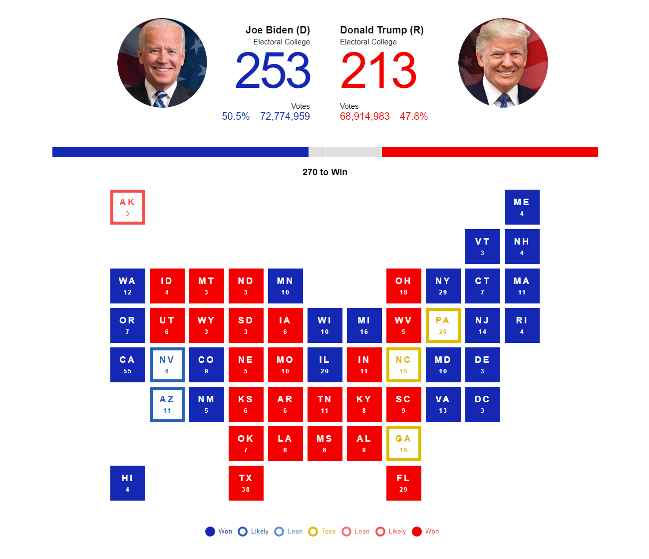
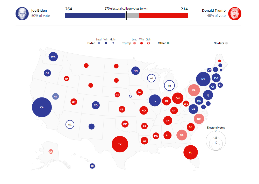
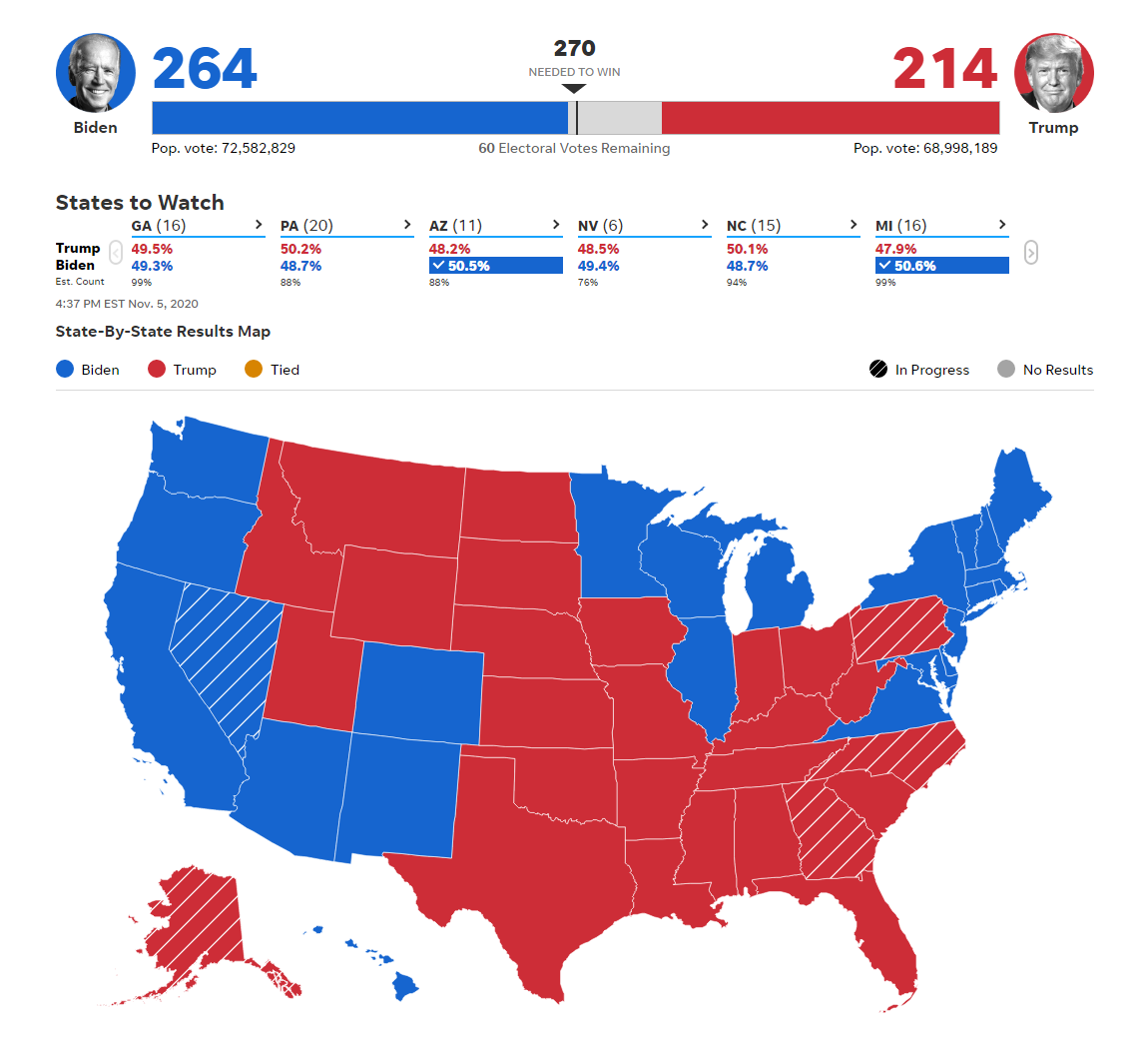
#1. Election Map by ABC News
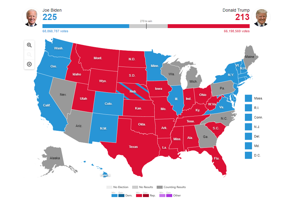
ABC News became one of the first major media outlets to launch an online election results mapping feature on the website. It happened even before Election Day, so the map displayed zero votes for all candidates at first.
U.S. presidential election results as currently shown on ABC News:
- Biden 279
- Trump 214
(Last updated here in the text on November 9th. Click the picture to see the updated map on the ABC website.)
Data source: National Election Pool (NEP) / Edison Research.
ABC’s election map project is based on a choropleth map visualization. Hover over the states to see the partial results as of now. Click on a state to drill down to the county level.
#2. Election Map by Al Jazeera
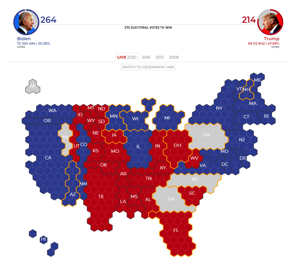
Al Jazeera provides two views of the election results data: a cartographic map (or a cartogram) and a traditional geographic, choropleth map. Click on a state while exploring Al Jazeera’s election maps and you’ll see the latest results for the respective state.
U.S. presidential election results as currently shown on Al Jazeera:
- Biden 290
- Trump 214
(Last updated here in the text on November 9th. Click the picture to see the updated map on the Al Jazeera website.)
Data source: The Associated Press (AP).
#3. Election Map by BBC
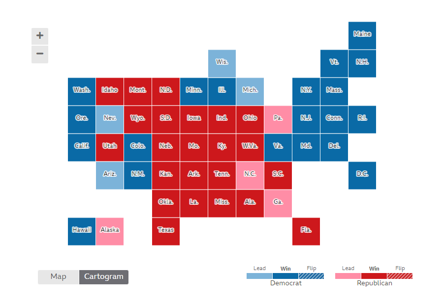
BBC graphically represents the latest election data in a choropleth map and in a cartogram. It is possible to click on a state to drill down to the county level right away.
U.S. presidential election results as currently shown on BBC:
- Biden 279
- Trump 214
(Last updated here in the text on November 9th. Click the picture to see the updated map on the BBC website.)
Data source: National Election Pool (NEP) / Edison Research.
#4. Election Map by Bloomberg
Bloomberg offers a look at the key vote statistics with the help of a cartogram and a choropleth map. You can see the percentages when hovering over a state. To learn more about the situation and outcome in a certain state, click on it and you’ll be directed to the dedicated page with a lot of numbers shedding light on how the election has unfolded in that state.
U.S. presidential election results as currently shown on Bloomberg:
- Biden 290
- Trump 214
(Last updated here in the text on November 9th. Click the picture to see the updated map on the Bloomberg website.)
Data source: The Associated Press (AP).
In addition, Bloomberg uses its own turnout model to estimate the percentage of total votes counted. So here you will also find other interesting graphics such as the “Turnout vs. Vote Margin” chart.
#5. Election Map by CBS News
CBS News provides a cartogram to explore the vote count progress. Data with details by state and county are available in the table view right there below.
U.S. presidential election results as currently shown on CBS News:
- Biden 279
- Trump 214
(Last updated here in the text on November 9th. Click the picture to see the updated map on the CBS website.)
Data source: National Election Pool (NEP) / Edison Research.
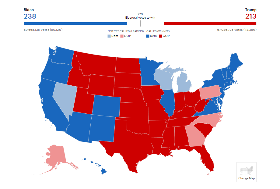
#6. Election Map by CNN
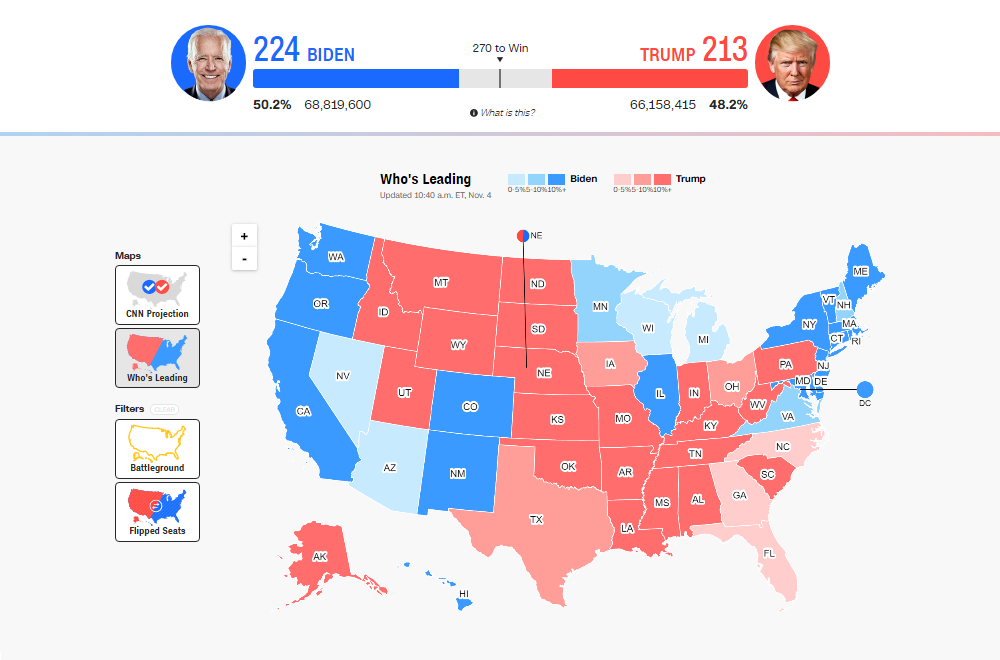
CNN has two choropleth maps for you to watch how the election of the United States President unfolds. There, you can check out CNN’s projection of the outcome and check out who is leading where in reality. It is easy to filter the battleground and flipped states using built-in options.
For details, hover around CNN’s election and click to drill down to counties.
U.S. presidential election results as currently shown on CNN:
- Biden 279
- Trump 214
(Last updated here in the text on November 9th. Click the picture to see the updated map on the CNN website.)
Data source: National Election Pool (NEP) / Edison Research; CNN also claims to produce a call “only after an extensive review of data from a number of sources.”
#7. Election Map by CTV News
Canadian CTV News offers two basic visual ways to explore the latest election results data. There are a choropleth map and a cartogram available on the website. The election maps by CTV News allow you to mouse over the states to quickly find out who is taking the lead where. Click on the state you are interested in zooming into it and seeing county-by-county details.
U.S. presidential election results as currently shown on CTV News:
- Biden 290
- Trump 214
(Last updated here in the text on November 9th. Click the picture to see the updated map on the CTV website.)
Data source: The Associated Press (AP).
#8. Election Map by Deutsche Welle
German DW’s U.S. electoral map choices also include the two most popular forms of geographic election data visualization. You are right, those are cartographic and choropleth. The way these visuals are configured on the DW website, they make it easy to explore who is winning in each state as well as take a closer look at the situation by county.
U.S. presidential election results as currently shown on DW:
- Biden 290
- Trump 214
(Last updated here in the text on November 9th. Click the picture to see the updated map on the DW website.)
Data source: The Associated Press (AP).
#9. Election Map by The Economist
The Economist shows the breakdown of electoral votes by state using the bubble map data visualization technique. Plus, there is also another peculiar election map that displays the leader by county scaled according to the population density in the corresponding area. Hover around for more information.
U.S. presidential election results as currently shown on The Economist:
- Biden 279
- Trump 214
(Last updated here in the text on November 9th. Click the picture to see the updated map on The Economist’s website.)
Data source: Decision Desk HQ and The Economist.
#10. Election Map by El País
Spanish newspaper El País has a pretty, interactive choropleth map that visualizes live results of the presidential election in the United States of America. As is always the case in such graphics, different colors help easily find out who of the two main candidates, Joe Biden or Donald Trump, is currently leading here and there. To get a little bit deeper understanding of how the race goes, just mouse over the states.
U.S. presidential election results as currently shown on El País:
- Biden 279
- Trump 214
(Last updated here in the text on November 9th. Click the picture to see the updated map on the El País website.)
Data source: unknown.
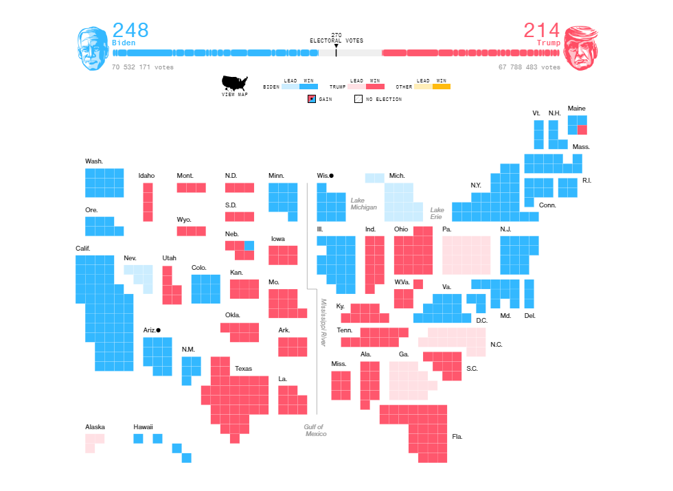
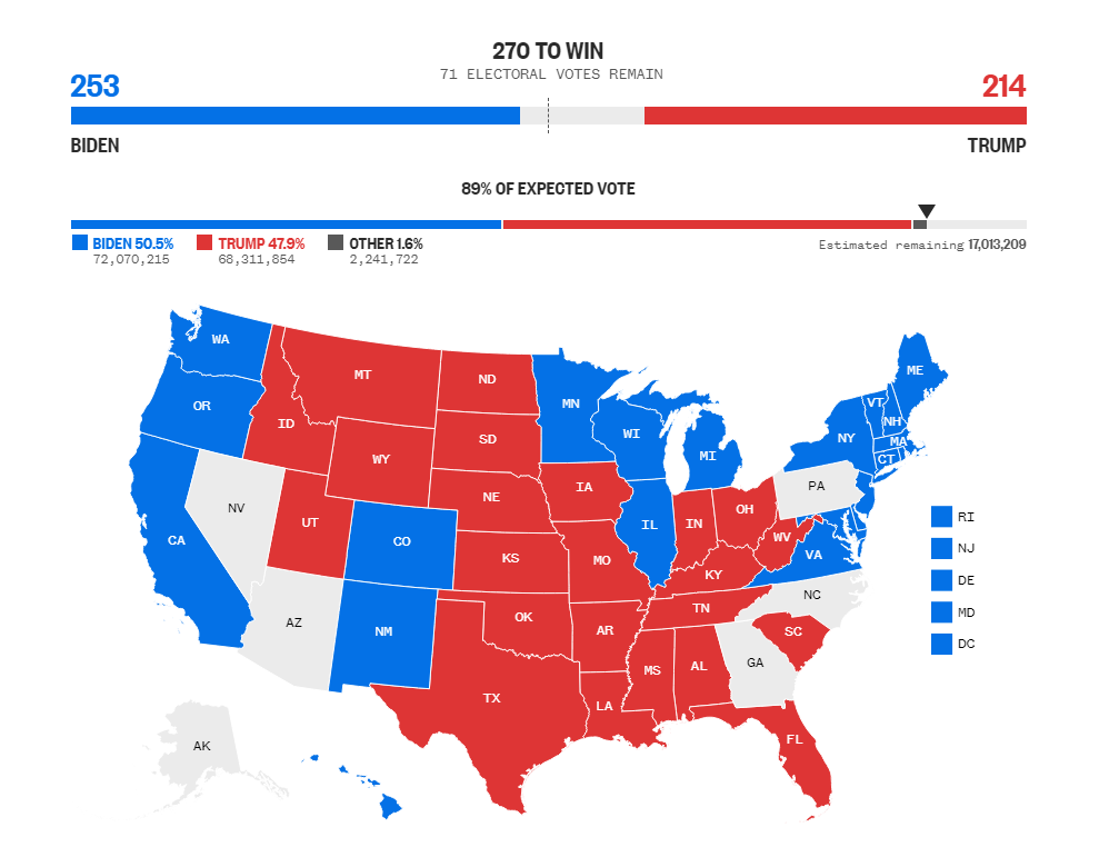
#11. Election Map by The Financial Times
FT’s election map makes use of squares to visualize how many Electoral College votes the candidates are receiving in each state based on the latest data on how the vote count unfolds. Beyond the map, there are charts revealing whether Trump and Biden are performing as previously expected by experts.
U.S. presidential election results as currently shown on FT:
- Biden 290
- Trump 214
(Last updated here in the text on November 9th. Click the picture to see the updated map on the FT website.)
Data source: The Associated Press (AP).
#12. Election Map by Fox News
The election map by Fox News is all choropleth. The view can be switched between states and counties. Everything is interactive, so feel free to hover and click around. Each state has an individual page that shows more details as well as historical data.
U.S. presidential election results as currently shown on Fox News:
- Biden 290
- Trump 214
(Last updated here in the text on November 9th. Click the picture to see the updated map on the Fox website.)
Data source: The Associated Press (AP).
#13. Election Map by The Guardian
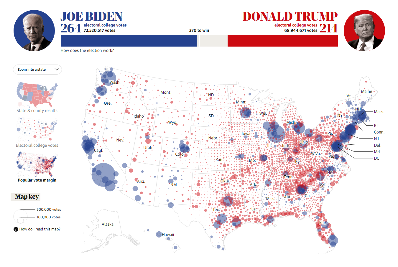
The Guardian visualizes the state and county results of the election in the United States in a choropleth map. In addition, it also makes good use of bubble maps to depict Electoral College votes as well as popular vote margins. The interactive form makes it easy to explore the details.
U.S. presidential election results as currently shown on The Guardian:
- Biden 290
- Trump 214
(Last updated here in the text on November 9th. Click the picture to see the updated map on The Guardian’s website.)
Data source: The Associated Press (AP).
#14. Election Map by NBC
NBC provides a choropleth election map. For details on the outcome in a certain state, just hover over it. Or click on it to get on its individual page with county-level information and more election statistics including exit polls. Don’t miss out on the extra graphics representing data on early voting, and voting trends by demographics.
U.S. presidential election results as currently shown on NBC:
- Biden 279
- Trump 214
(Last updated here in the text on November 9th. Click the picture to see the updated map on the NBC website.)
Data source: National Election Pool (NEP) / Edison Research.
#15. Election Map by The New Yorker
On The New Yorker, the electoral data is displayed in a choropleth map which can be changed to a cartogram. The results by state are clearly shown on hover. County information is also available – just click the state you want to explore.
U.S. presidential election results as currently shown on The New Yorker:
- Biden 290
- Trump 214
(Last updated here in the text on November 9th. Click the picture to see the updated map on The New Yorker’s website.)
Data source: The Associated Press (AP).
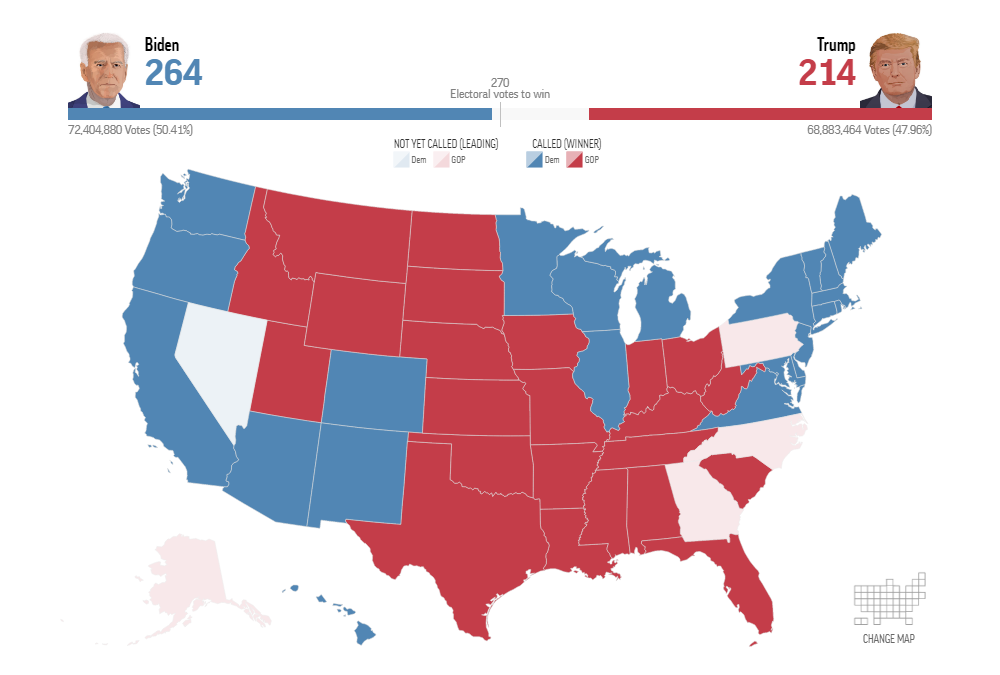
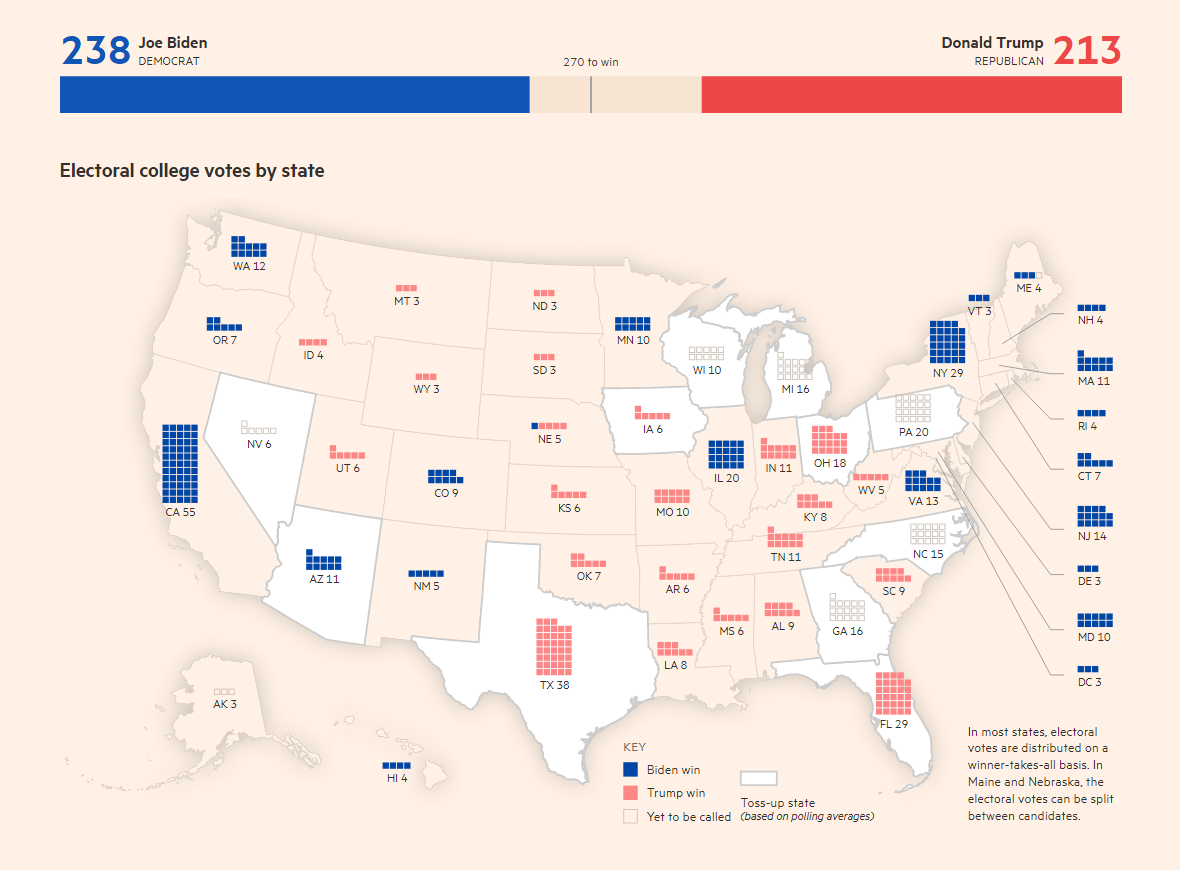
#16. Election Map by The New York Times
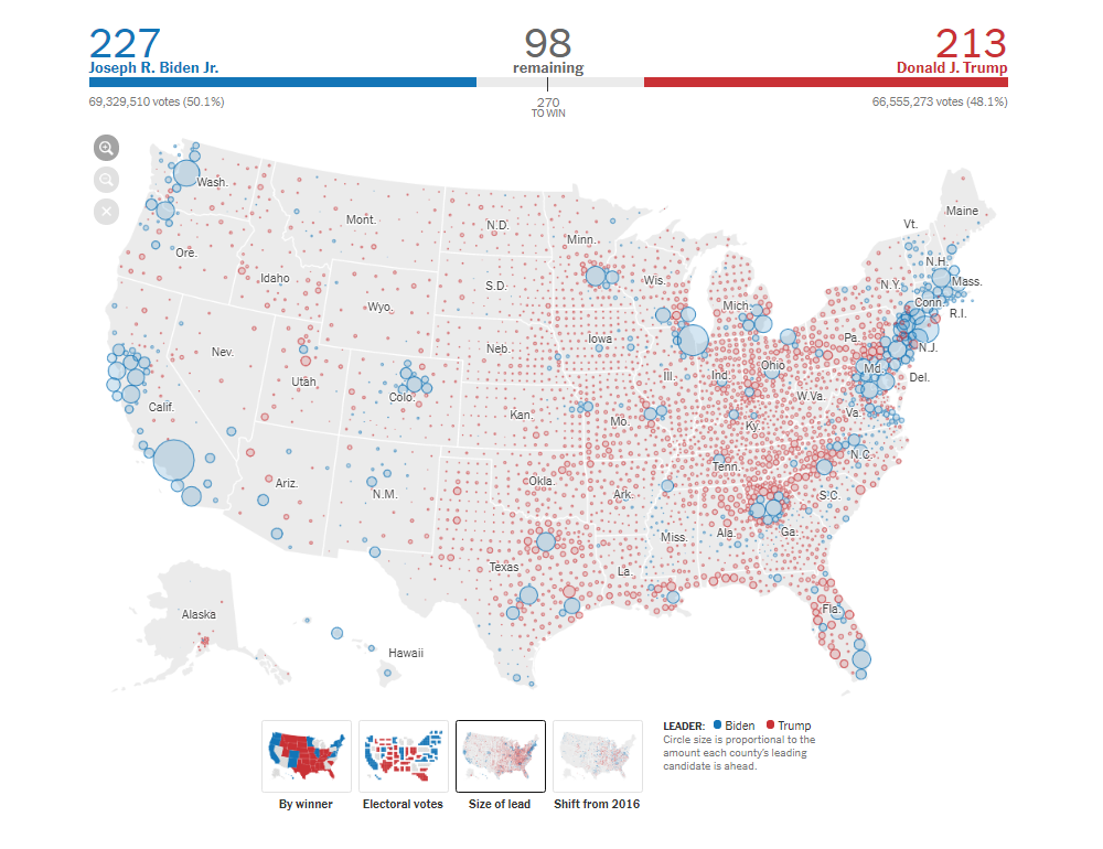
The New York Times offers four interactive geographic visualizations of the 2020 U.S. presidential election data. In addition to the two most widespread election map types, choropleth (by winner) and cartographic (electoral votes), the newspapers created a bubble map to display the size of lead and a map with arrows to depict vote shifts in margin from 2016.
There are also other interesting graphics in the same project. For example, look at the charts showing how the vote count is progressing in the states where it is still ongoing, including vote share and vote margin over time.
U.S. presidential election results as currently shown on NYT:
- Biden 279
- Trump 214
(Last updated here in the text on November 9th. Click the picture to see the updated map on the NYT website.)
Data source: The Associated Press (AP) and National Election Pool (NEP) / Edison Research.
The New York Times also claims to “take into account a number of factors before declaring a winner,” including AP’s and Edison’s race calls, “as well as analysis of the votes that have been reported so far.”
#17. Election Map by NPR
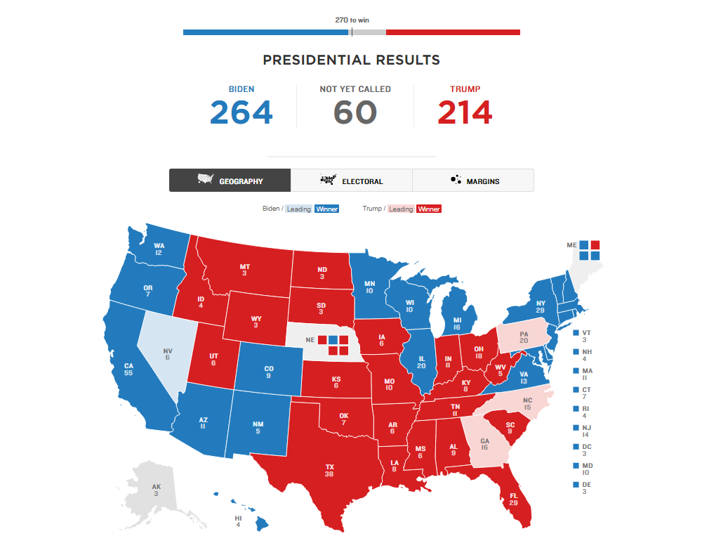
NPR’s electoral data visualization project includes three views of the election data. In addition to the “Geography” (choropleth) and “Electoral” (cartographic) maps, there is “Margins” (a diagram with bubbles). Hover for more information. Click to visit the states’ profiles featuring charts of demographic trends.
U.S. presidential election results as currently shown on NPR:
- Biden 290
- Trump 214
(Last updated here in the text on November 9th. Click the picture to see the updated map on the NPR website.)
Data source: The Associated Press (AP).
#18. Election Map by POLITICO
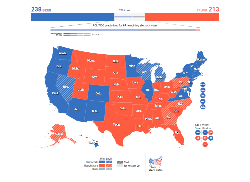
POLITICO has a choropleth map visualizing states by leader and a cartogram showing electoral votes as of now. You can additionally investigate the ways left to win and the demographics of the flipped states. State profiles contain a lot of extra graphics representing the election outcome in each state.
U.S. presidential election results as currently shown on POLITICO:
- Biden 290
- Trump 214
(Last updated here in the text on November 9th. Click the picture to see the updated map on the POLITICO website.)
Data source: The Associated Press (AP).
#19. Election Map by RBC
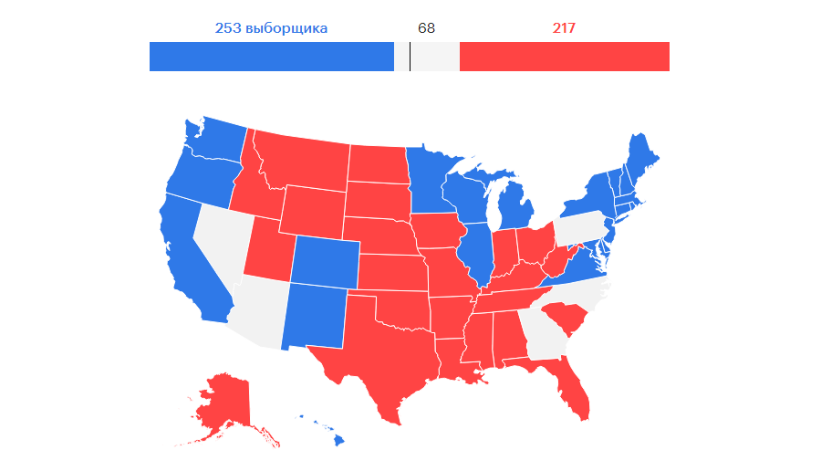
Russian RBC’s election map (choropleth, of course) is very simple but provides all the basic information. You can hover over the states to see the latest vote distribution across the United States.
U.S. presidential election results as currently shown on RBC:
- Biden 273
- Trump 217
(Last updated here in the text on November 9th. Click the picture to see the updated map on the RBC website.)
Data source: Bloomberg and Fox News.
#20. Election Map by Reuters
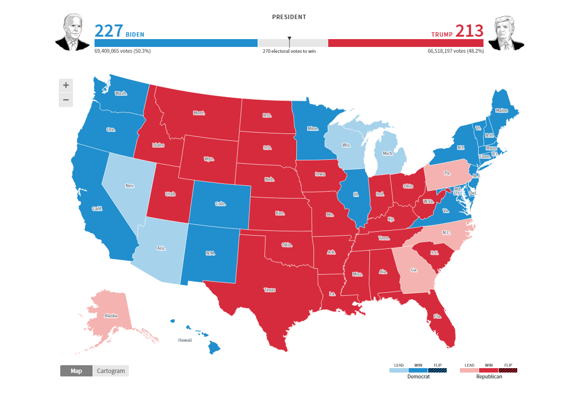
Reuters maintains an interactive choropleth map that lets you click on a state to drill down to counties. A cartogram is helpful in understanding the weight of each state’s choice when it comes to Electoral College.
U.S. presidential election results as currently shown on Reuters:
- Biden 279
- Trump 214
(Last updated here in the text on November 9th. Click the picture to see the updated map on the Reuters website.)
Data source: National Election Pool (NEP) / Edison Research.
#21. Election Map by USA TODAY
USA TODAY shares live results in a choropleth map. Hover or click to see the results in a certain state. Each state has its page where it is possible to see the vote details by county.
U.S. presidential election results as currently shown on USA TODAY:
- Biden 290
- Trump 214
(Last updated here in the text on November 9th. Click the picture to see the updated map on the USA TODAY website.)
Data source: The Associated Press (AP).
#22. Election Map by Vox
Vox made a choropleth map to allow the readers to keep track of the 2020 election in a convenient manner. To see the results in a certain state, hover over it; to look into the situation, including how the candidates are performing across counties, simply click on the state you would like to explore.
U.S. presidential election results as currently shown on Vox:
- Biden 279
- Trump 214
(Last updated here in the text on November 9th. Click the picture to see the updated map on the Vox website.)
Data source: Decision Desk HQ.
#23. Election Map by The Wall Street Journal
The Wall Street Journal’s election map visualizations include a cartogram, where states are sized proportionally according to electoral votes, and a choropleth map. Mouse over a state to see the latest ratings and click for further details.
U.S. presidential election results as currently shown on WSJ:
- Biden 290
- Trump 214
(Last updated here in the text on November 9th. Click the picture to see the updated map on the WSJ website.)
Data source: The Associated Press (AP).
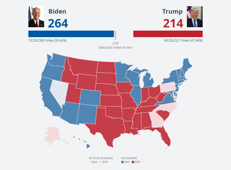
#24. Election Map by The Washington Post
The Washington Post’s election map is choropleth-only. It’s interactive, so feel free to move your mouse over it and click on the states you would like to learn more about. In addition to the map-based data visualization, you can take a look at several key states and what share of votes have been counted in each of them as of now and over time.
U.S. presidential election results as currently shown on The Post:
- Biden 279
- Trump 214
(Last updated here in the text on November 9th. Click the picture to see the updated map on the WaPo website.)
Data source: National Election Pool (NEP) / Edison Research and The Associated Press (AP).
***
There are many ways to visualize election results on a map. And design means a lot, actually. We hope these examples of election maps from leading media outlets, American and not only, have taught you something or at least have been interesting to look at. Stay tuned for great data visualizations on our blog.
- Categories: Data Visualization Weekly, News, Third-Party Developers
- 3 Comments »