Waiting for a new serving of interesting chart examples? DataViz Weekly is here! Check out new coronavirus data visualization projects from around the web that we’ve found worth seeing:
- Anatomy of the COVID-19 outbreak in Singapore — Reuters
- Health disparities in communities of color across the United States as revealed by COVID-19 — The Washington Post
- Bill Gates coronavirus conspiracy theory in public opinion — Yahoo News
- Link between the housing crisis and COVID-19 deaths in the United Kingdom — Inside Housing
Interesting New Coronavirus Data Visualization Examples in DataViz Weekly: May 22, 2020 – May 29,2020
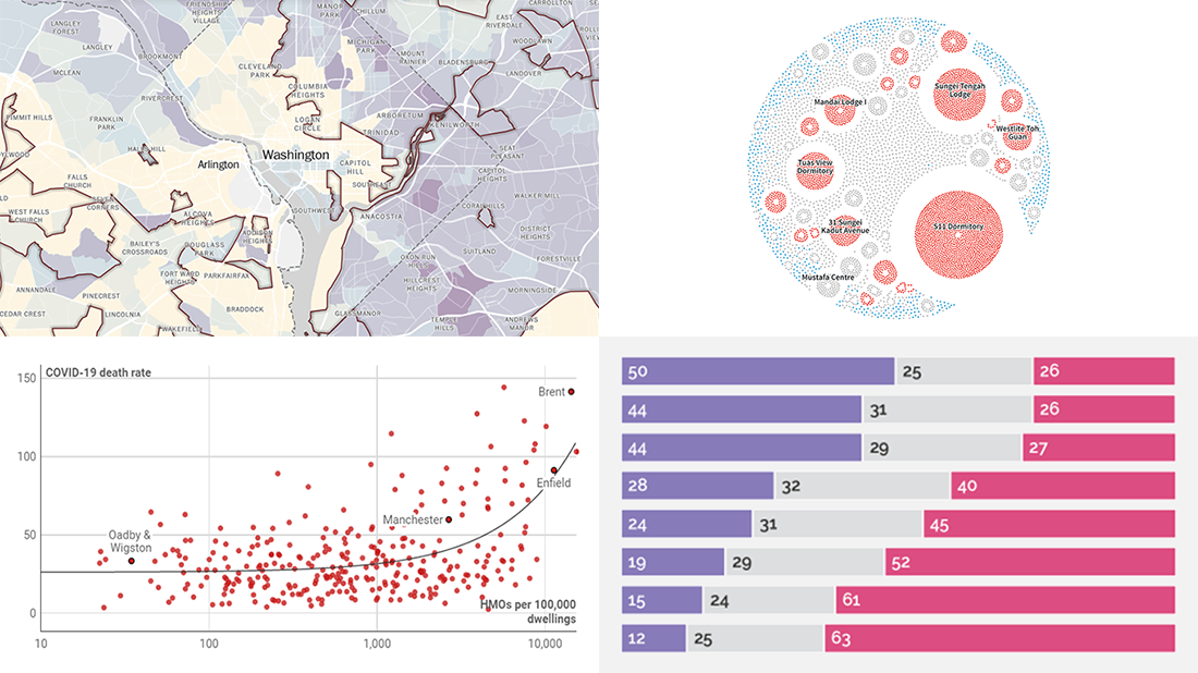
Anatomy of COVID-19 Outbreak in Singapore
Manas Sharma and Simon Scarr, from the Reuters graphics team, created an impressive graphical presentation of the anatomy of the COVID-19 outbreak in Singapore. For this project, they made stunning visualizations of data from the country’s Ministry of Health and Ministry of Manpower.
The very first visualization is an animation which shows how the virus emerged, spread, and centered around foreign worker dormitories, factories, and construction sites, January to mid-April. The second one, also animated, displays how the outbreak and clustering grew from mid-April to mid-May. Check them out and see more in the original story on Reuters.
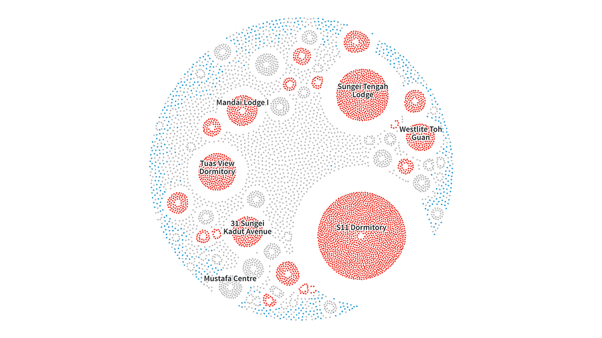
Health Disparities in Communities of Color as Revealed by COVID-19
Analyzing tract-level chronic health and social vulnerability estimates (from, respectively, data analytics firm PolicyMap and CDC), The Washington Post found how the COVID-19 outbreak had exposed health disparities in communities of color across the United States.
In the article, produced by Aaron Williams and Adrian Blanco, you can explore chronic health rates by community in a cool interactive map. For better insight, it is possible to additionally highlight specific locations: areas with a minority population greater than 50%, with high risks to hazardous events, with more people then rooms, and above-average populations without health insurance.
Bill Gates Coronavirus Conspiracy Theory in Public Opinion
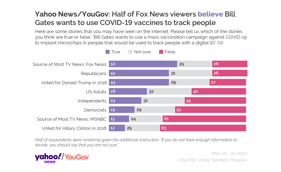
This chart is amazing in both its simplicity and what the picture shows. It visualizes the results of a new poll organized by YouGov and Yahoo News, and this data is very interesting.
The survey revealed that 50% or Fox News viewers and 44% of Republicans believe that Bill Gates is really going to implant microchips in billions of people through a mass coronavirus vaccination. At the same time, only 15% MSNBC viewers and 19% of Democrats agree the story is true. Look what the other bars display and read more about what Americans are reported to think about COVID-19 conspiracy theories like this.
Link Between COVID-19 Deaths and Housing Crisis in UK
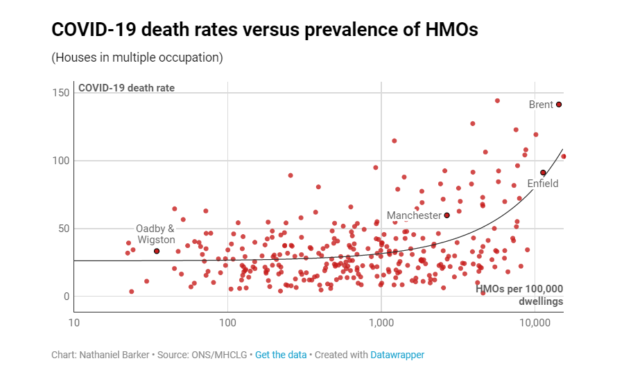
Nathaniel Barker, deputy news editor at Inside Housing, decided to find out if housing problems could be a factor in how the COVID-19 pandemic unfolds in the United Kingdom. For his research, he delved into data from the Office for National Statistics (ONS) and the Ministry of Housing, Communities and Local Government (MHCLG) and made four telling visualizations.
In three scatter charts and one column chart, Nathaniel Barker compares COVID-19 death rates against housing overcrowding, prevalence of houses in multiple occupation (HMOs), homelessness, and social housing shortage across local authorities in the U.K. Some correlations appear to be really stark. Take a look.
***
This week, we’ve found these new coronavirus data visualization projects worth checking out. Stay tuned for more cool chart examples. We curate the best new projects with interesting graphics and analytics every Friday within the framework of the regular DataViz Weekly feature in the AnyChart blog.
- Categories: Data Visualization Weekly
- No Comments »