 The new issue of DataViz Weekly puts a spotlight on some of the most interesting new creative visualizations from around the Web. Last week, we made a focus on COVID-19 charts. This time, we get along without the coronavirus subject. Well, mostly.
Here is what’s on DataViz Weekly this Friday:
- Winter temperatures in the northern hemisphere — The Economist
- Mass political protests worldwide — Center for Strategic and International Studies
- Spike in joblessness in the United States of America — The New York Times
- Wyoming wildlife corridors — The Washington Post
New Creative Visualizations in Data Visualization Weekly: March 20, 2020 — March 27, 2020
Winter in Northern Hemisphere
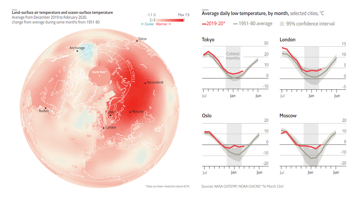
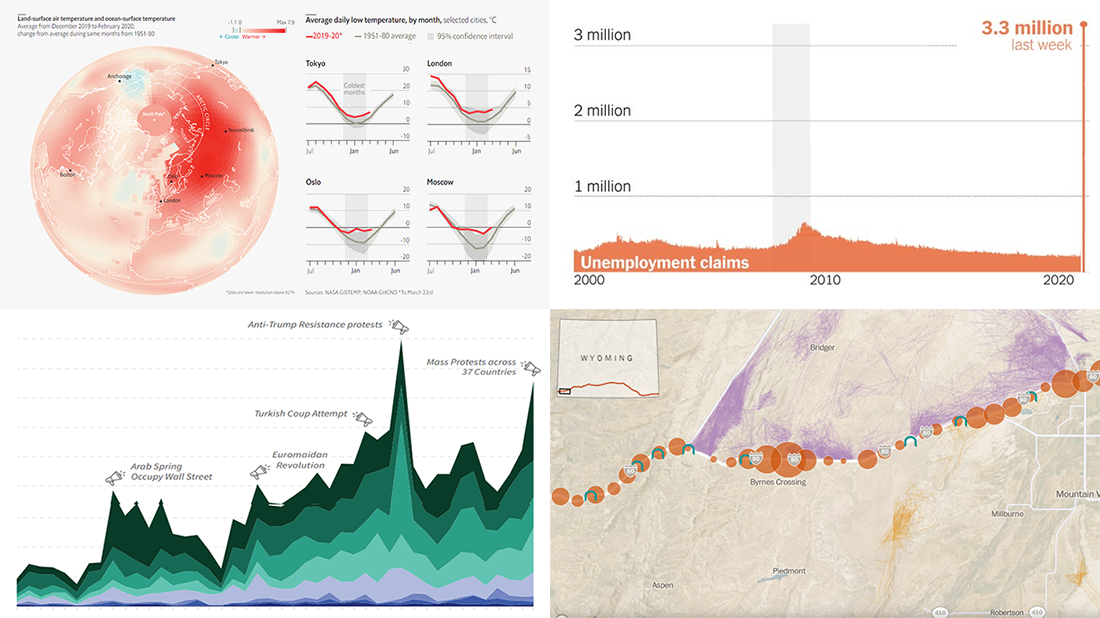
The northern hemisphere winter of 2019-20 was the second warmest since the beginning of weather records and the warmest ever on land. For example, the average daily low temperatures for Moscow and Boston this January were -2°C (28°F) and 0°C (32°F) against the customary -13°C (9°F) and -6°C (21°F). Basically, temperatures were approximately the same this season from November to March.
The Economist charted data from NASA and NOAA to show the change at a glance. A globe visualization displays how the land air and ocean temperatures between December 2019 and February 2020 were different from the 1951-80 averages. Graphs show the change for the whole northern hemisphere land temperatures and daily lows in selected cities — Tokyo, London, Boston, Oslo, Moscow, and Novosibirsk.
Mass Political Protests
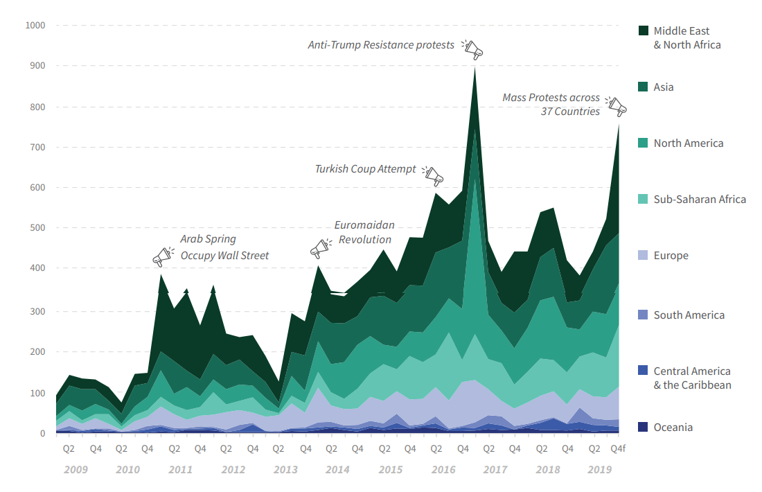
According to a new report of the Center for Strategic and International Studies (CSIS), mass protests have become more frequent all over the world over the past ten years. With the biggest concentration in the Middle East and North Africa region and the fastest growth rate in sub-Saharan Africa, they increased annually by 11.5% on average from 2009 to 2019. And the rising trend is likely to persist.
The report is titled “The Age of Mass Protests: Understanding an Escalating Global Trend” and can be found on the official CSIS website. In particular, it includes a choropleth map and a stacked area chart that visualize the regional breakdown. Line charts can be helpful in getting a better understanding of how political protests grew in each region.
Spike in Joblessness in America
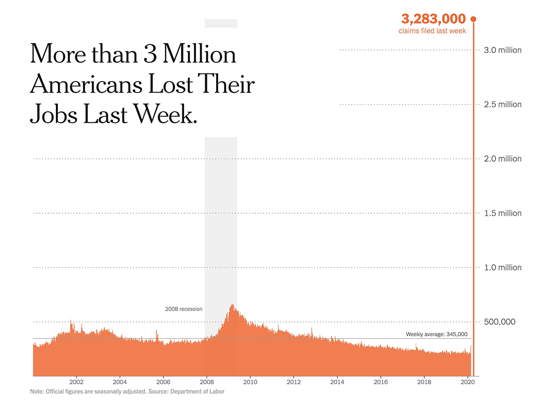
A new report of the United States Department of Labor issued just yesterday says that almost 3.3 million Americans applied for unemployment insurance last week. It is a drastic increase from 282,000 during the previous week and four times more than ever recorded.
The New York Times plotted the total U.S. jobless claims numbers for each week since 2000 as columns in a time-series chart, stressing the sharpness of the recent rise. Similar charts represent the same data for every state. So you can find your state and see what is going on over there.
Wyoming Wildlife Corridors
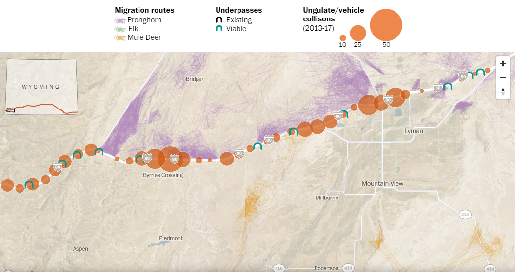
Cutting across the landscape of Sweetwater County in the state of Wyoming, Interstate 80 blocks the traditional paths of pronghorn, elk, and mule deer as they are trying to complete annual north-south migrations. In an effort to protect animals from deadly encounters with cars and trucks passing every 10 seconds on average, Wyoming officials and scientists are working to build wildlife crossings. As the climate warms, such safe passages become especially important.
The Washington Post created a stunning storytelling project that provides an in-depth look at the situation and ways to solve it. Don’t miss out on an interactive map at the bottom — it shows migration routes, existing and viable underpasses, and ungulate/vehicle collision locations.
***
We hope you found these projects with creative visualizations interesting. Stay tuned if you like good dataviz. Data Visualization Weekly is a weekly feature on AnyChart Blog.
- Categories: Data Visualization Weekly
- No Comments »