 Look at these new cool information visualization projects and notice how different techniques help explore and communicate data, in practice.
Today in DataViz Weekly:
- FiveThirtyEight’s 2020 U.S. presidential election model — FiveThirtyEight
- Herd immunity simulations — The Washington Post
- Unemployment in the United States at the census tract level — The Upshot
- Home prices in America — Realbloc
Data Visualization Weekly: August 7, 2020 — August 14, 2020
2020 U.S. Presidential Election Model
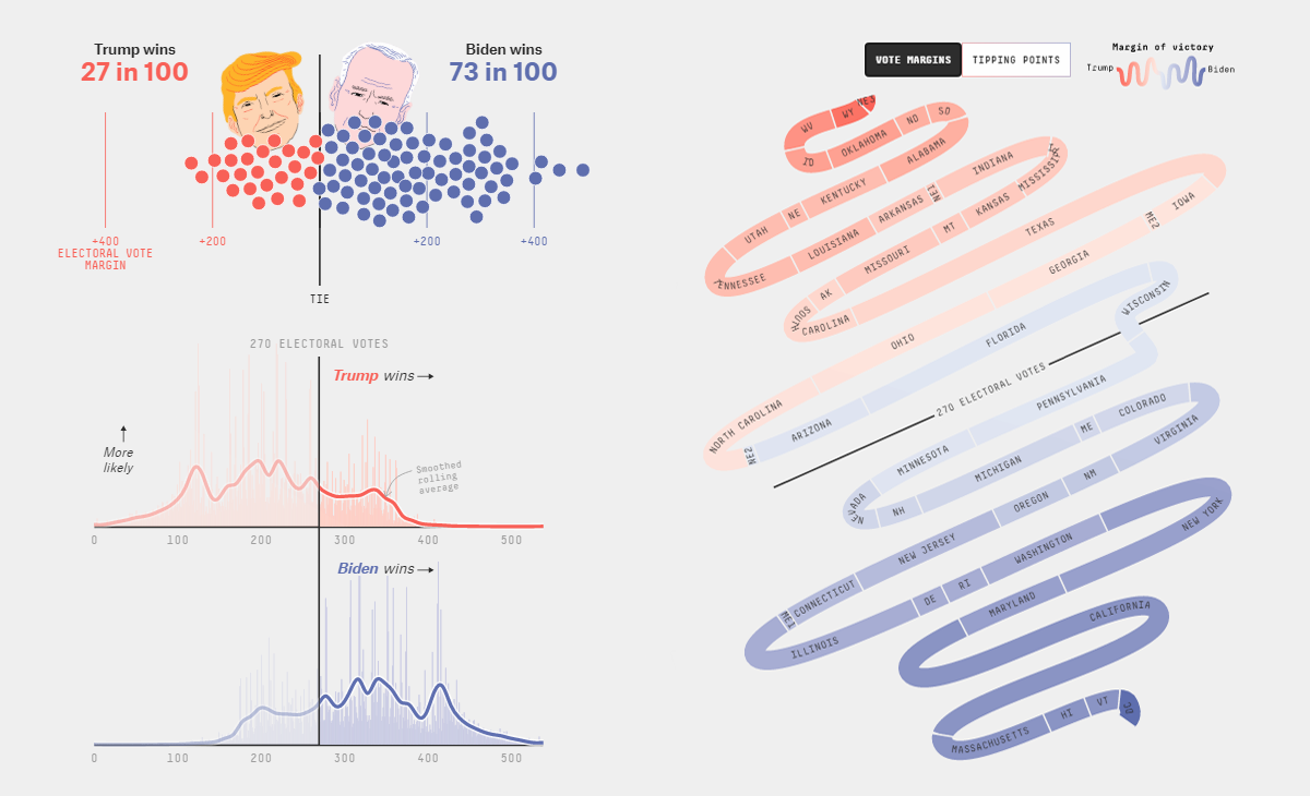
Lead by analyst Nate Silver, FiveThirtyEight has launched its own 2020 United States presidential election forecast this week. As many of our readers may know, the website is famous for original statistical models and projections on vote in America, taking the name from the number of members of the U.S. Electoral College (538).
Such FiveThirtyEight projects always feature awesome interactive data visualizations. The new forecast model is no exception. Biden? Trump? Check out the national and statewide forecasts from FiveThirtyEight in a number of compelling charts.
Before you start exploring, you might want to watch a quick video introduction by Nate Silver. See here to learn exactly how the model works (and how it is different from the previous approaches due to COVID-19).
Herd Immunity Simulations
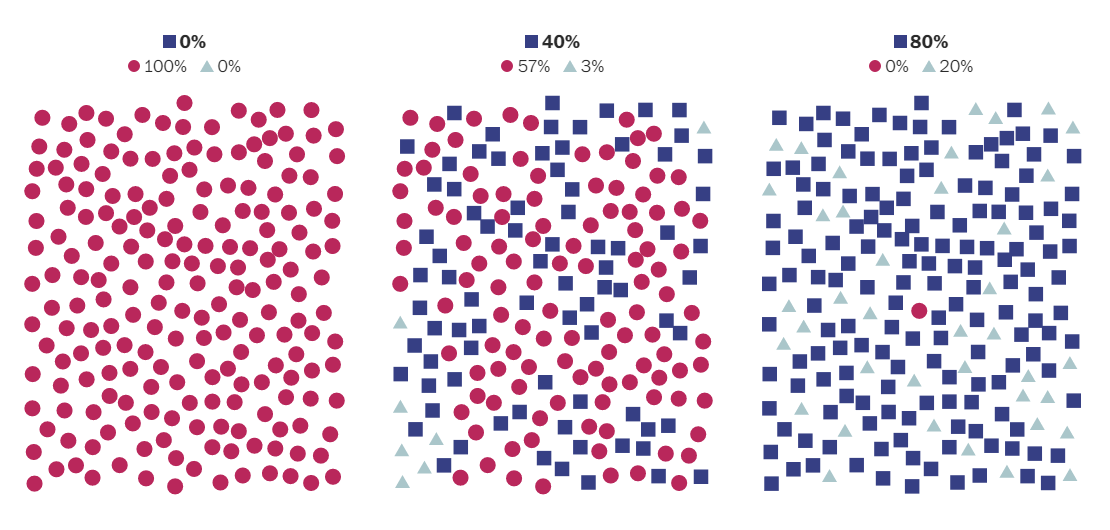
Harry Stevens, a graphics editor at The Washington Post, created another impressive story powered by visual simulations. The new one provides an intuitive explanation of how herd immunity works. It also shows how far the United States — and each state individually — are from reaching it during the current novel coronavirus epidemic.
At the end of the article, you can test how many deaths it could take for herd immunity to form if there is no vaccine or instead of carefully waiting for it. Play with the two sliders, herd immunity threshold and fatality rate, and you’ll see the cost of the alternative. Here’s one more important thing, however: The herd immunity point marks the peak but there is still a long way back down the curve.
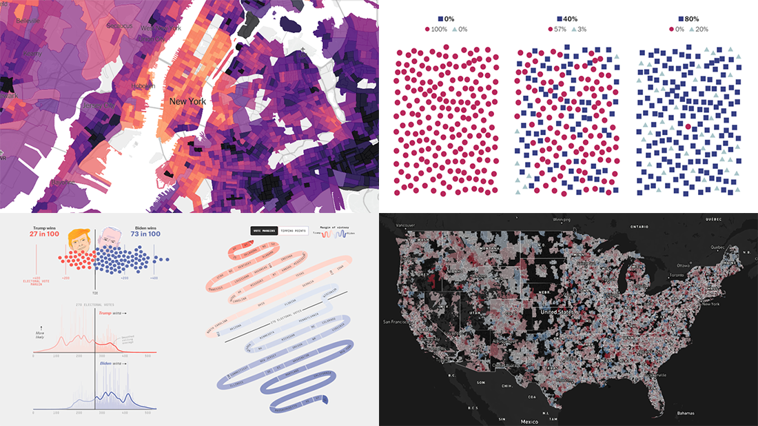
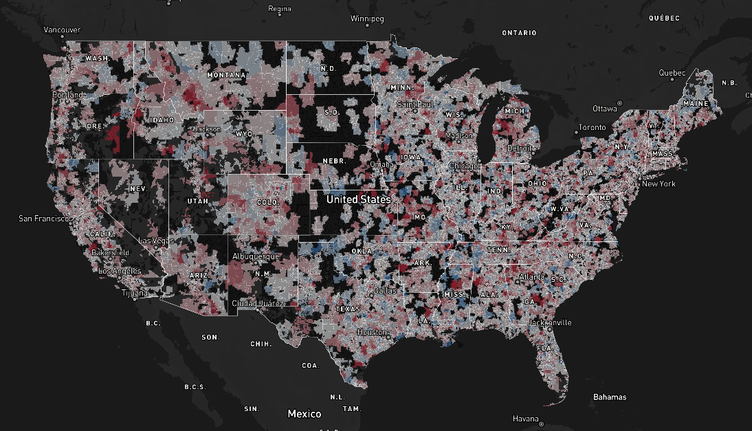
U.S. Unemployment Rates at Census Tract Level
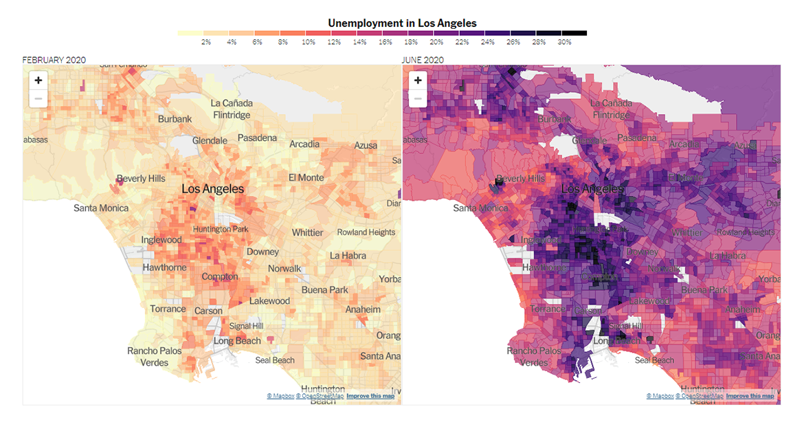
This year, the pandemic has caused unprecedented job losses all over America. Using publicly available data from the American Community Survey (ACS), the Current Population Survey (CPS), and the Local Area Unemployment Statistics (LAUS) program, analysts Mark Steitz and Yair Ghitza estimated unemployment rates across the United States at the census tract level. The New York Times, namely Emily Badger and Quoctrung Bui for The Upshot, visualized them in an interactive choropleth map and took a closer look at some neighborhoods with the worst situation in terms of the scale of job losses as of June 2020.
The three examples highlighted in the article are New York City’s Bronx, Chicago’s South Side, and South Los Angeles, where unemployment rates soared to over 20% and in some place even more than 30%. There, you’ll find two maps for each case, showing data for February and June, for side-by-side comparison. At the end of the article, you can explore the June unemployment rate estimates for any other places all over the country.
Home Prices in U.S.
Wondering how home prices across the United States have changed? Check out Realbloc. Launched by a group of data enthusiasts, the project builds on real estate prices data released by Realtor.com, providing its interactive choropleth map-based visualization.
Hover over a place and you’ll see the median listing price along with the month-over-month and year-over-year change rates for the respective zip code area. Depending on what kind of insight you want, command the map to visualize one of the three parameters. The authors say that the project will be evolving and receiving updates on a regular basis.
***
We appreciate your attention and will continue to meet you with newly published information visualization projects every Friday. Stay tuned for Data Visualization Weekly.
- Categories: Data Visualization Weekly
- No Comments »