 Lately, we’ve come across a lot of new impressive charts all over the internet. Here are some of the most interesting ones — check them out and you’ll see the real power of data visualization in action! Today in DataViz Weekly:
- New age for your age — FlowingData
- Electricity generation in the U.S. states by fuel source — The Washington Post
- Mortality consequences of climate change and income inequality — Bloomberg Green
- 1990s music recognition across generations — The Pudding
Data Visualization Weekly: July 31, 2020 — August 7, 2020
New Age for Your Age
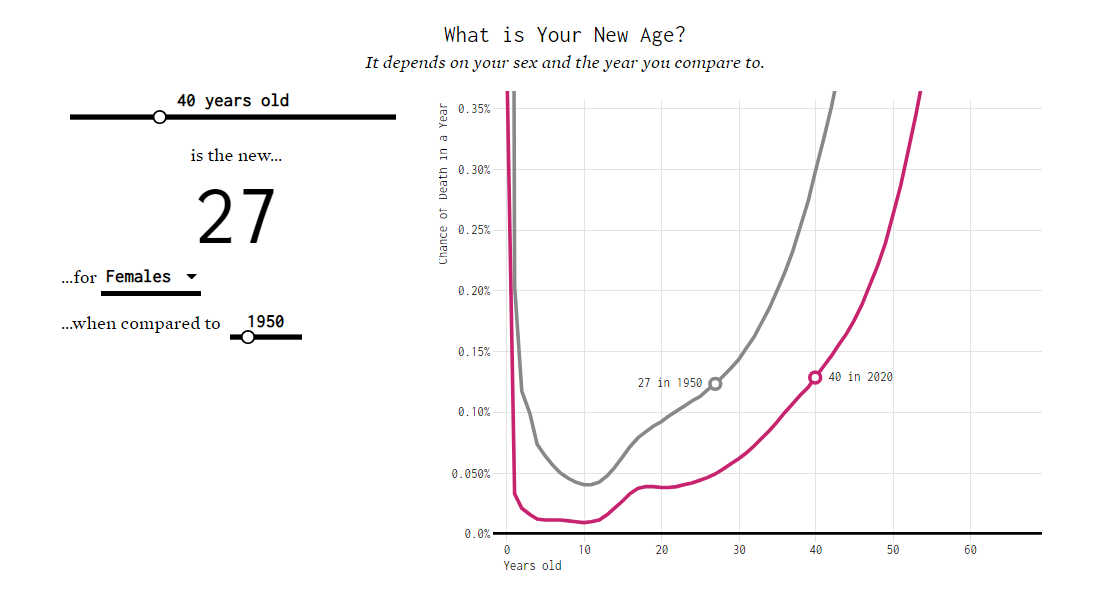
“50 is the new 20.” Or “70 is the new 30.” Or “some other age is some new different other age.” Many, if not all of us, have seen such headlines or heard similar expressions here and there. Basically, as the quality of life and life expectancy have been growing over time, it is hardly surprising nowadays to feel better (younger) than in the same age decades ago. But are there any strict and commonly accepted criteria to make conclusions about the exact difference?
Nathan Yau, a statistician, made an attempt to bring in more clarity with the help of data. For his research, he took mortality data from the Social Security Administration and looked at the probability of death by age now and in the previous decades, taking the respective curves as the point of reference.
Without more ado, we invite you to check out Nathan’s new article on his blog FlowingData, where he explains in detail what was done, step by step. As you read you will see multiple cool line (and step line) charts. The culmination is an interactive visual analysis tool that, for any age you enter, calculates the new age depending on sex and what decade you choose to compare to, as well as shows the respective curves for context.
Electricity Generation in U.S. States by Fuel Source
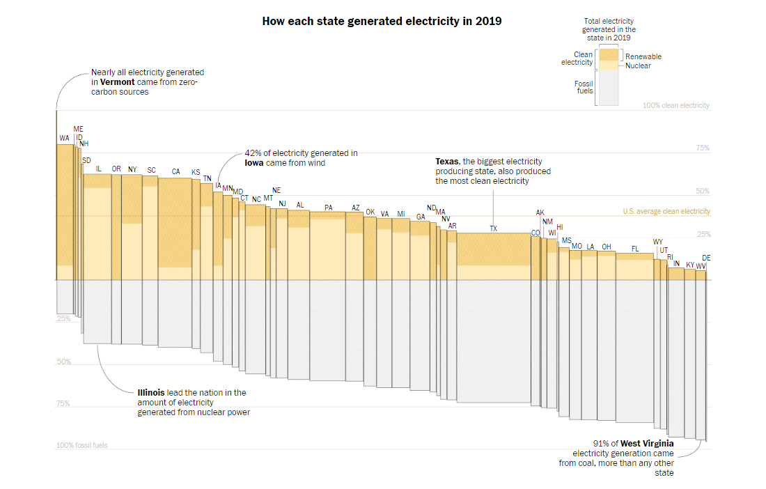
A bar mekko chart is a peculiar type of visualization which features bars of variable width to represent two quantitative measures at a time. Here’s an interesting example of how such graphic can be appropriate and useful in practice. John Muyskens, a graphics editor at The Washington Post, chose a bar mekko chart to display how the U.S. states generated electricity in 2019 based on data from the federal Energy Information Administration.
In the visualization, the width of each bar shows all electricity one state generated last year, in absolute values. Lengthwise, each bar represents 100% and shows the composition by fuel source type. The percentage for clean electricity (colored), including nuclear energy (solid color fill) and renewables such as wind, hydroelectric, solar, biomass, and geothermal (hatch fill), stacks above. Natural gas, coal, and other fossil fuels (gray) stack below.
This bar mekko chart is convenient to explore the electricity sources by state. If you are interested in this topic, the article where we found this chart, made by John Muyskens and Juliet Eilperin for The Washington Post, also has 100% stacked area charts that show the change in fuel source percentages for each state from 2001 through 2019.
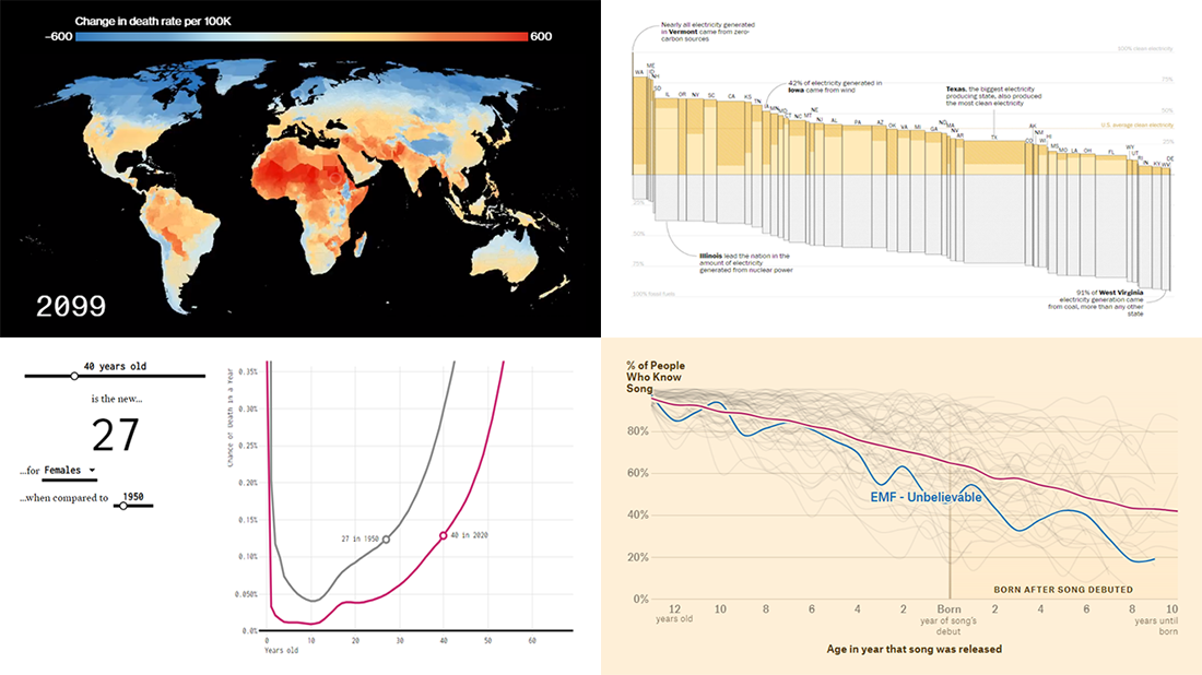
Mortality Consequences of Climate Change and Income Inequality
The risk of dying from extreme heat caused by global warming is an order of magnitude larger than previously believed. In addition to temperature, income is another important factor as it determines whether people have more or less access to air conditioning as well as other protective measures and opportunities that require investment. These are the key conclusions of the Climate Impact Lab’s new study made public lately.
For Bloomberg, Eric Roston, Paul Murray and Rachael Dottle made an overview of the main points using different visual techniques. They start with a range chart of the projected change in heat-related death rates, which reveals (or proves) the life-saving power of economic growth. Next goes the scrollytelling part. There, the shifts are represented in a global map and a distribution chart that change with the year as you scroll. Look at the projections and you’ll find even more interesting graphics and important revelations in the article.
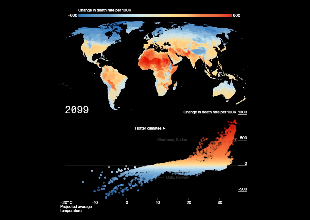
1990s Music Recognition Across Generations
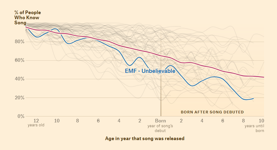
Teens hardly listen to the same music as parents and may even fail to recognize most of the hit songs from a couple of decades ago. The Pudding’s Matt Daniels and Ilia Blinderman created a cool story revealing how music is passed down from generation to generation.
Several months ago, The Pudding launched a quiz asking readers whether or not they recognized one song or another. Analyzing millions of data points collected in this way, the authors focused on the 1990s music and, among the insights revealed, found out what songs released in that decade have been losing popularity faster (and slower) than others. The story features, in particular, interesting line graphs that show the change in recognition rates for many 1990s hits by the person’s age in the year of the song’s release.
At the end of the piece, all the 1990s songs ever charted in the top five of the Billboard Hot 100 are represented, ranked by how well they were recognized among Generation Z participants of the quiz. “My Heart Will Go On” and “…Baby One More Time” are leading the list.
***
We hope you have had a great week. Keep it up and stay tuned for impressive charts.
- Categories: Data Visualization Weekly
- No Comments »