 Check out new interesting examples of charting COVID-19 data in action. We have seen a lot of visualizations over the past few days and selected the following projects to share with you today in DataViz Weekly:
- Fatality models for the United States – FiveThirtyEight
- Impact on climate change – Bloomberg Green
- (Now broken) correlation between the stock market and unemployment rates in America – The Washington Post
- Situation in Spain – The New York Times
Data Visualization Weekly: May 8, 2020 — May 15, 2020
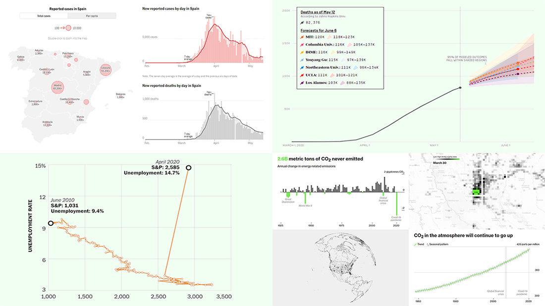
COVID-19 Fatality Models for America
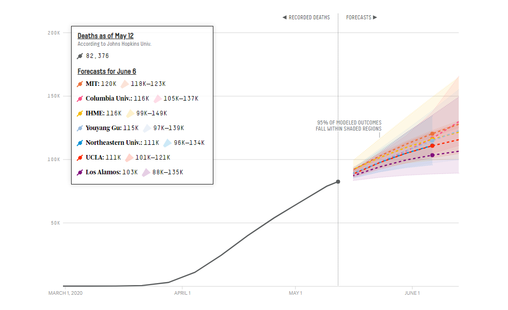
There are quite a few different COVID-19 models out there that predict where we are headed with the pandemic. Although none of them, created by scientists, can tell us exactly what and when will happen, such projections help officials make the right decisions by demonstrating the range of possibilities, from the worst- to best-case scenarios and from the least to most likely outcomes.
With the help of data put together by the COVID-19 Forecast Hub, FiveThirtyEight looked at nine models of fatality rates for the United States to find out what future to expect within the next few weeks according to them (and what makes the estimates different). The forecasts in the spotlight of this comparison come from Columbia University, IHME UW, LANL, MIT, Northeastern University, UCLA, University of Massachusetts, University of Texas, and data scientist Youyang Gu.
Check out FiveThirtyEight’s charts. Explore trajectories these models draw for the COVID’s death toll in America, nationwide and in each state.
Pandemic’s Impact on Climate Change
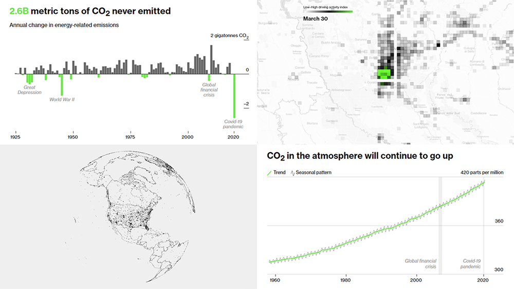
The COVID-19 pandemic made the humanity de facto take overwhelming climate action by keeping billions of people at home. Thanks to the halt of travels and factories, emissions dropped drastically, greatly reducing air pollution and making skies around the world significantly clearer in a matter of weeks, not even years. However, the big picture is unlikely to change.
Bloomberg Green published a visual story showing the overwhelming planetary-scale transformations at a glance through the prism of data in charts and map-based visualizations. Nevertheless, the key point here is disclosed by the final graph of the article, predicting that CO2 levels will continue to rise and the dangerous pace of global warming on the planet will not slow down anyway.
Read the story and look at the visualizations. Very interesting and insightful.
Stock Market vs Labor Market
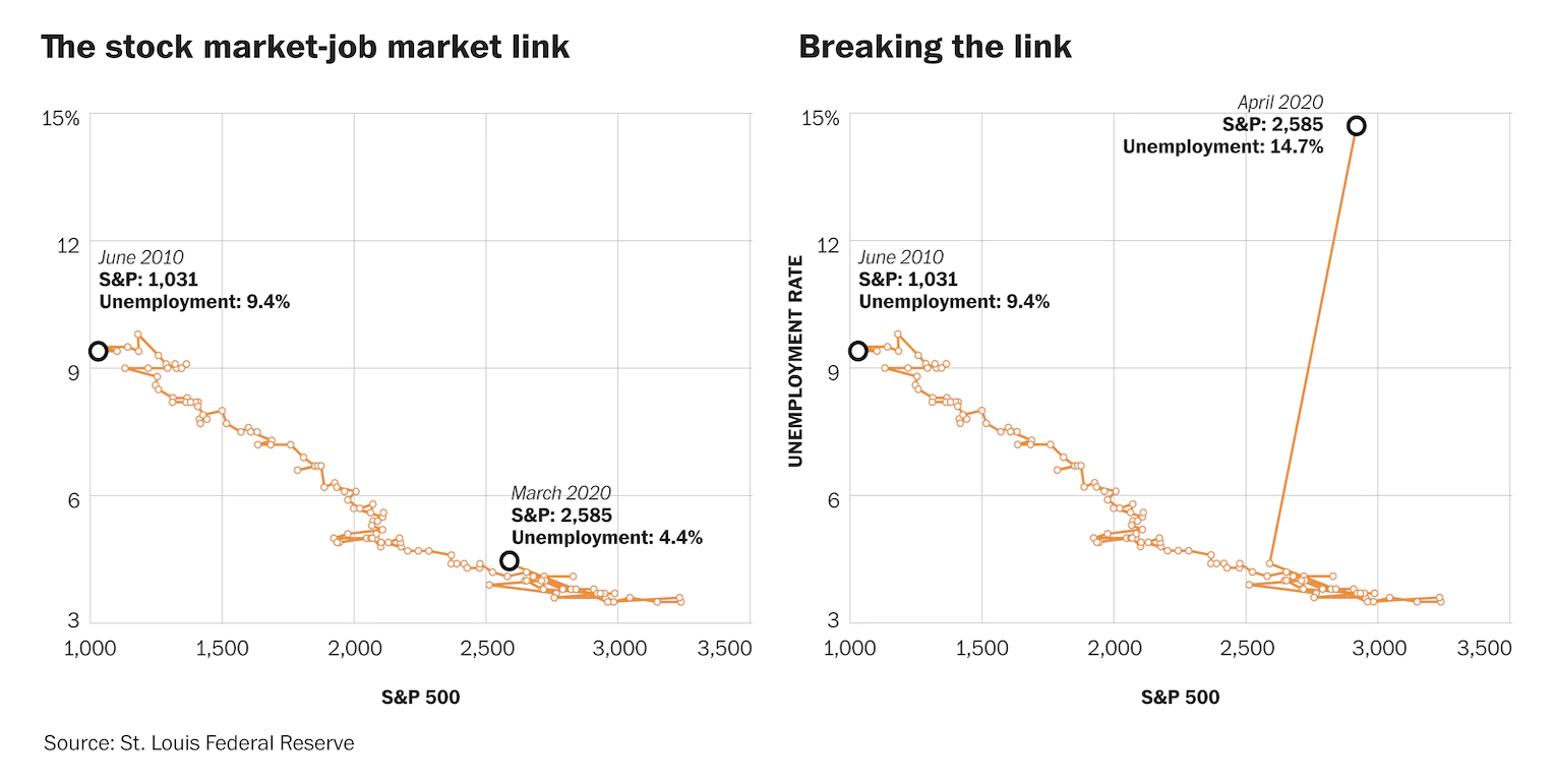
The S&P 500, a stock market index measuring the performance of 500 large companies on U.S. stock exchanges, and the U.S. unemployment rate moved almost in lockstep over the past ten years: the higher the former, the lower the latter. It all changed last month. In April, while S&P grew, unemployment soared to the highest level since last century’s Great Depression.
The Washington Post visualized S&P and unemployment in the U.S. since June 2010 to show the tight link which got broken. We can clearly see that the labor market is now completely decoupled from the stock market.
Look how telling even one chart can be! Check it out and learn more about the situation, on The Post.
COVID-19 in Spain and Worldwide
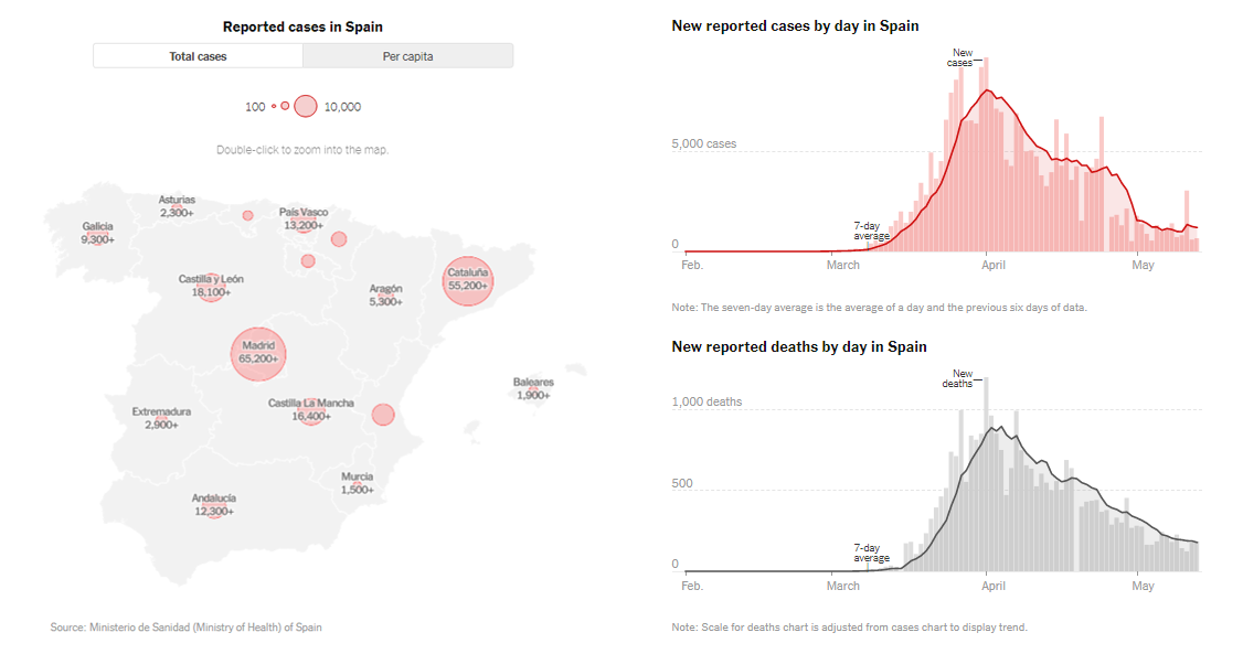
One of the most popular media outlets worldwide, The New York Times continues global data-driven coverage of the novel coronavirus outbreak. Here’s Spain, for example.
After a very strict nationwide lockdown, coming as no surprise because it has been one of the countries worst affected by the pandemic, Spain’s government has recently begun to loosen the imposed restrictions. Children are already allowed to go out, small groups may gather and dine outside, and shops reopen. Restrictions are lifted not everywhere across the country, though.
See NYT’s visualizations to understand how the situation unfolds in Spain. There, you will also find links to coronavirus spread trackers for some other countries, charting COVID-19 data with regular updates, including the U.S. and each of its states and the District of Columbia.
Have you found a new interesting example of charting COVID-19 data? Let us know and we may feature it in the next DataViz Weekly.
- Categories: Data Visualization Weekly
- No Comments »