New Coronavirus Data Visualization Projects Worth Seeing — DataViz Weekly
May 29th, 2020 by AnyChart Team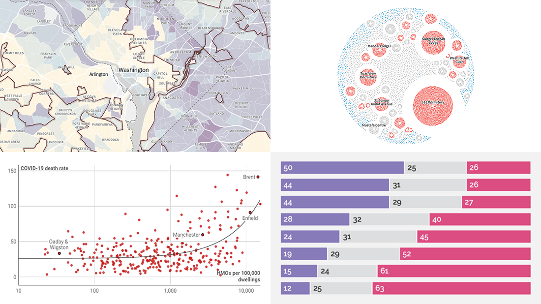
Waiting for a new serving of interesting chart examples? DataViz Weekly is here! Check out new coronavirus data visualization projects from around the web that we’ve found worth seeing:
- Anatomy of the COVID-19 outbreak in Singapore — Reuters
- Health disparities in communities of color across the United States as revealed by COVID-19 — The Washington Post
- Bill Gates coronavirus conspiracy theory in public opinion — Yahoo News
- Link between the housing crisis and COVID-19 deaths in the United Kingdom — Inside Housing
- Categories: Data Visualization Weekly
- No Comments »
Charting COVID-19 Data and Models — DataViz Weekly
May 15th, 2020 by AnyChart Team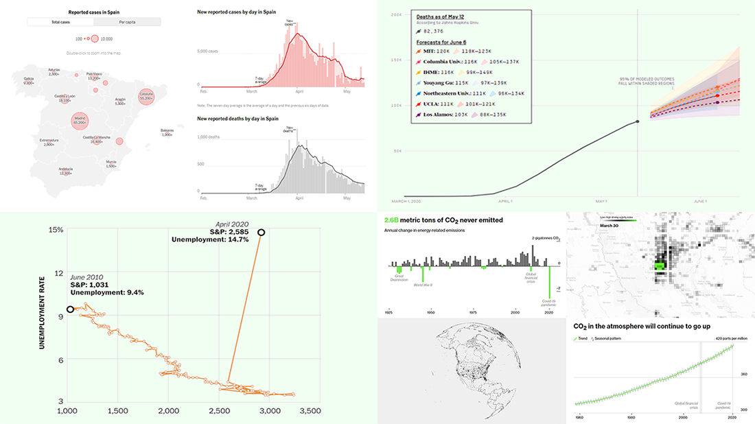 Check out new interesting examples of charting COVID-19 data in action. We have seen a lot of visualizations over the past few days and selected the following projects to share with you today in DataViz Weekly:
- Fatality models for the United States – FiveThirtyEight
- Impact on climate change – Bloomberg Green
- (Now broken) correlation between the stock market and unemployment rates in America – The Washington Post
- Situation in Spain – The New York Times
- Categories: Data Visualization Weekly
- No Comments »
Creative Visualizations on Climate, Protests, Jobs, and Wildlife — DataViz Weekly
March 27th, 2020 by AnyChart Team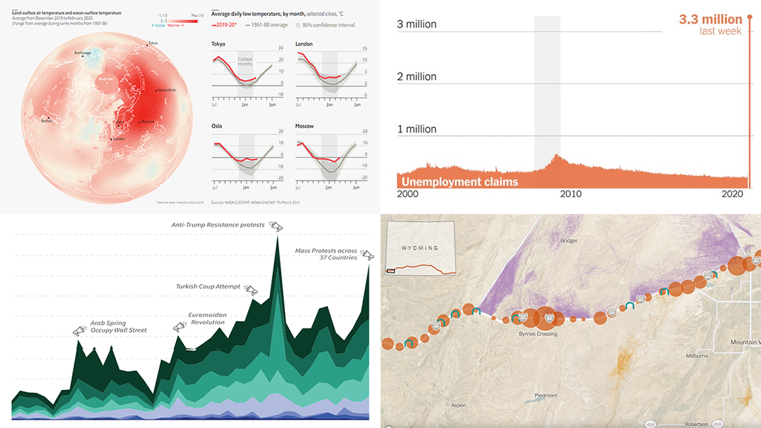 The new issue of DataViz Weekly puts a spotlight on some of the most interesting new creative visualizations from around the Web. Last week, we made a focus on COVID-19 charts. This time, we get along without the coronavirus subject. Well, mostly.
Here is what’s on DataViz Weekly this Friday:
- Winter temperatures in the northern hemisphere — The Economist
- Mass political protests worldwide — Center for Strategic and International Studies
- Spike in joblessness in the United States of America — The New York Times
- Wyoming wildlife corridors — The Washington Post
- Categories: Data Visualization Weekly
- No Comments »
Coronavirus in US in Charts and Maps — DataViz Weekly
March 20th, 2020 by AnyChart Team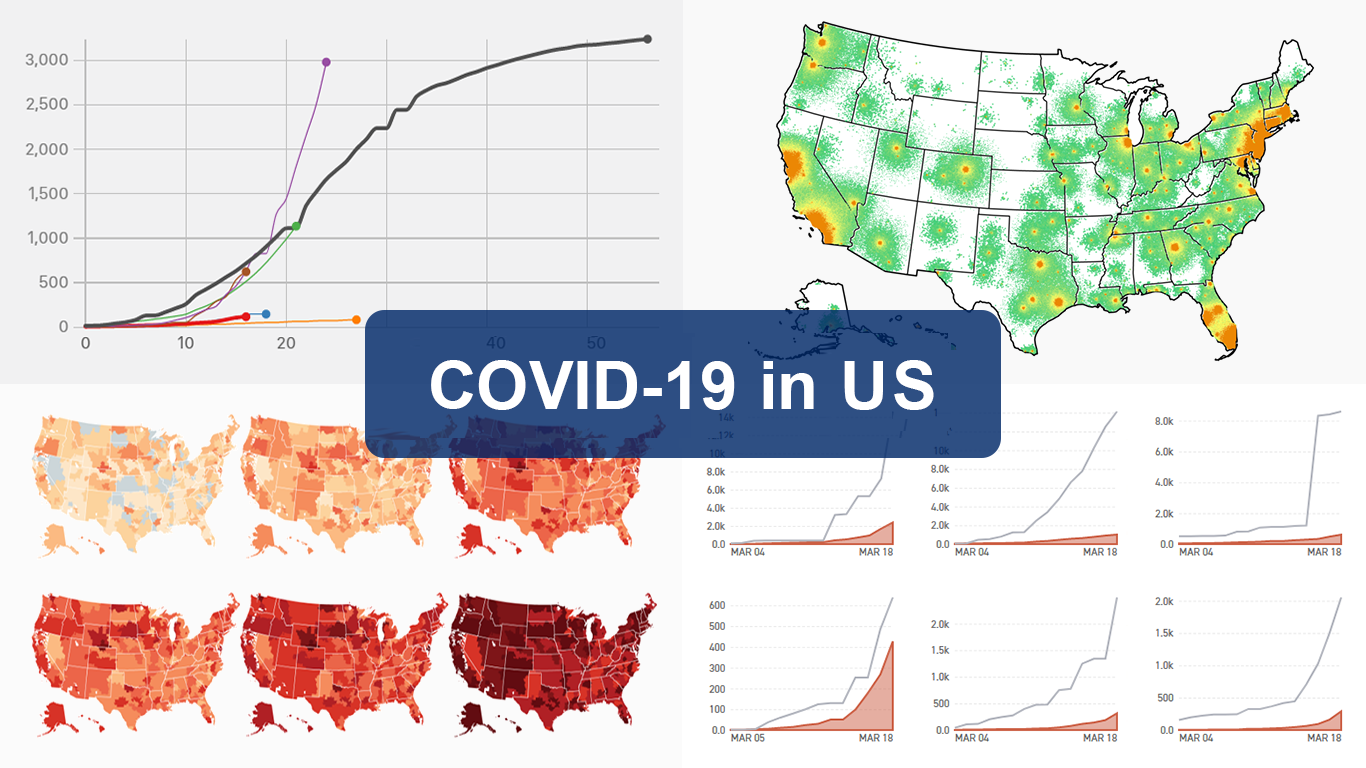 As the novel coronavirus pandemic is in full swing, COVID-19 is now by far the most topical issue on the global agenda. So it’s no surprise that the vast majority of the data visualization projects we’ve come across this week are about the outbreak. That’s why the new DataViz Weekly article is entirely devoted to the same subject — the coronavirus.
We are quite sure many of you have already seen some if not all of the best dashboards, charts, and trackers of the global COVID-19 outbreak from Johns Hopkins University, The New York Times, Financial Times, Business Insider, The Guardian, Bloomberg, and others. Awesome animated simulations from The Washington Post’s Harry Stevens, showing why epidemics like this spread exponentially and how social distancing could help to flatten the curve of COVID-19 cases, have almost certainly came to your attention and does not need to be presented additionally.
Headquartered in the United States, we decided to find out more about what has been going on about COVID-19 in America. Join us on a review of four interesting (though sometimes a bit frightening) data graphics features created by top media outlets, which provide insight into where the U.S. stands — from the perspective of cases and tests (Politico), scenarios (TIME), and hospital bed capacity (The Upshot by NYT), as well as compared to the rest of the world (BuzzFeed News). Check out the special “COVID-19 in US” edition of DataViz Weekly on the AnyChart blog.
- Categories: Data Visualization Weekly
- 2 Comments »
Readership, NBA, Color, and Christmas Data Visualizations — DataViz Weekly
December 27th, 2019 by AnyChart Team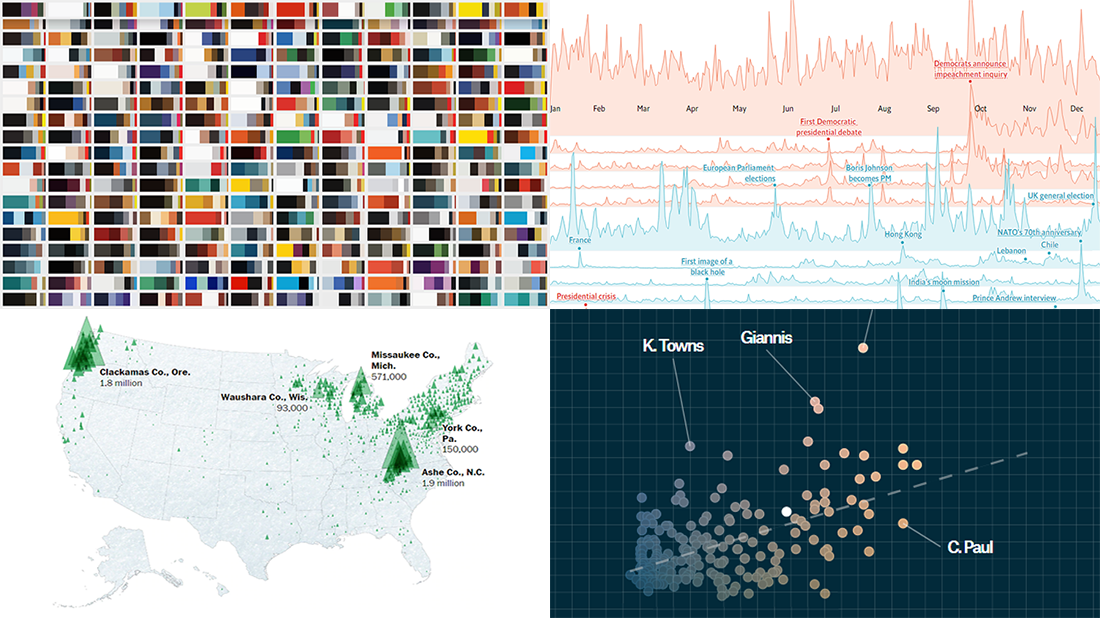 Merry Christmas to all who celebrate it! On the last Friday of 2019, we invite you to check out the year’s last DataViz Weekly article on AnyChart Blog, highlighting some of the most interesting charts published at the end of the year. Of course, we could not help featuring some Christmas data graphics in this festive week. But here you will also learn about projects with cool charts on other subjects. Here’s a list of what the data visualizations shown in today’s DataViz Weekly are about:
- Where American Christmas trees come from — The Washington Post
- Top news stories of 2019 by readership — The Economist
- NBA players’ performance against pay — The Pudding
- Colors on Scientific American’s covers over 175 years of the magazine’s life — Scientific American
- Categories: Data Visualization Weekly
- No Comments »
Visual Analytics Examples for City Climate, Pain Pills, Water Fountains, and Space Travels — DataViz Weekly
July 19th, 2019 by AnyChart Team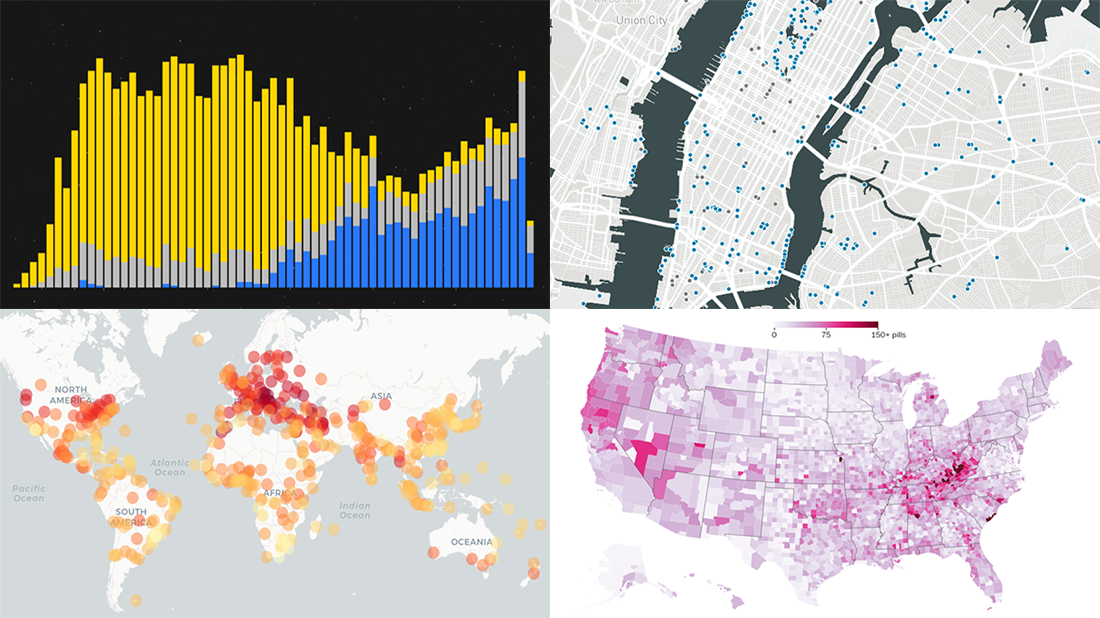 Enjoy another selection of new cool data visualization projects as great examples of visual analytics in action. Here’s what questions the charts featured today on DataViz Weekly show answers to:
- What city’s current climate will your city’s climate resemble in 2050? — Crowther Lab
- How legal pain pills were distributed across the United States in 2006-2012? — The Washington Post
- Where is the nearest water fountain? — Matthew Moy de Vitry
- How space travel has developed since Sputnik in 1957? — Reuters
- Categories: Data Visualization Weekly
- No Comments »
Plotting NBA Shots, Diversity, Disasters, and Air Traffic — DataViz Weekly
May 3rd, 2019 by AnyChart Team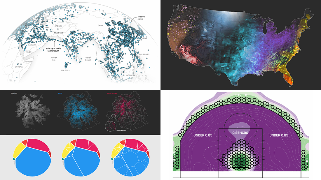 Check out new interesting examples of how plotting data on charts and maps can be both insightful and beautiful. Here is what we are happy to feature in today’s article in the DataViz Weekly series:
- Visualizing how India-Pakistan tensions disrupt air travel
- Plotting diversity of Brussels
- Mapping where natural disasters tend to strike in the United States
- Charting NBA shots
- Categories: Data Visualization Weekly
- No Comments »
New Interesting Data Visualizations on NBA, Spending, and Gender Pay Gap — DataViz Weekly
March 15th, 2019 by AnyChart Team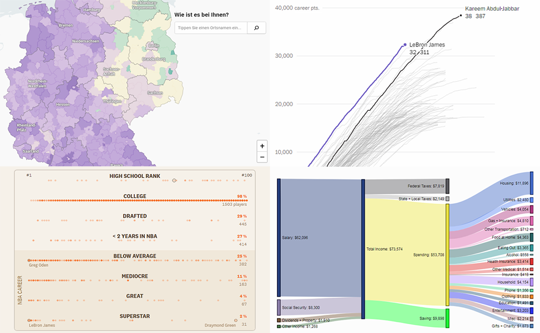 Continuing the regular DataViz Weekly feature on the AnyChart blog, today we are happy to tell you about new interesting data visualizations we’ve found these days — wonderful examples of charts designed for visual storytelling and analytics:
- gender pay gap in Germany;
- NBA’s all-time scoring leaders, now with LeBron James in top 4;
- from leading high school basketball players to NBA superstars;
- household spending in the United States, by income group.
- Categories: Data Visualization Weekly
- No Comments »
Year in Review in Graphics from Top U.S. Publications — DataViz Weekly
January 4th, 2019 by AnyChart Team Happy New Year, everyone! 2019 is already here. But while we still feel the proximity of the last year, let’s take another look back. 2018 brought us numerous interesting visual stories based on data and graphics. For this year’s first DataViz Weekly, we’ve put together year-in-review projects of the graphics teams at four leading media publications in the U.S. (we are a U.S. based company, right): The Wall Street Journal, The New York Times, The L.A. Times, and The Washington Post. Check out some of the key facts, trends, and findings of 2018 in their top picks.
- Categories: Data Visualization Weekly
- 1 Comment »
Interesting Data Visualization Projects About Thanksgiving, Air, Greenery, and Rape Clearance — DataViz Weekly
November 23rd, 2018 by AnyChart Team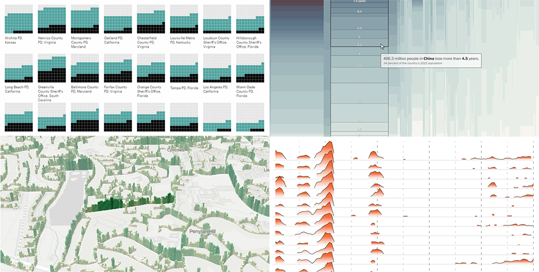 Happy Thanksgiving holiday! While the traditional Black Friday rush is getting into the full swing, we hope you can spare a minute to check out new interesting data visualization projects. Let’s see a list of what’s featured this time on DataViz Weekly and without more ado proceed to the charts:
- years lost due to air pollution;
- urban greenery in Cardiff and Newport;
- rape case clearance rates across the United States;
- Thanksgiving holiday trends.
- Categories: Data Visualization Weekly
- No Comments »