 Happy Thanksgiving holiday! While the traditional Black Friday rush is getting into the full swing, we hope you can spare a minute to check out new interesting data visualization projects. Let’s see a list of what’s featured this time on DataViz Weekly and without more ado proceed to the charts:
- years lost due to air pollution;
- urban greenery in Cardiff and Newport;
- rape case clearance rates across the United States;
- Thanksgiving holiday trends.
Data Visualization Weekly: November 16, 2018 — November 23, 2018
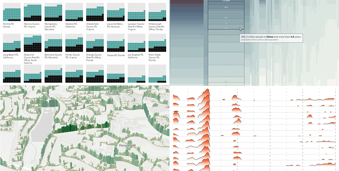
Years Lost Due to Air Pollution
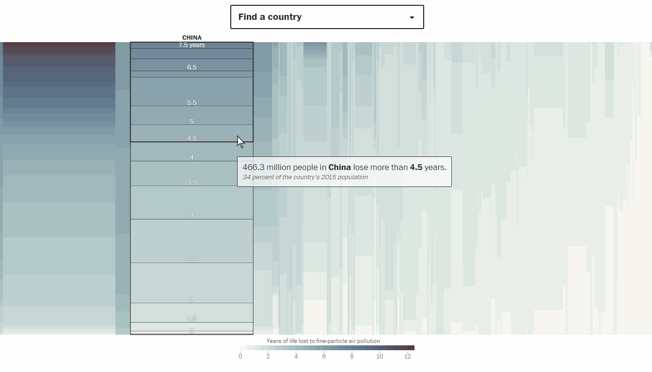
The Washington Post looked into the impact of air pollution on life expectancy around the world. According to data from the Energy Policy Institute at the University of Chicago, people on Earth live on average 2.6 years less than they (we) could due to the poor quality of the air we all breathe. However, this greatly depends on your home’s location. Check how many years you and your neighbors are likely to lose if the current air pollution trends persist.
Urban Greenery in Cardiff and Newport
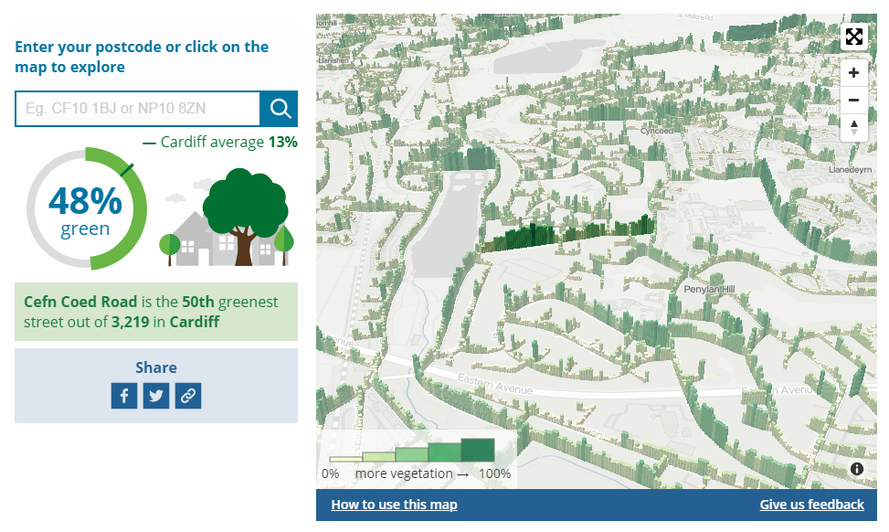
The Data Science Campus at the UK’s Office of National Statistics (ONS) made use of machine learning algorithms in order to measure greenery in Cardiff and Newport as seen on Google Street View. Take a look at their interactive data visualization tool to explore how green each street in the Welsh capital and its neighboring city is, per se and compared with other areas, in terms of the amount of trees, hedges, and other green spaces. Expect the same kind of data for the entire United Kingdom to be published by the authors next year.
Rape Case Clearance Rates Across America
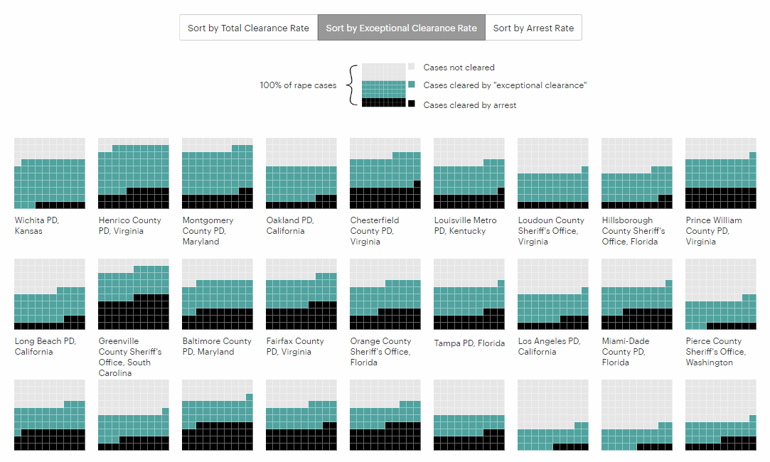
ProPublica, Newsy, and Reveal analyzed police and FBI data from all over the United States and found out that in many jurisdictions, law enforcement agencies could be inflating their rape case clearance rates by using the so-called “exceptional clearance” practice not so sparingly as they are supposed to. “The designation allows police to clear cases when they have enough evidence to make an arrest and know who and where the suspect is, but can’t make an arrest for reasons outside their control,” the publication explains. Look at the visualizations to overview the situation and explore clearance rates by police department.
Thanksgiving Holiday Trends
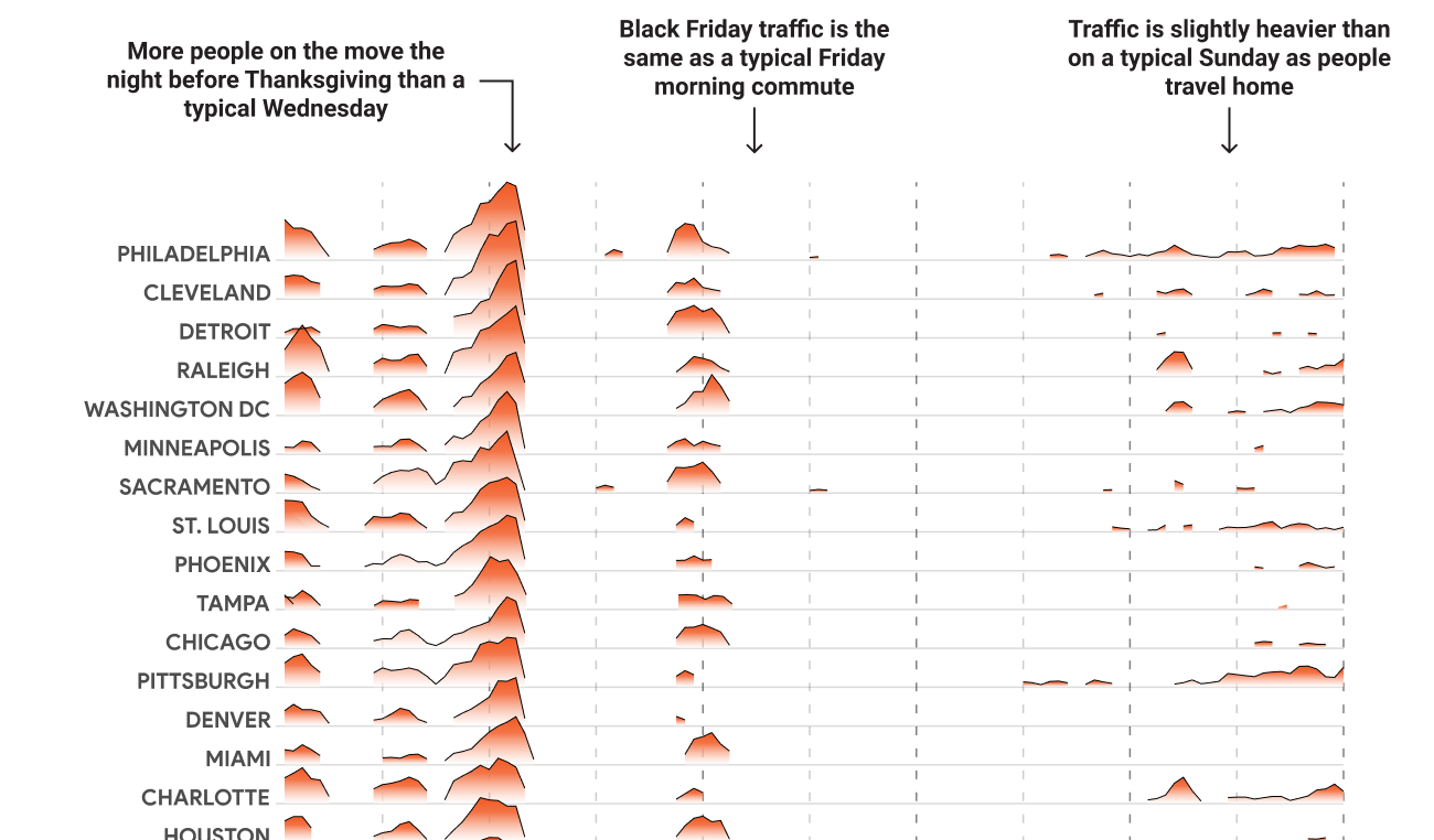
As a US-based company, we could not stay away from the Thanksgiving topic, of course. Here’s one of the interesting data visualization projects we’ve seen. Mapping Thanksgiving — a collaboration between Google Maps, Google News Lab, and Polygraph — reveals patterns in where Americans go during the Thanksgiving holiday time and when exactly. Based on the search trends data from the last year’s holiday season, the charts should be helpful in finding the best time to go to the places you want to visit, avoiding crowds and traffic jams.
***
This week, we’ve also published an article that explains what data visualization is, formulating its definition, describing its importance and some history milestones, and providing insight into how it works in practice by means of examples. If you like charts but are not really well into dataviz yet, that ‘Data Visualization 101’ article should be jolly good as the starting point.
Thanks for reading. Stay tuned for Data Visualization Weekly to learn about new interesting data visualization projects every week.
Have a great holiday, everyone!
- Categories: Data Visualization Weekly
- No Comments »