 Merry Christmas to all who celebrate it! On the last Friday of 2019, we invite you to check out the year’s last DataViz Weekly article on AnyChart Blog, highlighting some of the most interesting charts published at the end of the year. Of course, we could not help featuring some Christmas data graphics in this festive week. But here you will also learn about projects with cool charts on other subjects. Here’s a list of what the data visualizations shown in today’s DataViz Weekly are about:
- Where American Christmas trees come from — The Washington Post
- Top news stories of 2019 by readership — The Economist
- NBA players’ performance against pay — The Pudding
- Colors on Scientific American’s covers over 175 years of the magazine’s life — Scientific American
Visualizing Christmas Data and More in Data Visualization Weekly: December 20, 2019 — December 27, 2019
Where American Christmas Trees Grow
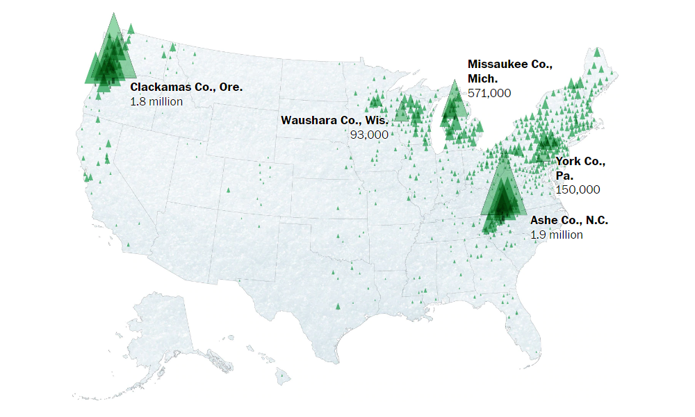
We could not let this post-Christmas issue go without at least one cool visualization project on a topic related to Christmas. It was easy, though, as The Washington Post published an interesting story revealing where Christmas trees that Americans purchase for their homes come from. The authors of the article, Tim Meko and Lauren Tierney, made several maps to communicate data they had found while researching into this topic.
The first map, pictured above, allows us to notice which counties produced most Christmas trees in 2017 and understand in which regions across the U.S. where the production is concentrated. Further down the story, maps will help you find out the location of choose-and-cut Christmas tree farms as well as forested areas with mostly Christmas tree varieties. Small maps at the end of the article display the origins of several famous trees — those traditionally installed near the White House (the National Christmas Tree), the U.S. Capitol ( the Capitol Christmas Tree), and Rockefeller Center (the Rockefeller Center Christmas Tree). Take a look.
Top News Stories of 2019
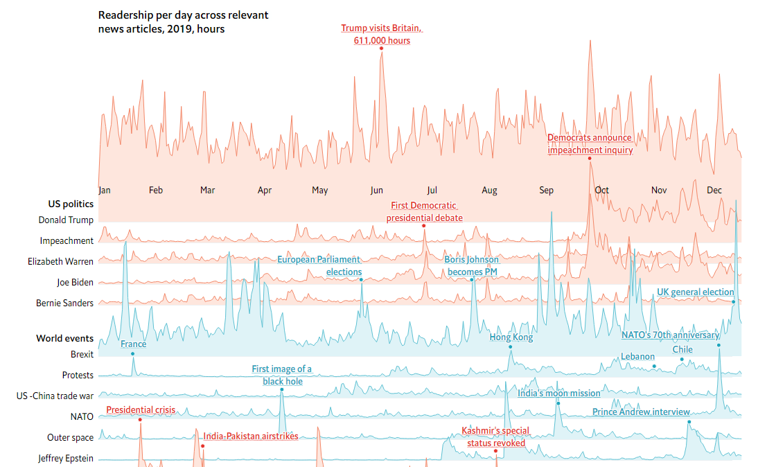
As 2019 is about to end, we see more and more look-backs. The Economist, for example, shared a chart that shows the year’s most popular news subjects, displaying readership over time for each. The visualization is based on a summary from Chartbeat, a company measuring audiences for digital media publishers, which compiled data on 4 million articles on 5 thousand websites, with half of the publishers located in English-speaking countries and about one-fourth in continental Europe.
Check out the chart to find out what news stories generated the most interest of the (mostly Western) readers monitored by Chartbeat and read more on The Economist. We’ll just say that U.S. President Donald Trump dominated the audiences’ attention in 2019 in general, although breaking news about events like the Notre Dame fire often attracted more audiences on the corresponding specific days.
NBA Players’ Performance Vs Pay
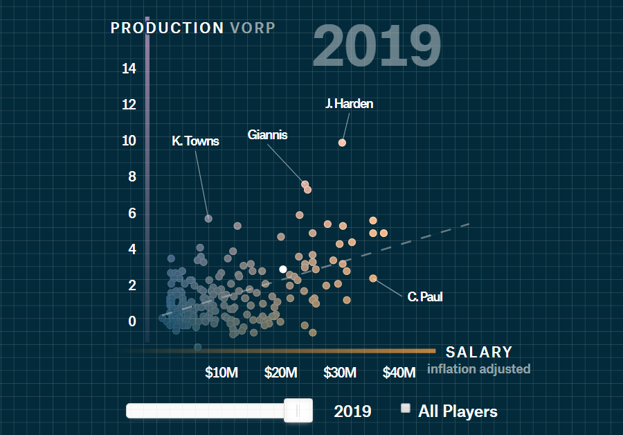
Matt Daniels from The Pudding built a model that uses advanced basketball statistics to rank NBA players’ performance against their pay. Based on data from the Basketball-Reference.com website, it allows us to identify the worst and, at the same time, highest-paid players.
Look at the interactive visualization he created within the framework of this project. The chart represents salaries against VORP (“value over replacement player”) for every season from 1988 to 2019. Do not miss out on the dedicated video explaining how this works and revealing interesting facts.
Scientific American’s Cover Colors over 175 Years
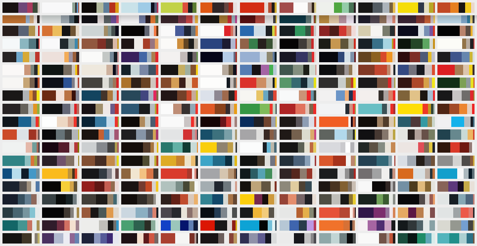
Scientific American’s Nicholas Rougeux and Jen Christiansen made an awesome visual feature consisting in a color analysis of the magazine’s covers over the 175 years of its existence. In an interactive grid, they binned weekly issues by year. The very analysis starts with the November 1921 issue which marked a shift to a monthly magazine; vertical stripes show the top five colors on each cover, and the entire visualization looks like an impressive puzzle.
See how hues used on the Scientific American’s covers were changing. It is interesting to look at the change as an indicator of shifts in publishing technologies, magazine ownership, and editorial vision over time.
***
Thank you all so much for staying with us this year. We will be happy to keep you posted on interesting data visualization examples within the framework of DataViz Weekly in 2020, too. So stay tuned. Have a great year-end time!
- Categories: Data Visualization Weekly
- No Comments »