2018 Midterm Election Results in Data Visualization — DataViz Weekly
November 9th, 2018 by AnyChart Team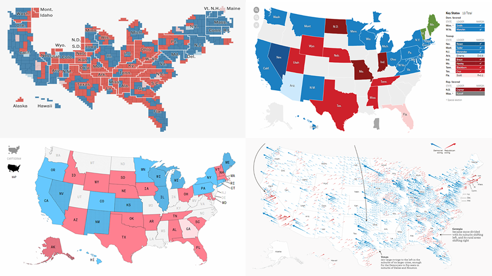 The 2018 midterm election in the United States of America has been among the hottest topics on the media agenda for quite a long time. Various publications were covering the course of the House, Senate, and governor campaigns, sharing forecasts from analysts, and so on. Now that voting is over, all eyes are on the outcome.
Today’s DataViz Weekly will show you how several prominent publications communicated the results of the midterms to their readers with the help of data visualization techniques: The New York Times, The Washington Post, Bloomberg, and The Guardian. So get ready for a lot of choropleth maps! But not only.
- Categories: Data Visualization Weekly
- 1 Comment »
Mapping Data About Cancer, Nobel Physicists, Rain, and Fall Foliage — DataViz Weekly
September 28th, 2018 by AnyChart Team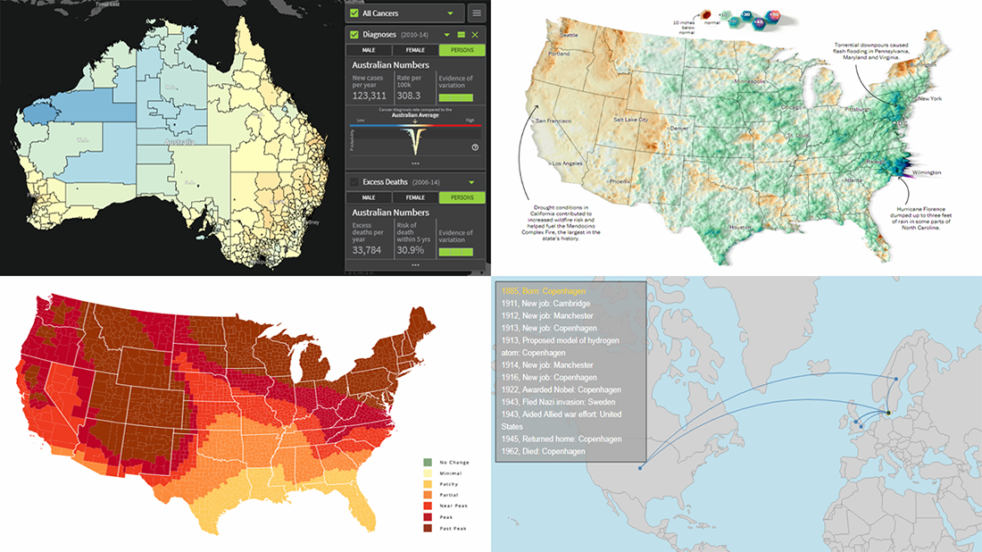 Today’s DataViz Weekly article highlights new beautiful map visualizations, demonstrating how mapping data can help to get geographical insights such as spatial trends, clusters, and so on:
- Australian Cancer Atlas;
- lifetime movements of Nobel Prize laureates in physics;
- U.S. summer rain levels;
- fall foliage prediction across the U.S.
- Categories: Data Visualization Weekly
- 1 Comment »